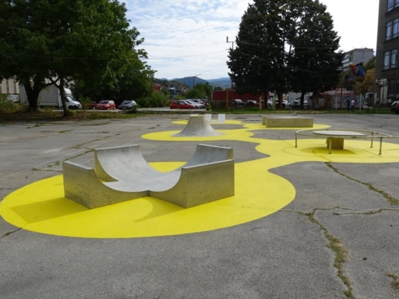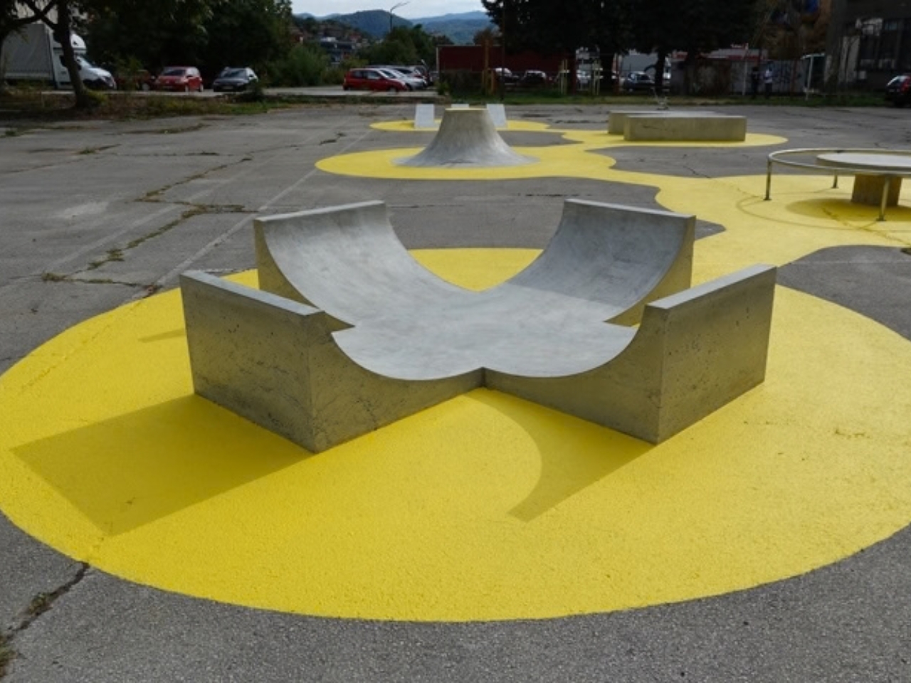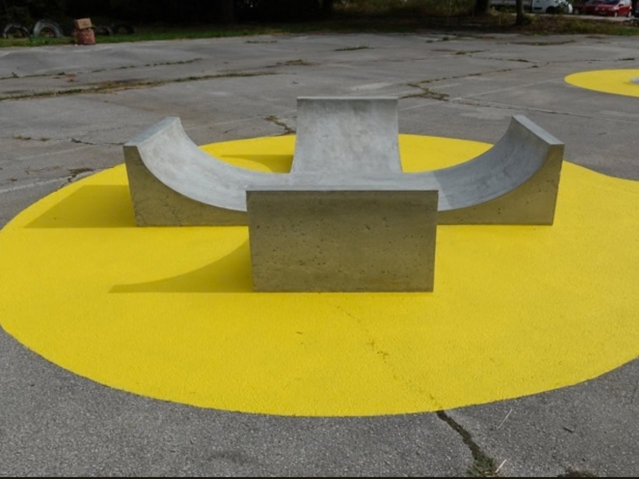
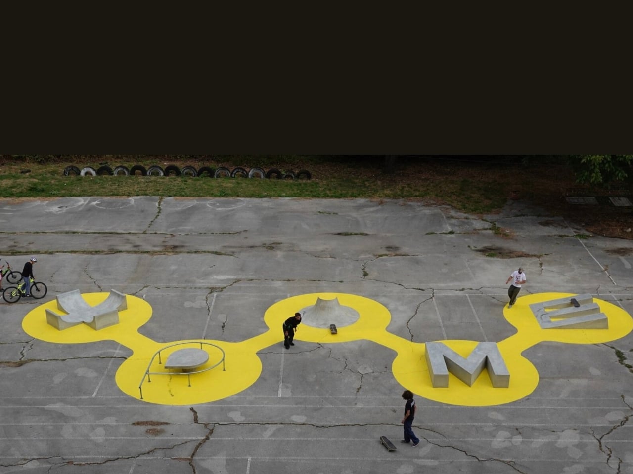
Public art often comes with an invisible instruction: look, but don’t touch. Skateparks invite the opposite response, yet their familiar ramps and rails can feel disconnected from the places around them. XPOME’s Skateable addresses both problems with a clever idea: make the sculpture the skatepark. In Gabrovo, Bulgaria, five concrete and steel letters spell out the graffiti artist’s name, and every letter offers a way to skate or a place to rest.
Created for an exhibition on the history of skateboarding in Bulgaria, Skateable stands outside the Christo and Jeanne-Claude Center. XPOME had been invited to make a sculpture, but the result refuses to sit quietly beside the subject of the show. It gives that subject a physical form, one that can be approached on wheels rather than understood only through a display. That feels like a more generous way to introduce people to skate culture.
Designer: XPOME
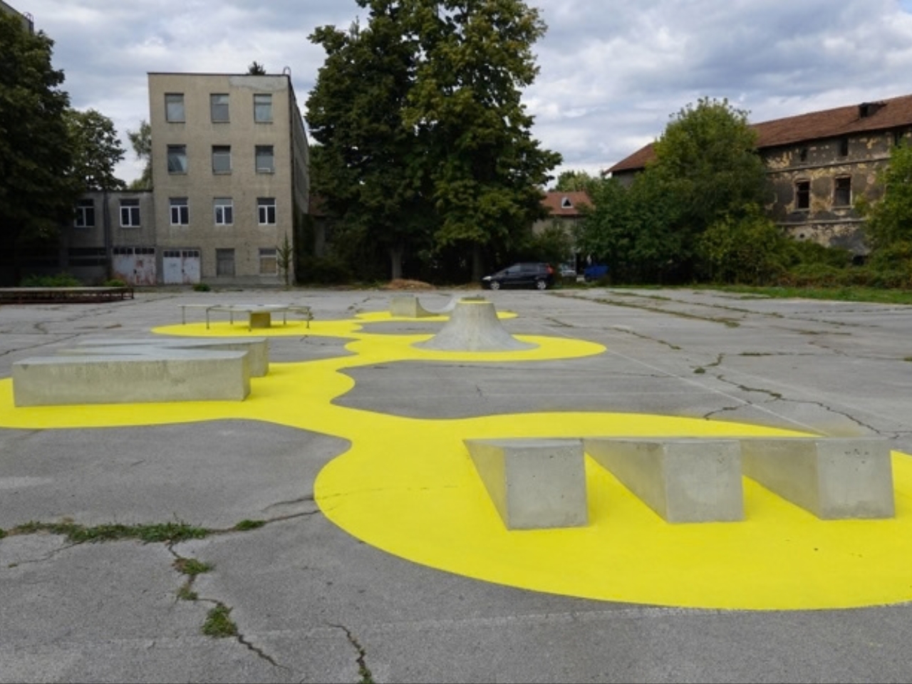
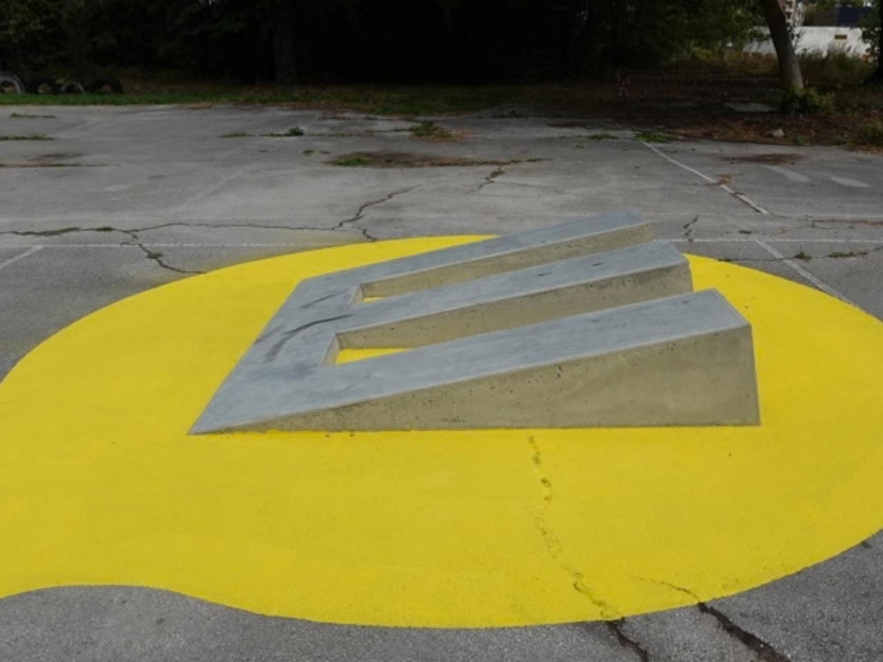
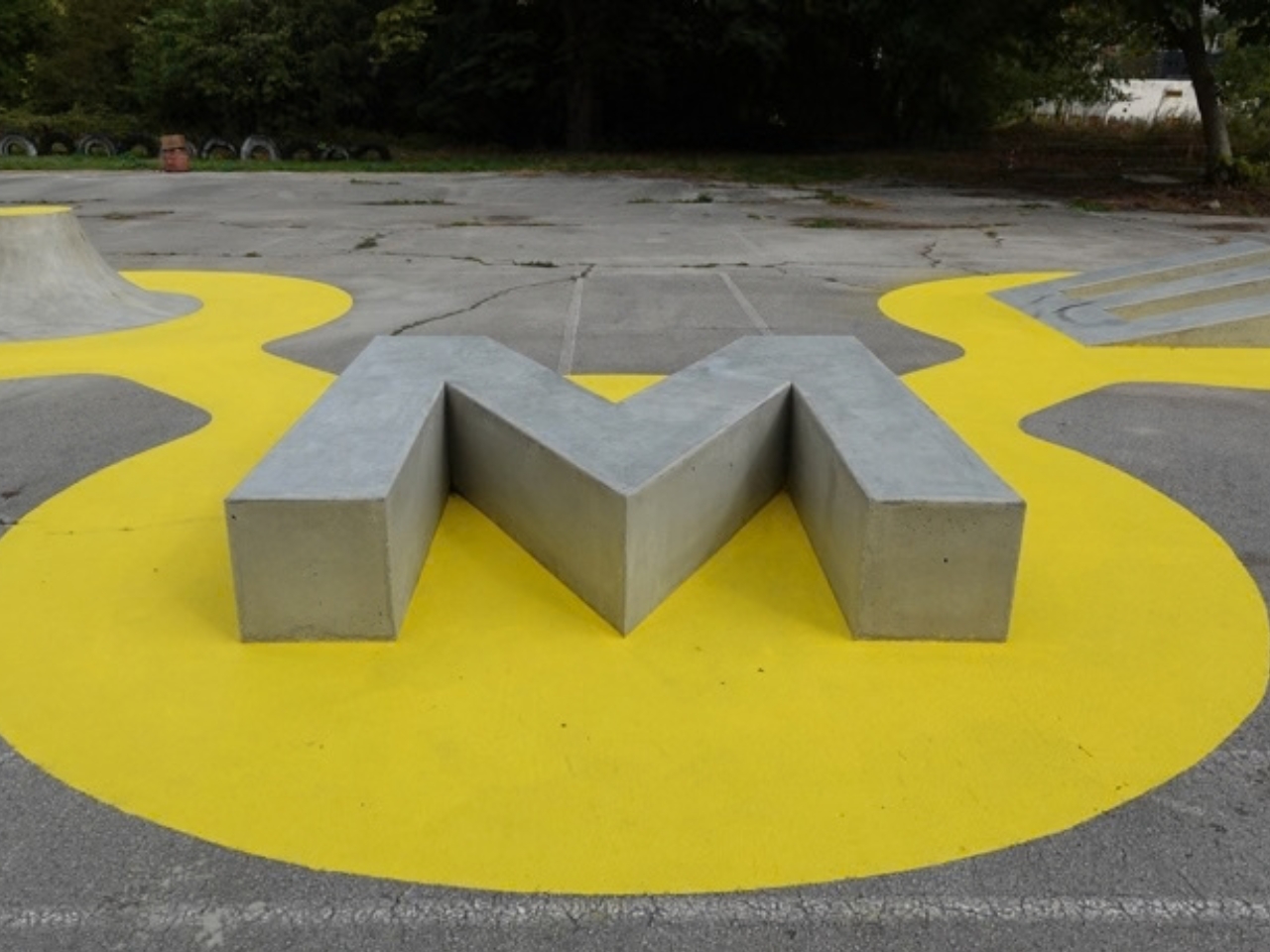
The letters are not identical obstacles dressed up as typography. The X forms a double quarter pipe. The P wraps a rail around a concrete island. The O becomes a volcano, while the M works as a bench for sliding and grinding. The E is a small triple jumping platform. Seen together, they read as a name; encountered individually, they offer a series of different movements.
I like how directly the idea comes across. You don’t need to skate to understand why the curved X might be fun, or why someone would want to test a line across the M. At the same time, a skater sees more than an oversized signature. They can read the shapes for what they might allow a board to do. Skateable gives both audiences a reason to pay attention without asking either to pretend they came for the same thing.
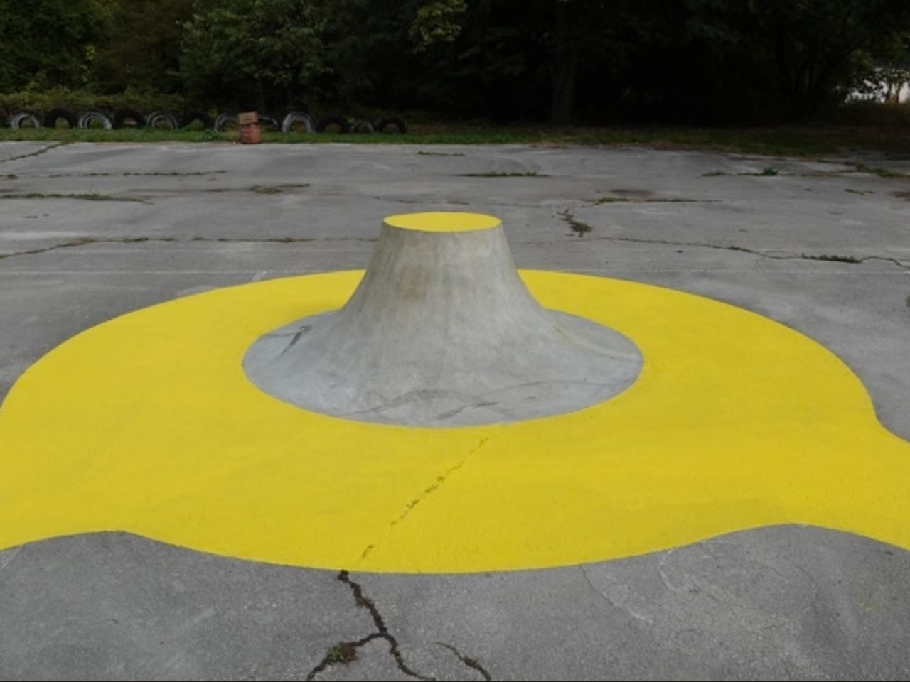
There is a real risk in turning an artist’s name into a large public object. It could easily feel like branding at everybody else’s expense. Here, the name earns its footprint by being useful. That does not make the work less personal to XPOME. If anything, it makes the signature more interesting. Rather than asking people to remember five letters, the artist lets them develop their own memories around the shapes those letters create.
The project also makes me think about how often design is judged from a single photograph. Skateable certainly has a strong image: chunky letterforms arranged in front of an older building. But a photo can only show the starting point. The work changes when someone rolls toward it, chooses a route, misses, tries again, or sits on the edge to watch a friend. Its appeal depends on what happens after the first glance.
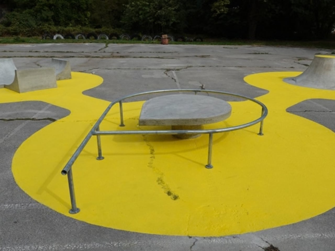
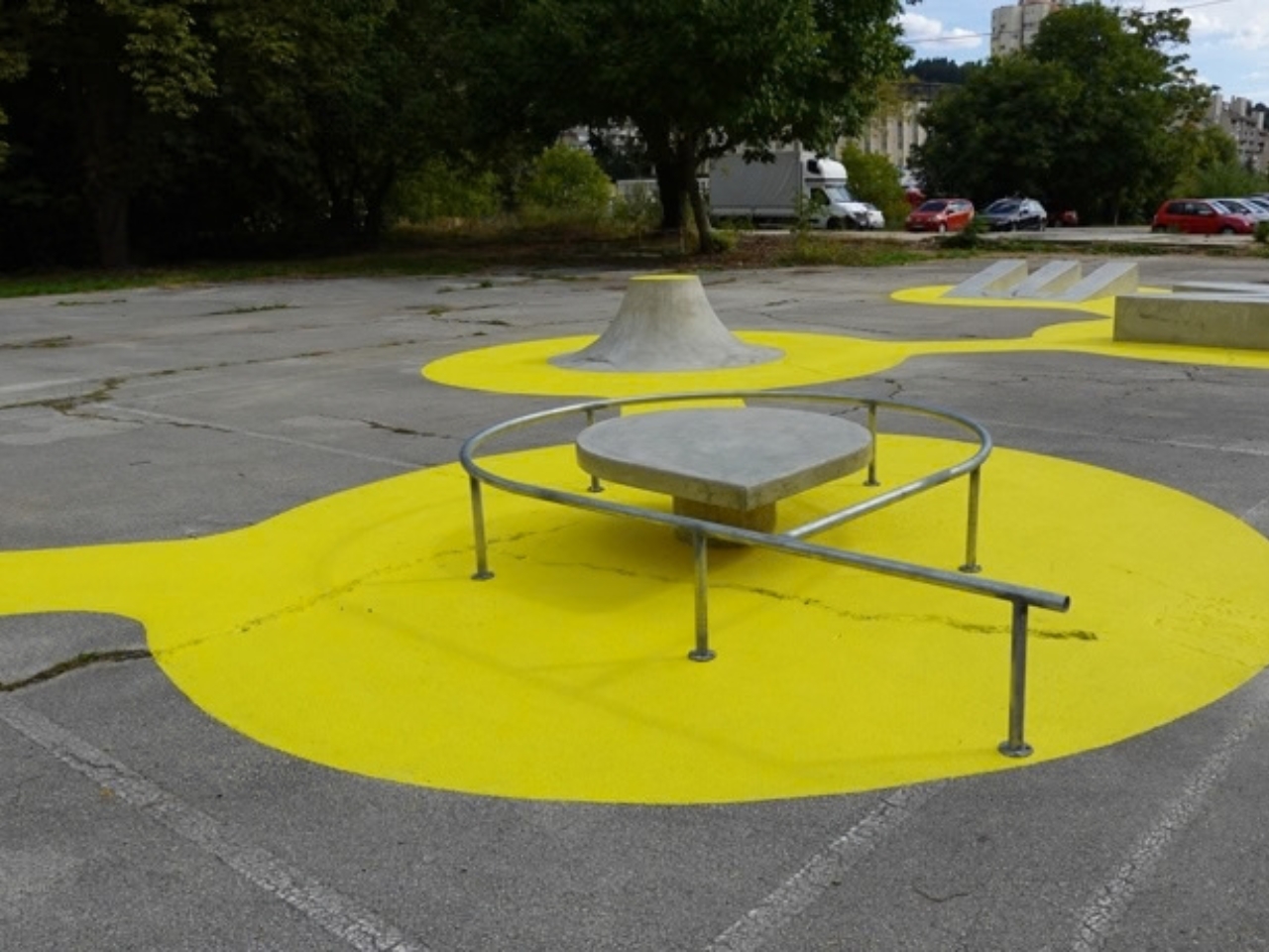
That is part of why the exhibition setting matters. A show about skateboarding’s history could leave visitors looking backward, even when the stories it tells are still relevant to people who skate today. Putting a skateable structure outside creates a connection between the exhibition and an activity happening in the present. You can learn about a culture indoors, then step out and see someone participate in it. That contrast gives the work more energy than an object made only to illustrate a theme.
Skateable is a mini skatepark, not a replacement for the space and range of a full-sized one. Its scale is part of its appeal, though. Each letter gives someone a specific feature to consider, while the complete arrangement leaves room to imagine different approaches. Even people who never pick up a board can understand the design as an invitation to linger. Watching can be a way into a place, too.
I’d like to see more public art judged by that kind of invitation. Not every sculpture needs to be climbed, and not every plaza needs a ramp. But Skateable shows how much can happen when an artist considers what people might do with a work, rather than only what they might think of it. Five letters are enough to make a name recognizable. Giving those letters a life beyond the signature is the better trick.