Purple is moving beyond its traditional associations with luxury, spirituality, and fantasy to become a distinctive language in contemporary product design. Once considered difficult to balance with modern interiors, the color is appearing across furniture, electronics, kitchen appliances, lighting, accessories, and lifestyle products. Its renewed presence reflects a broader shift toward expressive objects that bring personality and emotion into everyday environments.
Designers are experimenting with everything from muted lavender and dusty violet to saturated plum and electric purple, using the spectrum to create products that feel contemporary without becoming visually predictable. As product design becomes increasingly focused on emotional connection, purple offers an intriguing way to make familiar objects feel unexpected.
1. Purple Brings Personality to Everyday Objects
Everyday products have traditionally relied on neutral colors such as black, white, gray, beige, and metallic finishes. Purple introduces a different visual character without necessarily changing the underlying function of an object. A purple speaker, chair, lamp, kettle, or household accessory can immediately become more noticeable while retaining a familiar form. Designers can also use different shades to control the mood of a product.
Pale lavender can create a softer, quieter appearance, while deep violet can make an object feel more dramatic. This flexibility allows purple to function as both an accent and a defining characteristic, helping ordinary products develop a stronger visual identity in increasingly crowded markets.
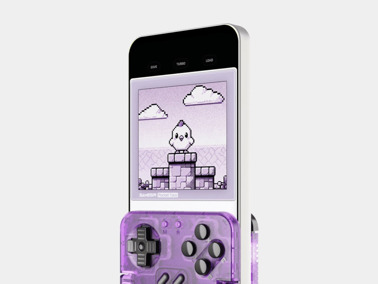
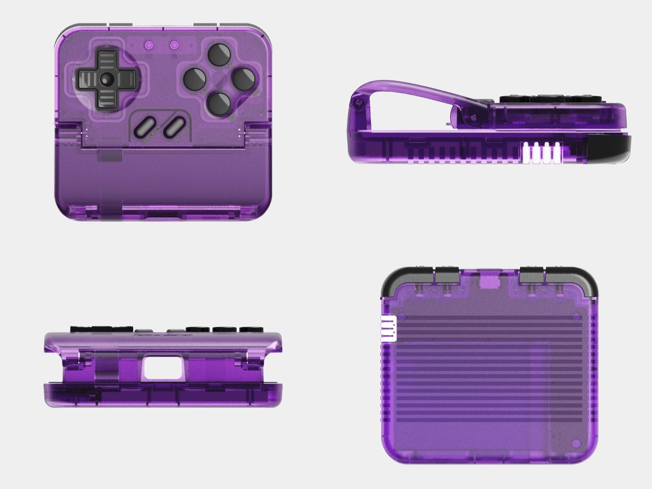
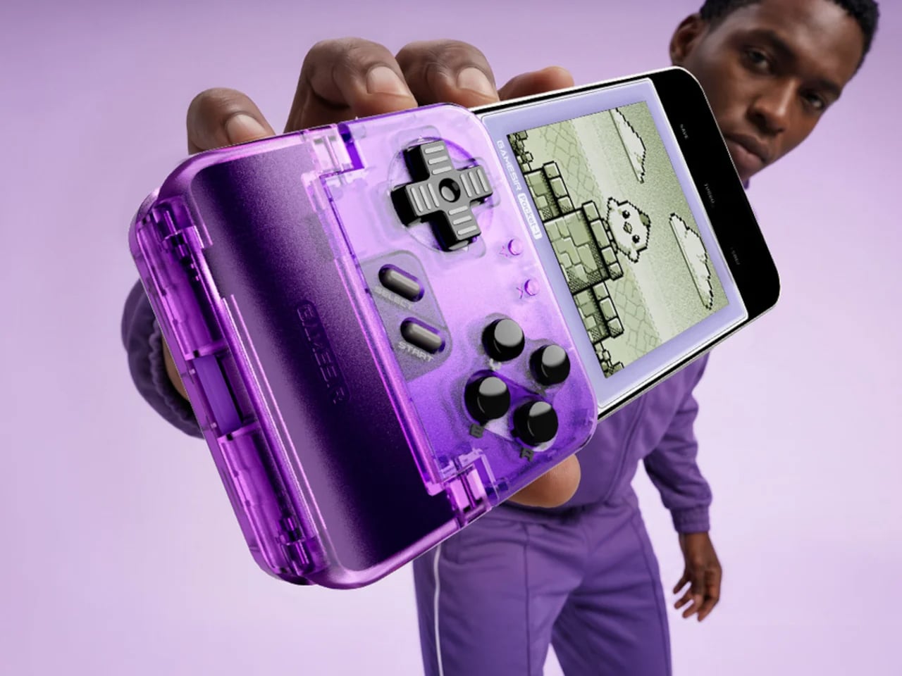
The GameSir Pocket Taco takes a distinctly retro approach to mobile gaming, but its new Voltage Purple finish gives the compact controller a decidedly contemporary personality. Designed to clamp vertically around a smartphone, the accessory recalls the silhouette of classic handheld consoles while providing physical ABXY buttons, a D-pad, triggers, and bumpers. Unlike the original retro gray version, the translucent purple treatment makes the controller feel more expressive and visually playful. The saturated finish highlights the compact construction and turns what could have been an understated gaming accessory into a statement piece.
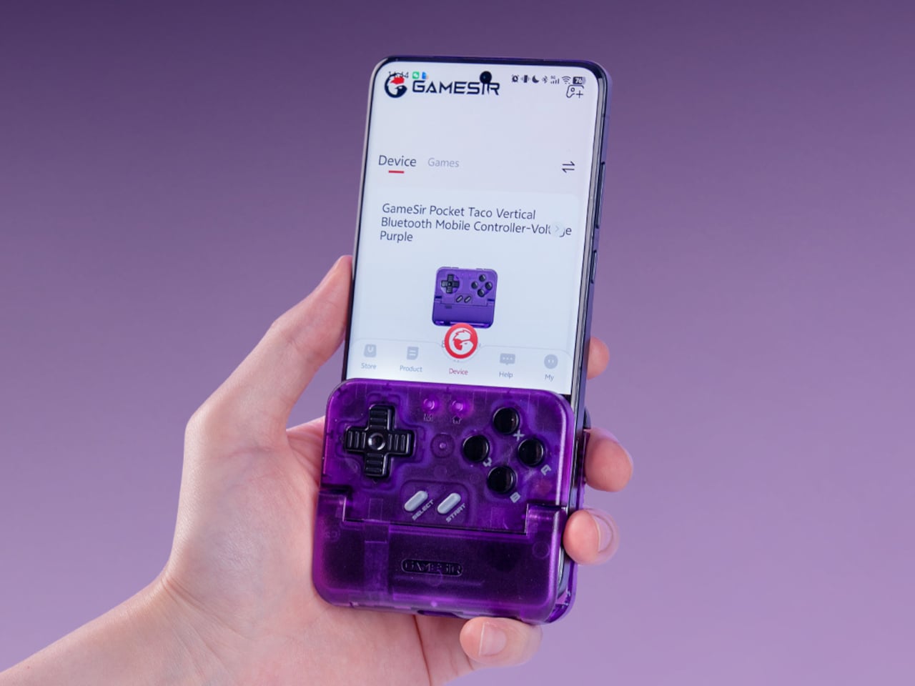
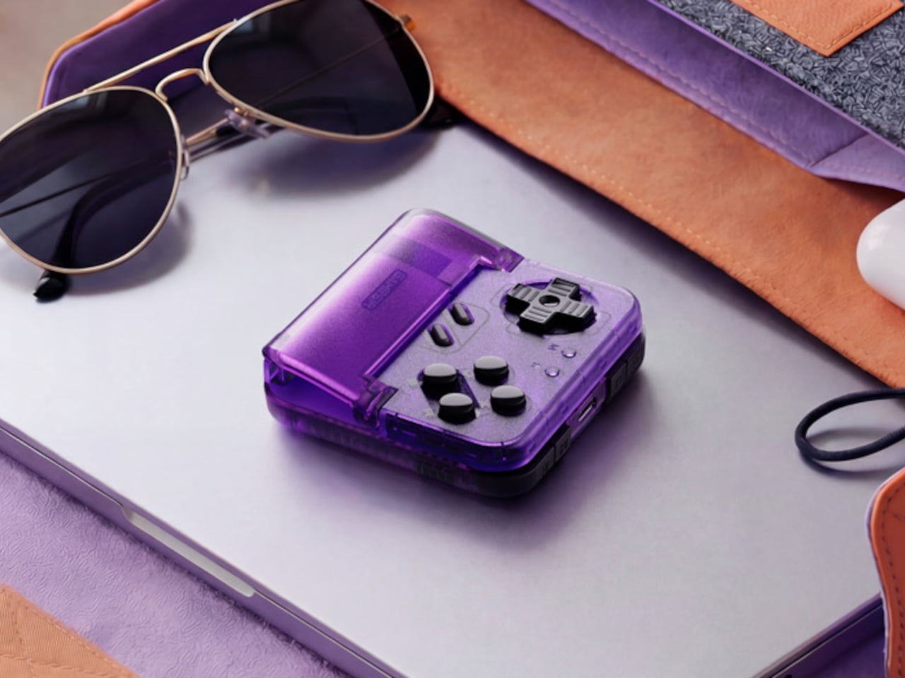
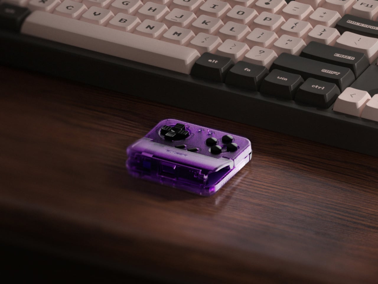
The Voltage Purple edition retains the same hardware as the original, including customizable controls, a 600 mAh battery, charging access, and compatibility with the GameSir app. More than a functional upgrade, the purple finish reflects a growing appetite for colorful, personality-driven technology and shows how bold color can give everyday electronics a stronger identity.
2. Technology Is Moving Beyond Black and Silver
Consumer electronics have long been dominated by restrained palettes intended to communicate precision and sophistication. Purple is challenging that convention by introducing more expressive color into products that were once almost exclusively black, silver, or white. Smartphones, headphones, gaming accessories, speakers, and personal devices can use violet tones to create a more distinctive presence.
The shift also reflects changing expectations around technology. As digital products become part of personal identity and home interiors, consumers are increasingly encountering devices as lifestyle objects rather than purely functional tools. Purple gives designers another way to soften technological forms or make them feel more individual and visually engaging.
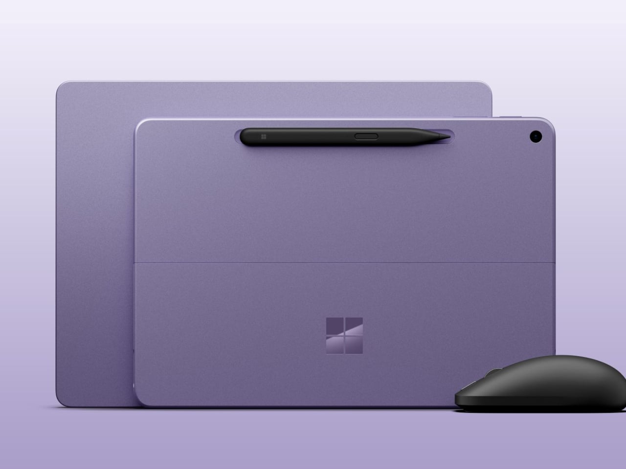
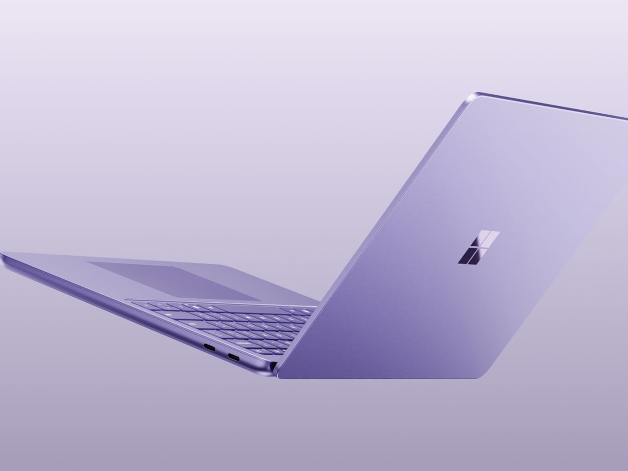
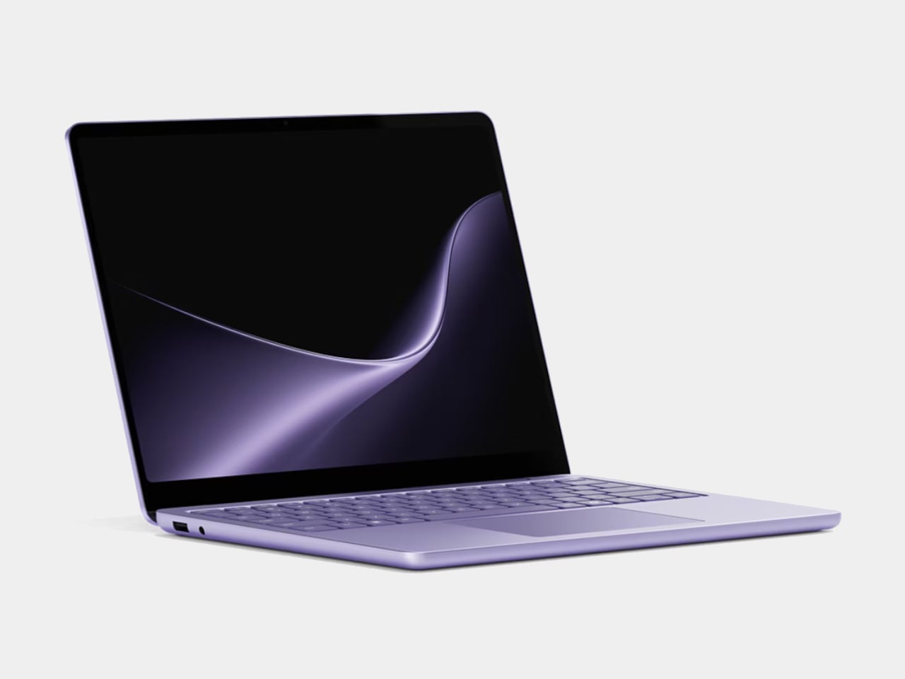
Microsoft’s Surface Pro 12-inch gives purple a more permanent place in laptop design with its Violet finish, bringing a softer and more expressive character to an otherwise minimalist device. Instead of treating purple as a short-lived special edition, Microsoft has carried the color into a second generation alongside familiar Black and Platinum options. The decision gives the slim, lightweight computer a more personal visual identity, challenging the usual dominance of silver, gray, and black in portable technology. Its violet tone also works naturally with the clean geometry of the Surface Pro, adding color without overwhelming the restrained form.
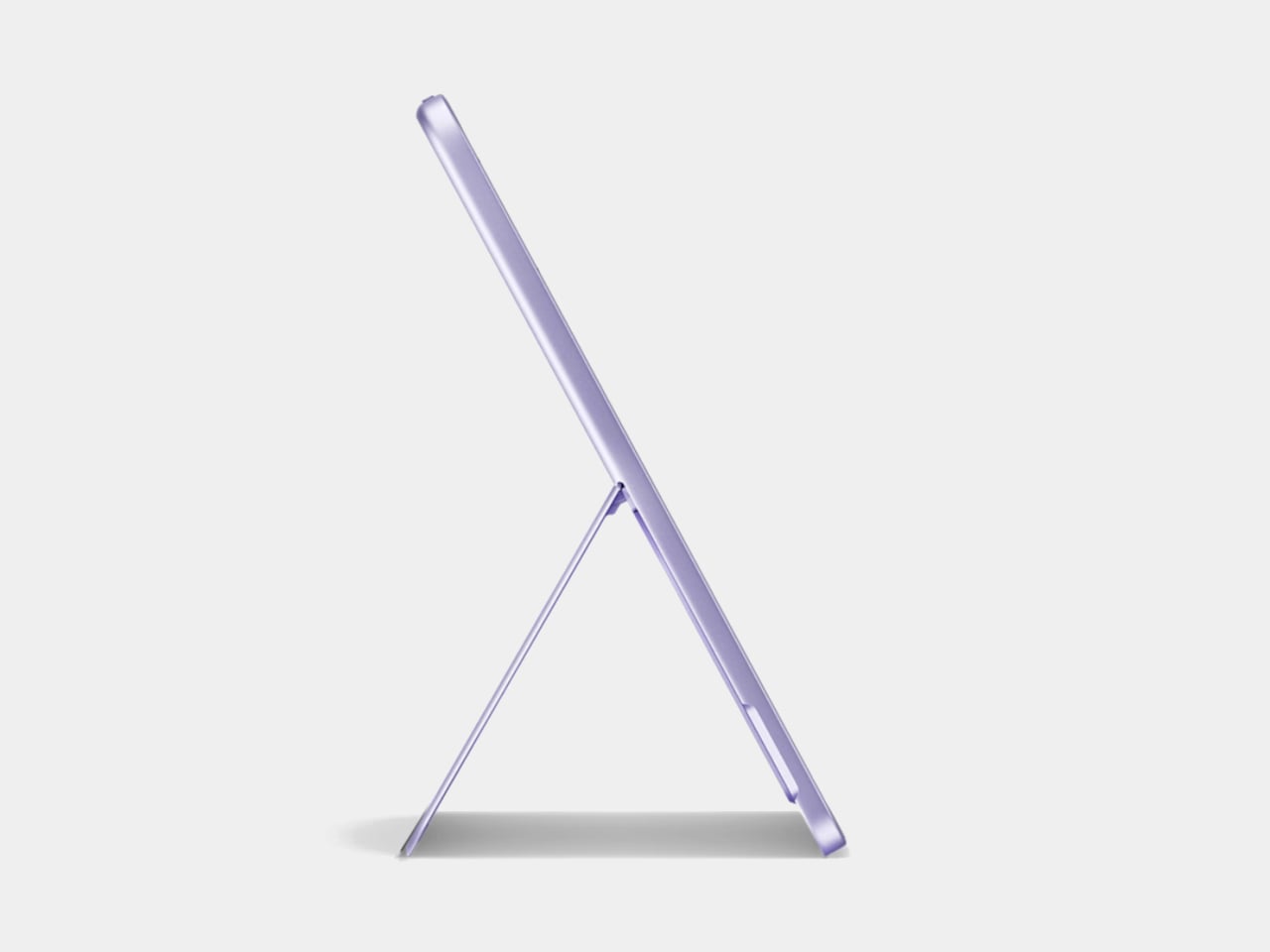
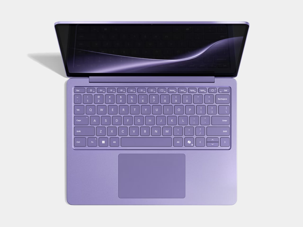
The approach reflects a broader shift toward technology that feels more connected to personal style and interior spaces. Purple can introduce warmth, individuality, and a subtle sense of playfulness to a device that typically occupies desks, coffee tables, and workspaces. The Surface Pro’s hardware remains focused on portability and performance, but the Violet finish changes how the product is perceived within its surroundings.
3. Soft Purple Creates a New Kind of Minimalism
Purple does not always have to be bold. Muted lavender, lilac, mauve, and dusty violet can work within minimalist interiors while introducing subtle color. These softer shades can complement natural wood, brushed metal, stone, glass, and neutral textiles without overwhelming their surroundings. This makes them particularly useful for products intended to occupy domestic spaces. Instead of disappearing into a neutral palette, a softly colored object can provide a controlled visual interruption.
The approach represents a broader movement away from minimalism defined exclusively by monochrome surfaces. Designers are increasingly exploring restrained color as another tool for creating calm, considered, and visually balanced environments.
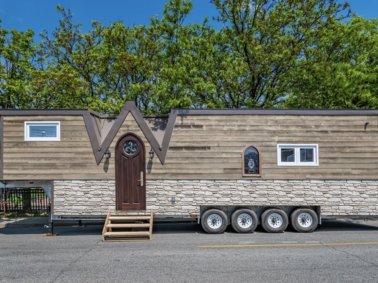
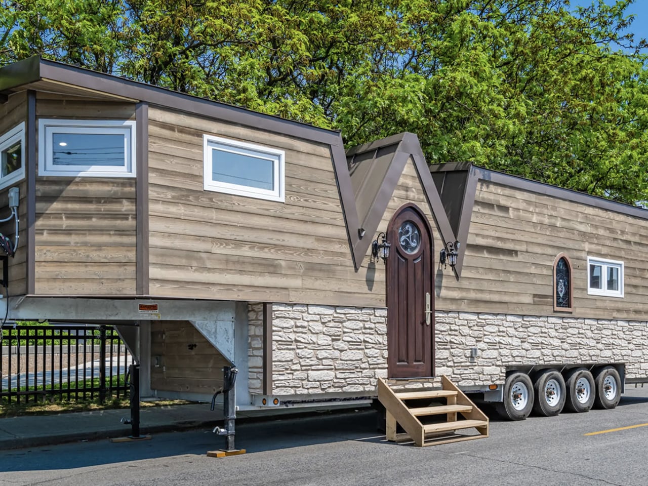
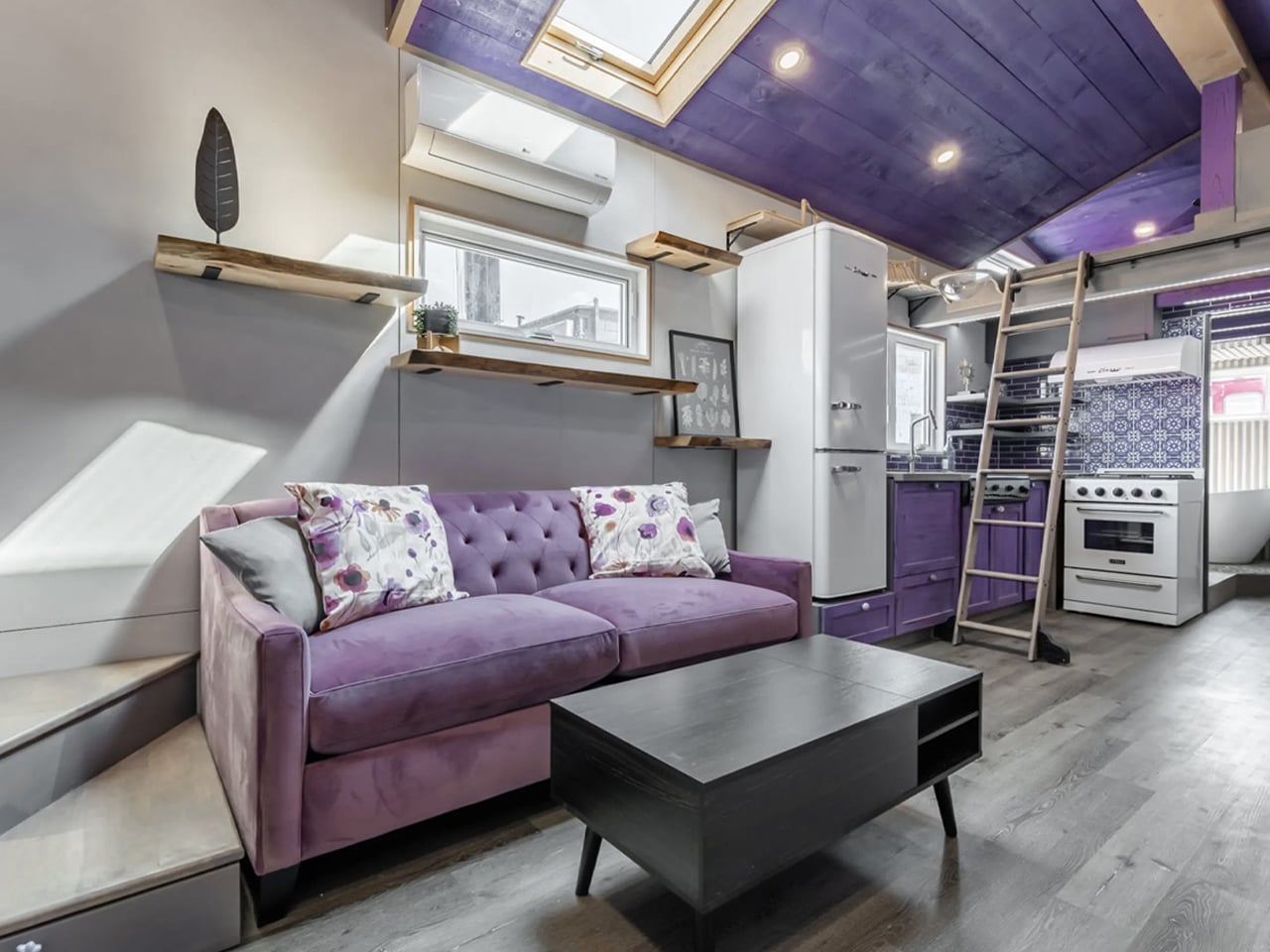
The Purple Heart Manor takes the tiny-home concept in a more expansive direction, using purple as one of its strongest design signatures. Designed by Canada’s Acorn Tiny Homes, the 43-foot towable dwelling combines medieval-inspired details with the owner’s love of the color. Its exterior pairs faux stone and wood siding with a distinctive roofline, while purple accents continue throughout the interior. A custom purple sofa bed gives the living room a strong visual anchor, complemented by floor-to-ceiling bookshelves, a movable library ladder, and personalized spaces for gaming, dining, and creative activities. Even the cat-friendly features, including a rope bridge and dedicated “catio,” contribute to the home’s highly customized character.
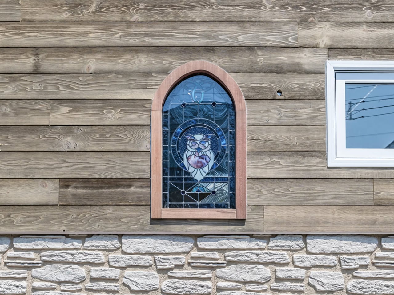
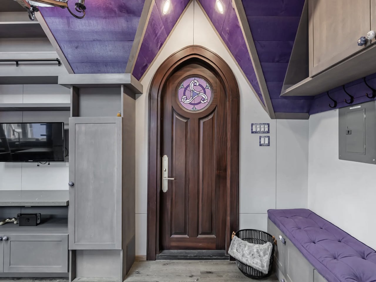
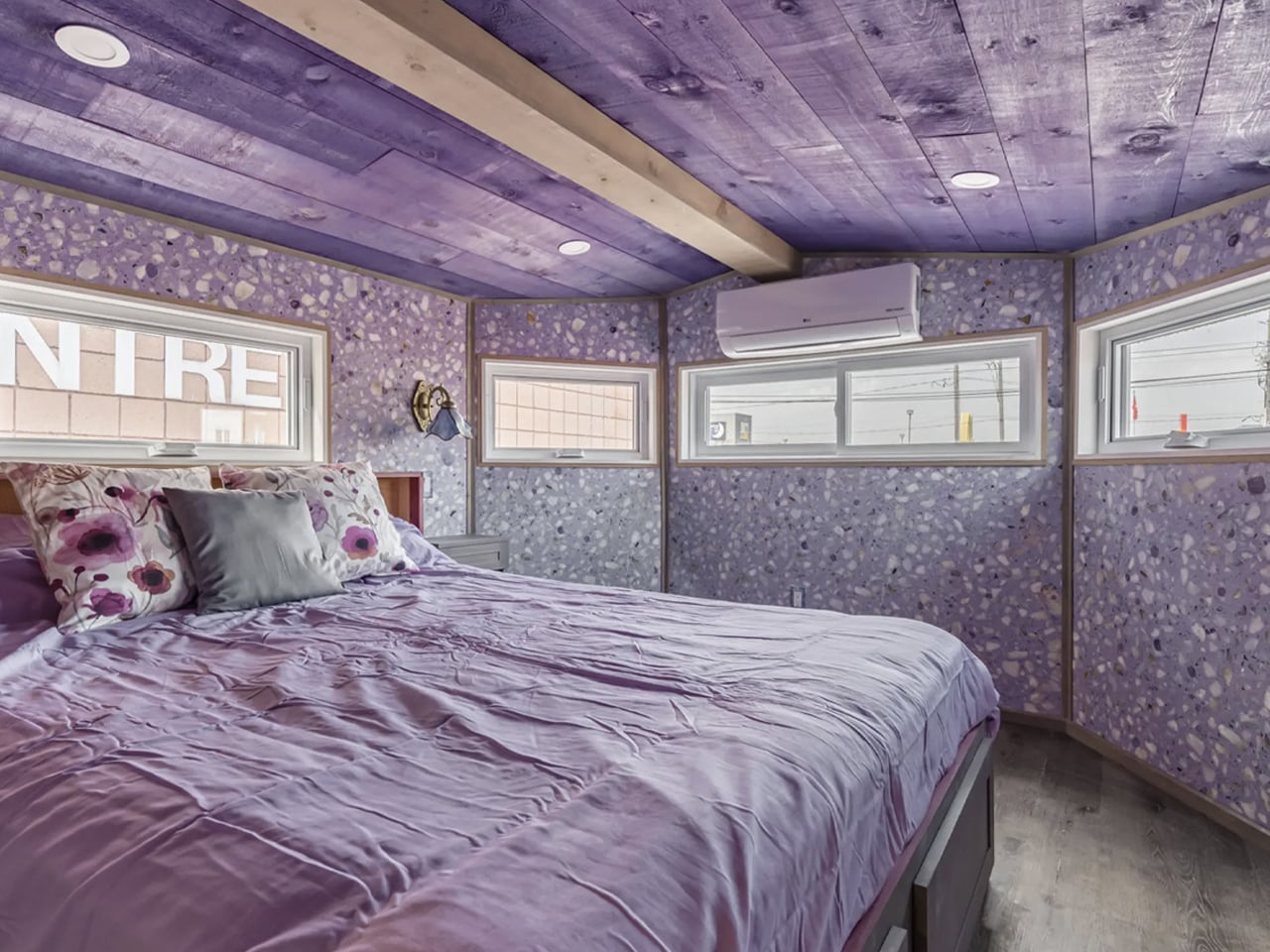
Inside, the purple theme works alongside medieval-inspired wallpaper, stained-glass details, rich wood finishes, and carefully tailored furnishings. The spacious kitchen, bathroom, master bedroom, and secondary loft make the dwelling feel closer to a compact apartment than a conventional tiny house.
4. Bold Violet Makes Products More Memorable
At the opposite end of the spectrum, highly saturated purple can give products an unmistakable identity. Strong violet finishes can attract attention in retail environments, digital campaigns, and social media imagery, where products often compete for a moment of recognition. This makes the color particularly useful for brands seeking a memorable visual signature.
Purple can also communicate a sense of experimentation because it remains less predictable than conventional product colors. When paired with unusual forms, translucent materials, glossy surfaces, or metallic details, it can amplify the perception of novelty. Used carefully, bold purple becomes more than decoration; it becomes part of the product’s communication strategy.
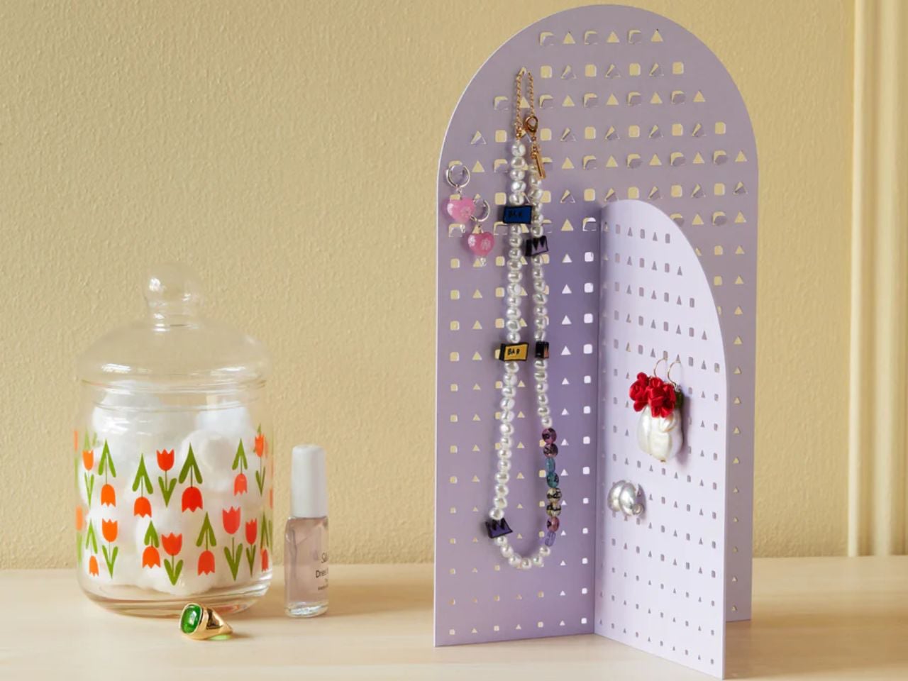
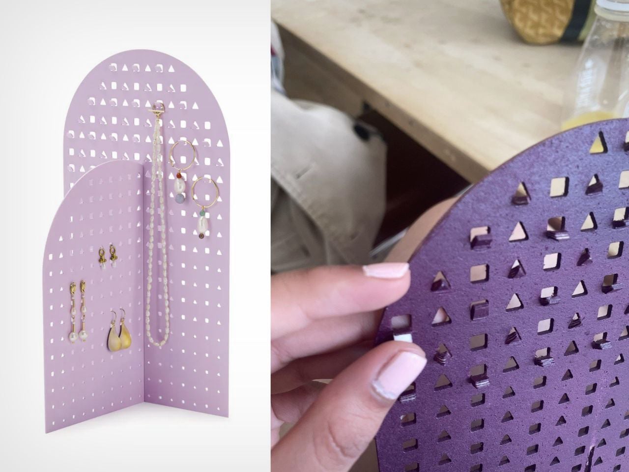
The Modern Geometry Jewelry Stand turns jewelry storage into a sculptural display, with color playing an important role in softening its architectural form. Designed by Nihaarika Arora for the MoMA Design Store, the stand uses two powder-coated iron panels that interlock without fasteners. Its cool, playful color palette contrasts with the rigid geometry of the metal, giving the structure a lighter and more approachable character.
Instead of functioning as a purely utilitarian organizer, the stand becomes part of the room’s visual composition, allowing its color, perforated surfaces, and geometric silhouette to work together as a contemporary decorative object.
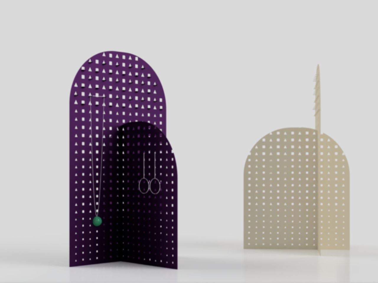
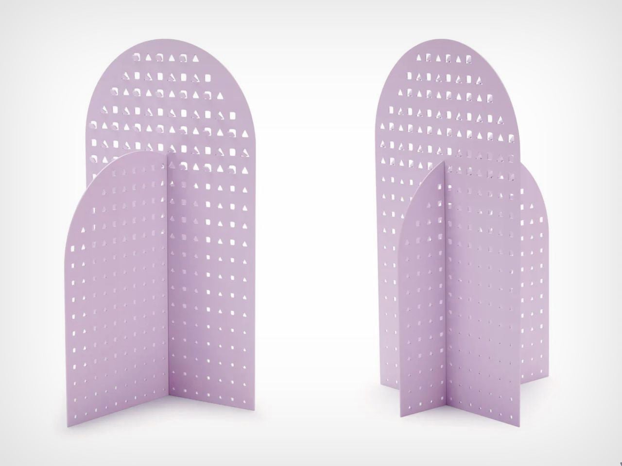
The perforated panels allow earrings to pass directly through the surface, while integrated hooks hold necklaces and bracelets in clean arrangements. As jewelry is added, the color becomes a backdrop that frames different metals, stones, and finishes, effectively turning personal collections into changing compositions. The restrained palette also allows the stand to integrate into different interiors without competing with the objects displayed on it.
5. Color Is Becoming Part of Product Experience
The growing presence of purple reflects a larger evolution in product design, where color is increasingly treated as an experiential element rather than a final surface treatment. Designers are considering how a product should feel before it is even touched, using color to establish mood, identity, and emotional associations.
Purple offers considerable range, moving between quiet sophistication and playful experimentation depending on its tone, material, and context. As consumers seek greater individuality from the objects around them, expressive color is becoming an increasingly important part of how products communicate.
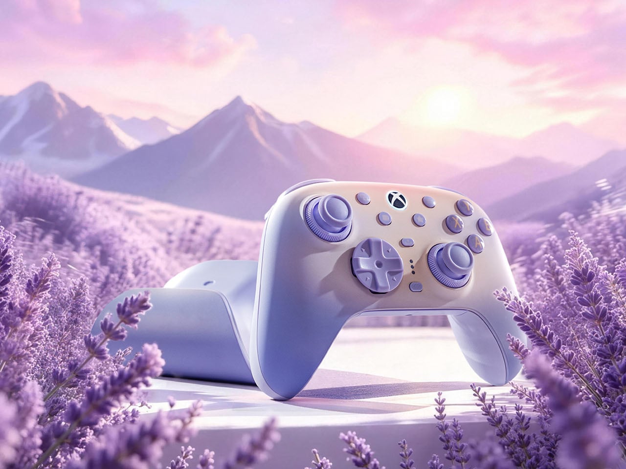
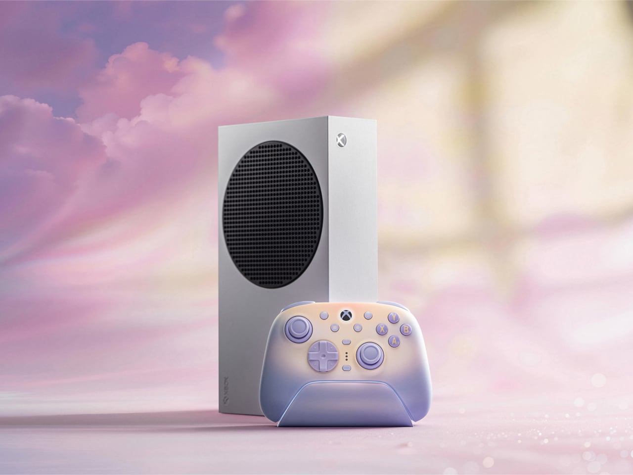
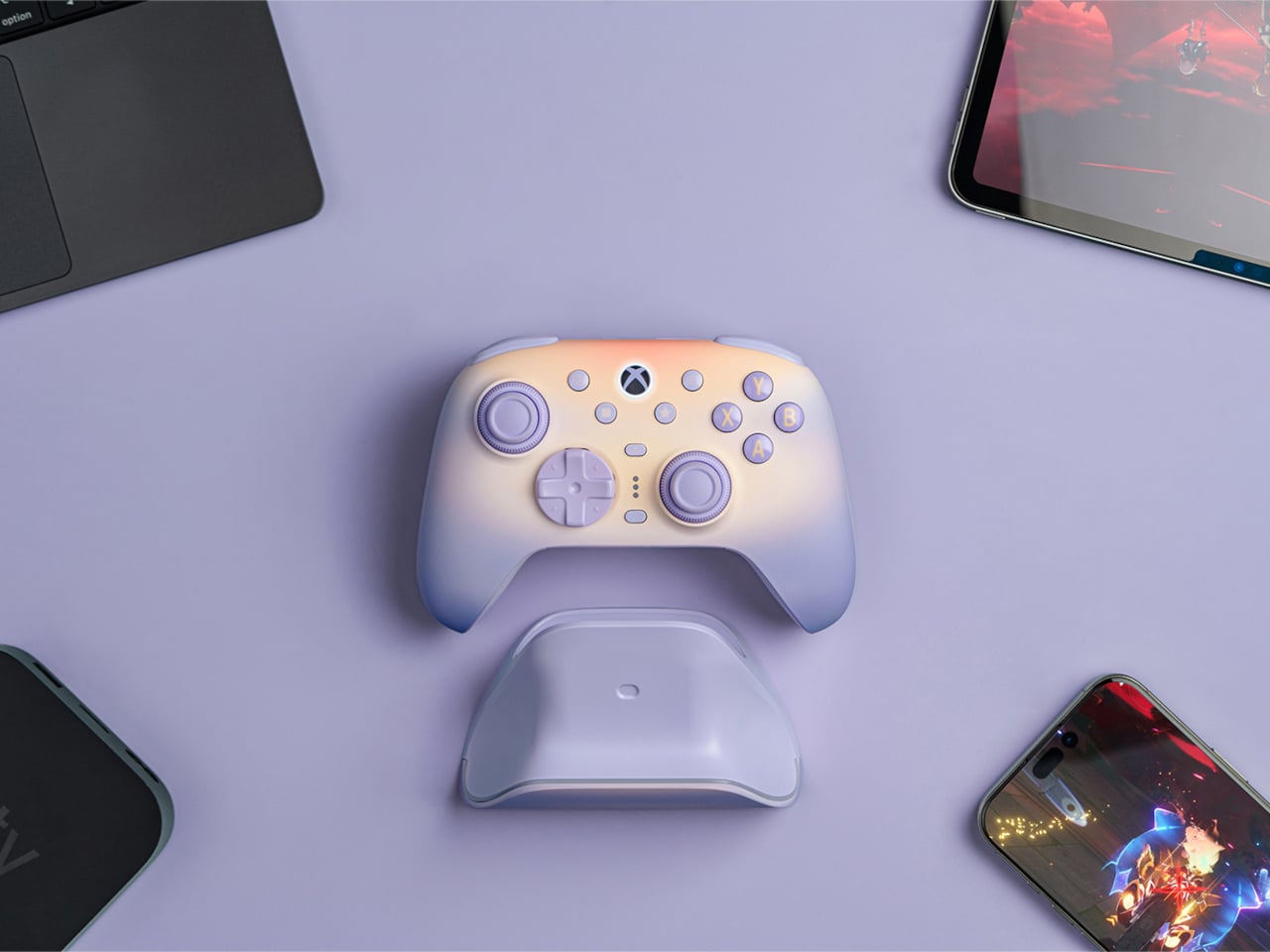
The 8BitDo Ultimate 3 in Lavender Dusk moves gaming hardware away from the predictable language of black plastic, sharp contrasts, and RGB-heavy styling. Its soft lavender finish introduces a gentler visual character, drawing from Rococo-inspired pastels. The color also has a subtle shift depending on the surrounding light, appearing cooler in daylight and warmer as evening approaches. This changing quality gives the controller a more atmospheric presence, allowing it to feel at home in everyday interiors rather than looking like equipment designed exclusively for a gaming setup.
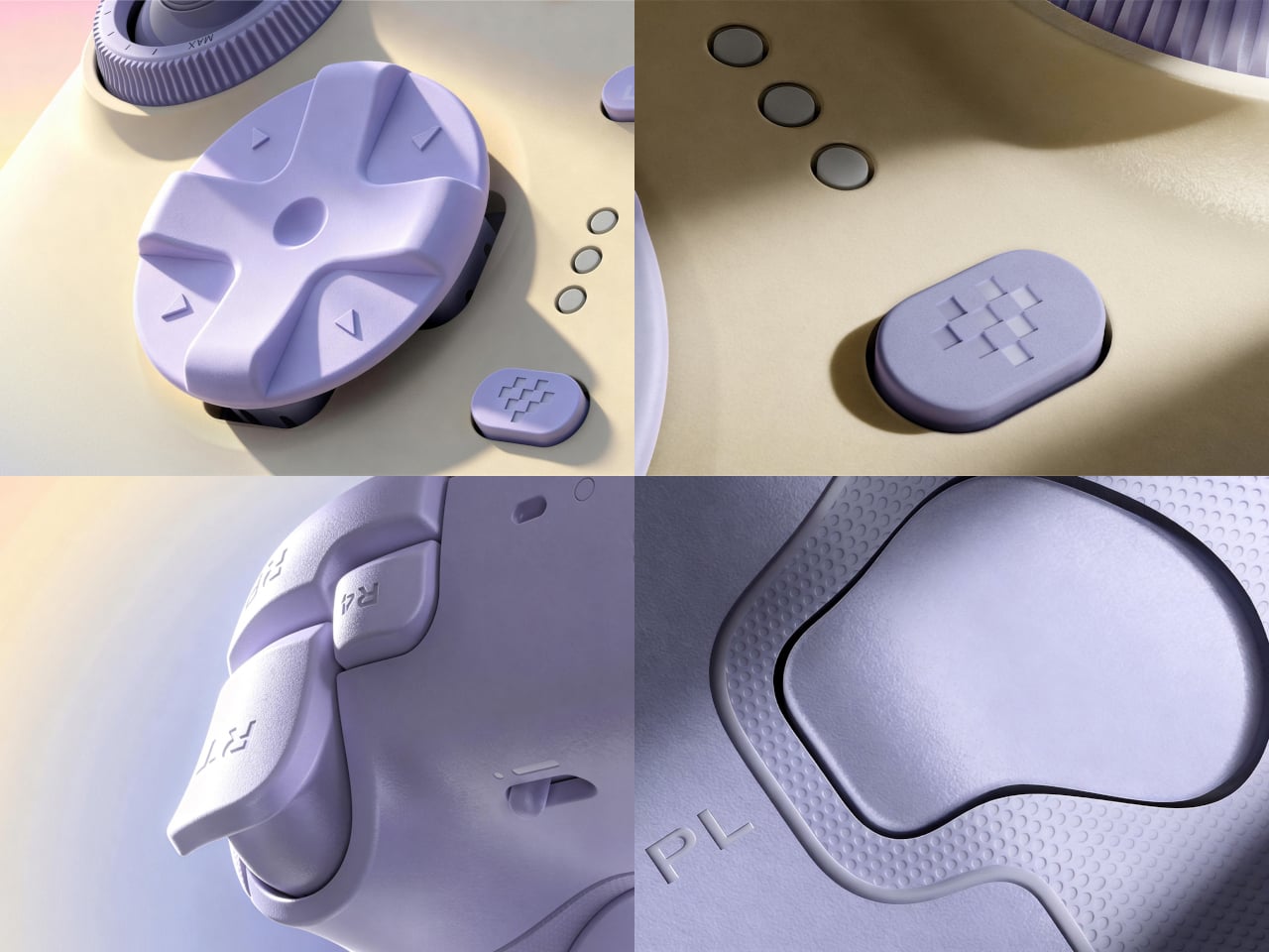
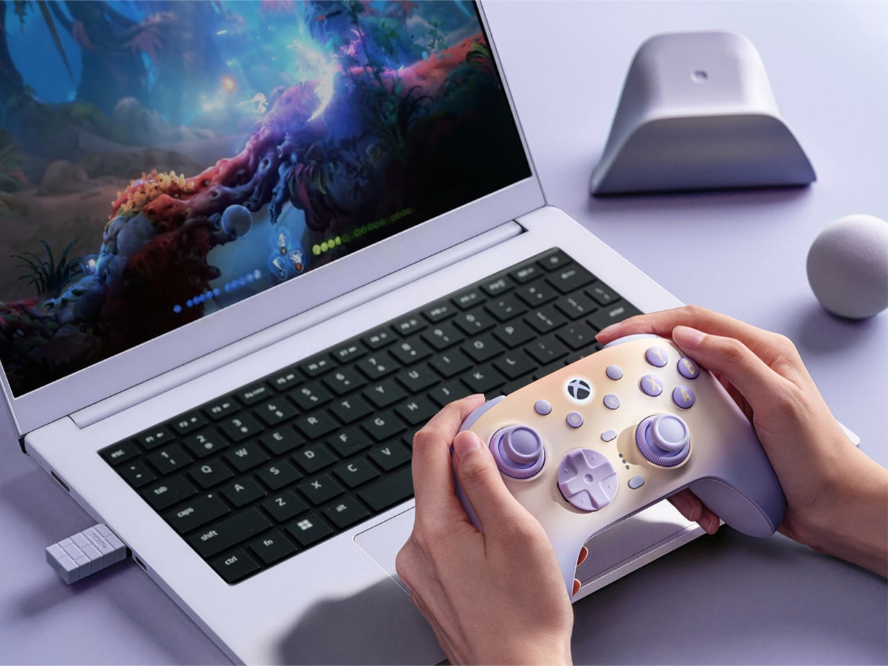
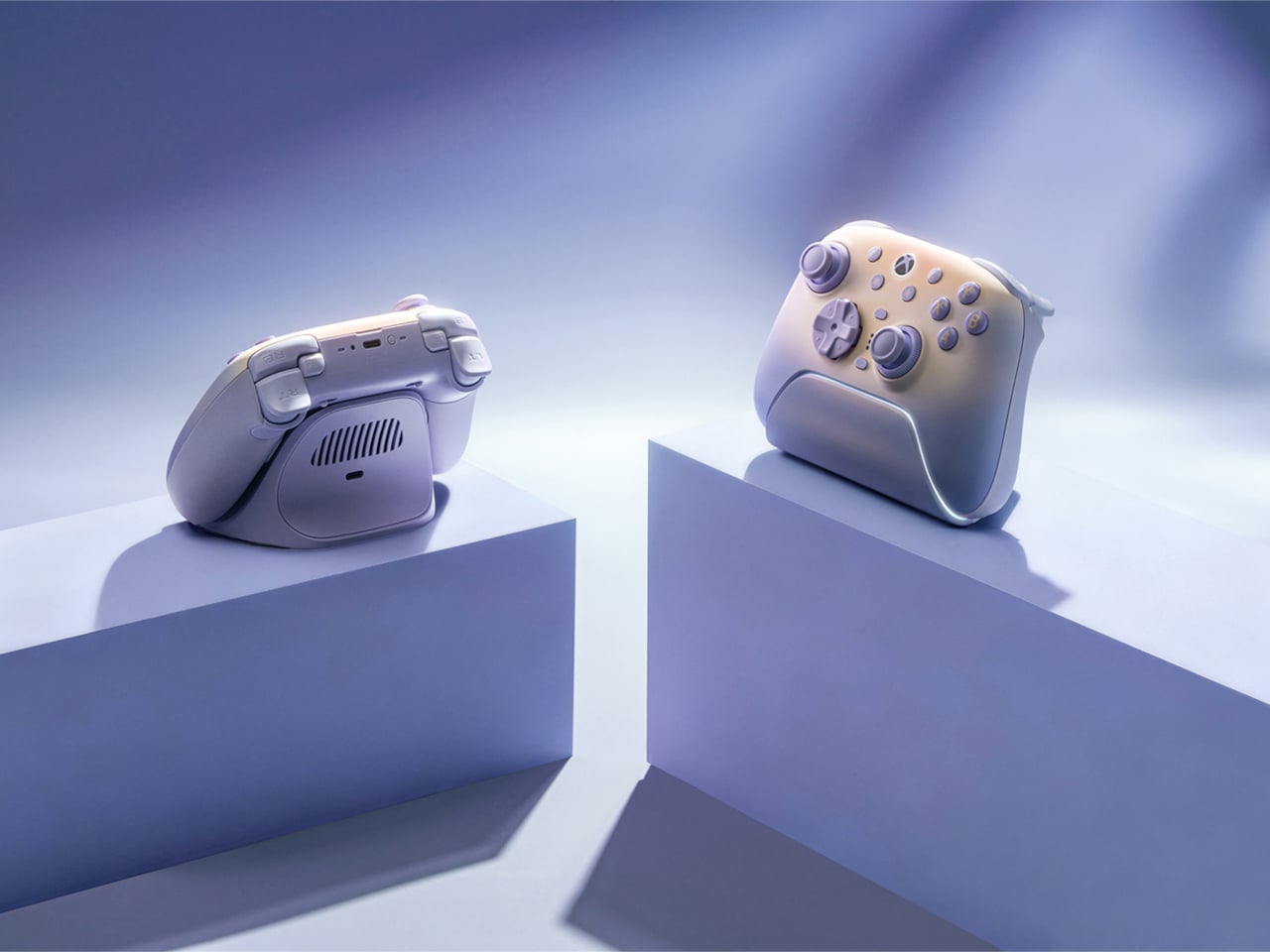
The lavender treatment is effective because it does not replace performance-oriented hardware with decoration. TMR joysticks, adjustable Force Ring resistance, Hall-effect triggers, remappable controls, and wireless connectivity remain central to the design. Instead, the color gives the technology a softer identity while preserving its serious functionality.
Purple’s resurgence in product design signals a move toward greater expression and emotional character. The color gives designers another tool to challenge predictable palettes, strengthen product identity, and make everyday objects feel more distinctive, contemporary, and personal.