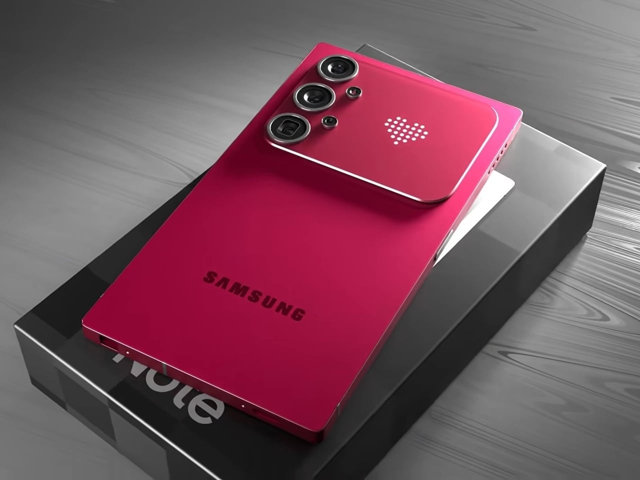
Samsung’s Ultra lineup has been on a gradual softening trajectory. The hard, squared-off corners that made early Galaxy S Ultra and Note phones feel deliberately architectural gave way to progressively rounder edges with each generation, culminating in the S26 Ultra’s fully rounded ergonomic corners. For users who preferred the original boxy confidence of those older devices, that direction has been a slow farewell to something they actually liked.
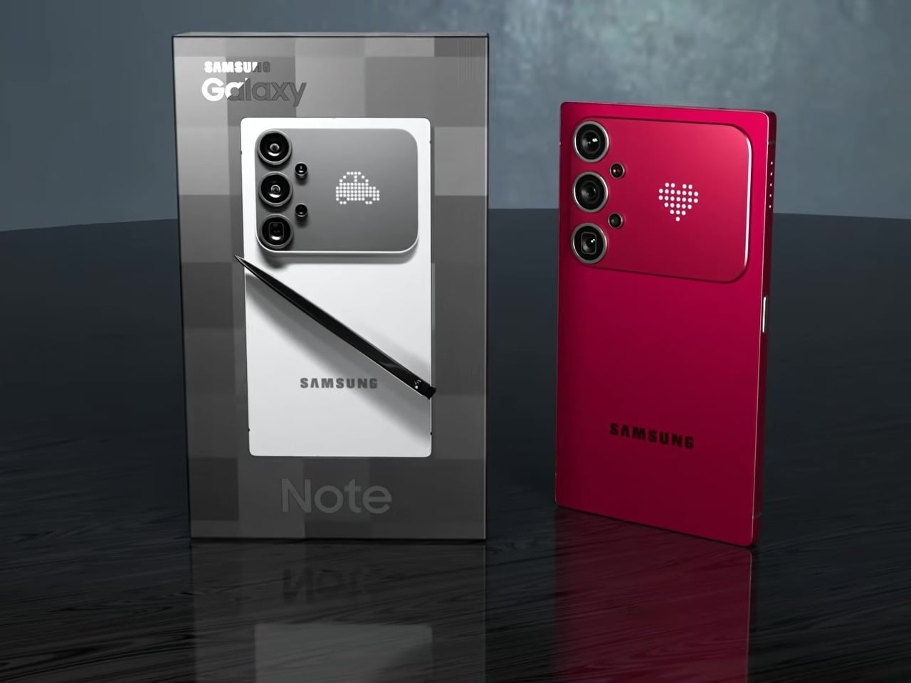
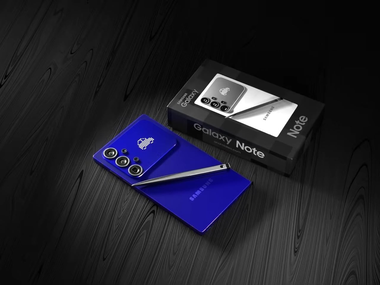
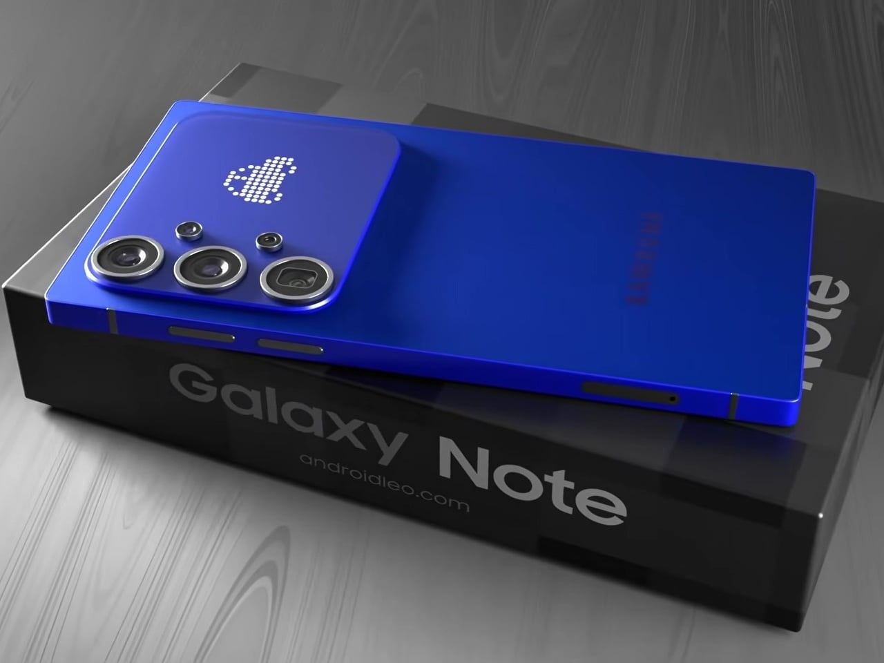
This concept for a Galaxy S27 Ultra reverses that. The sharp 90° corners are back, along with flat top and bottom edges that give the phone a distinctly geometric presence. The “Galaxy Note” name appears on the packaging, framing this as a full revival of Samsung’s discontinued productivity flagship identity rather than just another Ultra iteration. It’s a design argument about what the phone should have stayed.
Designer: AndroidLeo
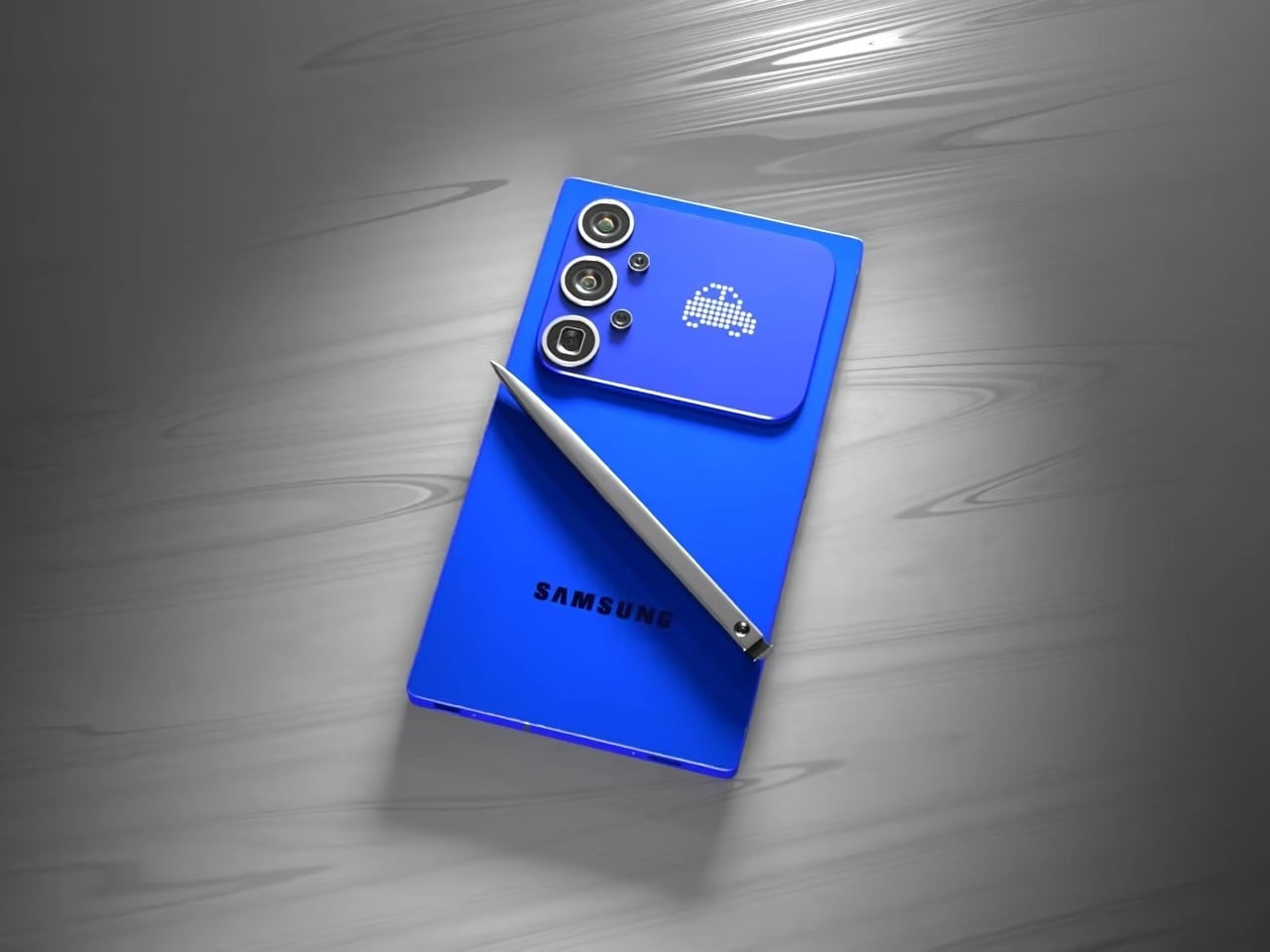
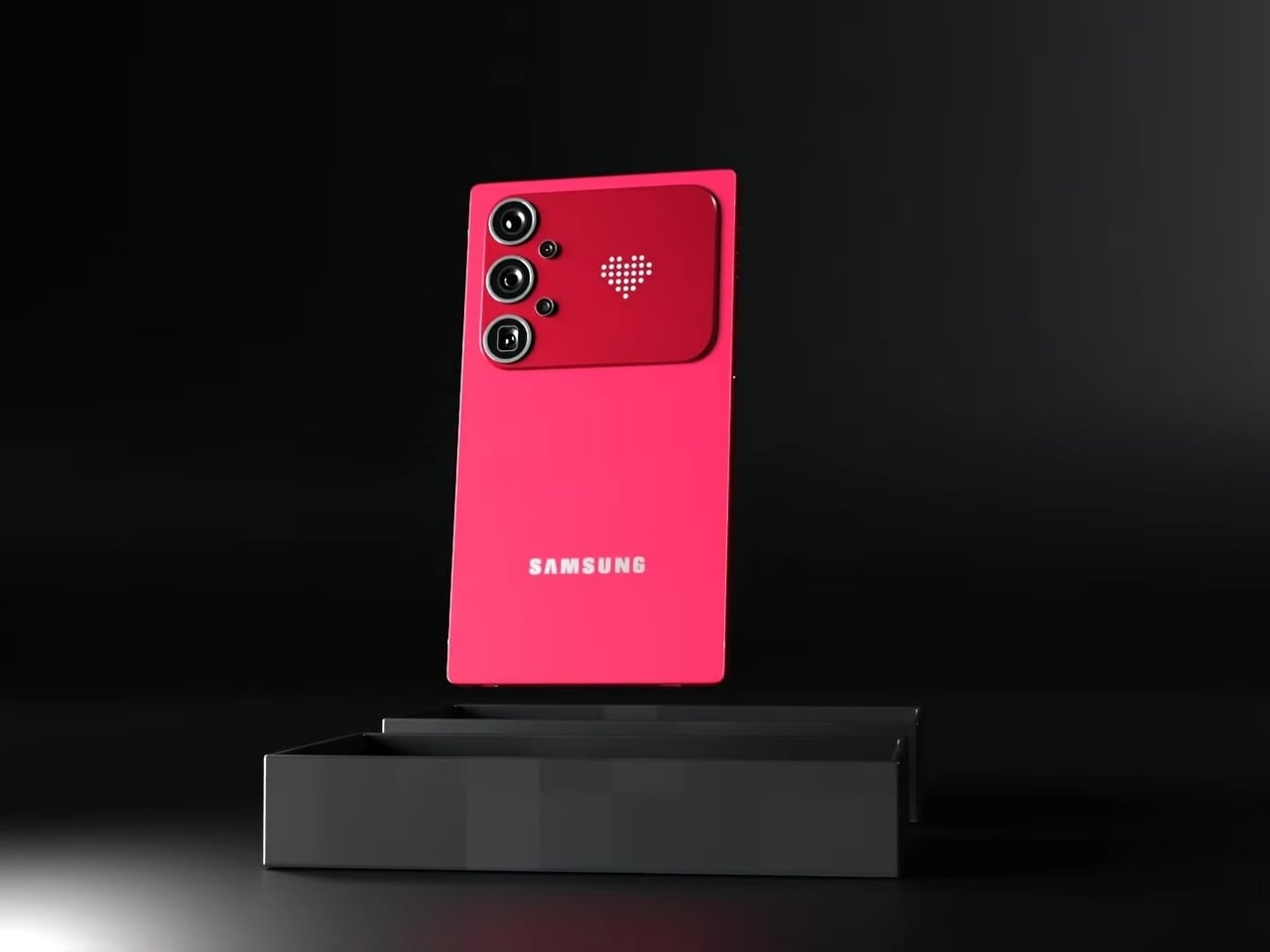
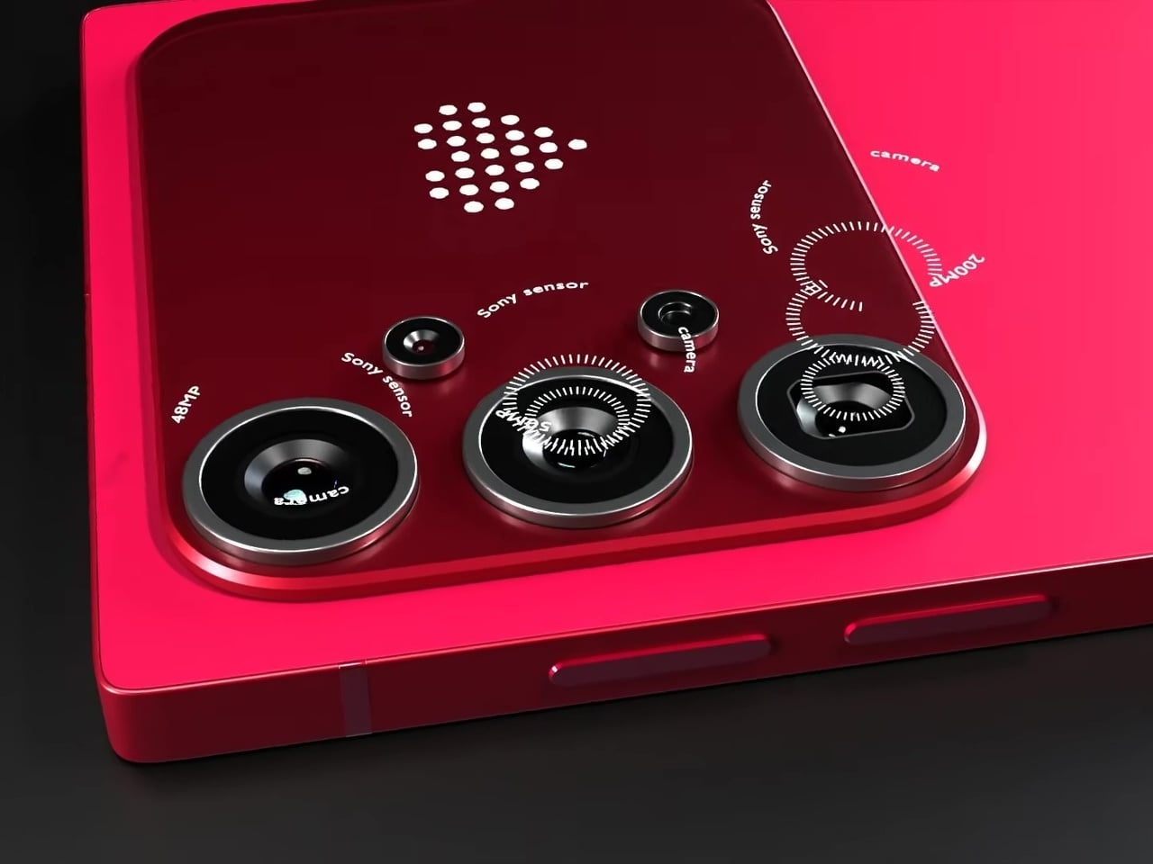
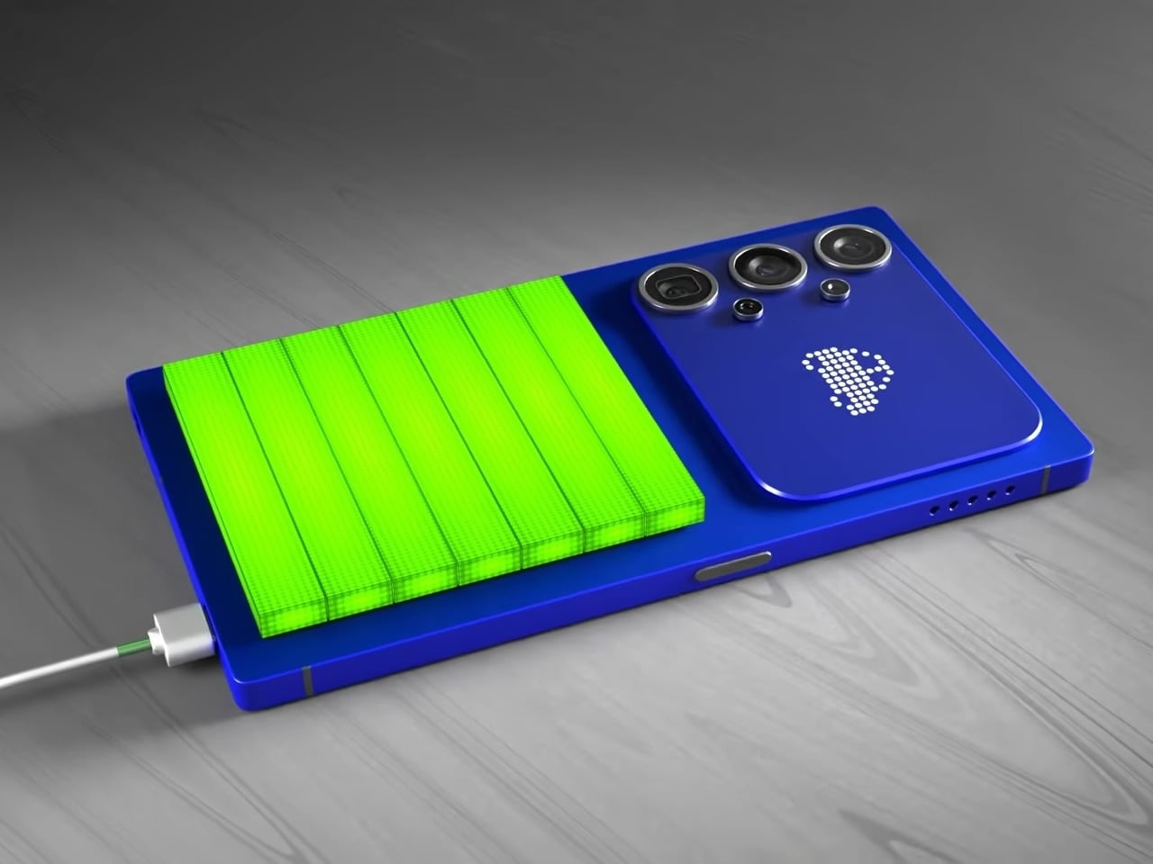
The most unexpected element on the back isn’t the camera. Nestled beside the vertical triple-lens array is a dot-matrix LED display that shows customizable pixel art animations, swapping between icons as conditions change. It’s the same logic that Nothing applied with its Glyph Matrix and that ASUS uses on ROG devices: the back of a phone has real estate that can do something, and simply leaving it matte glass feels increasingly like an opportunity missed.
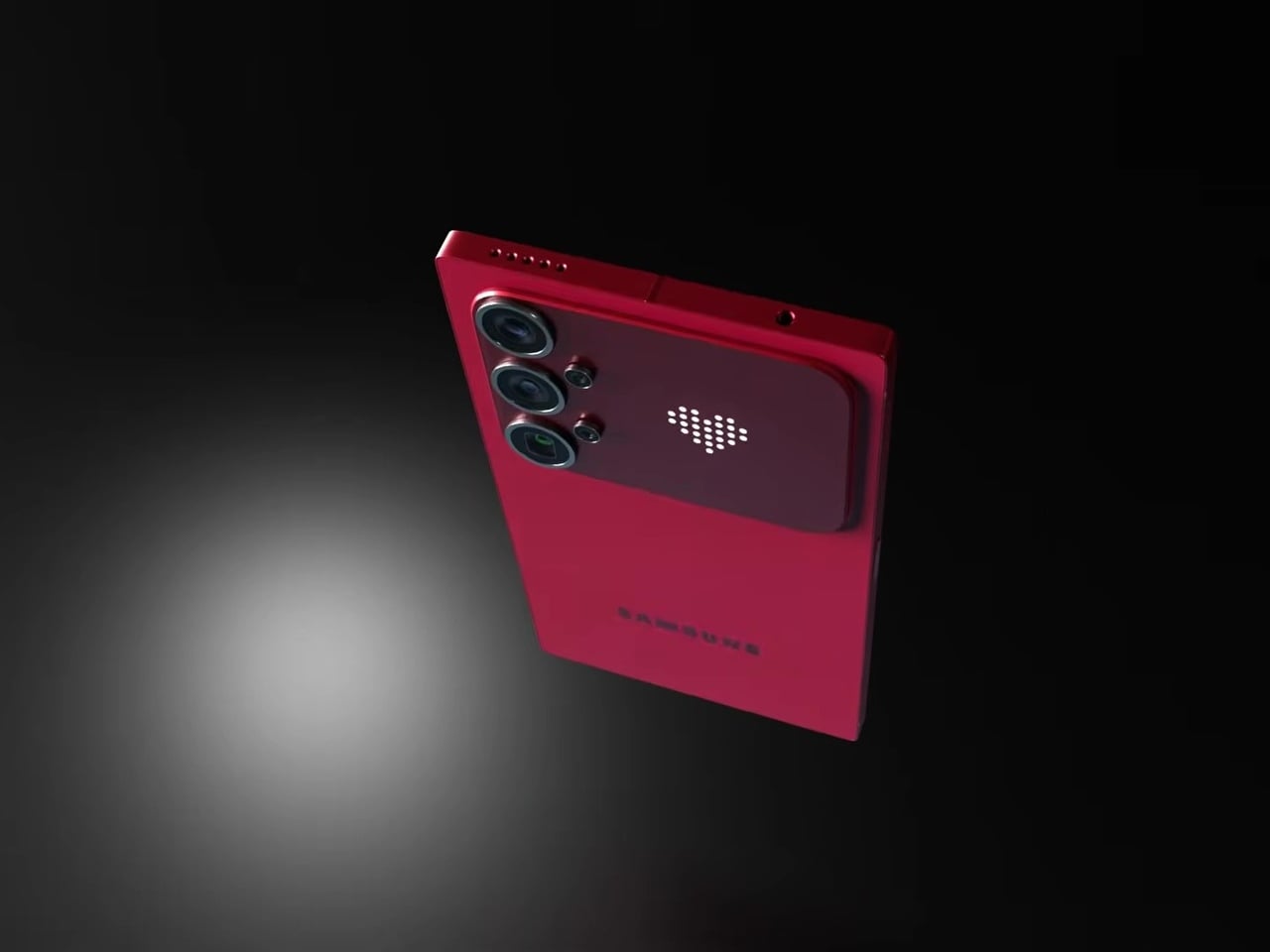
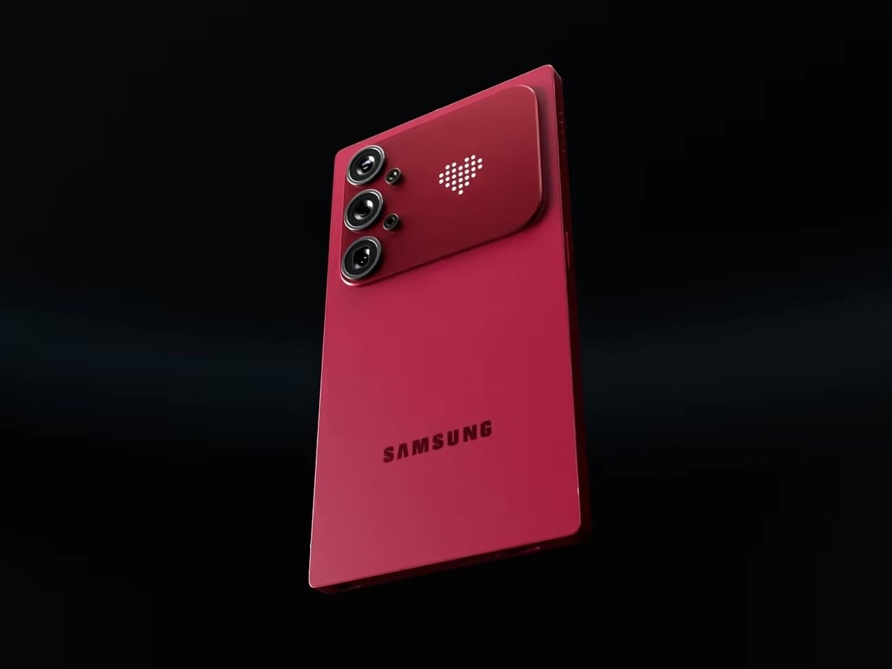
In practice, that small display becomes a second layer of expression without pulling attention away from the main screen. Notification icons, charge indicators, and personalizable graphics all live on a surface that’s visible when the phone rests face down or sits on a desk, the exact moment when the front display is least useful. The concept proposes this as an attention filter as much as a personalization feature.
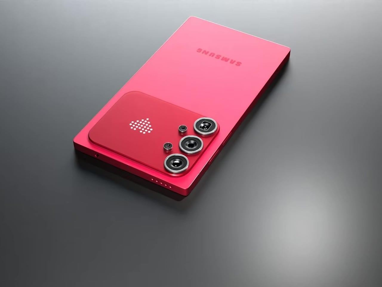
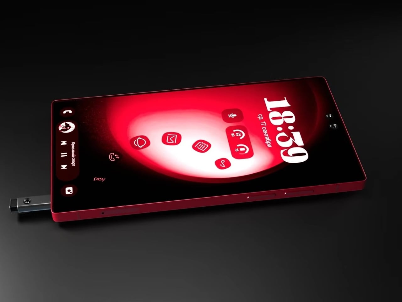
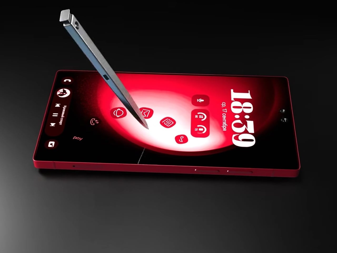
The S Pen slots into the bottom rail via a spring-ejected silo, appearing chunkier than the slim stylus Galaxy Note and Ultra users are familiar with, which may be more a rendering artifact than an intended design change. The front is a flat, edge-to-edge panel with a dual punch-hole selfie camera configuration at the top center, serving the kind of stylus-optimized interface that the Note series built its identity around. The high-contrast red UI reads as purpose-designed for wide-open canvas navigation.
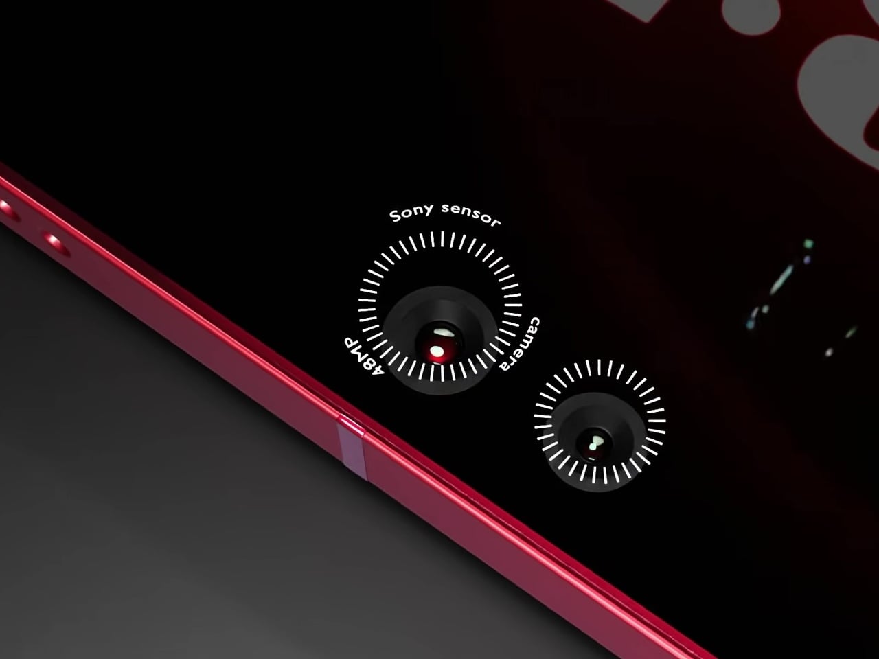
Camera specifications go ambitious: a 200MP main sensor paired with 48MP Sony sensors and periscope telephoto optics round out the vertical lens configuration. The USB-C port, notably, isn’t centered on the bottom edge, a small but visible deviation from convention. And this is where the whimsical and fantastical nature of the design shows through.
None of this is real, of course. Samsung hasn’t announced any plans to revive the Note name, and the dot-matrix display exists in the realm of render enthusiasm rather than confirmed engineering. What the concept captures is a reasonable frustration: the Ultra line has drifted from the qualities that made it distinct, and features appearing elsewhere, like Nothing’s Glyph Matrix, suggest the broader market hasn’t fully moved past wanting the back of a phone to say something.