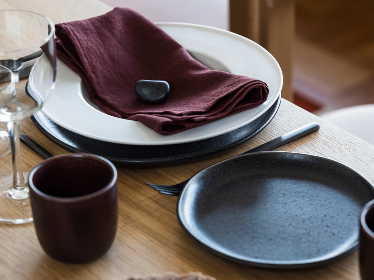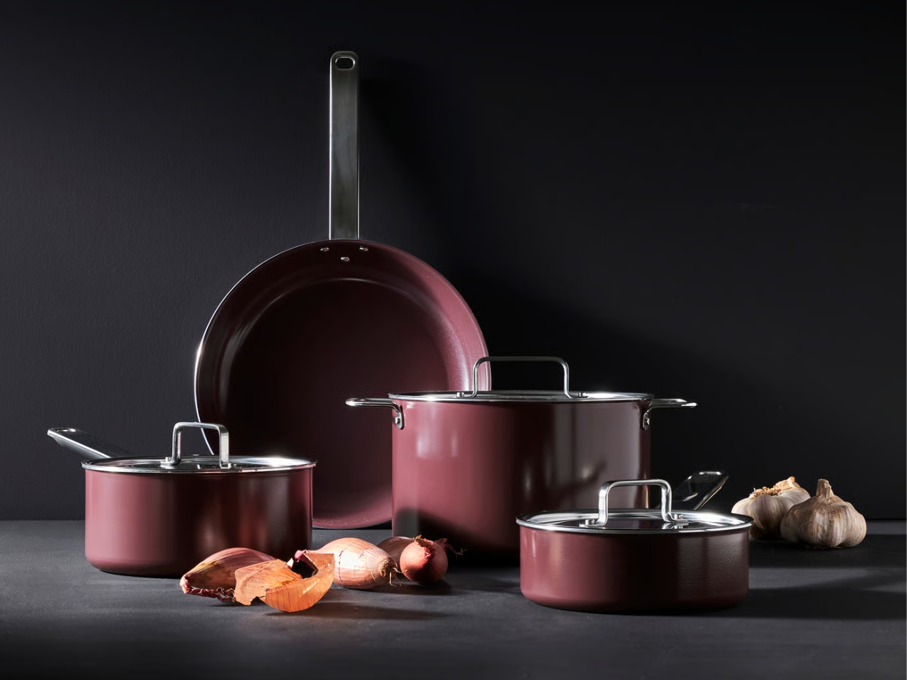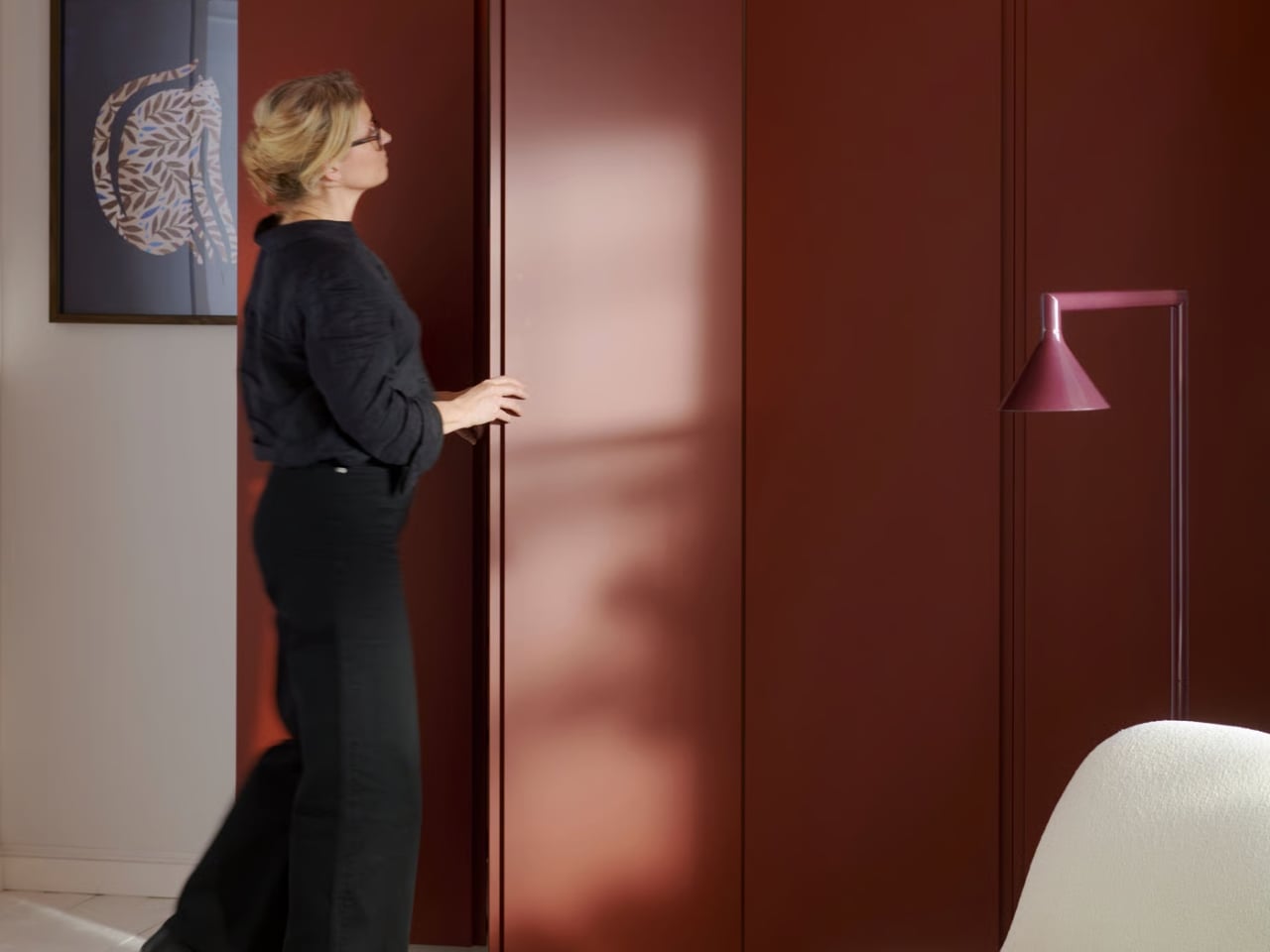
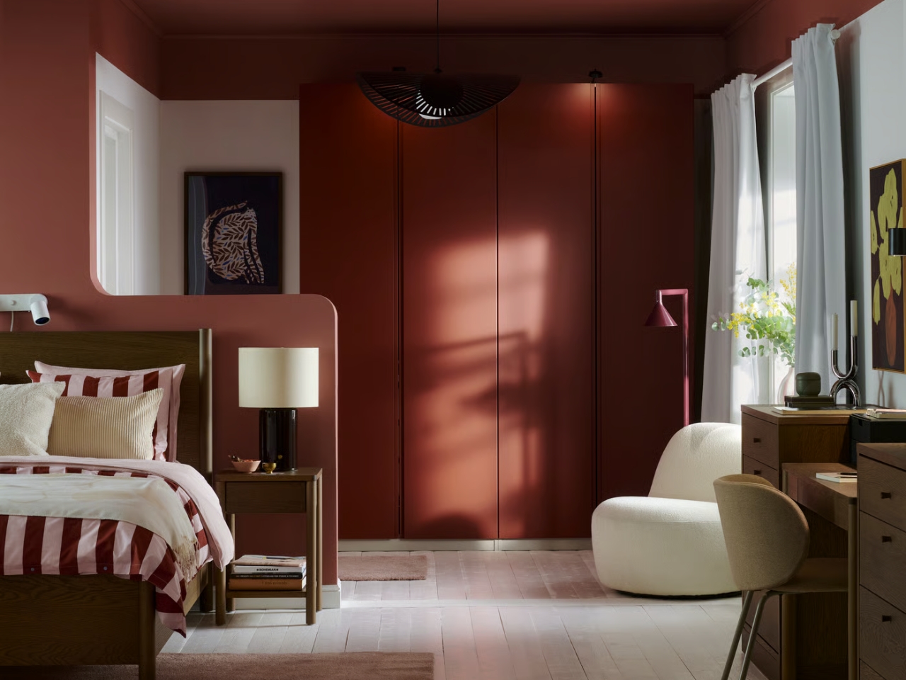
A beige sofa can be perfectly comfortable and still leave a room feeling unfinished. Replacing it because you’re bored with the palette seems like an expensive response to a smaller problem: wanting more personality without starting over. IKEA’s 2027 Color of the Year, Wild Fig, offers a less drastic place to begin. The deep purple shade makes a case for adding richness through the things your room already needs.
The color lands somewhere around burgundy with a purple cast, closer to the skin of ripe fruit than a bright violet. I like that it has a little ambiguity. “Purple decor” can sound like a fairly specific commitment, while this feels easier to imagine alongside the brown furniture and pale upholstery you might already own. It’s dark enough to make a deliberate mark, but I wouldn’t automatically build an entire room around it.
Designer: IKEA
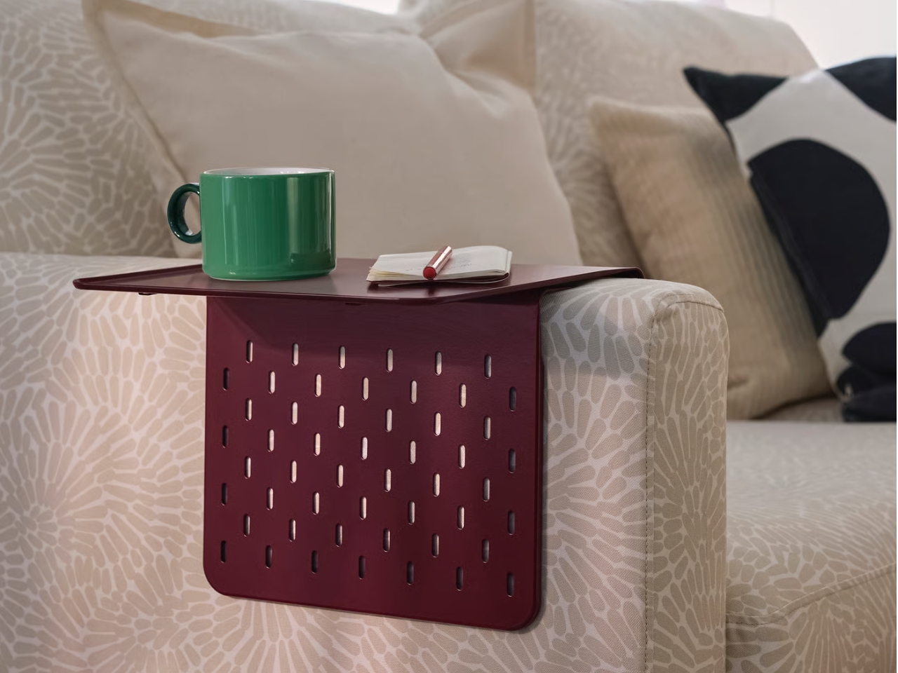
The most persuasive example might be the $9.99 KRAMPHULT armrest tray in dark lilac-red, included in IKEA’s Color of the Year selection. Made from powder-coated steel, it hangs over a sofa arm to provide a surface for a phone, book, or coffee cup. IKEA specifies flat, straight armrests between 4 and 9.5 inches wide, so check the couch before getting attached. That’s a useful little design proposition: introduce a strong color while giving an awkward patch of upholstery an additional job.
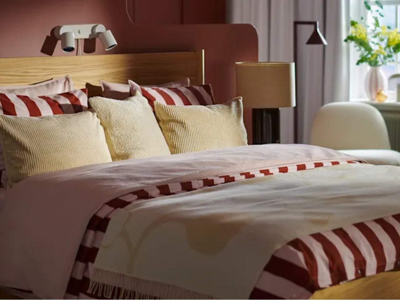
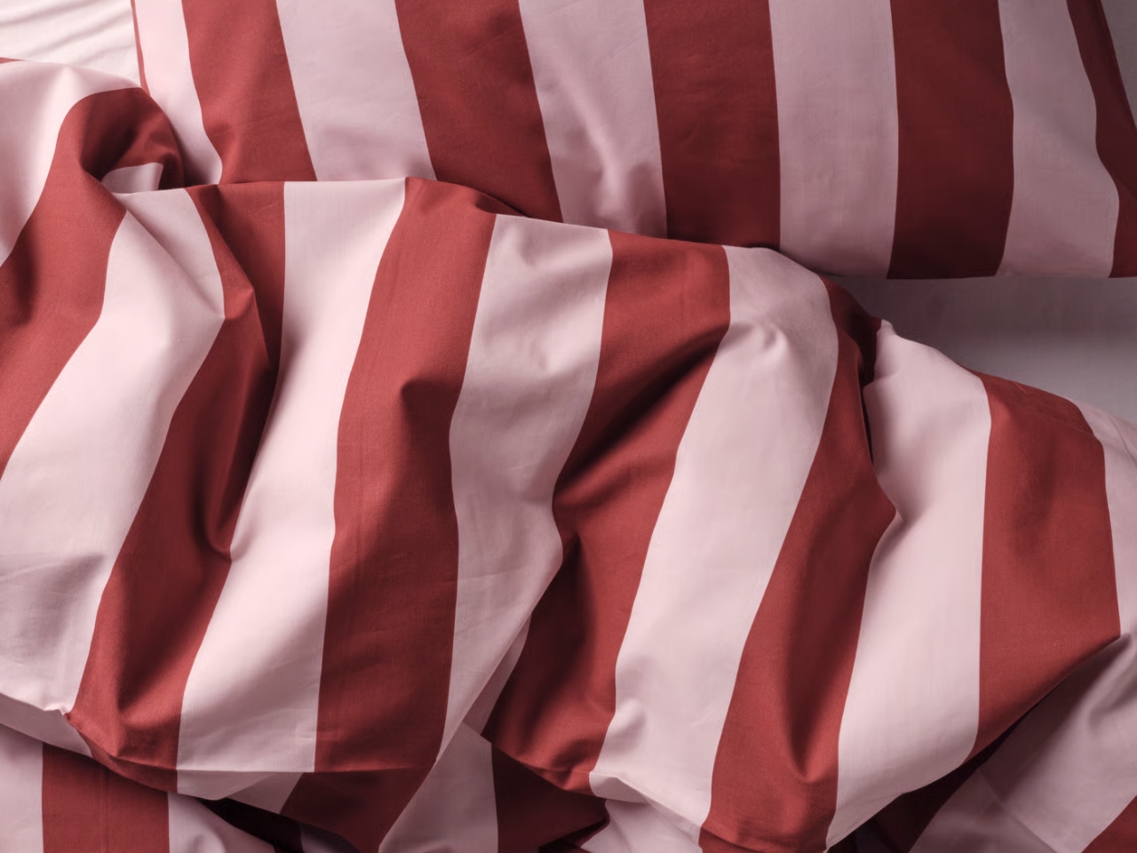
Textiles offer a different scale of commitment. The SLÅNHÖSTMAL duvet cover set pairs light pink with dark red stripes and costs $39.99 in Full/Queen. Its fabric is 57% cotton and 43% lyocell, with a percale weave. The alternating colors appeal to me because they break up the darker shade across a large surface. For a bedroom that feels a little flat, I’d consider that before buying another decorative object that needs somewhere to sit.
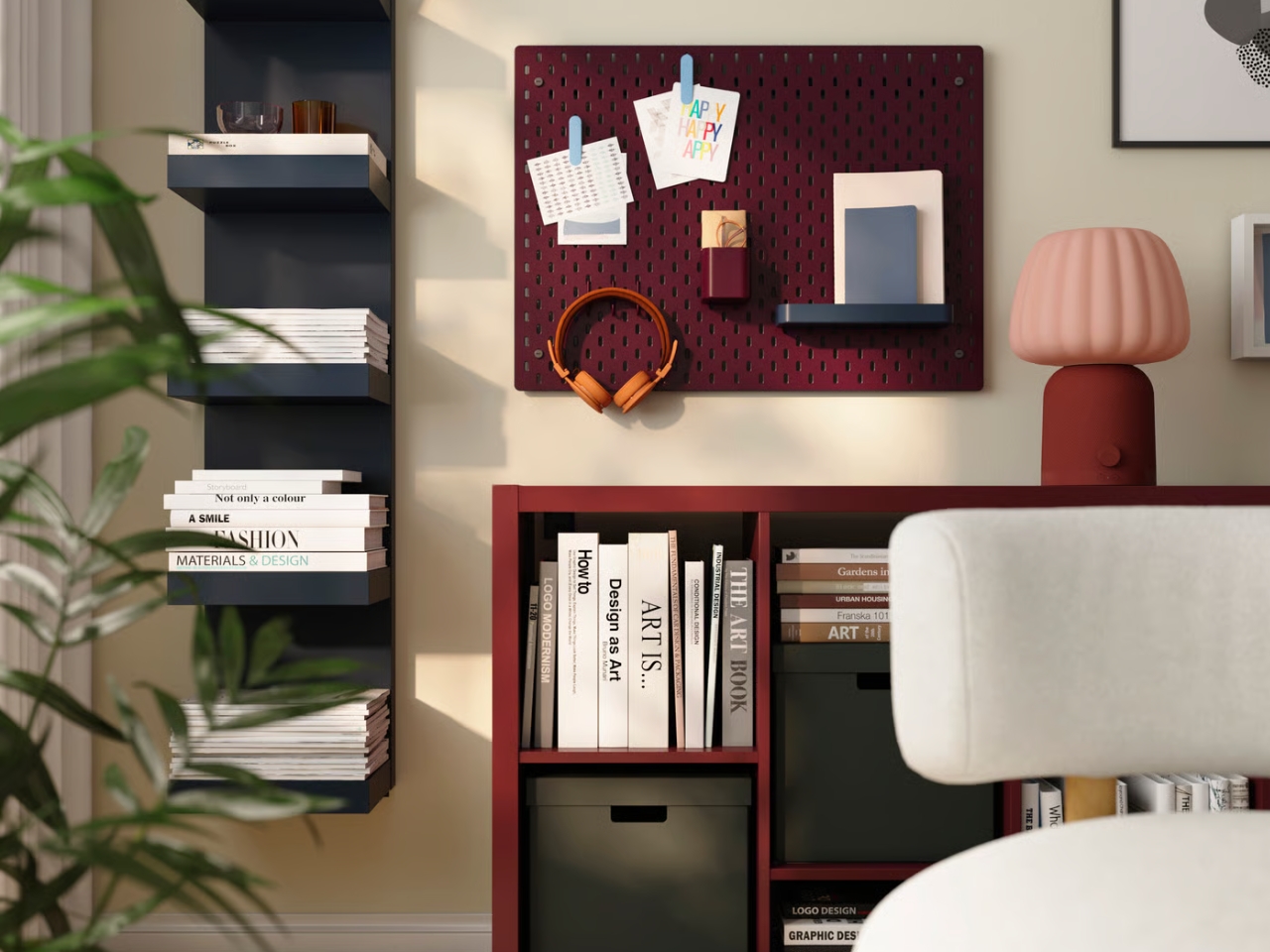
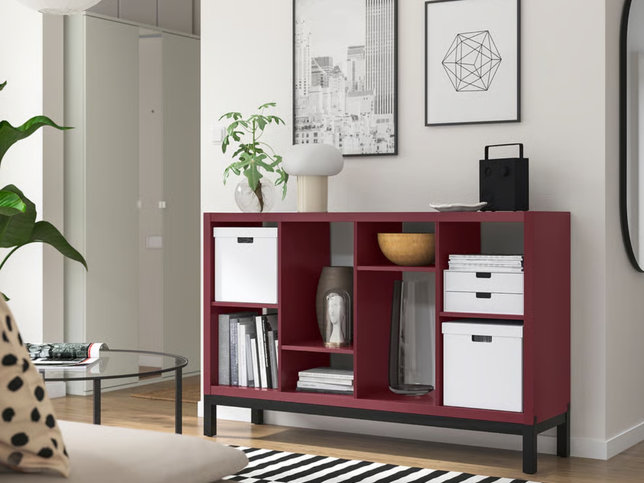
There’s a larger option in the brown-red KALLAX shelving unit, currently listed at $79.99 for the eight-compartment version. Here, color becomes part of the storage rather than an accessory placed on top of it. If shelving is already on your shopping list, that seems like a reasonable opportunity to choose something with presence. I’m less convinced by replacing a perfectly useful shelf simply because the annual color announcement has arrived. The storage need should come first.
IKEA recommends combining Wild Fig with warm woods and neutrals, or taking a brighter route with Electric Blue and Rebel Pink. My preference would be to begin with the quieter pairing. Let a dark red tray interrupt a cream sofa, or put the striped bedding beside a wood bed frame. A single concentrated area of color feels more intentional to me than buying several matching pieces before knowing which one you actually enjoy.
The wider 2027 Style Guide gives the choice some context. Its Whimsical Wonder direction encourages mixing florals, stripes, checks, and textures, while Mindful Minimalism favors natural materials, simple furnishings, and practical storage. Those are different decorating appetites, and I appreciate that the guide leaves room for both. You can borrow the berry-colored accent without signing up for a patterned sofa, a maximalist identity, or a living room that suddenly requires a mood board.
Of course, a Color of the Year is also an invitation to shop, and I’d treat the date on the label lightly. Nobody needs to retire a color they love when the next forecast appears. The more useful question is whether Wild Fig helps you make a decision you were already considering. Would you choose that bedding without the trend designation? Does the tray fit your sofa? Those answers matter considerably more than being early to 2027.
I’d start with the smallest useful piece and give it time. Leave the sofa, keep the wood furniture, and see whether that dark patch of color makes the room feel more like yours. Wild Fig is an appealing suggestion, especially if your home could use some depth. It doesn’t need to become a decorating assignment. A place to set your coffee is enough.