The most interesting part of House of Cards may be the part you cannot see. Vantieghem Talebi designed this family home in Koksijde, Belgium, on the foundations of an earlier coastal house, with a limit on how high the new building could rise. That combination can leave architects trying to disguise a compromise. Here, the inherited footprint gives the house its unusual shape. I like that the design begins with a problem it cannot simply erase.
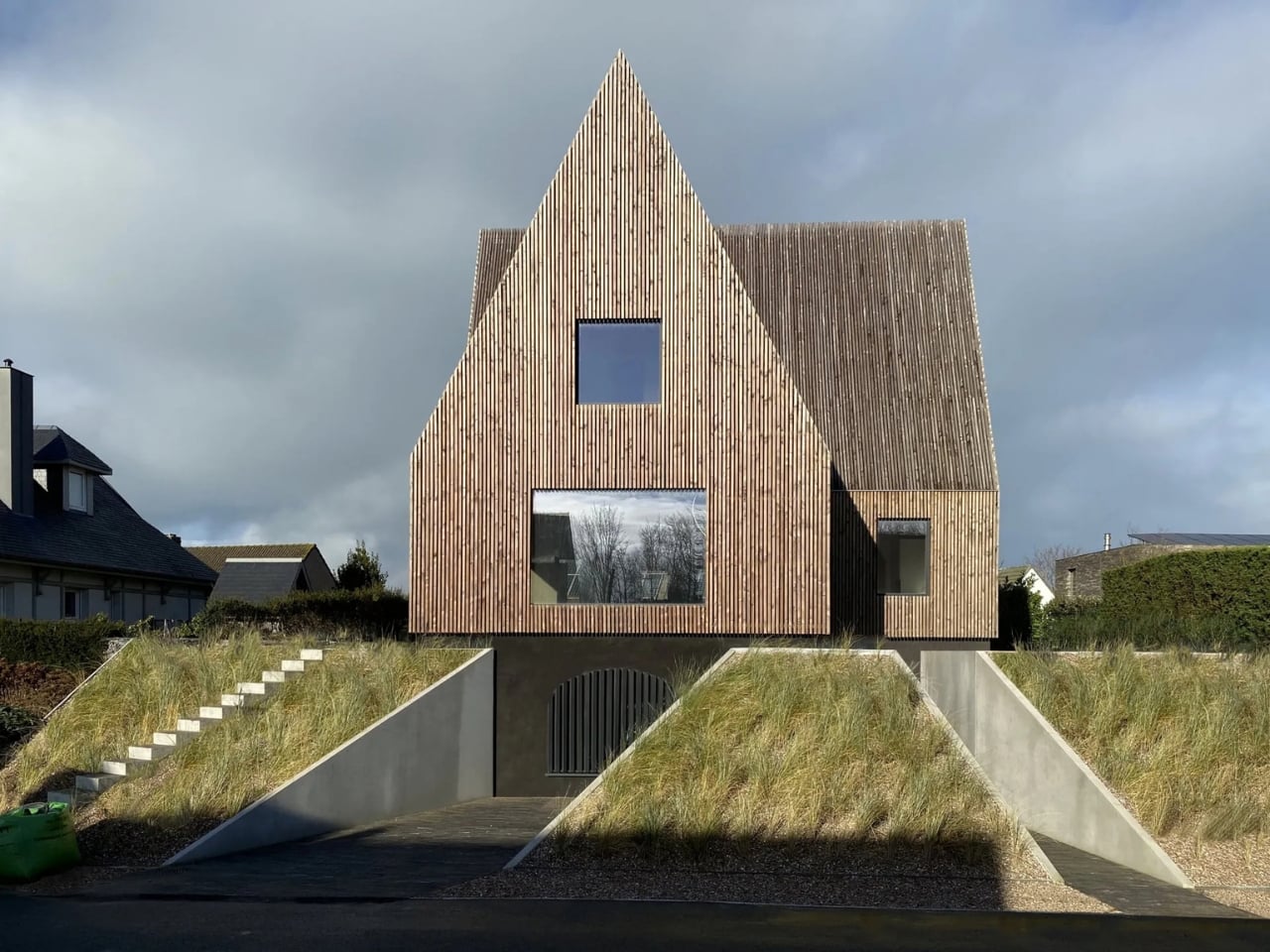
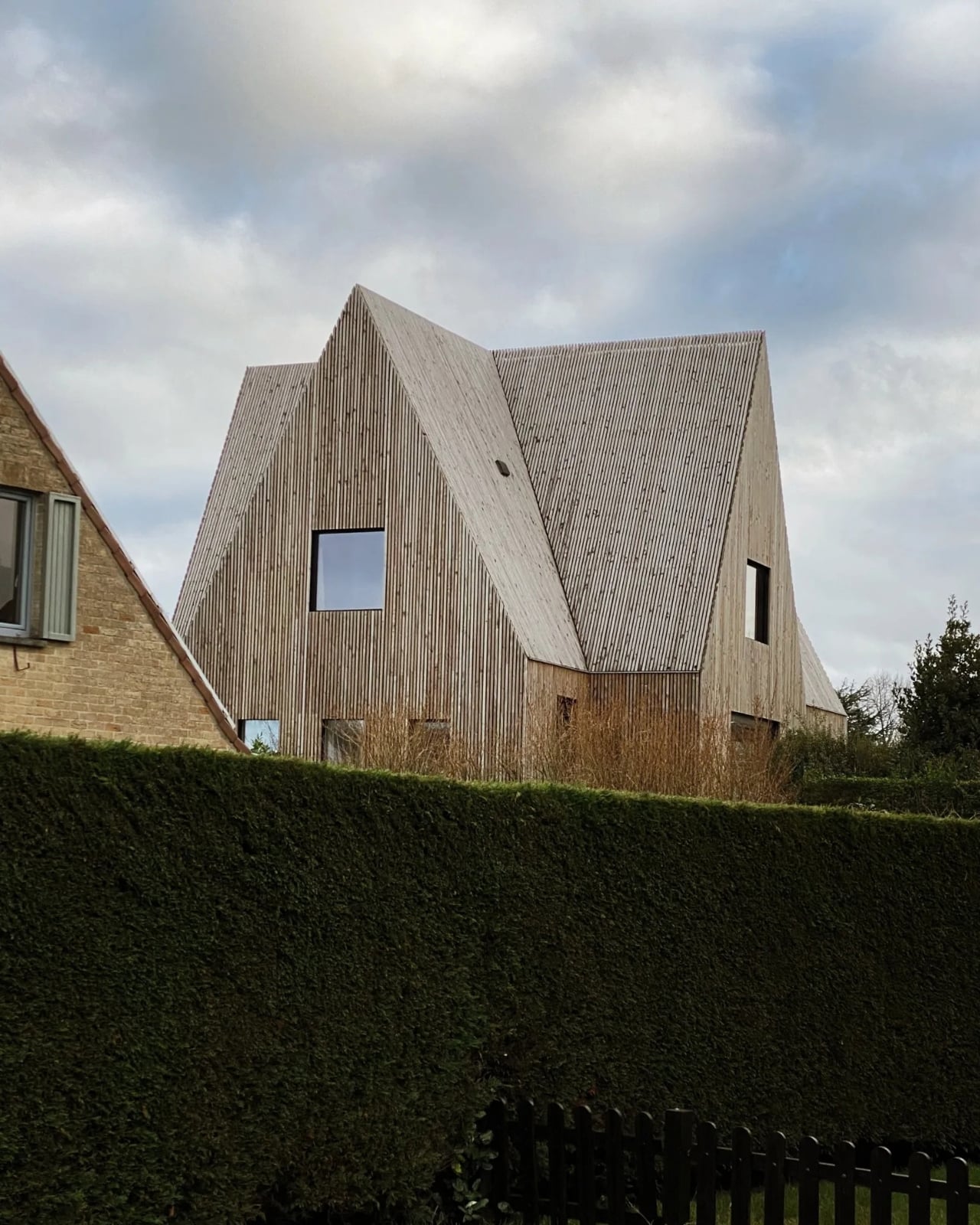
The old foundation has an asymmetrical, cross-shaped layout. Instead of forcing a conventional box onto it, the architects developed each section into a distinct house-like form, creating the layered composition behind the name House of Cards. It looks playful, but the arrangement is rooted in the site rather than added for effect. That distinction matters: an expressive home is much easier to appreciate when its shape has a reason.
Designer: Vantieghem Talebi
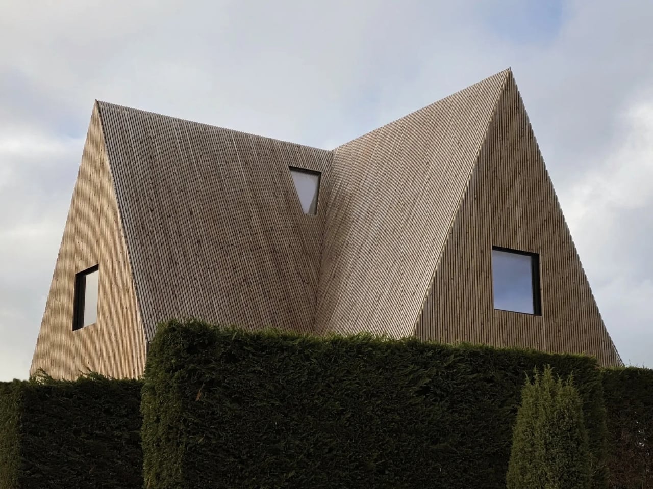
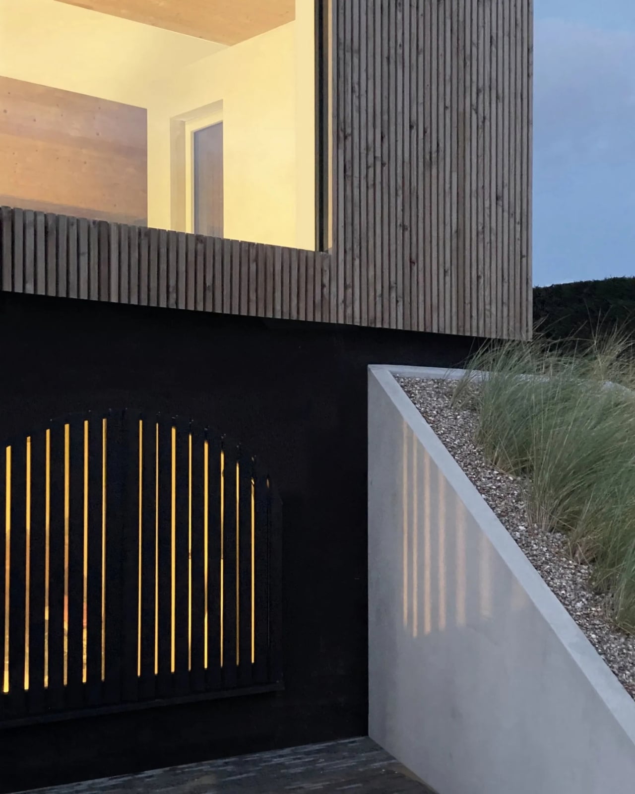
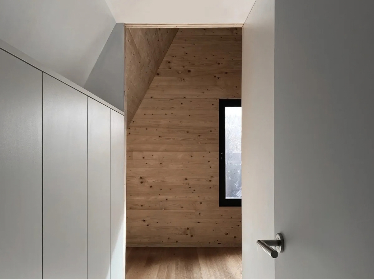
The exterior is wrapped in finely detailed Douglas fir, giving the project a warmth that balances its sharp geometry. Timber could have been treated as a softening finish, something to make an unconventional building feel more approachable. In House of Cards, it has a more substantial role. The studio describes skin, structure, and space as parts of the same idea, so the surfaces you see feel closely tied to the building beneath them.
There is also a conversation with its surroundings. The steep roof angles recall the historic beach houses of the area, even as the overlapping forms give that familiar silhouette a different rhythm. I appreciate that approach more than a design that tries to stand apart from its neighbors at every opportunity. House of Cards has a clear point of view, but it still seems interested in belonging where it was built.
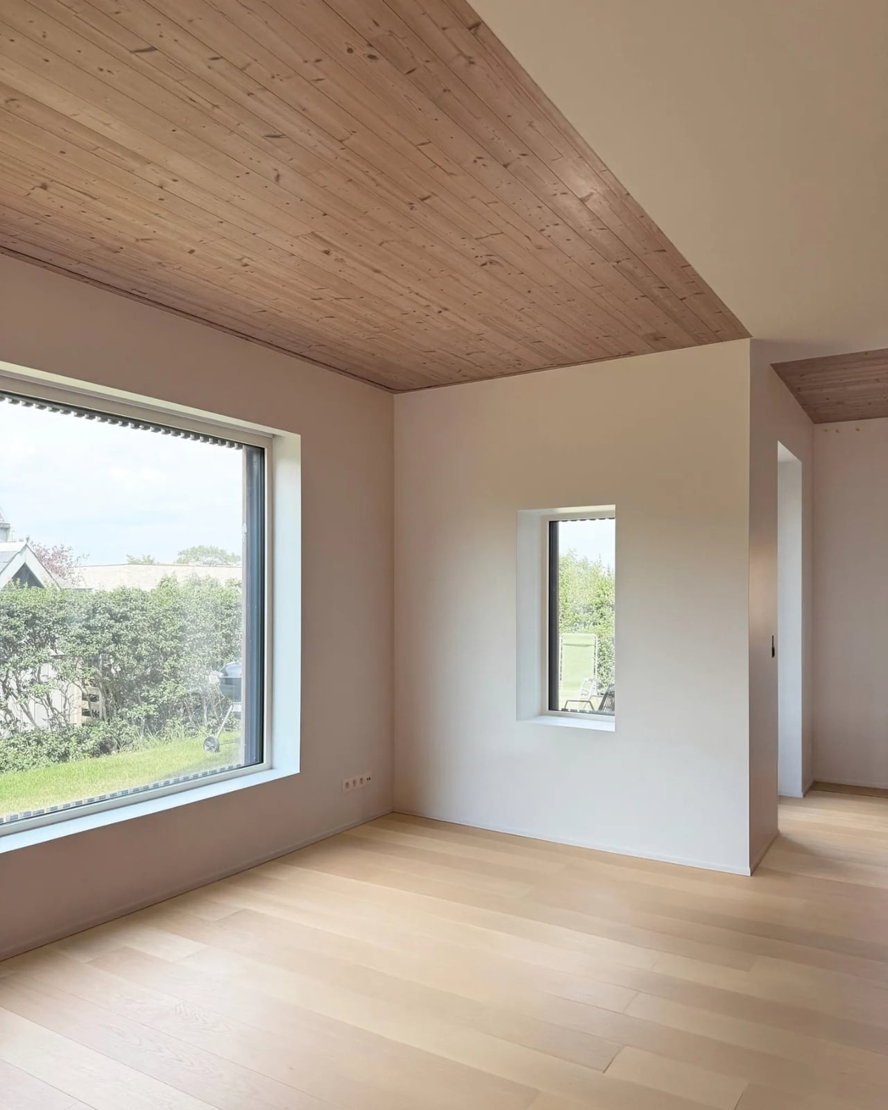
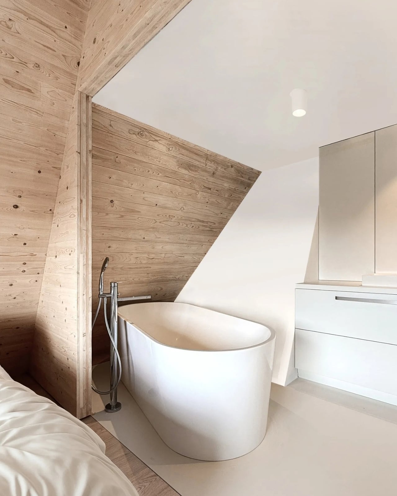
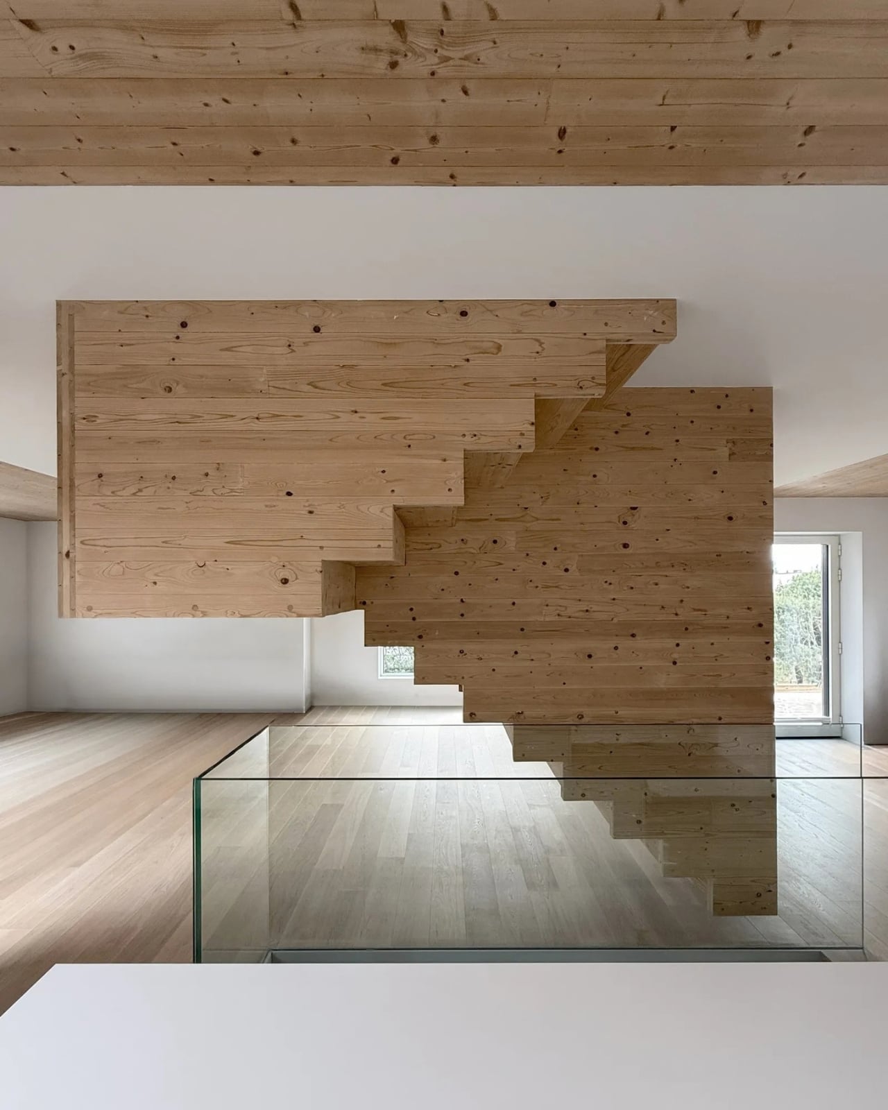
That makes the name especially fitting. A house of cards suggests something temporary, maybe even a little precarious, while this one is the result of working carefully through structural and zoning limits. The contrast gives the project a sense of humor without making it feel like a joke. From one angle, you might notice the recognizable outline of a pitched-roof home. From another, the intersecting volumes make you look again.
The architects also used prefabrication techniques in developing the structure and envelope. That detail is less immediately charming than the roofline, but it helps explain how an intricate design could be treated as a coherent whole. It would be easy to look at a house like this and see only a striking exterior. The more compelling story is how its construction, materials, and constraints were considered together from the start.
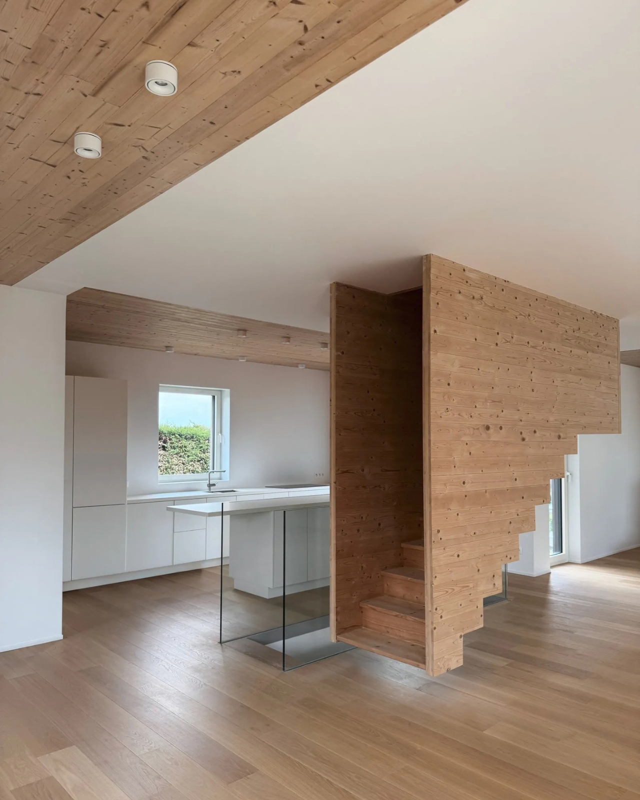
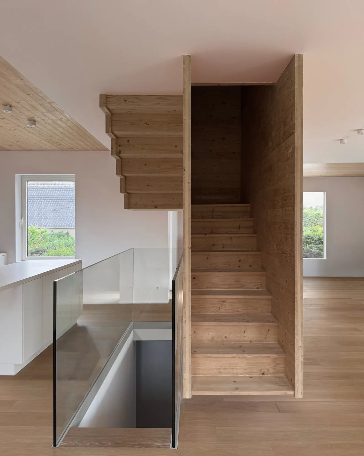
Of course, House of Cards is a custom home, not a ready-made answer for every aging property. An old foundation can present practical questions that a beautiful photograph will never settle, and unusual geometry is not automatically a better way to live. Still, the project makes a persuasive case for examining what a site already offers before assuming that a blank slate would produce a better design.
That idea feels particularly relevant when so many new homes borrow the same handful of visual cues. A pitched roof, timber cladding, a carefully composed profile: none of those elements is novel on its own. House of Cards gets its character from the way they respond to a specific footprint and a specific place. It suggests that familiarity and originality do not have to compete. Sometimes the recognizable shape is what makes the unexpected one legible.
I would love to know how the family experiences those intersecting forms from inside, beyond what the exterior can tell us. But even from the outside, the house offers a useful reminder. The conditions designers inherit are not always obstacles to overcome as quickly as possible. Given enough attention, an awkward starting point can become the detail that makes a home worth remembering.