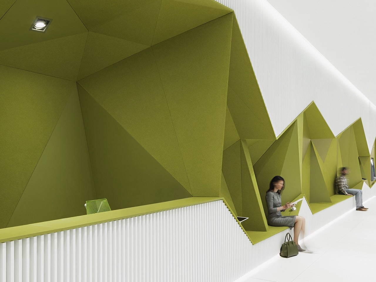
Walls, generally speaking, have one job. Stand there, hold up the ceiling, maybe hide some plumbing, and stay out of everyone’s way. DA Architects looked at that job description for the DSK Bank flagship branch in Sofia and decided it was criminally boring. So instead of a wall, they built a single continuous folded surface in punchy olive green that runs the length of the branch and somehow moonlights as a bench, a desk, an ATM housing, a screen bezel, and a light fixture, all without changing material once.
The trick is genuinely clever once you notice it. Every fold in that green ribbon is doing structural or functional work, not just decorative flexing, and the surrounding white louvers exist mostly to give the whole thing a clean edge to disappear into. Sit inside one of those angular little niches and you are basically perched inside a piece of the wall itself. It is origami logic applied to interior architecture, and it turns a routine bank visit into something closer to sitting inside a crystal.
Designer: DA Architects
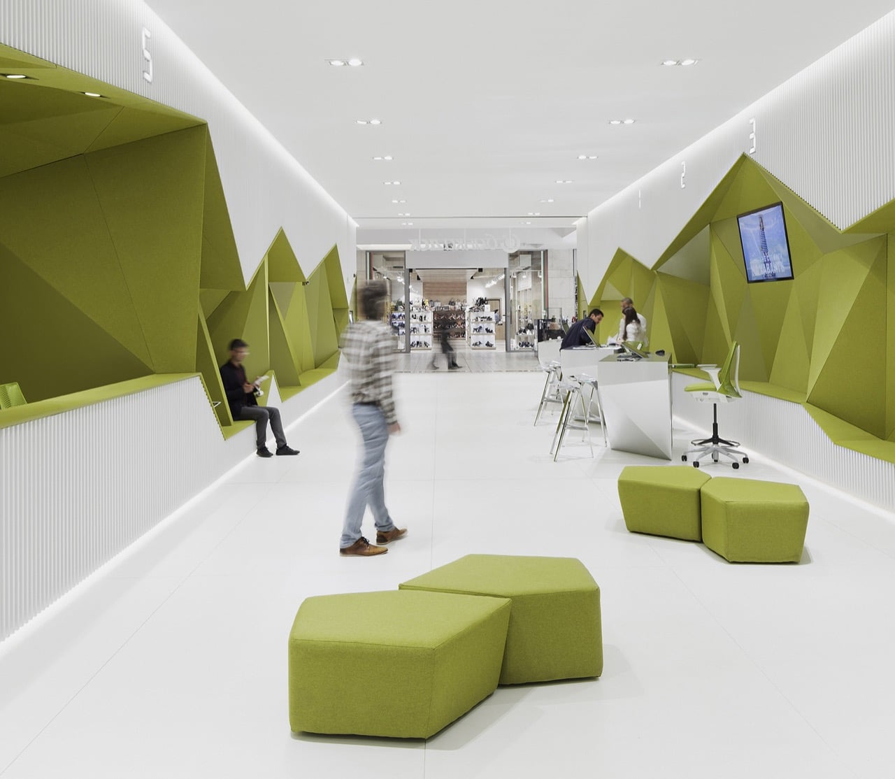
The branch sits inside The Mall on Tsarigradsko Shose in Sofia, and it was built out between October 2016 and early 2017 as the pilot for a much bigger idea. DA Architects had won a competition to redesign DSK’s entire branch network, and this space was the proof of concept, the one location that had to sell an entire bank on going full geometry. At roughly 270 square metres, it is not a massive footprint, but the design punches well above it by refusing to waste a single wall surface on doing nothing.
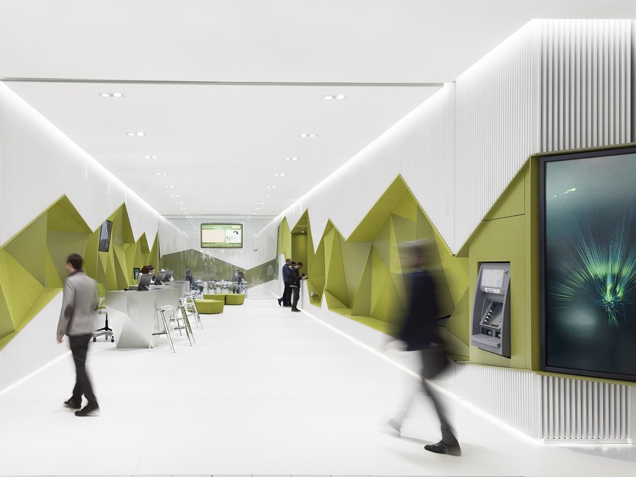
Old-school bank branches keep everything locked in the center, tellers, machines, security, and make customers orbit around the edges like they cannot be trusted too close to the cash. DA Architects flipped that completely, pushing every functional unit, screen, and device to the periphery and leaving the entire core of the room open. It is the kind of move that only makes sense once you realize digital banking already killed the old security logic, most people just never bothered to redesign the room to match.
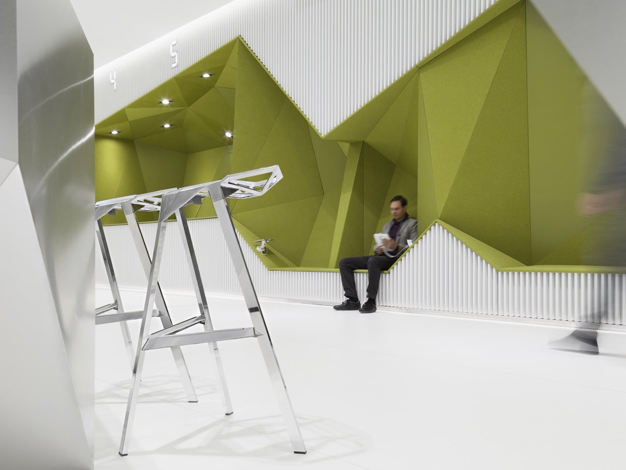
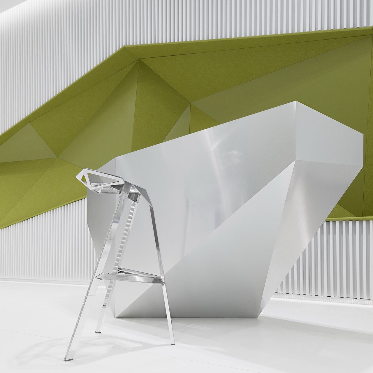
The material choices back up the concept instead of just decorating it. MDF louvers and mirror-polished stainless furniture handle the hard surfaces, while the green strip itself splits into solid panels where devices are built in and softer upholstered ones where people actually sit, a small distinction that keeps the whole thing from feeling like one giant showroom prop. Behind the louvers and green niches, the studio tucked away cabling and services, so the geometry reads as intentional rather than as a skin bolted over a normal room.
Tucked at the back is a private consultation room sealed off by a switchable glass wall, milky one second, fully transparent the next, once you run current through it. It is a small gesture buried at the end of a much louder design, but it says a lot about the studio’s instincts. They know exactly when to let geometry do the talking, and exactly when to go quiet.