CREATOR: gd-jpeg v1.0 (using IJG JPEG v80), quality = 82
It’s too easy to take certain product designs for granted. Milk cartons, for example, used to have this tall square design that became iconic for decades before they were replaced by more rectangular shapes with screw caps or lids. Like with any mundane object in our lives, these boxes are functional but not exactly inspiring, especially for the kids that would be drinking them.
That’s even more true for boxes of powdered milk sachets that neither convey their purpose nor spark interest in younger consumers. Most packaging goes for one or the other, either catching attention with bright colors and lively characters or indicating the value of the product right on the label. This milk box surprisingly does both, and all it required was some out-of-the-box thinking, figuratively and literally.
Designer: Simply Brand Design
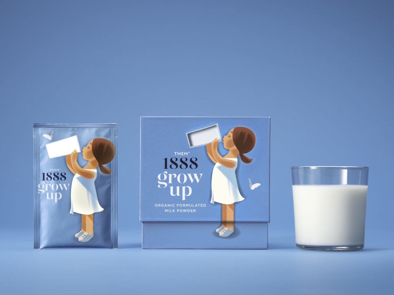
Although they’re always advertised as beneficial, not all kids like drinking milk. Disregarding lactose intolerance, some toddlers just don’t dig the taste or texture of the liquid. As any parent would know, however, sometimes all it takes is to present the same thing in a different and fun way to completely change a child’s mind.
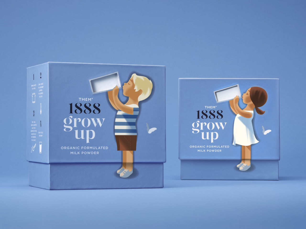
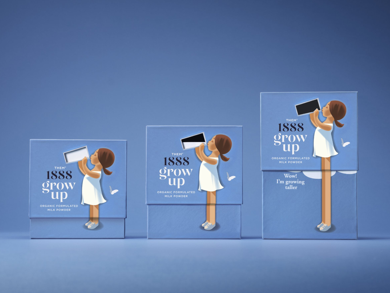
The box for Them 1888’s powdered milk sachets does that by presenting the value of drinking milk in a way that a child would understand even without being told. The front of the box has a boy or a girl holding a full glass of milk, but when the lid is lifted up, that milk seems to magically drain and the child’s leg grows longer. It delivers the message that drinking milk will make you grow taller in a way that’s more effective than some spoken literature.
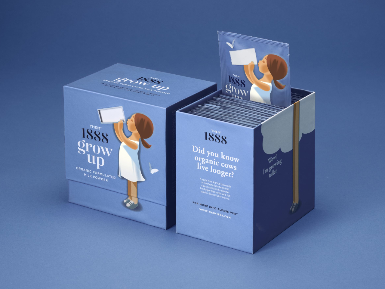
Although it looks like magic to the child’s eyes, it’s really just a simple visual trick. Part of the inner box has a white area that matches the location of the glass of milk. Simply lifting the lid up makes it look like that white area is going down instead, creating the illusion of the glass being emptied. It’s pretty much the same effect you get when you’re in a moving vehicle, making it look like everything else is moving backward.
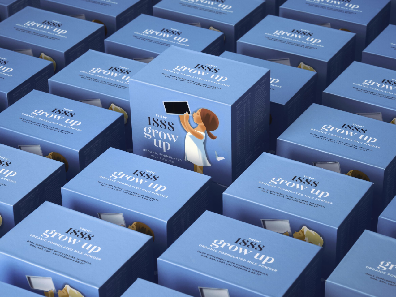
This “grow up” design does nothing to make the milk more effective or more delicious, of course, but it could get the kid to drink more of it, just for the sake of seeing that “magic” again. It’s not even a design innovation, as this mechanism has been in use for so many different products, but it definitely takes some creative thinking to apply it in this manner.
SHARE