
Japan has a long tradition of treating ordinary objects as worthy of serious attention. Not just functional, but considered – the angle of a pour spout, the resistance of a dial, the way candlelight moves through cooling wax. These are not luxury objects or collector’s pieces. They are things meant to be used every day, and that repetition is the point. The habit they build is not around consumption. It’s around attention.
The eight objects below cross kitchens, desks, and living rooms. Some have been in continuous production for decades. Others are newer, but built on the same premise: that the ordinary is worth redesigning from first principles. What connects them is not a single aesthetic or price point. It’s a refusal to accept that an object is finished simply because it already exists and technically works.
1. ClearFrame Speaker CD Player

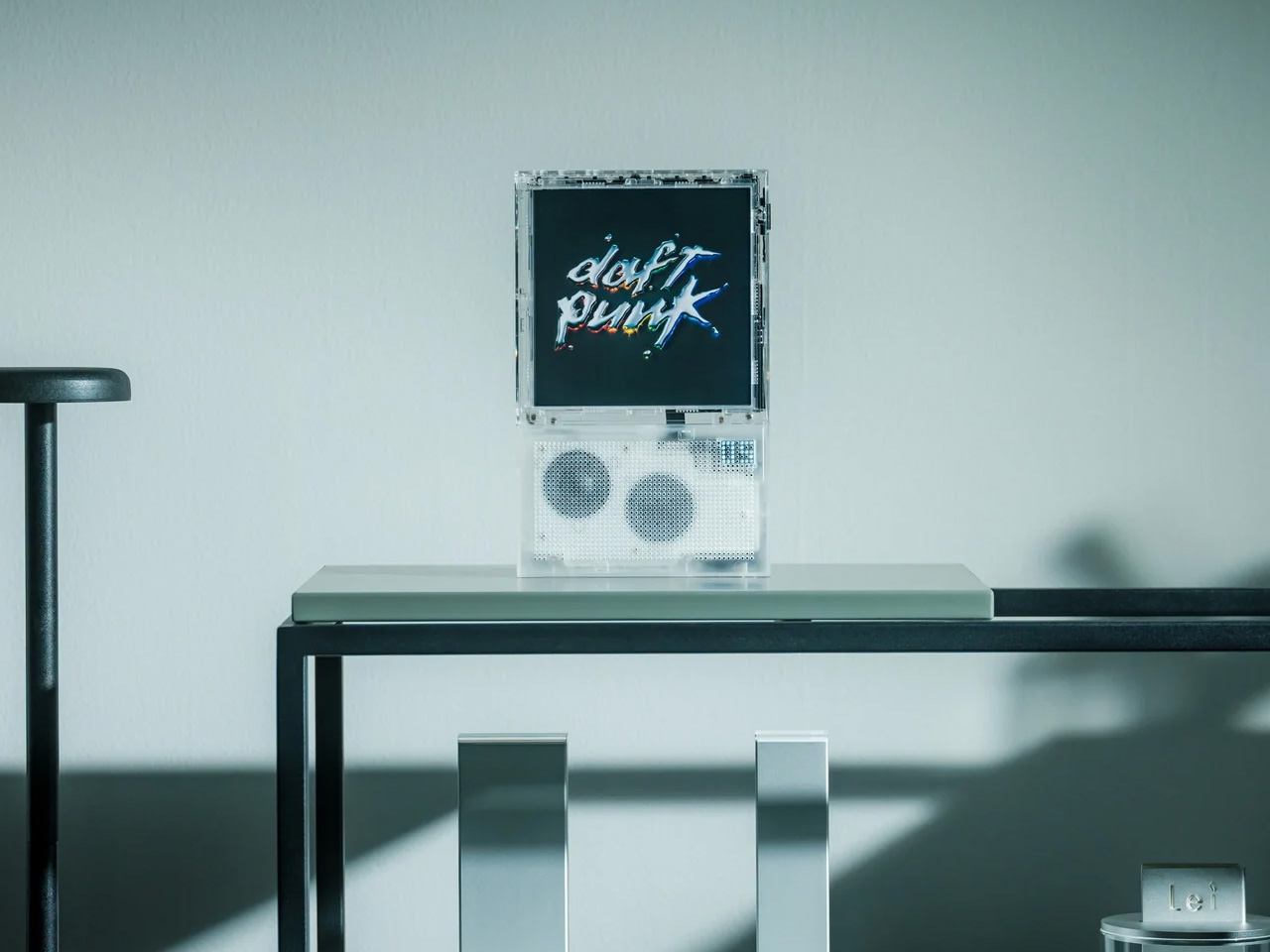
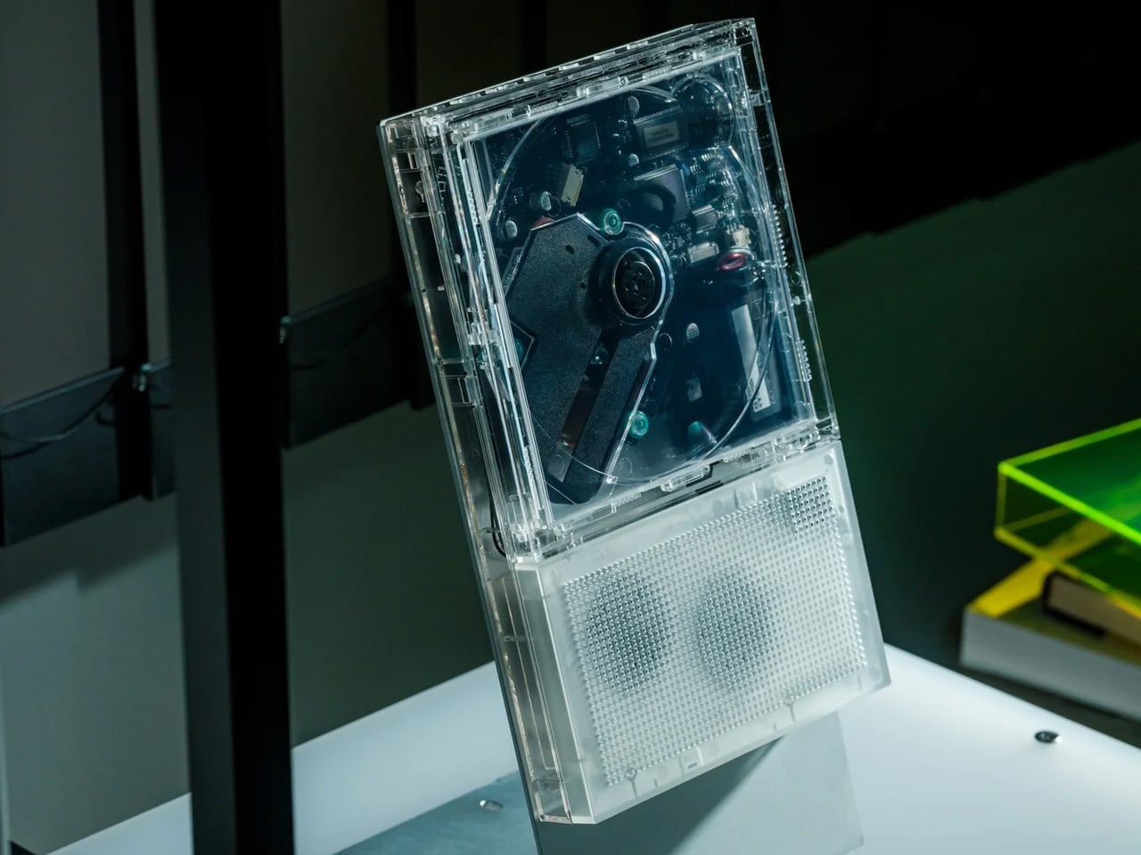
The ClearFrame makes the argument that the most interesting part of a CD player was always the part manufacturers chose to hide inside the housing. Its square polycarbonate body is fully transparent, so the black circuit board, the disc, and the spinning mechanism are all visible during playback. Album artwork faces outward. The engineering is the display. On a desk or shelf, it functions as a slow-motion kinetic object – something you glance at differently depending on what’s playing and where the disc sits in its rotation.
Beyond the visual dimension, it works straightforwardly: continuous play, repeat-all, or single-track looping. The built-in speaker means it operates as a standalone unit without cables or additional audio hardware. For a renewed CD habit – one that treats the physical act of loading a disc as meaningful rather than inconvenient – this is the object that makes that habit visible in a room.
Click Here to Buy Now: $240.00
What we like
- Watching the disc spin and the mechanism move makes listening more active than streaming typically does; you pay attention to the album differently
- The built-in speaker removes the need for any additional setup or cabling
What we dislike
- At $240, it’s priced as a design object; the audio quality reflects that positioning rather than audiophile expectations
- The transparent body shows fingerprints and dust clearly, requiring more frequent cleaning than an opaque unit would
2. Stalogy Editor’s Series 365Days Notebook
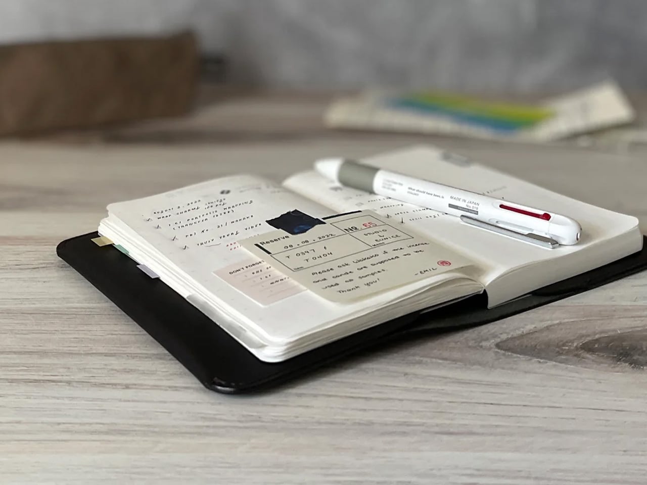
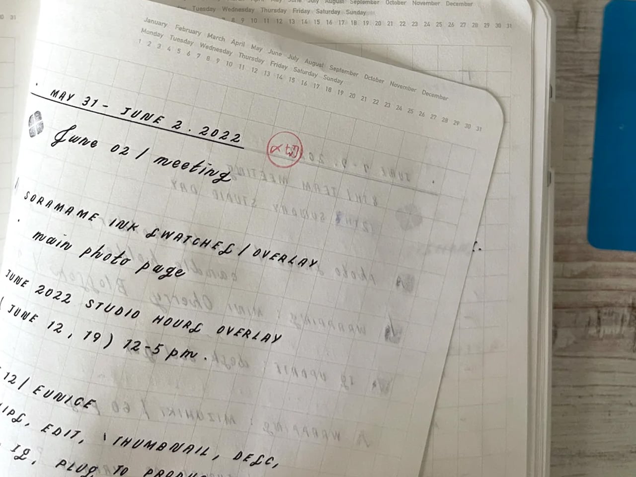
The 365Days is built around a specific premise: a notebook designed for a full year of daily writing should earn its use rather than demand it. The A5 version runs 368 pages of 52gsm paper – thin enough to keep the volume lightweight, and bleed-resistant enough for fountain pens. The 5mm dot grid is printed in a gray light enough to disappear when a page fills up. Months, dates, days of the week, and hour markers from 7 to 24 are printed across each page, but at a scale that stays out of the way.
There is no branding on the cover – just the color and a yellow band at the bottom that peels off. That restraint is the design. It’s a notebook that wants to be used rather than displayed, carried into meetings rather than left on a shelf. For a daily writing practice, a running work journal, or a year-long log of anything worth tracking, the 365Days earns its keep by doing nothing wrong. Available in the US through JetPens and Galen Leather, in black, blue, yellow, red, and seasonal colorways depending on the year.
What we like
- The 52gsm paper handles fountain pen ink without significant feathering or ghosting, which is rare at this notebook’s price point
- No cover branding means it reads as a professional object in a meeting room rather than a branded product
What we dislike
- The pre-printed date structure works best starting at the beginning of a year; beginning mid-year leaves dated pages behind that feel like a structural mismatch
- At 368 pages, the A5 version is thicker than it appears in product photos, which can feel unwieldy in smaller bags
3. Chouchin Lantern Candle
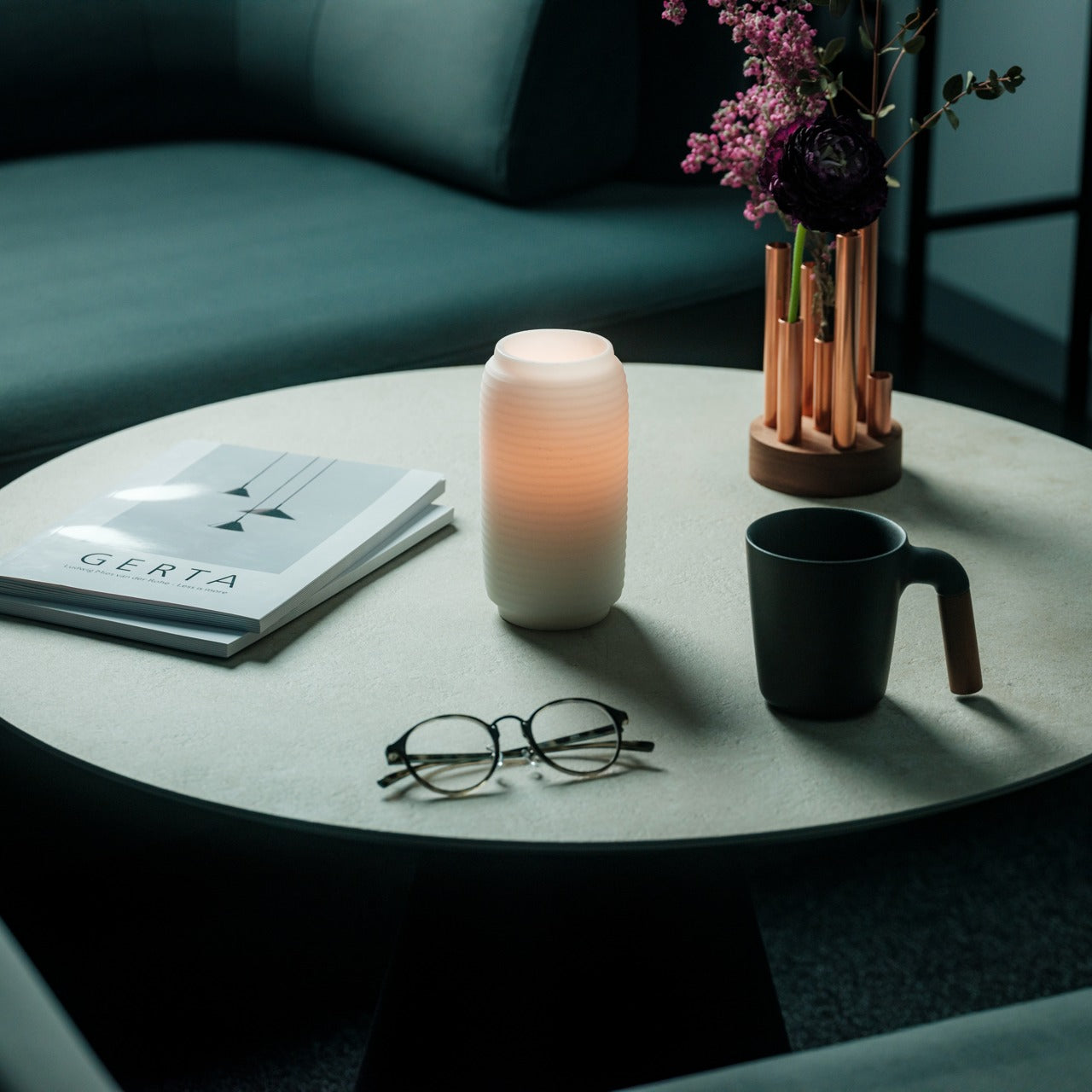
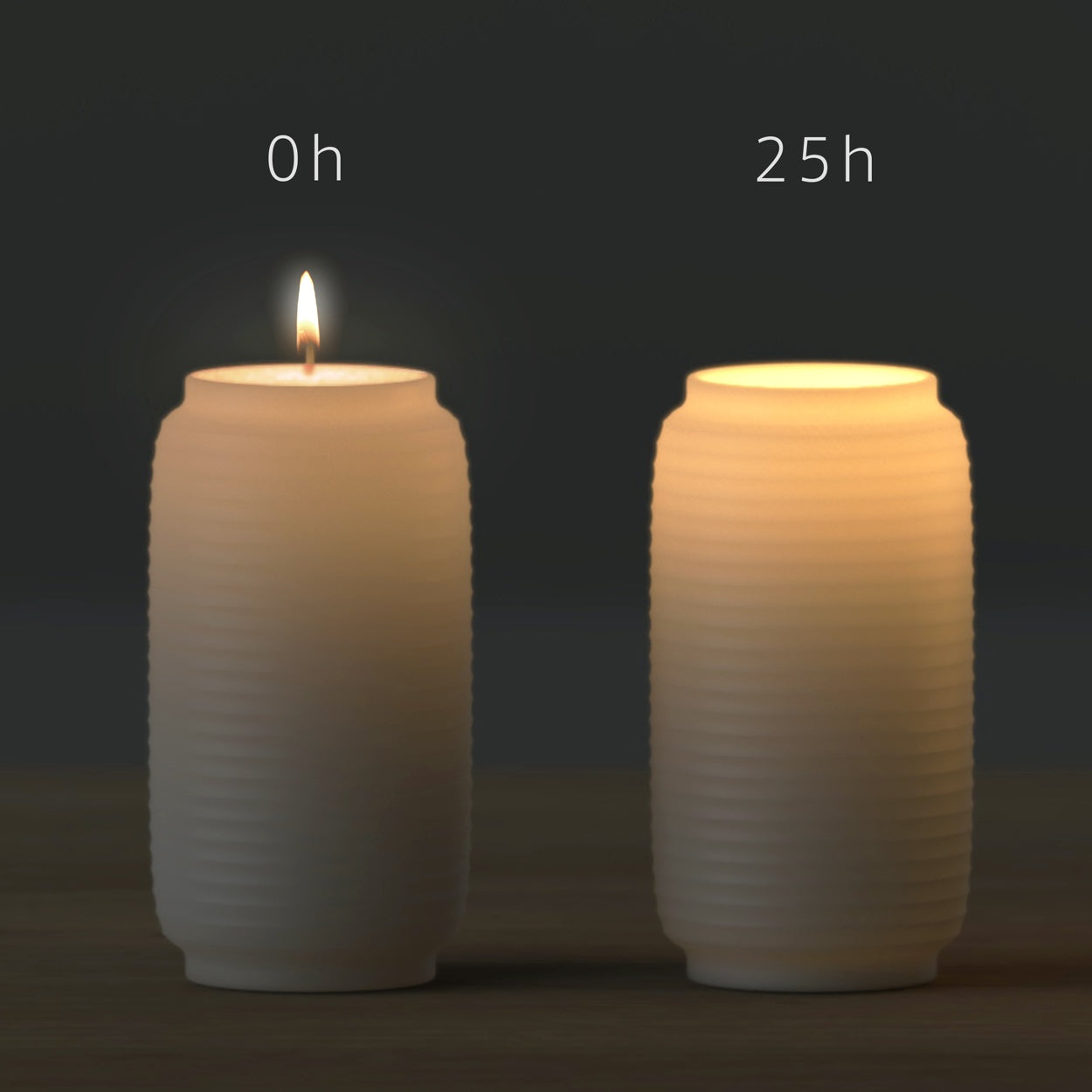
Designer James Kaoru Bury drew directly from the chouchin, the ribbed paper lantern that has lit Japanese festivals and traditional bars for centuries. He made a pillar candle that changes as you use it. When lit, the flame gradually sinks into the wax. The outer shell, now translucent, begins to glow like the lantern it references. You don’t lose the candle as it burns. It becomes something else, and the shift happens at its own pace, without announcement.
On a shelf or a bedside table, the Chouchin earns its space twice: once as an object before you light it, and again as a light source once you do. The patented wax construction is handcrafted in Kurashiki, a city in Okayama Prefecture with a deep textile and craft heritage. For evening routines that benefit from a slower, more deliberate wind-down signal, this is the kind of object that makes the ritual feel intentional rather than incidental.
What we like
- The transformation from candle to lantern is gradual and genuinely striking the first time you see it happen in real time
- The Kurashiki handcraft process gives each one a slight variation that makes it feel like an object rather than a unit
What we dislike
- At $70, it’s a one-time experience – once it burns through, you’re buying another
- The lantern shell becomes delicate as the wax depletes; placement matters more as the burn progresses
4. Hasami Porcelain Mug in Gloss Gray
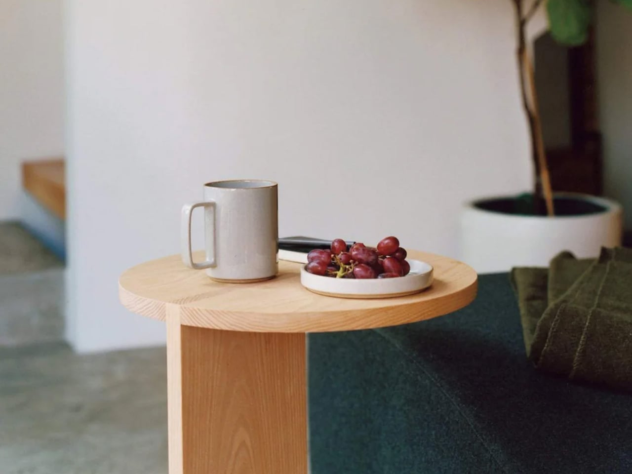
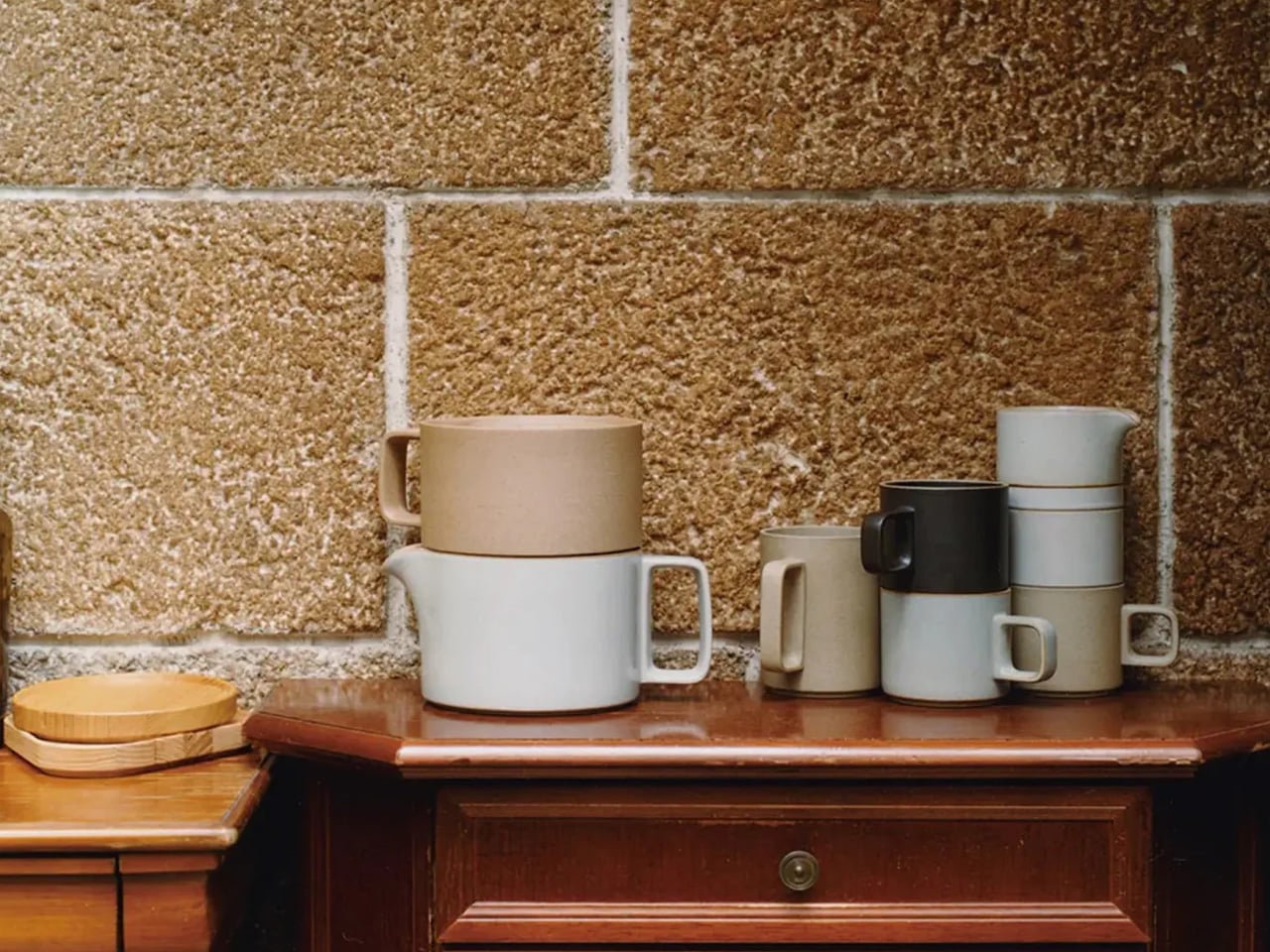
Hasami is a town in Nagasaki Prefecture that has been producing ceramics since the 17th century, when Korean potters first brought the craft to the region. The Block Mug carries that lineage in a form as direct as porcelain gets: a clean cylinder, straight walls, flat base, no handle. The gloss gray glaze shifts between warm and cool depending on the light, which means it looks different at 7 am than it does at dusk. Stackable by design, it stores more efficiently than its footprint suggests.
The mug is wide enough to hold a proper volume of coffee or tea, and the absence of a handle is intentional. Hasami Porcelain designs around holding the vessel directly, which connects you to the temperature of the drink and slows the pace of consuming it. That’s a small behavioral nudge, but it tends to change a morning routine over time in ways that are difficult to trace back to a single object.
What we like
- The stackable form is genuinely practical rather than a detail that only works in product photography
- The gloss gray glaze holds up to daily dishwasher use without losing its finish
What we dislike
- The handleless design requires adjustment; very hot liquids need a careful, calibrated pour until you’re accustomed to it
- US retailers carry a limited colorway selection compared to the full range available in Japan
5. Sori Yanagi Stainless Steel Kettle
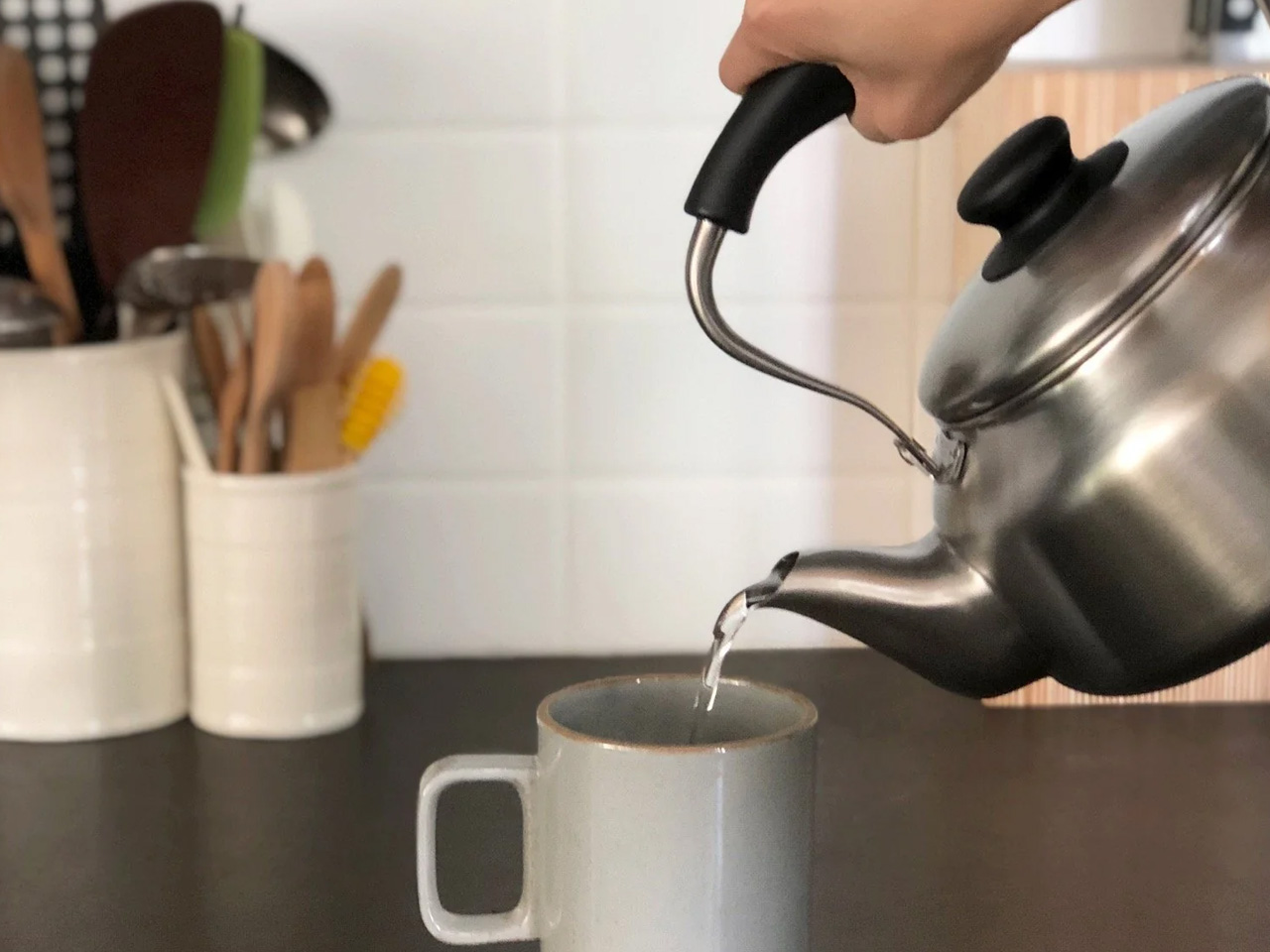
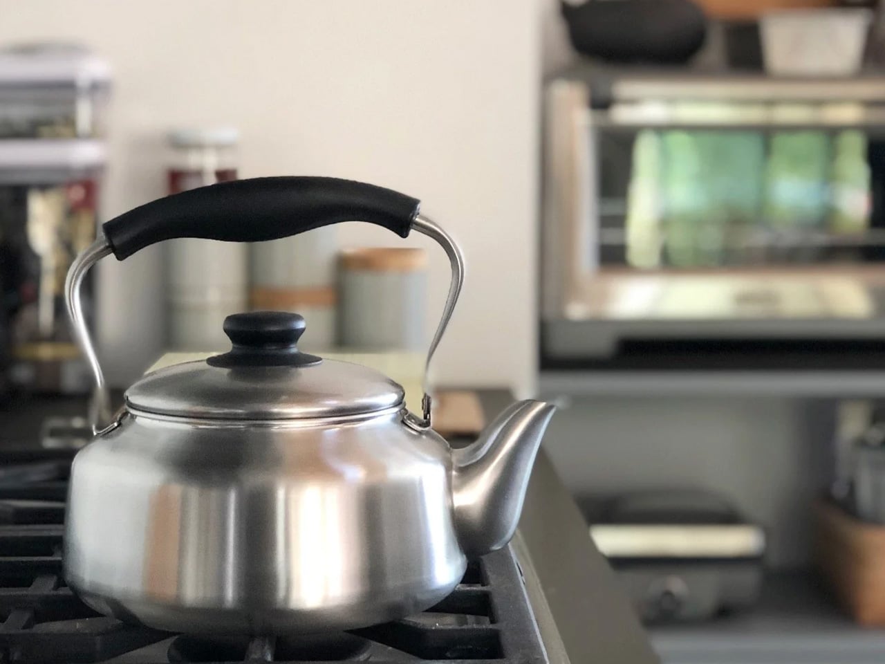
Sori Yanagi first designed this kettle in 1953. The handle was developed not through sketches but through hundreds of iterative clay models shaped by hand, until the grip felt exactly right. The kettle’s wide base allows for rapid boiling, and steam-release holes in the handle prevent heat transfer to the hand while the water heats – a detail so considered it reads as obvious only after you’ve used it daily for a week. It has remained in production, largely unchanged, since that first edition.
Made in Niigata, a Japanese region historically recognized for high-quality metalwork, the kettle is 18/8 stainless steel with a matte finish and a 2.5-liter capacity – enough to cover a table of four without a second fill. The Good Design Award has recognized it twice, including in 2013, not for how it photographs but for how it performs. Yanagi believed that “true beauty is not made; it is born naturally.” The kettle is the plainest evidence he was right.
What we like
- The handle shape genuinely reduces wrist strain during pouring, a detail that reveals itself after the first week of daily use
- Dishwasher safe and built to last decades without the finish degrading
What we dislike
- At $180, it requires real commitment for a kettle; the design case is strong, but the price is not casual
- The matte exterior shows water spots readily in hard-water areas without regular wiping
6. PaperLock Stapler
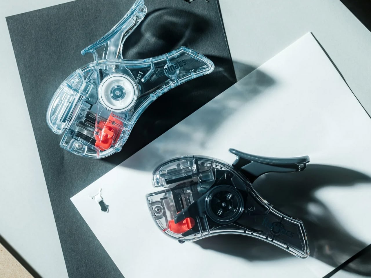
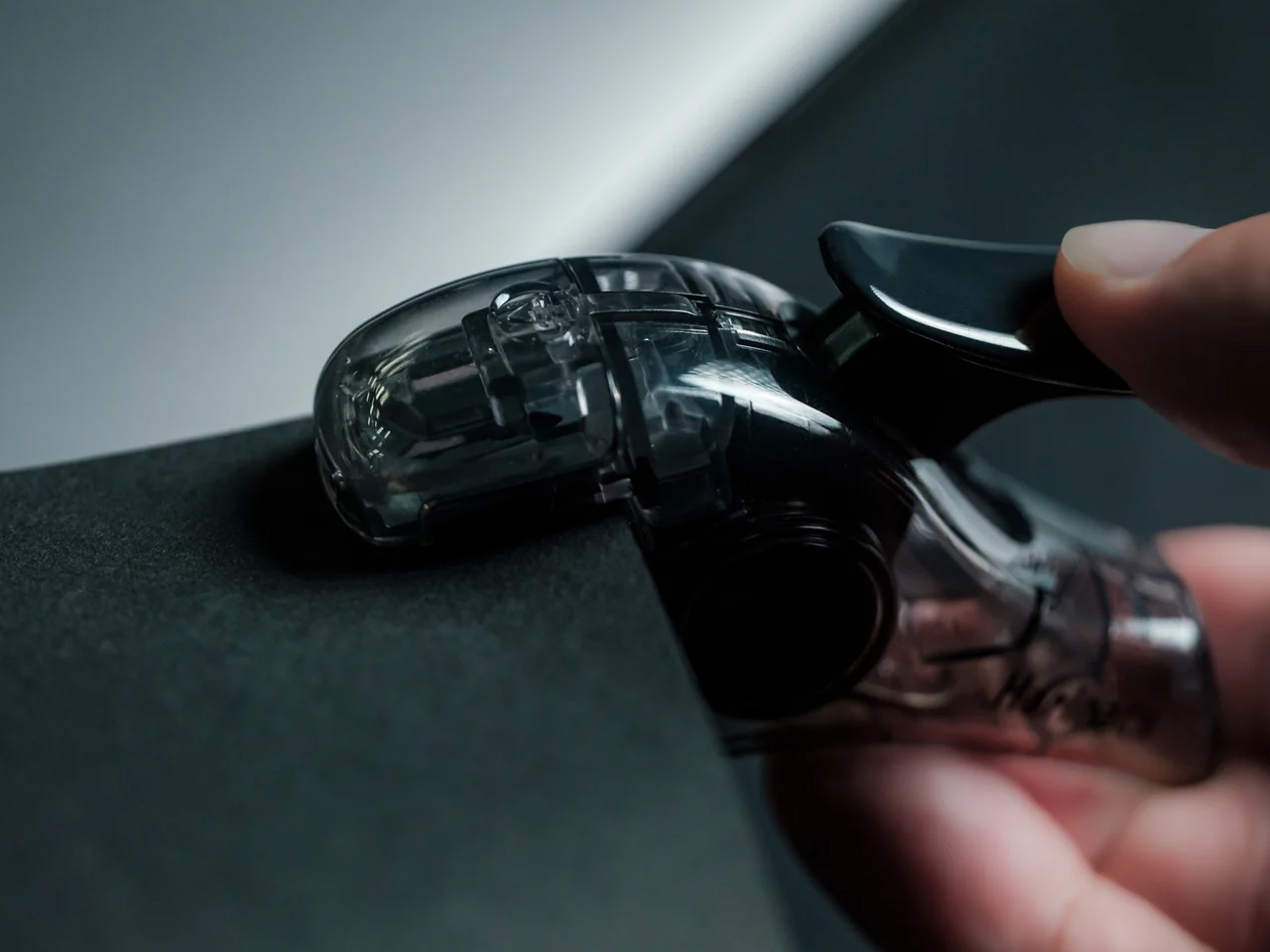
The PaperLock does what every office stapler does – it binds sheets of paper together – but without a single metal staple. Its mechanism punches a wing-shaped slit through the stack, then folds a tab of paper through it, locking the sheets without any metal at all. The bound pages go straight into a shredder without removing anything first. There are no refills to track and no jams to clear. At its most basic, it is a stapler from which the staple has been removed entirely, and it works better for it.
At $35, it’s the kind of object that takes one use to understand and about a week to make you wonder why staplers ever worked differently. For a desk that sees regular light paperwork – receipts, notes, printed drafts – the PaperLock removes the small recurring friction of checking whether the refill strip is seated and whether the jam from yesterday has cleared.
What we like
- No refills, no jams, no metal waste – the mechanism removes three of the four things that routinely go wrong with a standard stapler
- Bound pages shred without any prep, which matters more in daily desk use than it sounds
What we dislike
- The stapleless bind is weaker than a metal staple for thicker stacks or documents that will be handled repeatedly over time
- The mechanism leaves a small visible tab in the paper, which some find less visually clean than a traditional staple puncture
7. Kinto Hibi Cutlery Set
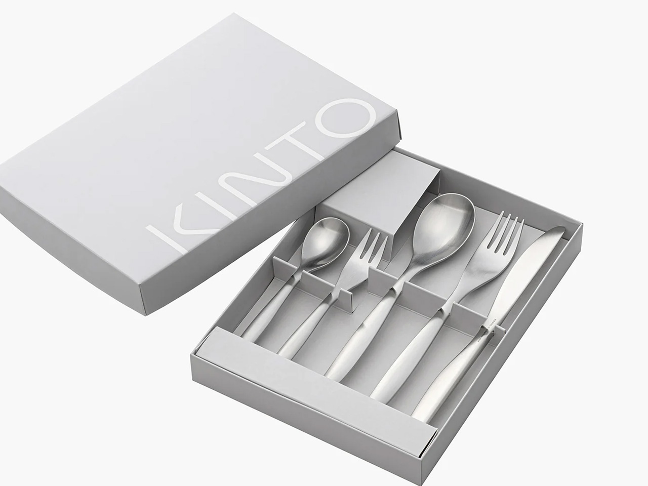
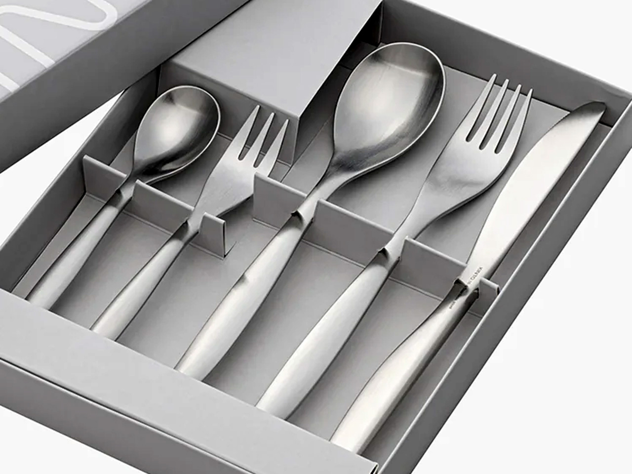
HIBI means “day-to-day” in Japanese, and the name is unusually plain for a product that could easily have reached for something more evocative. The set includes five pieces – two spoons (135mm and 185mm), two forks (140mm and 190mm), and a knife (215mm) – in 18-8 stainless steel. It arrives in a flat box designed to be left out as storage rather than emptied into a drawer. Kinto, the Japanese homeware brand behind it, built the Hibi line explicitly around daily use, not occasion.
At $42.50 for the full five-piece set, the Hibi asks you to stop treating flatware as a category where design stops mattering before price does. The pieces are slim and balanced without feeling fragile, and dishwasher-safe without any protective coating to degrade over time. For a single place setting or a table of two, this is the object that makes a meal feel considered without calling attention to itself.
What we like
- The flat box functions as a presentable storage tray, so the cutlery stays in it rather than disappearing into a drawer
- At $42.50, it is one of the most accessible design objects on this list
What we dislike
- The slim profile feels noticeably light compared to heavier Western-style flatware; it takes adjustment for those used to more substantial pieces
8. Kokuyo Campus Roll
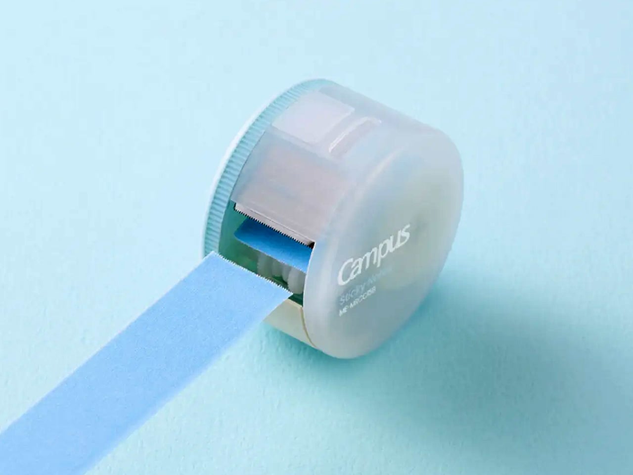
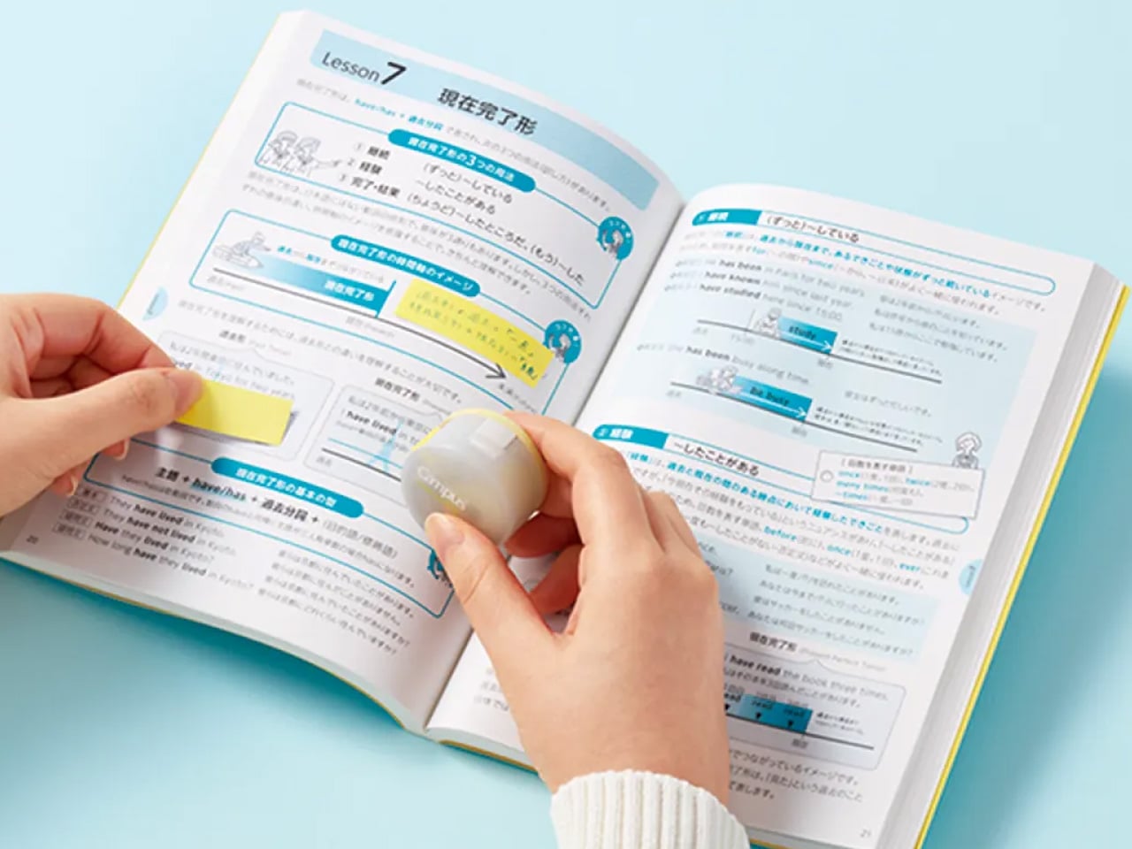
Kokuyo took the sticky note – an object so familiar it’s essentially invisible – and asked what was actually wrong with it. The standard pad format means you always grab more surface than you need, the exposed adhesive collects dust between uses, and there’s no clean way to carry it in a bag. The Campus Roll addresses all three in a case the size of a large coin. Twist the dial clockwise, extend the roll, cut to whatever length the margin requires, then twist back to seal it shut.
The roll is 15mm wide with full adhesive coverage, meaning it stays flat and removes cleanly without curled edges or residue. For annotating textbooks, flagging pages in a reference book, or leaving a note on a shared surface, the format is more efficient than a pad in most real-use situations. JetPens stocks it alongside the refill rolls, so the initial dispenser purchase pays forward over time. For anyone whose desk currently has a deteriorating sticky pad problem, this is the object that quietly replaces it.
What we like
- The cut-to-length format eliminates oversized notes for single-line reminders, a small change that improves desk discipline noticeably
- The sealed case keeps the adhesive surface clean between sessions in a way no standard pad does
What we dislike
- The 15mm width suits margin annotation and short notes well, but is too narrow for longer freehand writing
- Cutting requires a flat surface to work against cleanly; it’s slightly less intuitive in the moment than tearing a pad sheet
The Ordinary, Taken Seriously
What connects these eight objects is not a shared material, price point, or design school. It’s the assumption that the ordinary is worth the effort. Japan’s design tradition has long treated daily-use objects as worthy of the same rigor applied to things people notice more readily. A kettle shaped through hundreds of clay models. A candle that becomes a lantern as it burns. A sticky note dispenser that seals the adhesive shut between uses. These aren’t upgrades. They’re replacements for objects that never quite worked.
Not every object here will suit every desk or kitchen. But starting with one, even the $35 stapler, tends to change how you look at the rest of the category. That’s the quieter effect of good design in daily life. It doesn’t announce itself or ask to be noticed. It makes you realize, gradually, that everything around it could have been thought through with the same care. That realization, once it lands, is hard to undo.