Fever Wireless Charger Has Smooth Lines

muji_feature

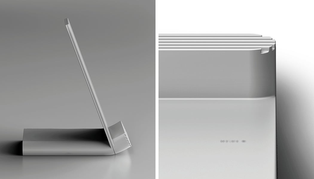
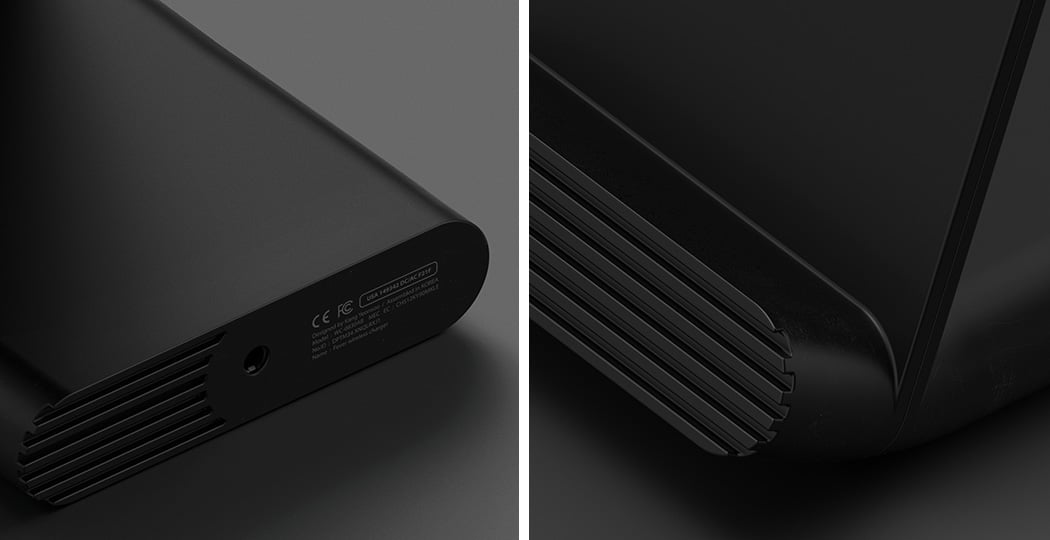
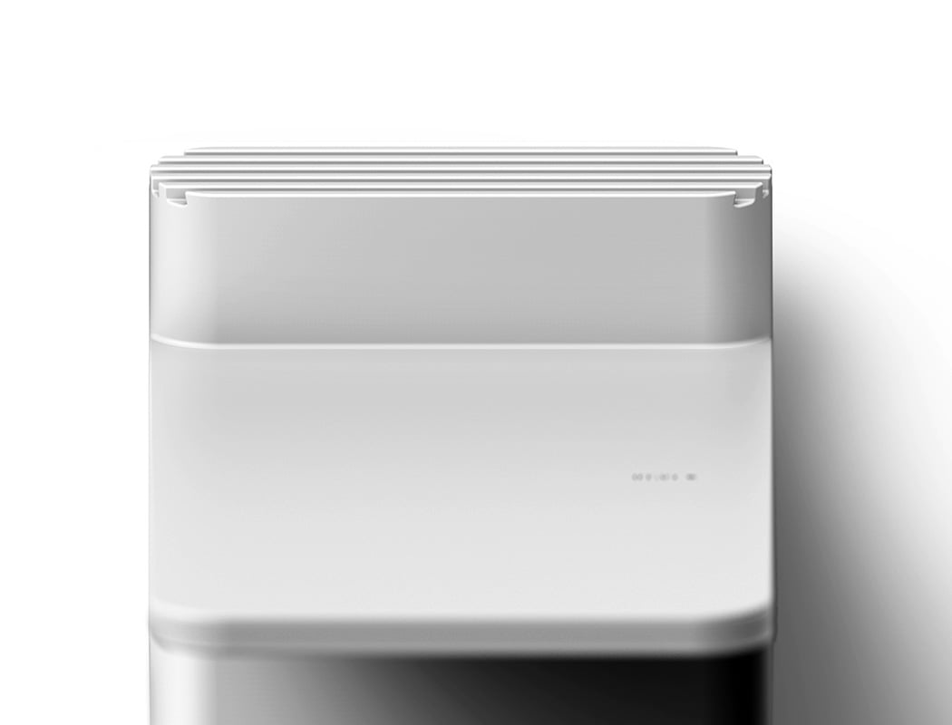
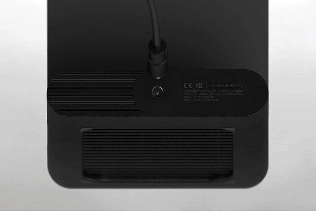
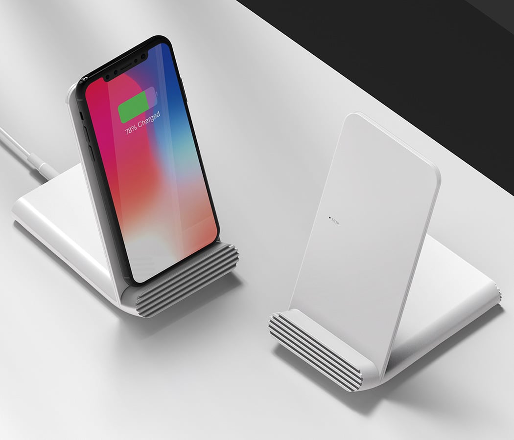
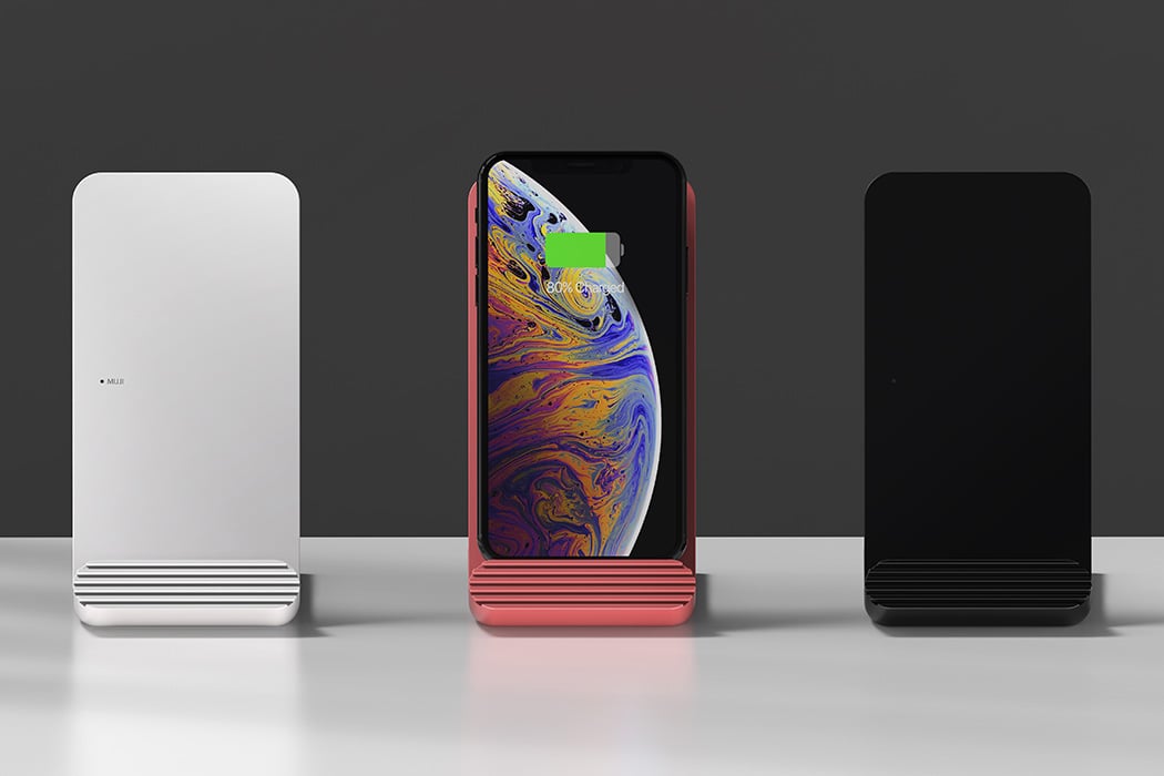
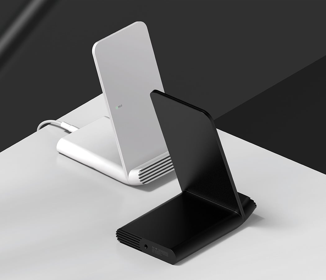
No Idea why the designer calls it the Fever wireless charger, however I understand that the bare-bones design has a purpose of minimalism backing it. The focus of this charger is to charge your phone as efficiently as possible, and keep the frills of ‘added functionality’ out of the frame. The distinct silhouette of lines is to help better ventilation and prevent from over-heating. The fact that it enhances the looks of the charger, is simply incidental.

Designer: Yeon Soo Kang (Joyce Kang)
muji

muji3

muji4

muji6

muji5

muji7

author avatar
Radhika Seth
Radhika Seth is a design and technology writer with over 18 years of experience covering products, innovation, and the ideas shaping design. She serves on the jury of international design competitions, including the iF Design Award, and hosts Yanko Design’s Design Mindset podcast. A former Ogilvy advertising professional, she has also taught Communication and Design Journalism, bringing together her experience across design, storytelling, brands, and media.