Visual Treats
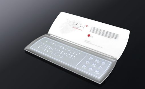
Yummy Tummy! But that ain’t a phone you know; it’s a digital menu card. Snooty waiters and stained-dog-eared menu cards in restaurants are two things that I detest and are a big let-down. Although I hear that some places in the Far East do have a digitalized menu card system, I’m sure it’s not as sleek as this Aygness here. This one’s got features like language options (good for tourists), image representation of dishes, direct order placement to the kitchen, and entertainment tools like news and restaurant trivia. It reminds me of the iPhone, but I’m gonna let that pass. Now only if this means no leaving hefty tips, then it’s worth making a future reservation via this digital menu!
Designer: Yeli Tong


5 Comments »
Lamah says
Looks like a job for Microsoft’s surface computer. Turn meal ordering into a fun group activity instead of making each person in turn pass around some tiny device.
The UI as shown (particularly the tickboxes) looks far, far too small to be manipulated with a clumsy finger. Have the designers ever used a touchscreen?
So the UI is worthless crap, how about the rest of it? Well, what they’ve essentially “designed” is a small box with a touch screen on it. Not exactly earth shattering.
Meliuli says
I’ve been to a restaurant that uses that kind of menus in London. It’s called INAMO. The menu is projected on your table, and you navigate with a trackpad on your right. You can change the background, play games, order your food, see how much will be the bill (in total or only what you ordered), …
I wrote a post about it here, http://www.meliuli.com/2009/05/17/inamo-el-restaurante-interactivo , but it’s in spanish!
It was a really cool experience!
cerberuus says
there is a chain of bars in Czech republic that use a similar system, all your food etc is ordered via a stand in the middle of the table. However it goes one step further. The stand not only contains a touch screen. It also contains 4 beer taps. Thats right you pour your own beer and then pay at the end of the night by the liter. There is even a leader board live updated with all of the other bars other locations in the country – so you can see how your table stacks up to others in the beer drinking stakes !. individual billing is easy to set up. Its an amazing conceopt well executed.
Johan says
A device like this needs a large (backlit if needed) colored e-paper touch display:
- As Lamah has already mentioned a touch-enabled device adds a size requirement to the screen. But not only because it is touch enabled, but also because the user will very likely want to compare several different dishes to find what s/he wants to eat. A menu simply needs the screen real estate. The suggested device appears to be too small. As a sidenote, what I really think would be nice: the ability to “pin” an item to the menu. Meaning when the user turns the virtual page, the pinned items sticks – allowing for comparison even between different pages of the menu. This functionality would be impossible on the unit above.
- Backlight obviously because many locations are simply too dark to allow for comfortable reading of a menu.
- E-paper is a good idea simply because it can take a beating, uses less power and most importantly behaves like paper. Colored e-ink will soon be the commonplace, so even with this tech the menu will still look nice.
-The digital menu device would need touch as this is simply the most natural interface; with direct interaction even grandma can take the order without having to locate or use the outdated stylus.
Trackbacks