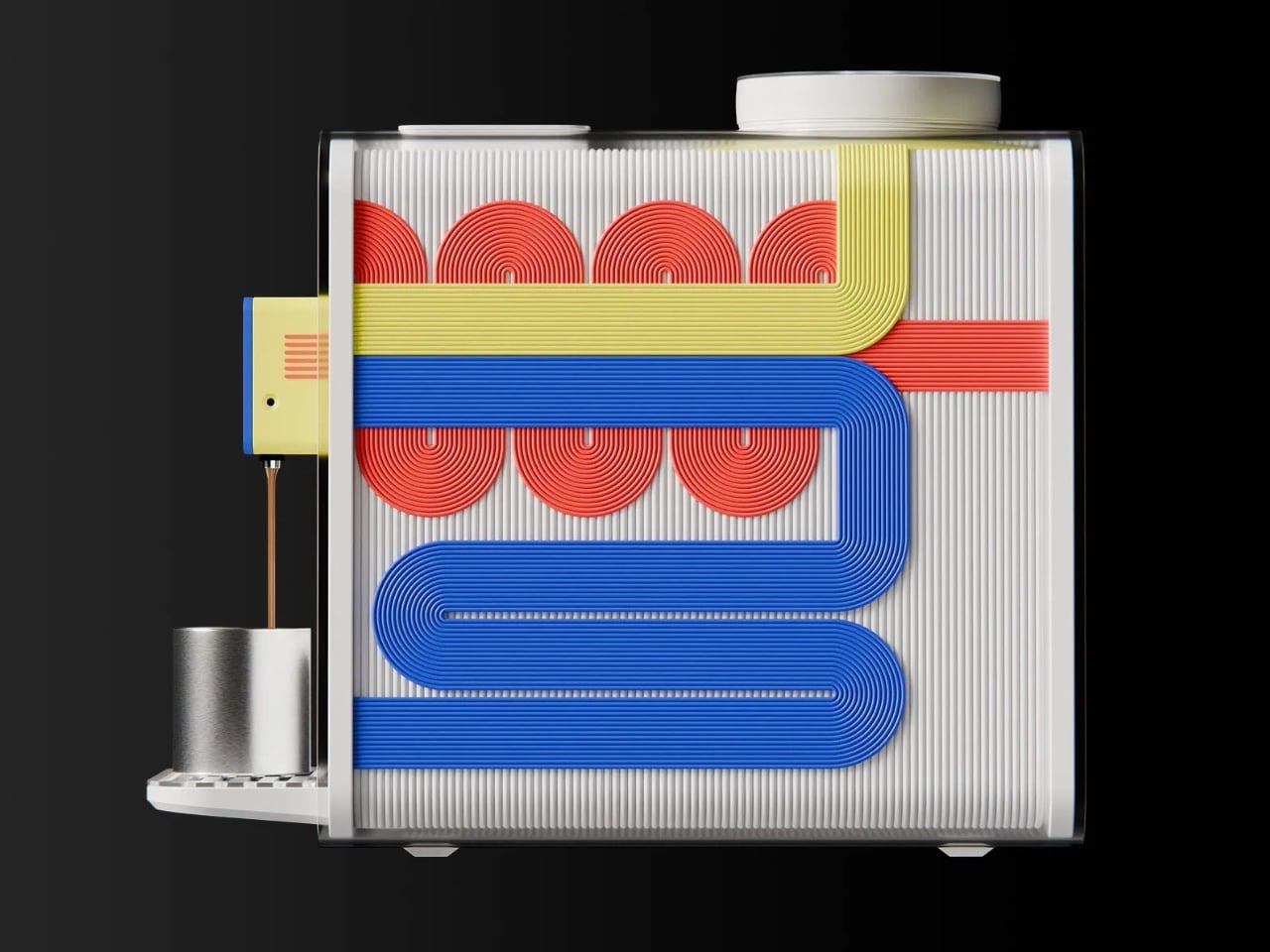
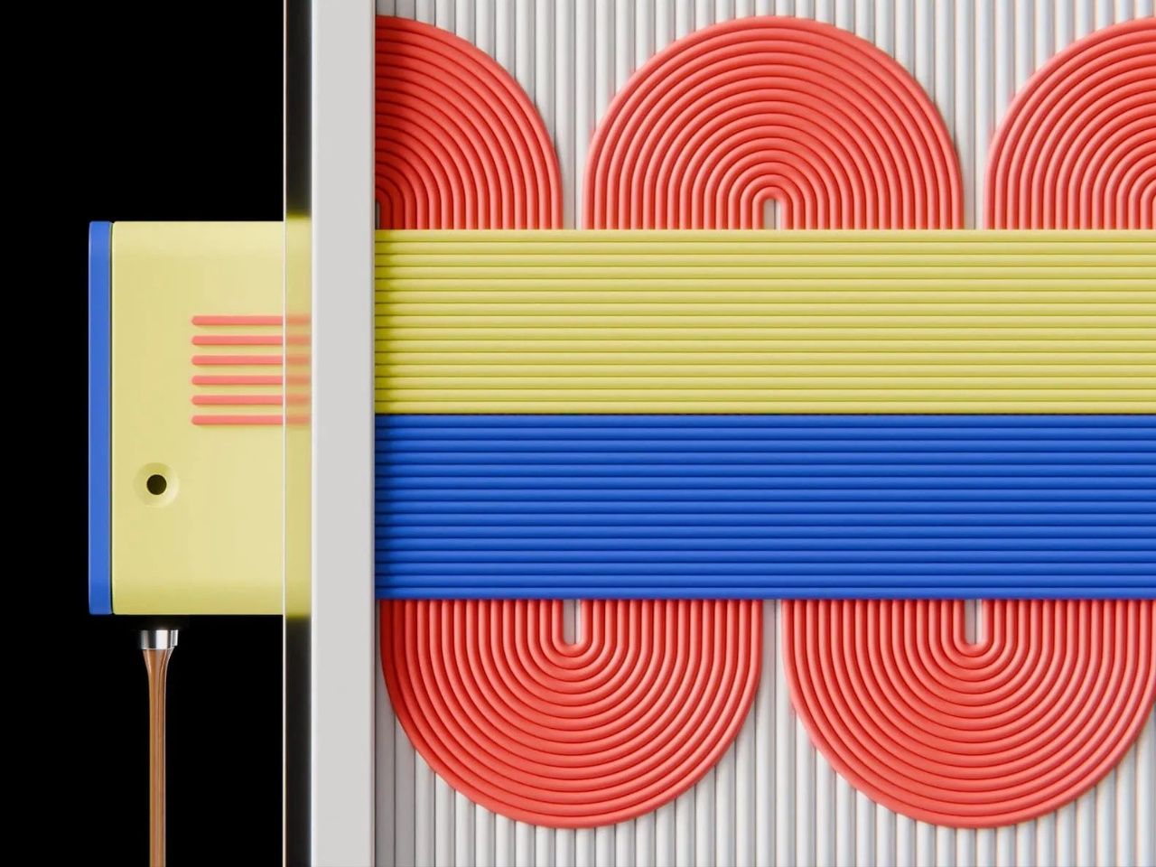
Blue lines double back across a white interior. Red coils sit behind them, while a yellow band bends around the top. Jaka Kordiš’s C+C coffee machine concept turns its internal routing into a graphic composition, visible through a clear enclosure. It addresses a modest but recognizable design problem: a coffee maker can belong to your daily routine without feeling particularly connected to your taste. C+C proposes giving that relationship more personality.
Kordiš developed the project in 2024 during a one-week intensive industrial design workshop led by Aleks Tatic of Taticdesign Studio. Participants started with a predefined coffee-machine technical platform, then identified a user group and designed around its lifestyle and expectations. That constraint makes the result more interesting to me. The assignment concentrated on what design could change around an established technical starting point, rather than claiming a new way to brew.
Designer: Jaka Kordiš
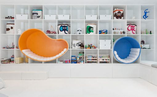
The intended audience comes into focus through Kordiš’s target-user moodboard: electronics projects, coding screens, circuit layouts, and worktables crowded with equipment. It suggests people comfortable around technology in its less polished, more exploratory state. I can see the appeal for someone who enjoys assembling a keyboard or investigating how a device works. That is an interpretation of the imagery, though, rather than a formally stated customer profile.
Viewed from the side, C+C almost reads like a transit diagram. Broad groups of parallel lines travel across a finely ribbed white background, with rounded turns and tightly wound red shapes creating a deliberate rhythm. The transparent housing gives that arrangement room to register. My favorite decision is the restraint of the enclosure itself. With this much color inside, an elaborate outer silhouette would have been a distraction.
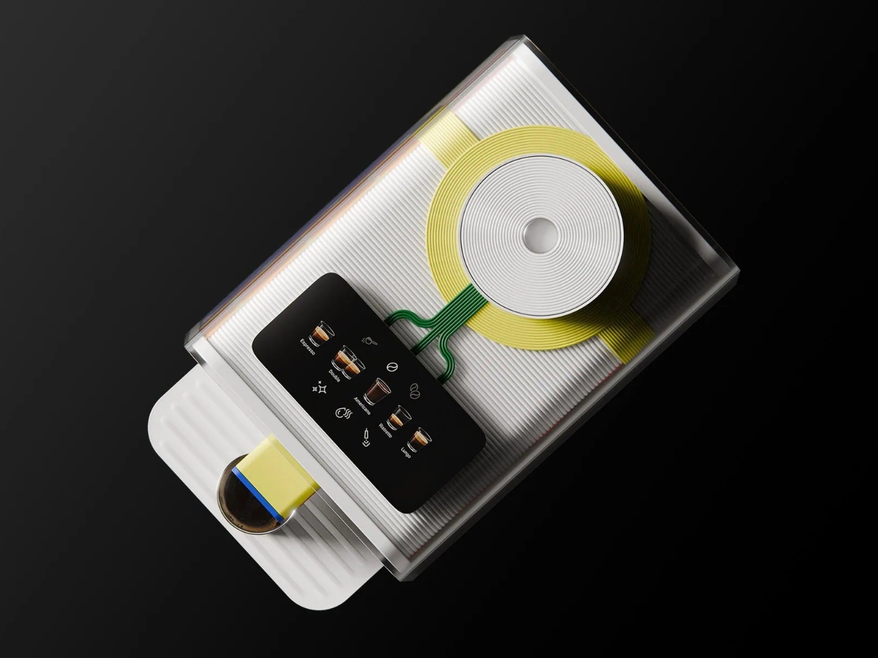
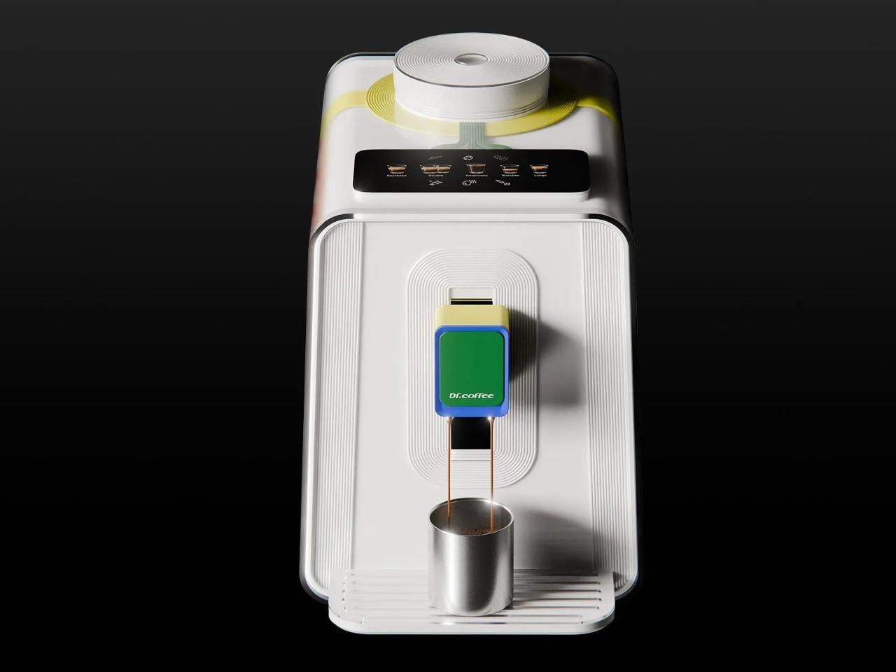
The front is comparatively calm. A projecting dispensing assembly combines a pale yellow body, blue edging, and a green face, positioned above a ridged cup platform. A black panel on the upper surface depicts drink choices, while a large circular white element anchors the top. The repeated grooves connect these areas visually. Even the quieter surfaces participate in the same vocabulary, so the colorful internals feel integrated rather than pasted on.
The project’s transparent-tech moodboard includes phones, earbuds, and handheld gaming hardware with visible interiors. That reference makes sense, but C+C gives the idea a different domestic role. A coffee machine occupies a place you might look at repeatedly throughout the day. For a reader who cares about how everyday equipment looks, the potential benefit is straightforward: an appliance that contributes something visually, even while it is sitting unused.
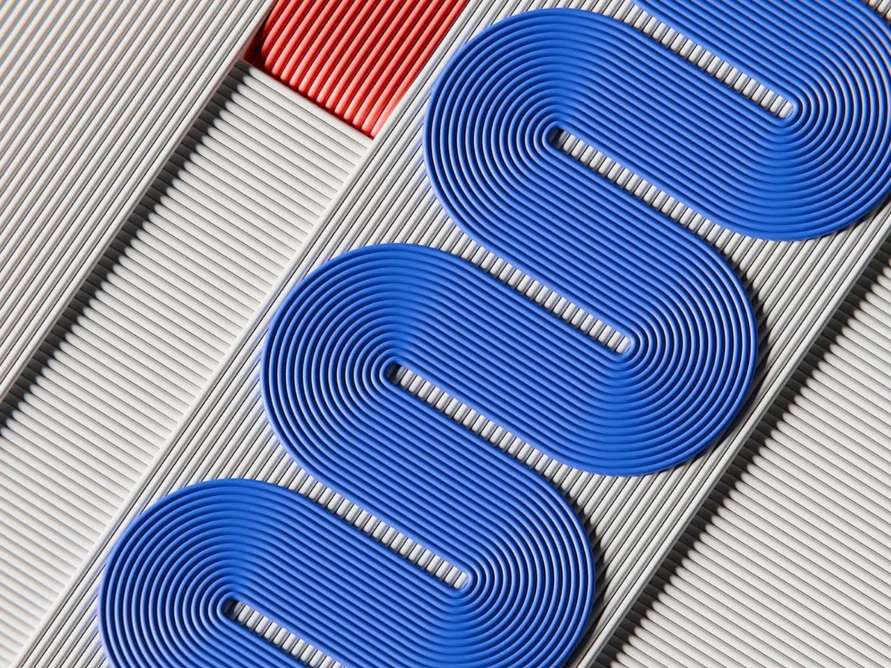
That attention to the interior also earned recognition. C+C won the Logitech Future of Work Award at the Render Weekly Awards 2026. In its announcement published May 11, 2026, Render Weekly specifically praised the treatment of the internal details and cable harnesses. The distinction matters because the award recognizes a design submission. It does not establish that Logitech is manufacturing the machine or that a retail release is coming.
The evidence stops short of establishing everyday performance. The designer’s published project description does not provide brewing specifications, pricing, or retail availability, and it presents C+C as a concept. I would want to know how its enclosure opens, how the machine is cleaned, and whether its carefully composed interior survives the demands of production. Those questions would determine whether the visual idea translates into a convincing appliance.
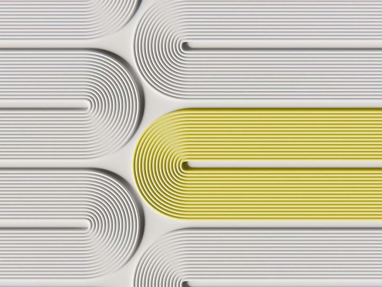
Transparency also raises a useful distinction between seeing a machine and understanding it. The colored routes are engaging, but the images alone cannot tell us what each one does. Nor does visibility establish repairability. A production version could strengthen the idea by making maintenance information as legible as the internal composition. Until then, the clearest reader benefit is aesthetic and emotional, rather than a demonstrated improvement in convenience.
I like C+C most as an argument for paying attention to an appliance’s idle hours. Coffee occupies only part of its life on the counter; the object remains after the cup is gone. This concept gives that presence a purpose. Whether I would want to live with it would eventually depend on cleaning, access, and upkeep, but the visual invitation is already persuasive.