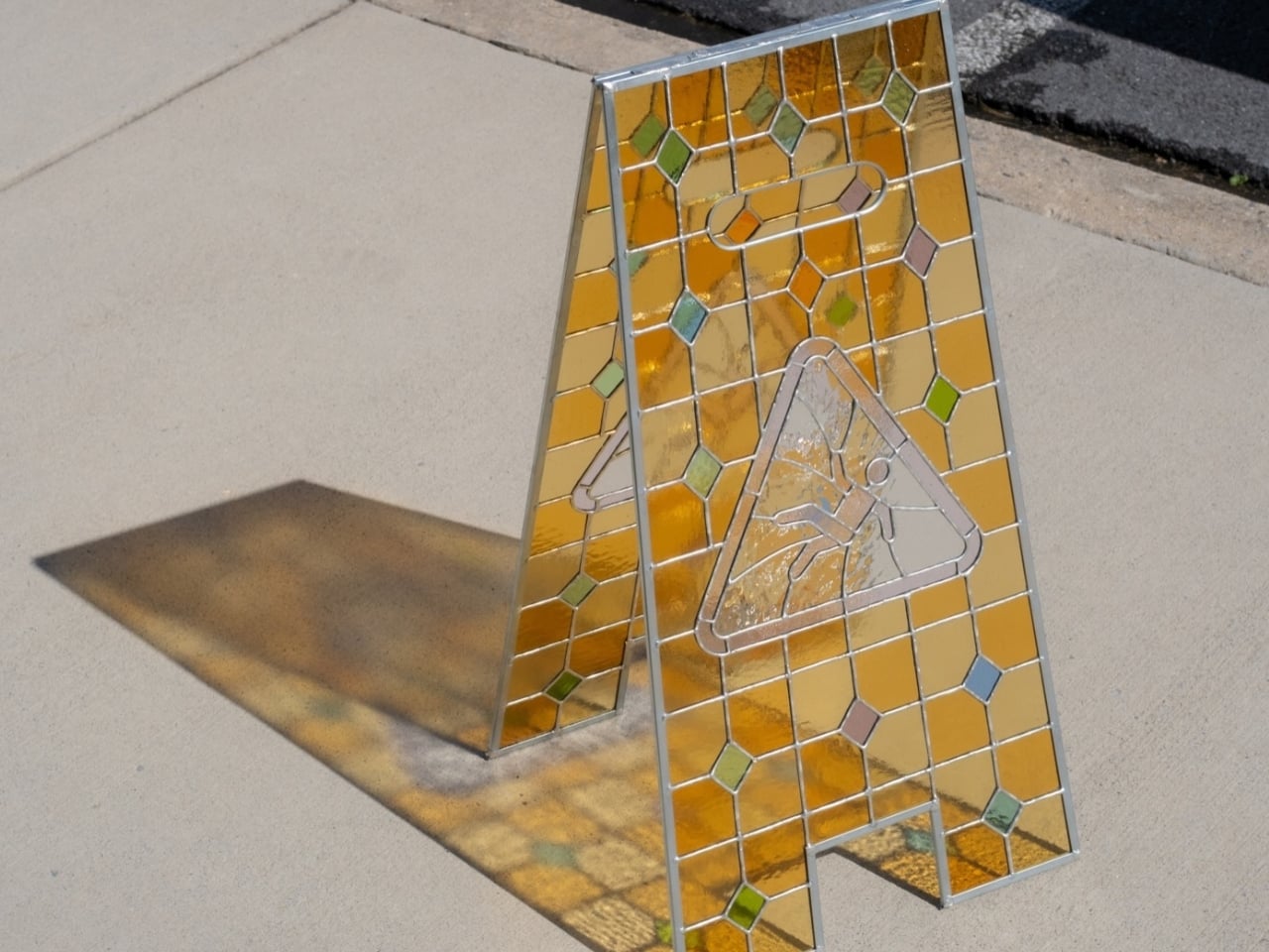
The amber shadow on the sidewalk is almost as appealing as the object casting it. Hayden Clay Williams’ stained-glass caution sign takes the familiar folding silhouette and rebuilds it as a sculpture, with golden panels, small colored diamonds, and a slipping figure enclosed in a triangle. I like that you can recognize the source immediately. The glass hasn’t swallowed the design; it gives you a reason to study its familiar parts.
A conventional caution sign has a straightforward problem to solve: make a hazard visible before someone steps into it. Williams keeps that visual shorthand, particularly the upright stance and warning symbol, while changing what happens when light hits the surface. This is an artwork rather than a demonstrated improvement to safety equipment. Its appeal comes from preserving an everyday sign’s identity while making its construction worth a closer look.
Designer: Hayden Clay Williams
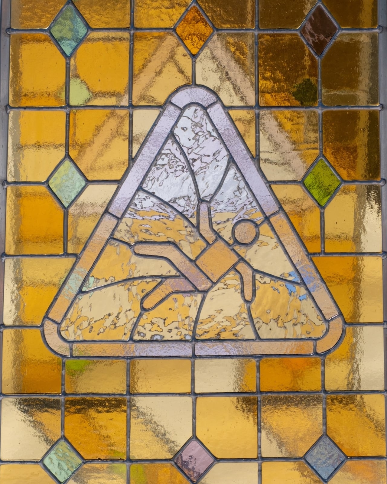
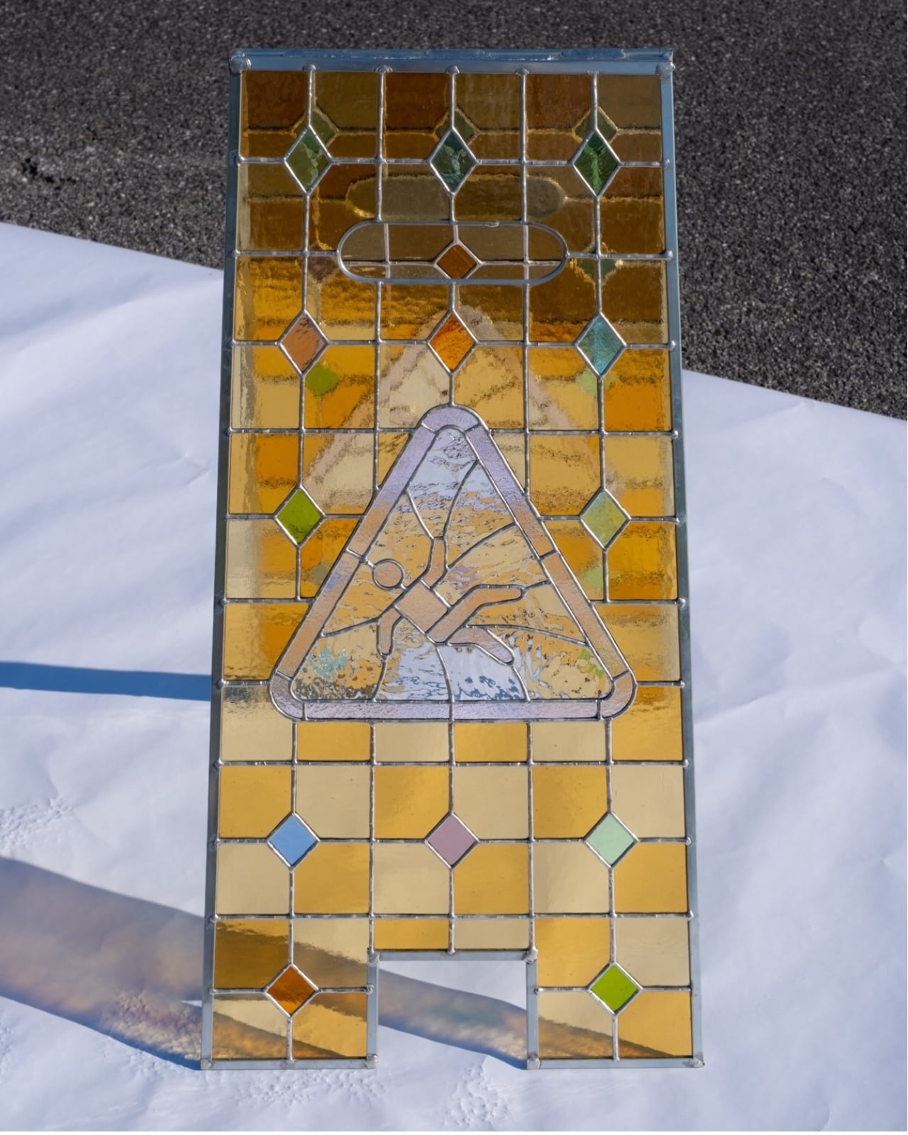
The color does much of that work. Rather than reproducing a uniform safety yellow, Williams uses rectangular sections ranging from pale honey to deeper orange and amber. Their uneven textures break up reflections, giving neighboring pieces subtly different appearances. Small diamonds interrupt the grid in green, blue, pink, and rust. The arrangement reminds me of a decorative window transplanted into the cleaning aisle, with enough restraint to keep the warning symbol from disappearing into the pattern.
That symbol deserves its own attention. The triangular border is picked out in pale, translucent glass, separating it from the warmer background without turning it into a completely opaque graphic. Inside, the tumbling figure is drawn through the network of seams between glass pieces. Its circular head and bent limbs remain readable, but the surrounding cuts make the whole triangle feel integrated into the assembly. The image has been worked into the glass rather than simply applied over it.
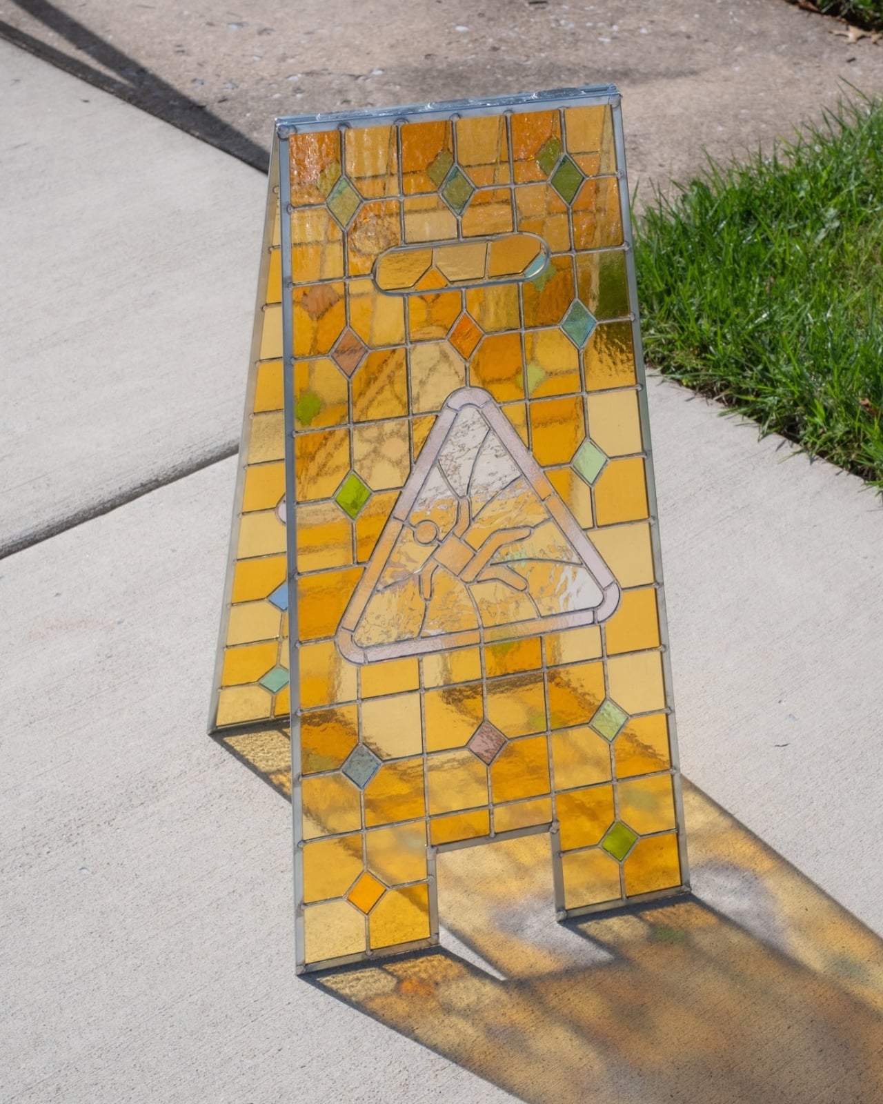
Williams also retains the less glamorous parts of the original shape. There’s the rounded handle form near the top, the slight taper of the panels, and the rectangular notch between the feet. Those details matter because a flat rectangle of decorative glass with a warning symbol would read very differently. Here, the proportions and cutouts carry the association before you’ve examined the central image. Even the slim perimeter frame leaves the sign’s outline easy to follow.
The construction adds another layer of interest. The two stained-glass panels can be separated, giving the piece a physical logic beyond its surface decoration. Joined at the top, they form the familiar freestanding A-frame. Seen at an angle, the space between them becomes part of the composition, allowing the rear panel’s colors and pattern to appear through the front. I appreciate that Williams has treated the sign as a three-dimensional object, rather than concentrating all the effort on one decorated face.
Sunlight makes that depth particularly clear in the photographs. The panels cast warm, patterned shadows across the ground, extending the grid beyond the sculpture’s edges. The darker seams remain visible within those projections, while the glass contributes patches of color. A molded sign normally occupies a small piece of floor space. Here, the light gives it a second, less predictable footprint, one shaped by where it stands and the direction of the sun.
Of course, glass changes the practical proposition. I wouldn’t mistake the familiar handle shape or folding stance for an invitation to put this beside a supermarket spill. The material introduces a need for care that sits awkwardly, and amusingly, beside the warning about falling. That tension feels earned because the object still looks so much like equipment. Strip away those utilitarian details, and much of the humor would go with them.
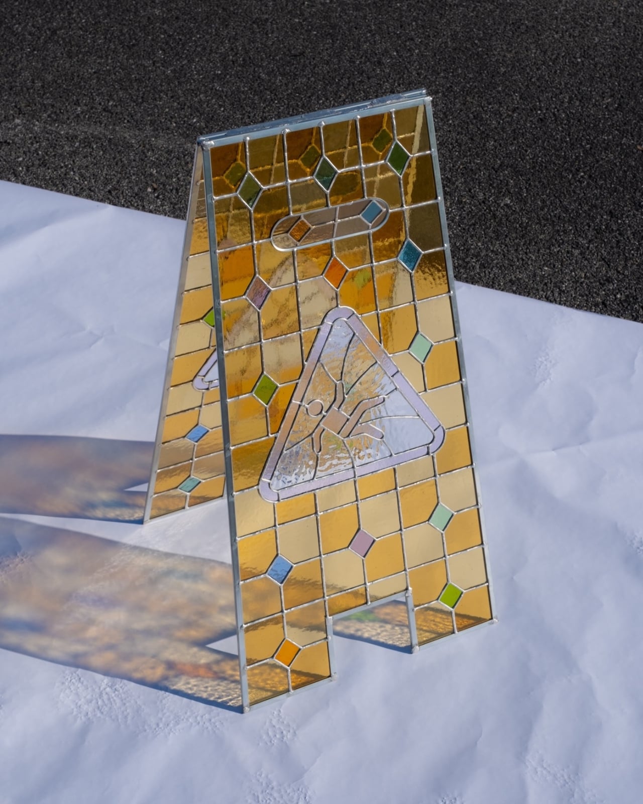
I’d display it with room for the shadow, preferably where daylight could pass through both panels. Placing it against a wall would preserve the pattern but lose some of the design’s best work. Williams has made the gap between the panels, the translucent warning, and the surrounding floor worth looking at together. The sculpture needs a little empty space to show how much is happening inside that ordinary silhouette.