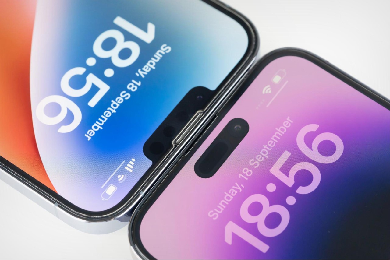
In the six full years that it took to transition from the notch to the dynamic island, I’m sure the Apple team was hard at work figuring out what the next logical step would be. Under-screen cameras had their caveats (camera quality would suffer), and bezels were an absolute no-go. The iPad could get away with a notch built into its relatively thin bezels, but the same bezel thickness couldn’t be carried forward to the significantly smaller iPhone. Then in 2022, Apple revealed the successor to the notch, a more detached notch that they called the Dynamic Island. Its benefit? That it could shapeshift into different shapes and sizes depending on notifications, resulting in a notch that didn’t feel like a compromise.
But information obtained by the folks at MacRumors provides a rare peek behind the curtain of Apple’s design process, and more importantly, what we COULD have gotten instead of the dynamic island. The concepts range from acceptable to downright absurd, with some proposing two notches instead of one! Here’s a look at the 6-year worth of brainstorming at Apple’s design offices before they transitioned from the notch to their now ubiquitous Dynamic Island.
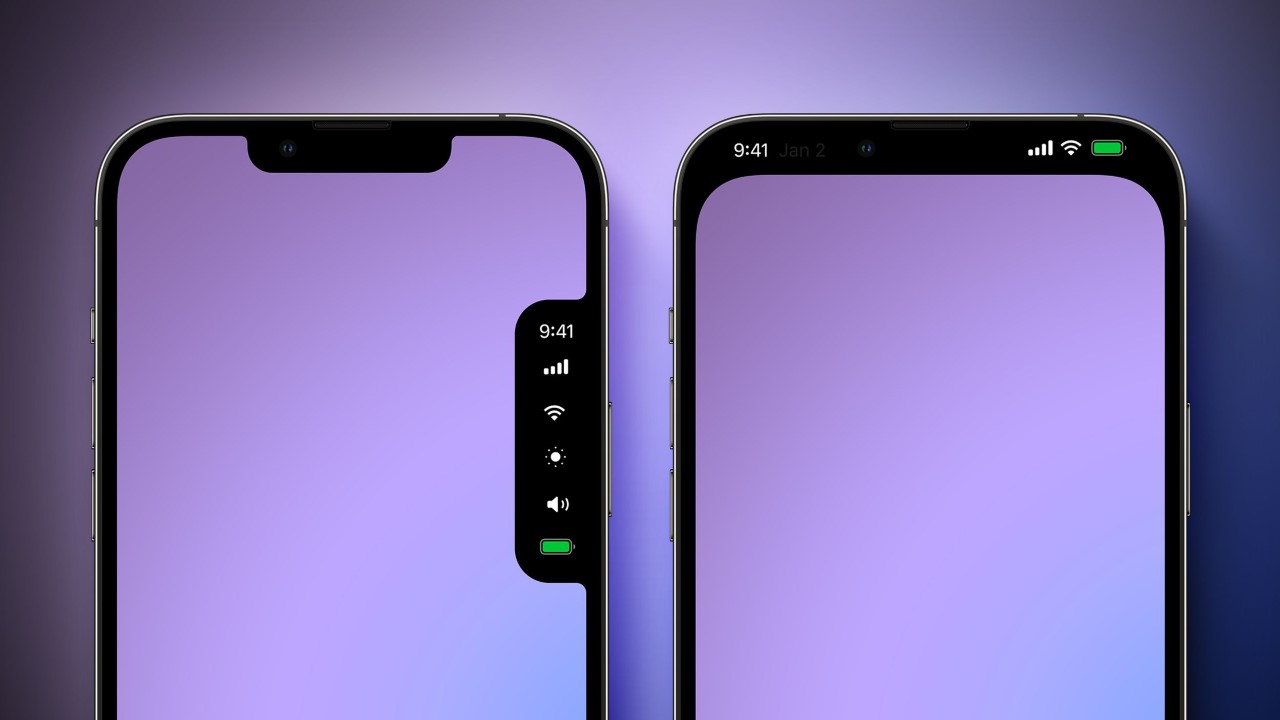
The notch made its first appearance in 2017 with the iPhone X, a commemorative phone to mark the product line’s 10-year anniversary. It soon became a meme, and then a standard fixture for iPhones moving forward, but needless to say, Apple wanted to find a better solution. The first solution was in the form of an extra notch to make the existing notch look more appealing. Visible in the image above (left), this notch would effectively be your control center, but would disappear when not in use. Let’s be objectively clear, I’m glad Apple didn’t implement this because it’s downright hideous. It creates a uniquely displeasing screen shape (even if temporarily), and is an ergonomic nightmare for left-handed people. The second alternative was to black out parts of the screen entirely to hide the notch (top right) – a feature that looked much more acceptable visually, but was a step back for Apple’s zero bezel effort. It, however, would translate to battery savings because the top part of the screen on either side of the notch would remain black for most of the time.
Finally, the company arrived at the dynamic island, but struggled with finding the right way to make it ‘dynamic’. Initial explorations would show dot-shaped icons emerging from the island when in use, while others showed the island transforming into a large block when increasing or decreasing the volume before returning to its original size. This pretty much put Apple on the right track, but they weren’t there yet. Another concept showed the entire island turning into your control center (I somewhat like this if I’m being absolutely candid), while one concept gave the island a second skin in the form of a colored window.
Finally, Apple figured out how to have the island dynamically transform into widgets based on apps and processes, offering something much more elegant than the concepts shown here. However, that’s the nature of the design process, whether you’re a small startup or a trillion-dollar company. You try, ideate, evaluate, fail, and go back to the drawing board over and over till you find something that works… even if it takes six damn years. In hindsight, I’m glad they took that long. I’d take a dynamic island any day over that godawful secondary side notch!
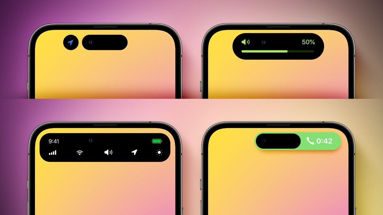
Image Credits: MacRumours