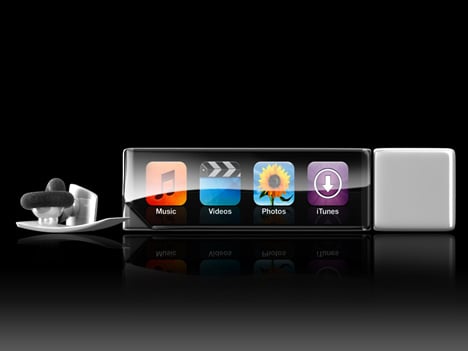
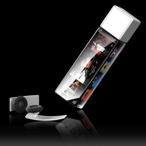
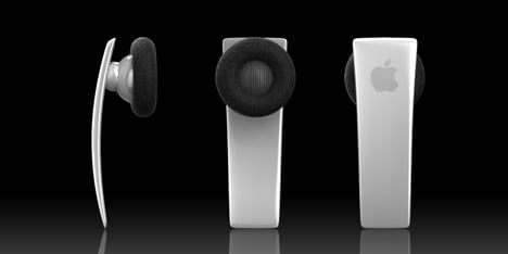
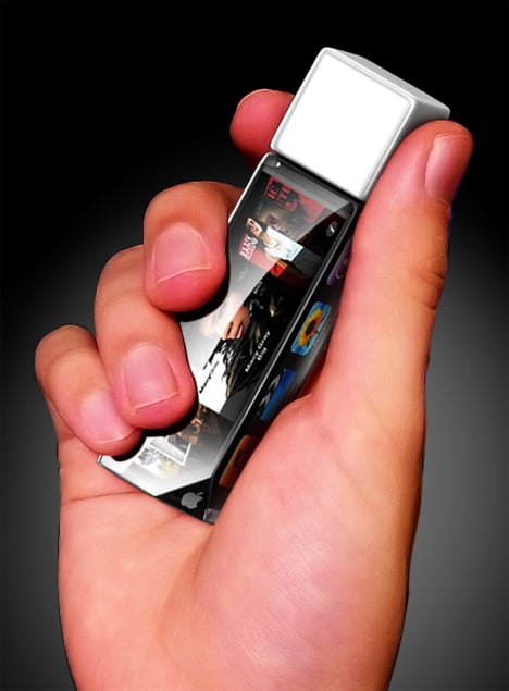
Designer Alexei Mikhailov isn’t out to convince people his iStick concept is the perfect mobile convergence device. In fact he clearly points out the iStick isn’t for viewing movies and the screen is too small for effective photo viewing. What it does have is a visual replication of the iPhone/Touch space inside a device the size of a lipstick tube.
Big square icons and of course Coverflow let you navigate the Mac way. What’s interesting is his surface design. All four surfaces are touchscreens which could present some interesting and unique interface design. The integrated WIFI also enables you to browse iTunes. It’s not an iPod replacement per say. Think of it more as a big brother to the iPod Shuffle.
Designer: Alexei Mikhailov
Why not! I would not mind having a multimedia lipstick! Instead of having the full functionality of an iTouch, it could simply communicate about what makeup is about …
its cute hope this will come,into reality
Each time you pick it up you’ll be launching a program, unless there’s a special locking system…Photos and videos are out of the question.
Looks sleek though! Makes me wonder what the next iPod Shuffle will look like.
Good to have for the gym. It would be nice to have an FM receiver too so you could tune into the TV when you are working out at some of the nicer gyms.
If this would be like the new Shuffle so to speak, I’d probably pick one up. They look sweet,
I’m still waiting for Apple to add a screen to the shuffle. It would be nice not to have guess to find the song you want.
ok ok people ya this would be cool but this would have to be the update for the nano because the shuffle s just suppose to be as small as possible
but no screen cause theres not point with how little they hold.
but ya this is an awesome idea other than the lipstick. I’ve been designing a new iPod that I want to show to apple that is kind of like this
There is a reason there is no screen. It’s the same reason it’s called the shuffle. If it had a screen why call it that when you could then pick what you want? They wanted to bank on a cheaper apple product for the masses. It’s a great idea- Take the screen off to save bank on the manufacturing, then market it as a “shuffle” only iPod. They will NEVER put a screen on a product marketed as a shuffle. DUH!!!
The shuffle was a stupid idea in the first place. I want to know exactly what song I'm going to listen to next without having to go to my computer every time, or writing it down on paper. This is a brilliant design, and I would much rather buy this than a shuffle.
This is douable only issue is apple has to design a single line web interface that would spread across the screen so you could scroll like the contact list in the iphone for info. This is a possibility.
i think this is a great idea, but a few things
1. to small to view videos
2. why cube shape? that makes it more comlicated, if it were just flat, thatd be nice
3. how many people actually put pictures on their ipod?
4. whats with the one eared headset that looks like a cell phone head set, unless this thing can take calls or act with voice command, get me two ear headphones
5. itd be awsome if it could take calls
I don’t really get the white cube
the white cupe is the part that holds the computer chip.
The white portion is probably supposed to be a removable USB cover. The unit would plug directly into a USB port just as some existing players do.
The white stick makes sense to me – so that there is a place on the unit that you can hold without activating the four touchscreens….
I think that the cube is there so you can turn the touch screens. That way, you pick which screen is touch enabled.
looks pretty decent, but to me, it looks kinda too fat :/
I NEED THAT ONE
WHAT? IS THE RATE
that’s interesting.
Nah.
if i see another ” iproduct” for apple, i’m gonna flip out!!!!!
seriously, there is a whole world of good design outside of Apple.
wake up people!!!!!!
if i see another ” coomenter” abusing designers, i'm gonna flip out!!!!!
seriously, there is a whole world of good design you don't need to get angry about.
wake up people!!!!!!
AWESOME DESIGN there would be a very interesting interface on this wouldnt it be cool if u were able to view pictures (thought they would be small) and drag it around the whole thing and a game like those balls that go through a maze!!!
Apple should be paying attention to Yanko Design.
This is a revolutionary concept that takes full advantage of space and technology while presenting a visually appealing multimedia kit.
Kool!!
screen on four sides is ridiculous, unless you have a hollow head with four inward eyes
there are some delusional people here
Quit being an idiot. You don't need four eyes to look at ONE SCREEN AT A TIME.
This is such an impressive design! I really like the idea of having just a screen to play with on such a small area of space. The only thing is that the cube shaped width might be a little too bulky if you were going to put it in your pocket. Maybe if it didn’t have all four sides as touch screens, and just a back and front screen where you could flip it over. More of a slim, usb shape.
I love the earphones too! No obnoxious cords always getting tangled! A fantastic solution- a really sleek design.
Lipstick? From the picture I saw in the “Best Of February”, it looked like an iTouch Shuffle or something. Not a very big fan.
When the minimalist iPod fashion to do?
wooow kerenn /cool
I need this to tease my friends..so cool!