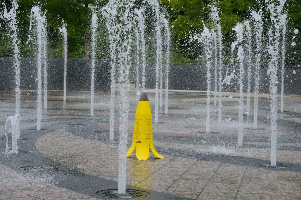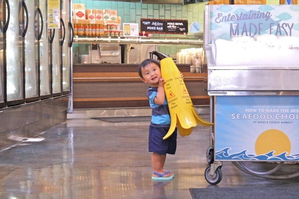
The sad reality is that caution signs are not particularly cautionary. They’re designed to be visible and legible, but the human brain, burdened with information from everywhere, has a tendency to prioritize information based on necessity. So while in theory, bold warning signs are designed to get noticed, they do get noticed… but get pushed to the back of the mind jut as fast too.
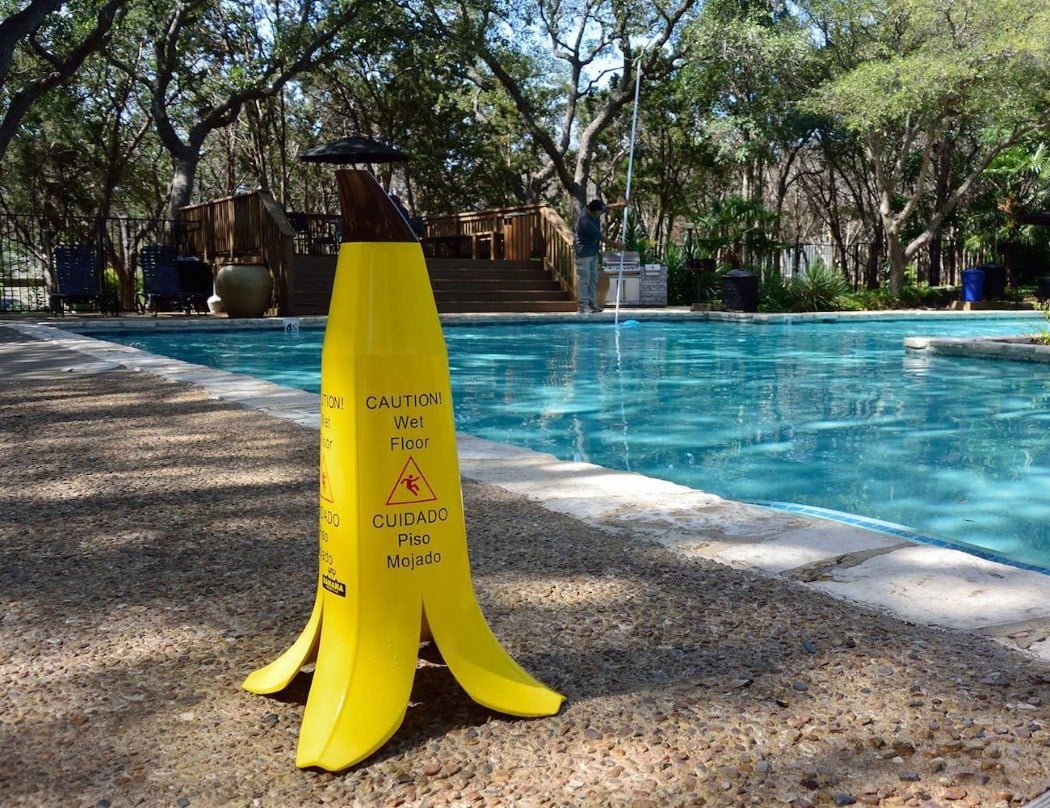
Product design, and a quirky sense of humor could however make signs more noticeable and therefore save lives. Look at the Banana Cone for instance. You’d probably have your head buried in your phone, walking across a wet floor if there was a regular yellow sign placed there, but not with something as hilariously creative as this banana peel shaped warning sign. The visual metaphor for slipperiness – the banana peel, plus the yellow/black contrast of caution signs make the banana a perfect pick for being a mascot for this slippery floor sign. Plus, get this. Studies show that a quirky sign like the Banana Cone is 88% more noticed and registered, as compared to standard floor signs. Who knew slapstick comedy could inspire effective safety products?!
Designers: Patrick & Kevin Brogan
![]()
![]()