Most clocks announce the time whether you asked or not. Digital displays blink at you in red or blue, counting down like they’ve got somewhere better to be. Even a classic analog face, the kind you’d find above a mantel or in a hotel lobby, still demands you stop and decode two hands sweeping past a dozen numbers. It’s efficient, sure, but it’s also a little relentless. Time gets shoved in your face instead of simply existing around you.
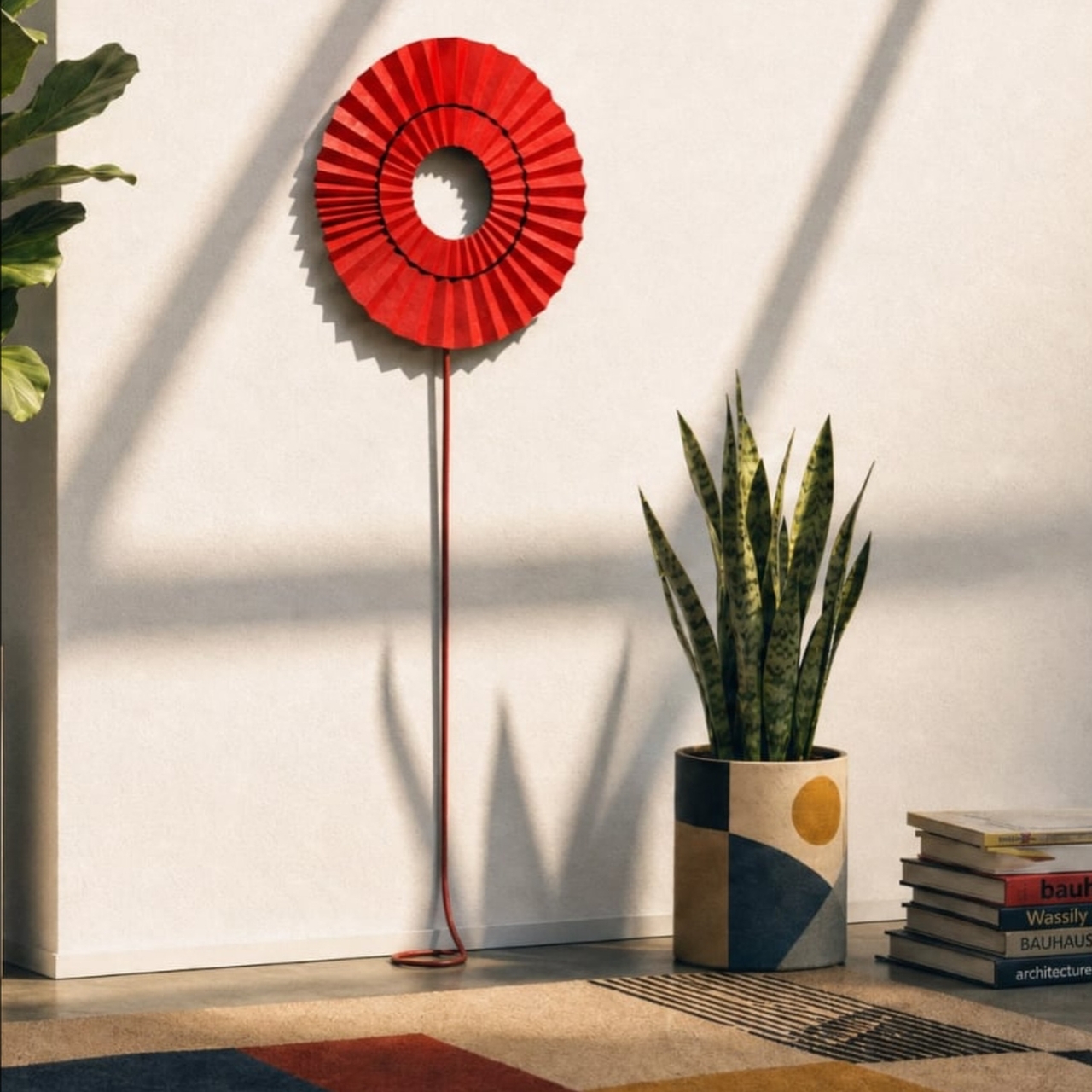
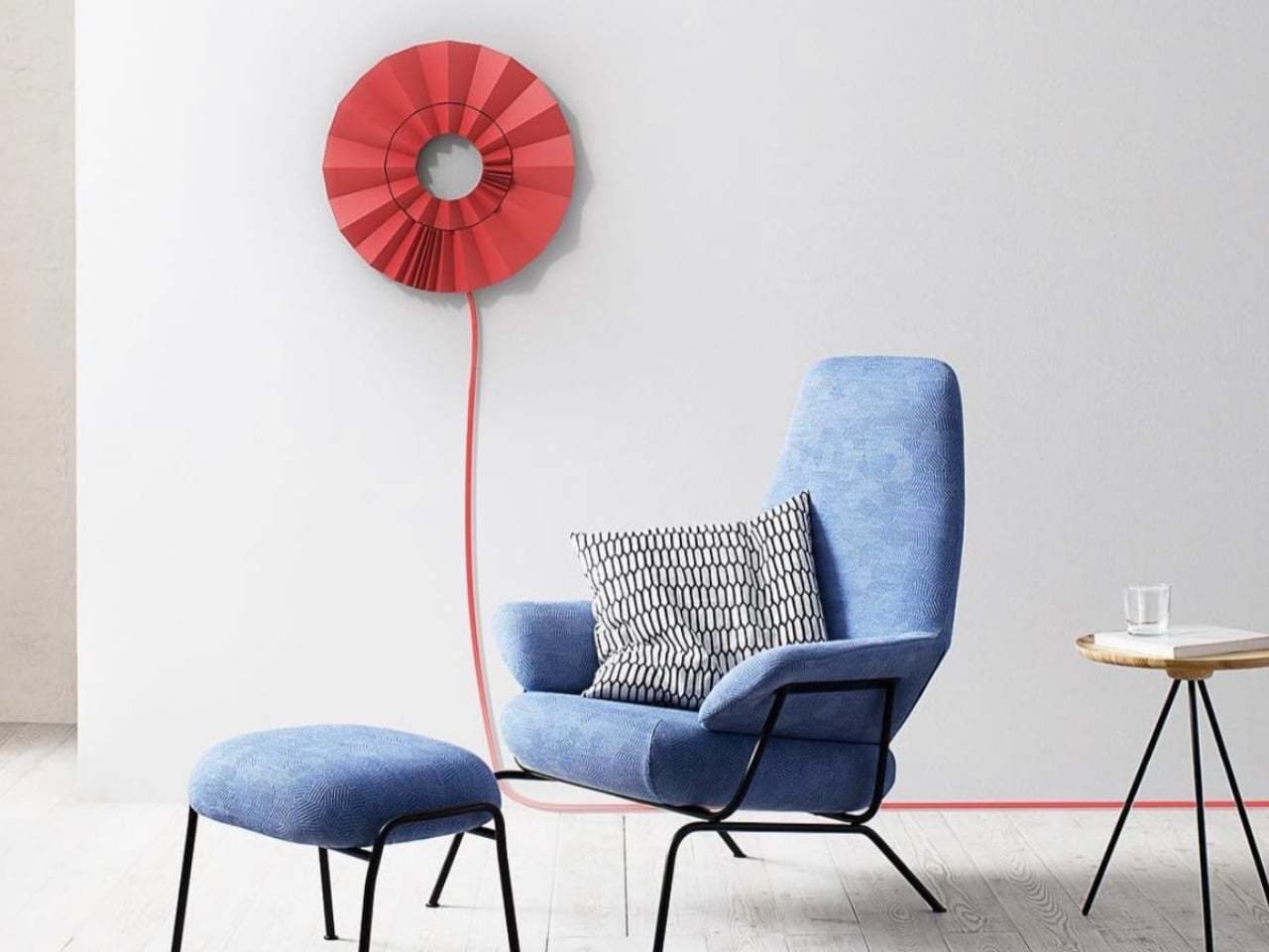
Mauricio Romano’s corrugated paper clock takes the opposite approach. There are no hands. No numbers. No glowing digits. Instead, a pleated disc of paper, folded like an oversized fan or a flower caught mid-bloom, hangs on the wall with a colored cord trailing down from its center. A hidden magnet inside nudges individual pleats open or closed to mark the hours, so the clock doesn’t tell you the time so much as it lets you notice it, if you’re paying attention.
Designer: Mauricio Romano
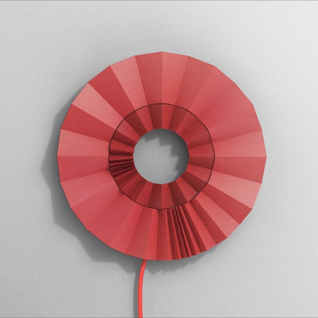
Romano first sketched this idea more than a decade ago as a design student, back when he was exploring his own synesthesia and how shapes could stand in for things that usually live in other senses. That early version, called the Geometry Clock, used triangles that shifted to represent numbers once you learned the logic. This corrugated version feels like the same instinct, matured. Instead of geometry you memorize, you get folds you feel. The mechanism is quieter, the material is warmer, and the whole object reads less like a gadget and more like a piece of kinetic sculpture that happens to keep honest time.
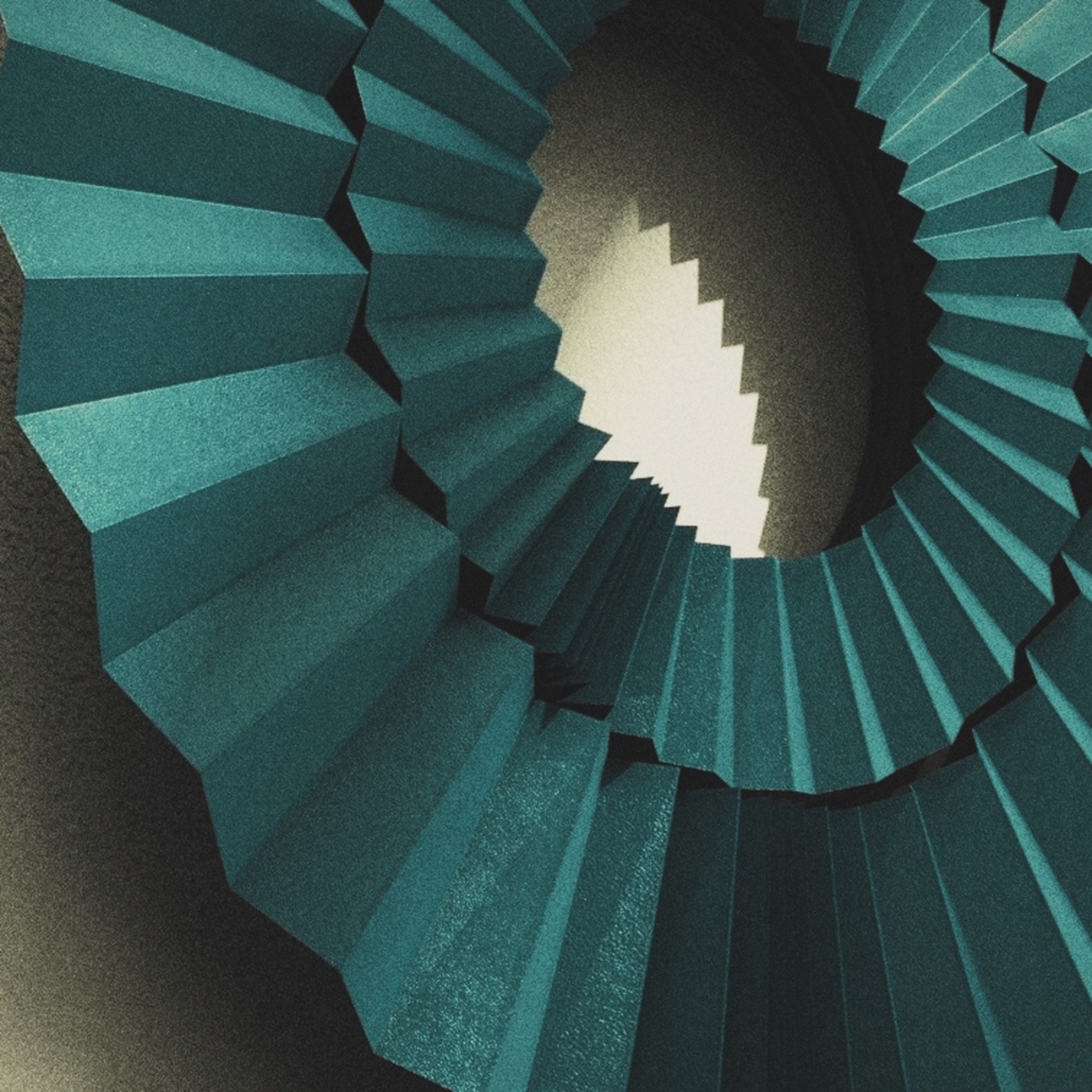
What actually gets me about this piece is the material choice. Corrugated paper is cheap, disposable, the stuff of shipping boxes and school projects. Romano folds it into something that looks closer to a paper lantern or an accordion caught in a gust of wind, then colors it in deep red, cobalt, teal, and a dusty terracotta that all photograph beautifully against a plain wall. It’s the kind of object that could sit in a design gallery just as easily as a living room, and it doesn’t apologize for being decorative first and functional second.
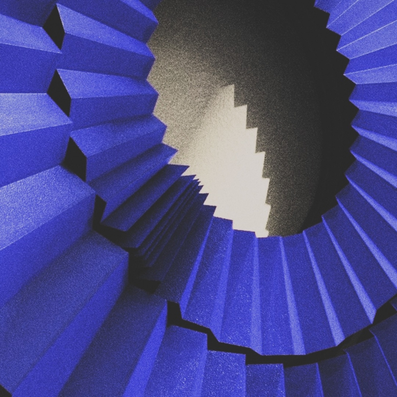
That ordering matters. A clock you have to study for a second before you understand what hour it is isn’t a clock built for glancing. It’s built for living with. You walk past it a dozen times a day and maybe don’t register the time at all, and then one afternoon you actually stop, trace the folds, and realize it’s later than you thought. That small delay, the beat between seeing the object and understanding what it’s telling you, is the whole point. It turns timekeeping into something closer to noticing the light change outside a window.
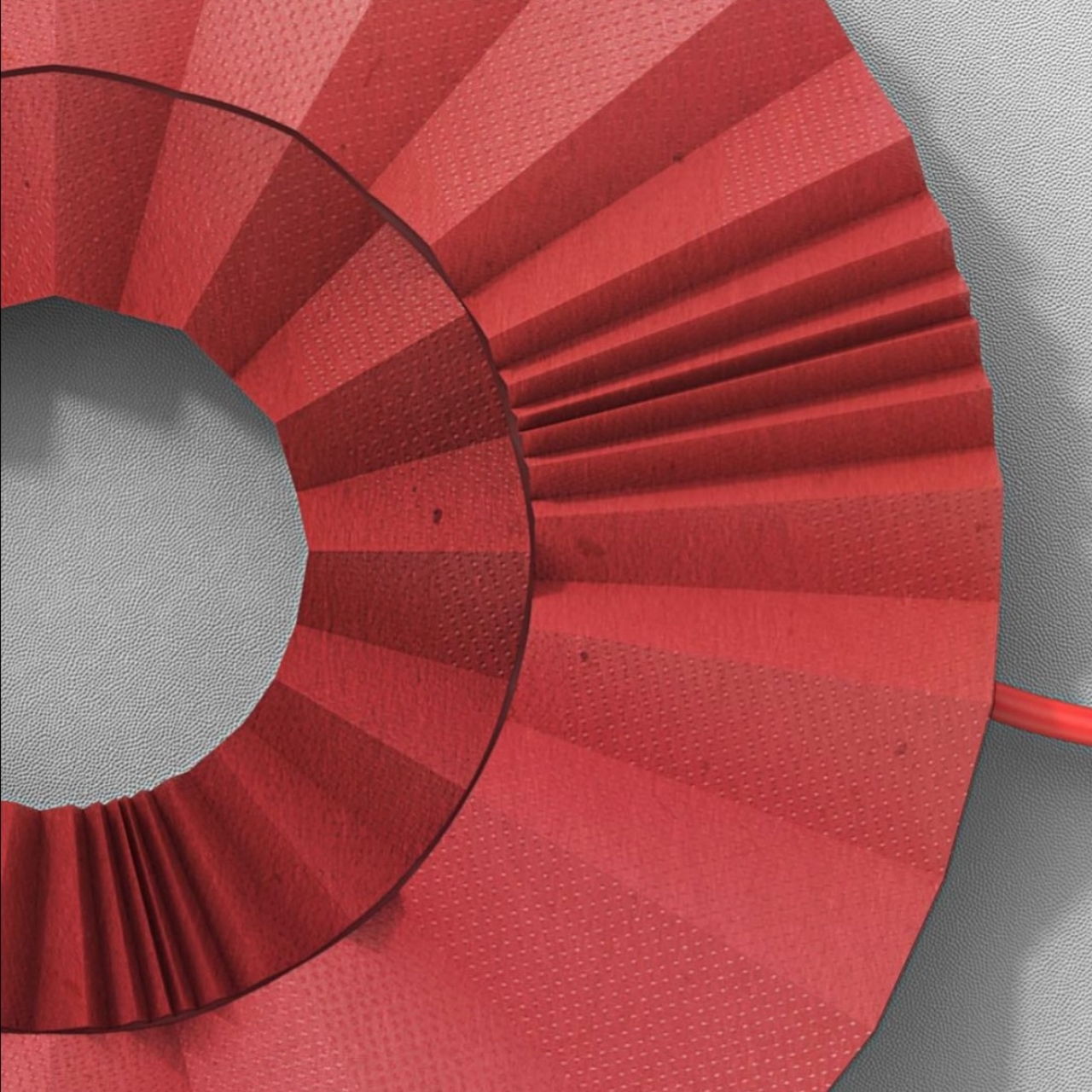
There’s an argument that this makes the clock less useful, and that argument isn’t wrong. Nobody is checking a corrugated paper sculpture to catch a train. But plenty of design right now is chasing that same tension between object and instrument, blurring the line until function becomes almost secondary to the experience of owning something beautiful. A speaker that looks like a piece of pottery. A lamp that looks like folded silk. This clock belongs to that same family, and it makes its case well.
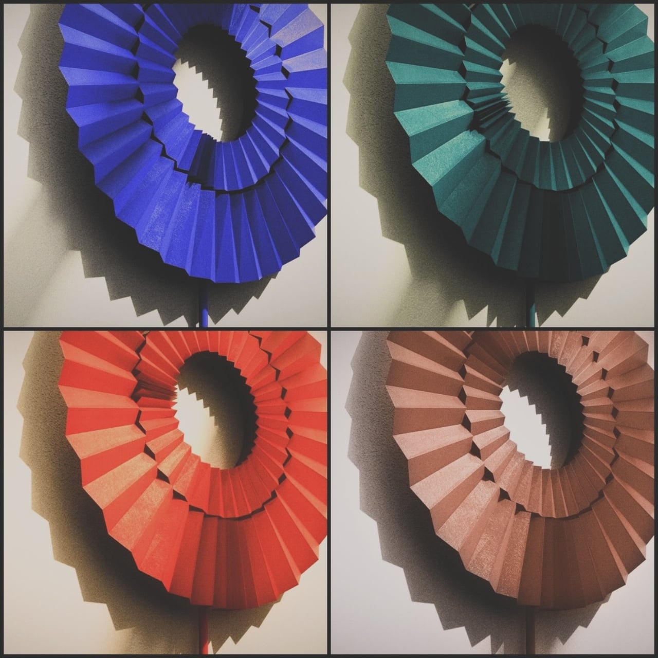
As of now, Romano’s corrugated clock exists mostly on Instagram, shared in different colorways without a confirmed release date or price. It might stay a study piece, the kind of concept that circulates and inspires without ever hitting a shelf. I hope it doesn’t. A wall clock that refuses to shout, that asks you to slow down and read folded paper instead of glancing at a screen, feels like exactly the kind of quiet object worth having in a house full of louder things.