I’ll admit, I hate the notch. I see it as a necessity, and I acknowledge its presence (with red-hot hatred), and I’m sure you do too, but I promise you from this moment onward, you’ll look at it differently. Very differently.
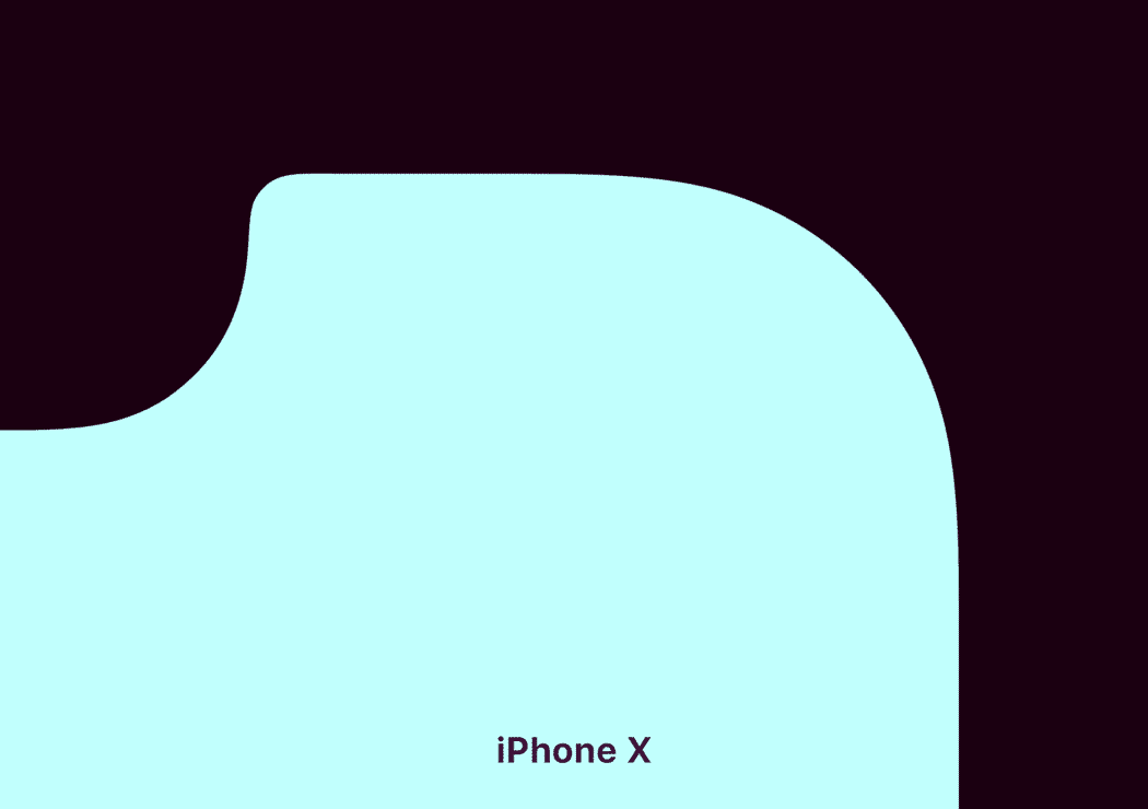
What’s the notch? Or even the screen for that matter? A couple of straight lines meeting at right angles which are then rounded off, or beveled to look aesthetic. That’s what your eyes will have you believe, and honestly, as an industrial designer, that’s the most obvious solution. But when has Apple ever been the company to do the ‘obvious’? Interaction Designer Brad Ellis (and a few designers before him) picked up on a certain detail while closely analyzing Apple’s official design resources. Not a single radius was a true radius, and the notch you look at was in fact, an inverted trapezoid.
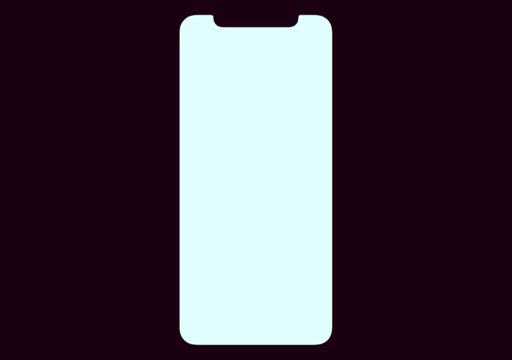
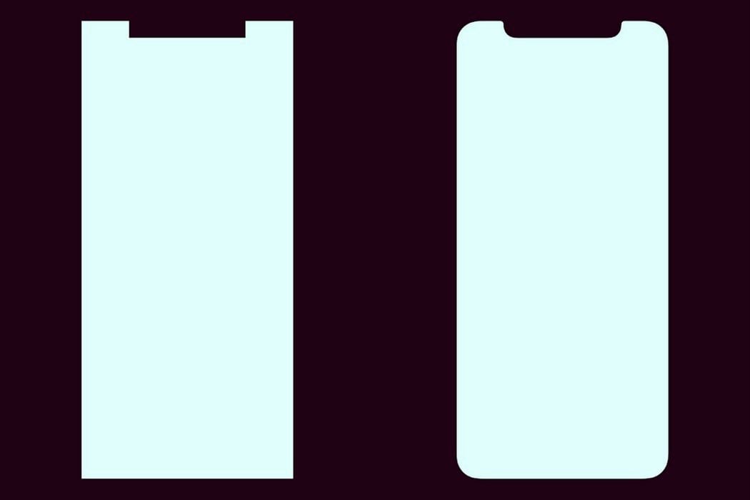
That right there above you, is the screen schematic for the iPhone X. Below you is the screen schematic placed beside its most simplified form, aka, the form you’d build before applying radii. Let’s move on.
Look closely at the image below and the gif below. There is a difference in curvature, and Apple moves very far from simple fillets/radii. What you’re looking at is a Squircle, a shape that Apple has increasingly begun adopting as an alternative to basic fillets. They do this not only because they’re a company devoted to the art of aesthetic beauty, but also to stand out from the rest. The Squircle, unlike two lines with a curved corner, is much easier on the eyes. “A ‘secret’ of Apple’s physical products is that they avoid tangency (where a radius meets a line at a single point) and craft their surfaces with what’s called curvature continuity.”, says Industrial Designer, Mark Stanton. Squircles can be found on most of Apple’s products today, from the corners of their Macbooks, to the iPad, to the iPhone, to even the Apple Watch. It made its digital debut in iOS7, when icons started employing the Squircle instead of the rounded rectangle. You’ll find some images below to show you the subtle yet rather important difference.

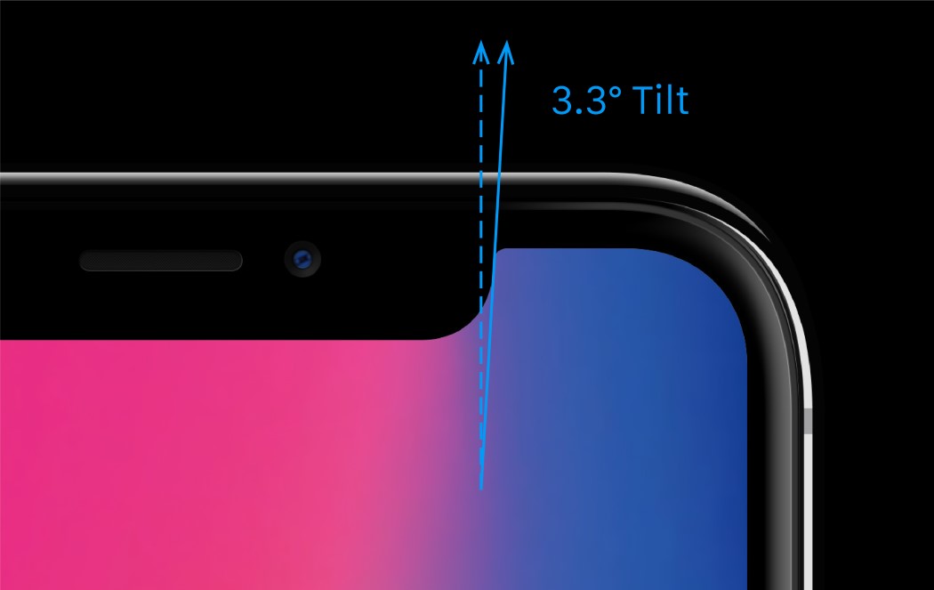
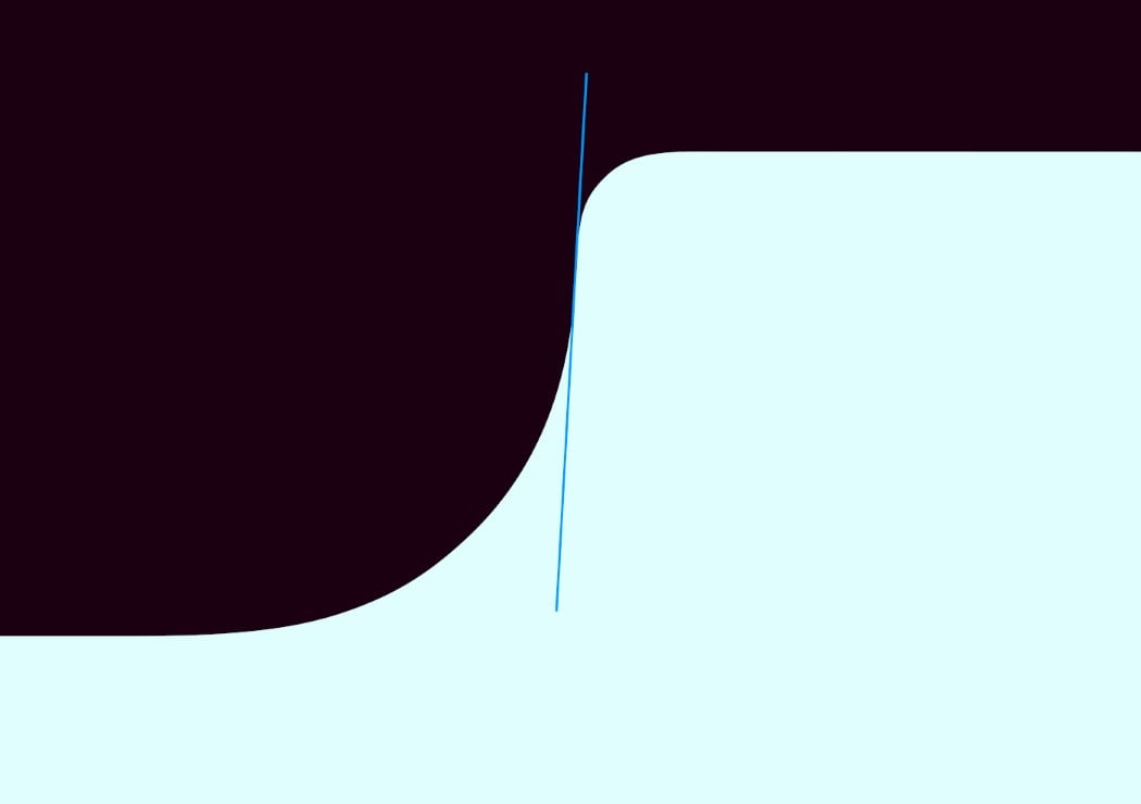
Now onto the notch. Inverted trapezoid, as I called it earlier. The notch on the iPhone X employs zero vertical lines. In fact, the line you think is vertical, is actually at a 3.3° tilt (so if you’re a UX designer, make sure you watch out! P.S. be sure to use only Apple’s official design resources for your work!), thanks to Apple’s need to be visually pleasing. Because of the curve falloff, one curve doesn’t complete before the next one starts — they blend seamlessly into each other. As a result, no tangent line on this edge actually hits a perfect vertical.
The Squircle, it can be argued, is probably the reason why Apple’s products look so visually pleasing. The highlights on the corner of the iPhone’s Piano Black variant follow through beautifully with visual continuity that one takes for granted, but is actually the result of a lot of sweating at Apple’s design labs. While I admit that the notch on the iPhone X is far from ideal, Apple’s work with geometry and details is definitely worth taking a page from. It has consistently pushed out products that embody a certain ethos of being a class apart, and has streamlined that approach to reflect in not just the hardware, but also the software. The result? Products that look beautiful and subconsciously simple but are often far from it… and now you know why!
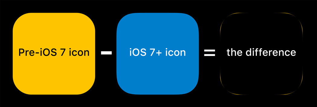
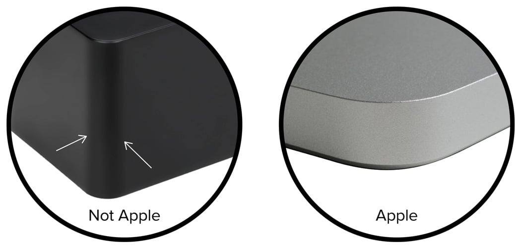
Image Credits: Brad Ellis & Mark Stanton
You can read the original piece by Brad on Medium and Mark’s breakdown on Hackernoon