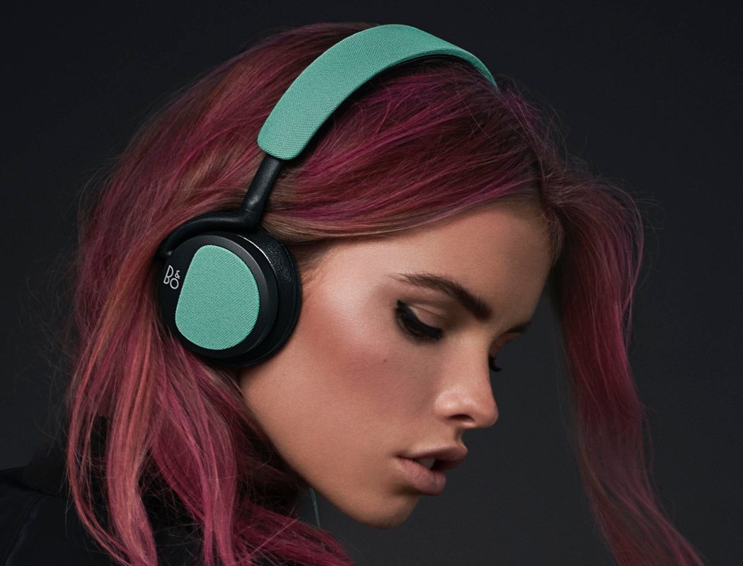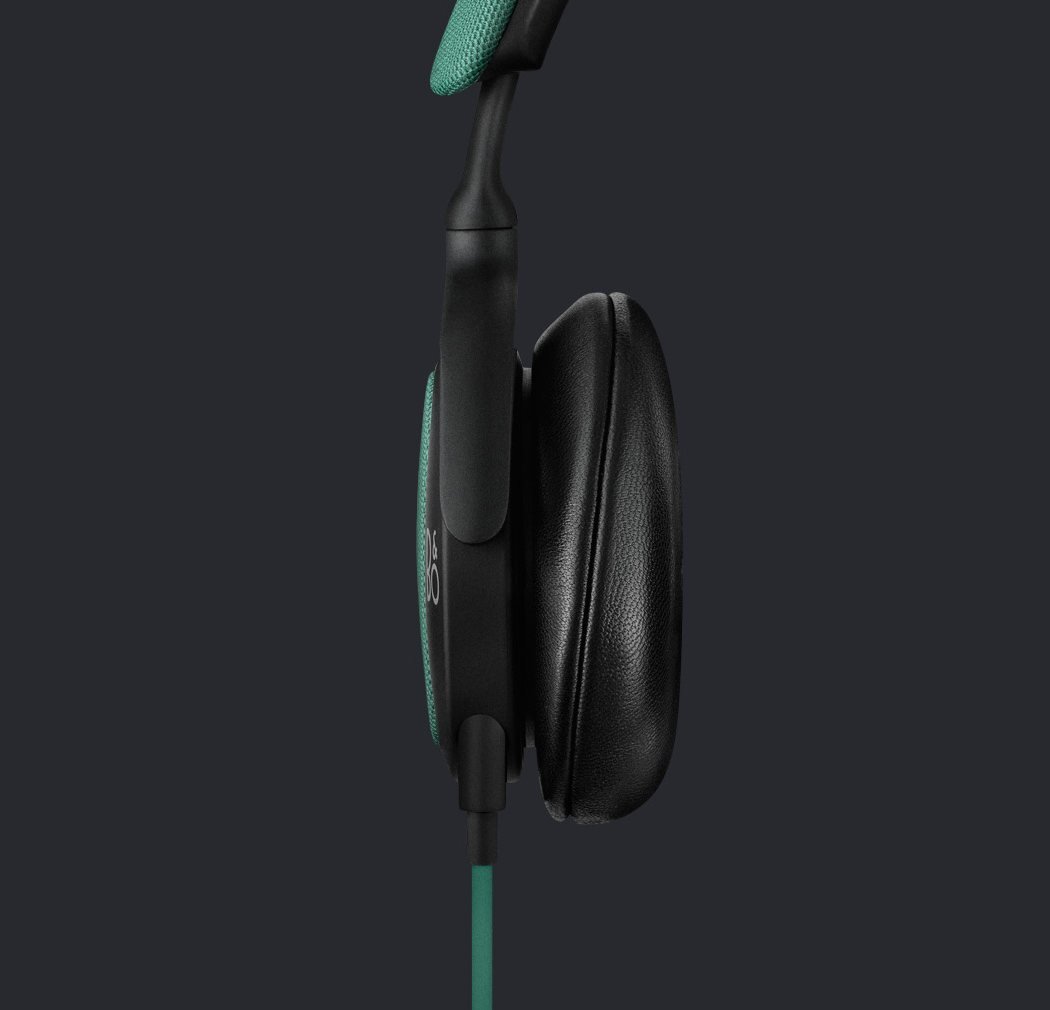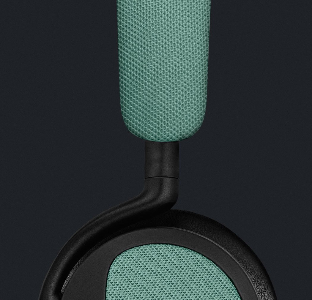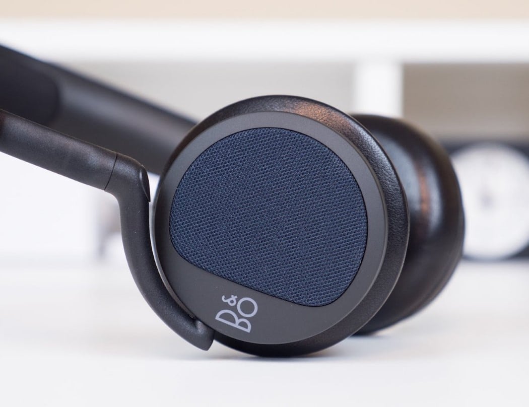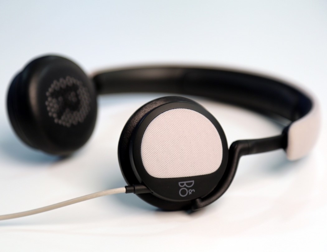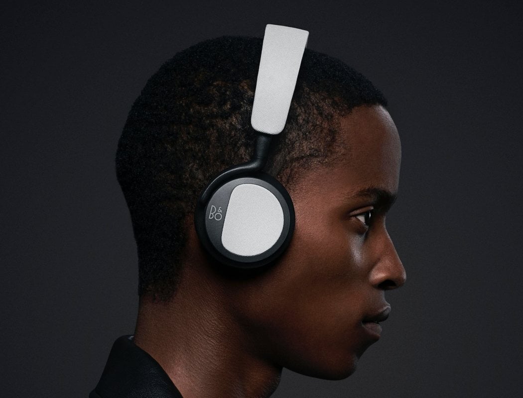
Even with the Beoplay H2’s somber design aesthetic, there’s still an invisible energy to it. If you haven’t noticed, it’s because of the clever way they managed to put in an exclamation mark into the design of the headphone itself! Do you see it now??
The design makes it look that the wearer has an exclamation hovering near/above their head in a way that makes it look like the wearer is surprised by how good the music/sound quality is. It’s a neat trick industrial designers, graphic designers, and packaging designers rely on to promote a certain image along with the product while bringing a smile to the users or the viewers. Remember the delightful packaging for the Panasonic Note earphones from back in 2010??
Designer: Bang & Olufsen
![]()
![]()