If you’ve ever felt like the AirPods Pro case looks like a dental-floss box, you’re not the only one. The AirPods debuted in 2016, rapidly rising to occupy the #1 place when it came to TWS earphones, but the case sort of feels like an afterthought. It’s clunky and doesn’t really sit well with Apple’s design philosophy of sleekness, so designer Iván Antón decided to redesign it to make it sleeker and more memorable-looking.
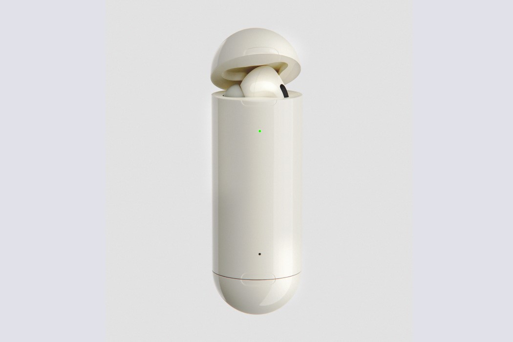
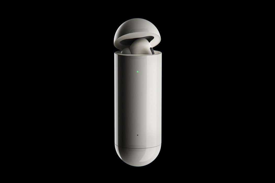
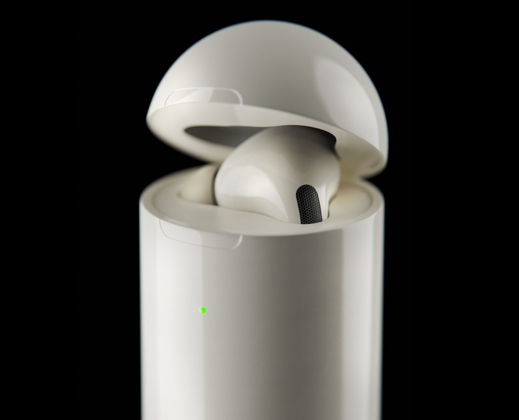
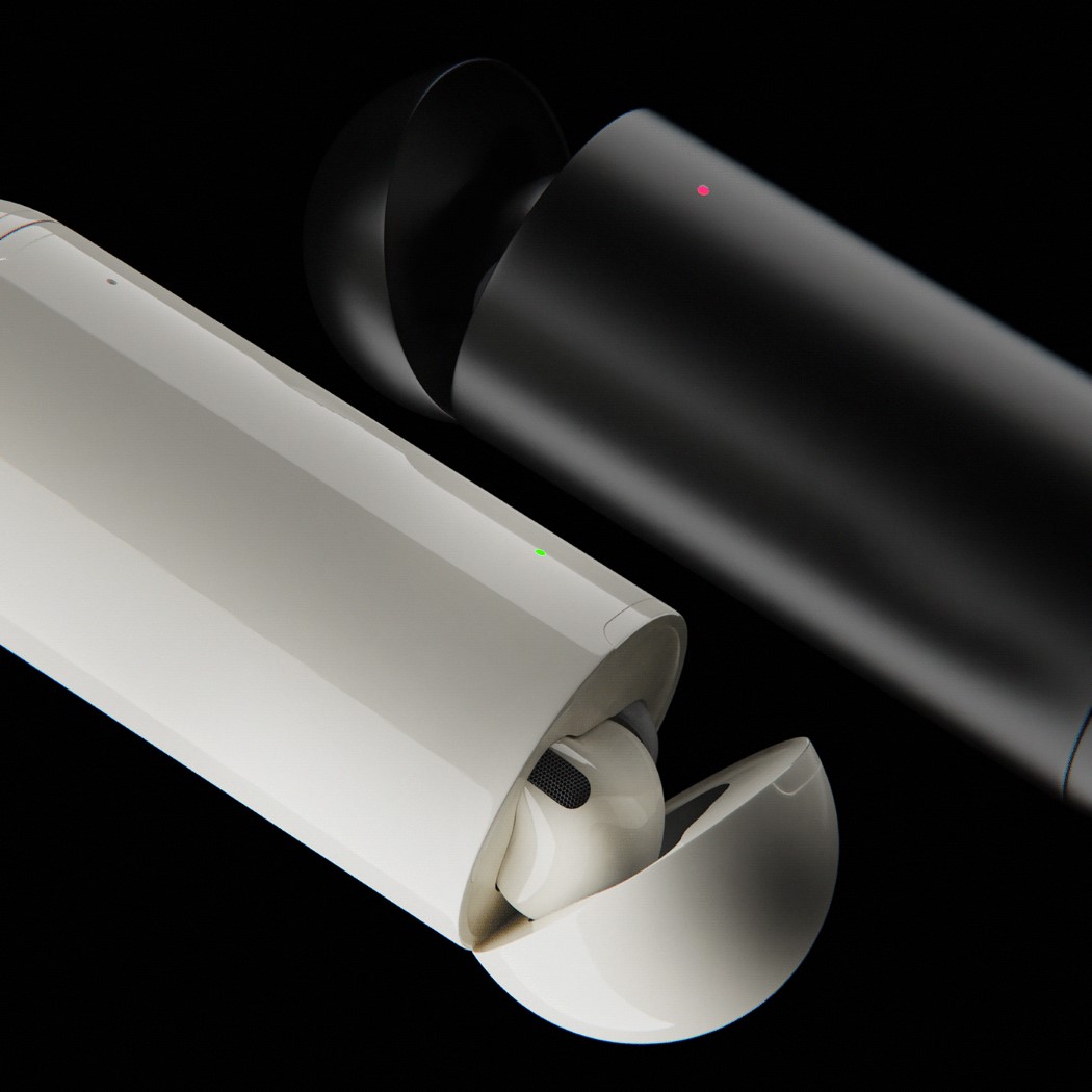
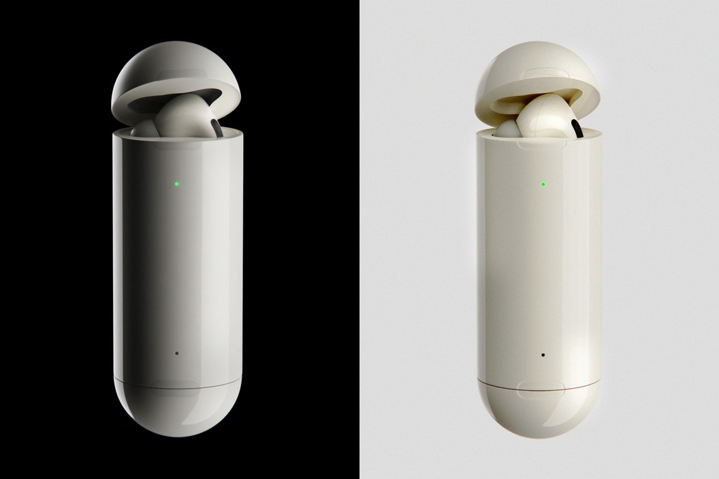
Antón’s redesign turns the Apple AirPods Pro case from something that looks like a ‘box of floss’ to a really classy-looking ‘chewing-gum-stick dispenser’. The rounded-box shape gets ditched for a taller and sleeker capsule shape, with lids on both ends, allowing individual earpieces to fit into each end of the case. Sure, the redesign presents some structural issues – like where would one place the Qi charging coil, or the battery, but what Antón’s concept really provides is a sense of variety, while sticking to Apple’s design philosophy of building sleek products.
The redesigned AirPods Pro case also fundamentally changes the UX of the AirPods. The two separate openings house the left and right earphones, and while they do that, they also hint at a behavior that’s common within the AirPods user community of using just one AirPod at a time to maximize battery life. While Antón’s AirPods Pro case redesign is just a fan-made concept, it’s definitely visually interesting… primarily because it highlights that the AirPods don’t NEED to go in a boxy-looking case. Instead, the case could be a whole lot sleeker and easier on the eyes!
Designer: Iván Antón