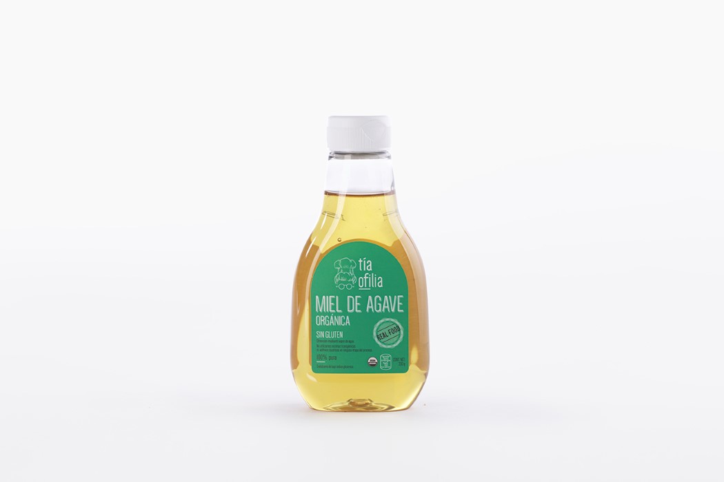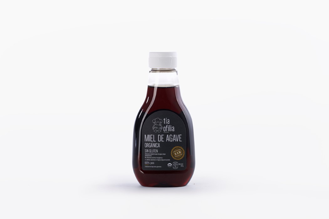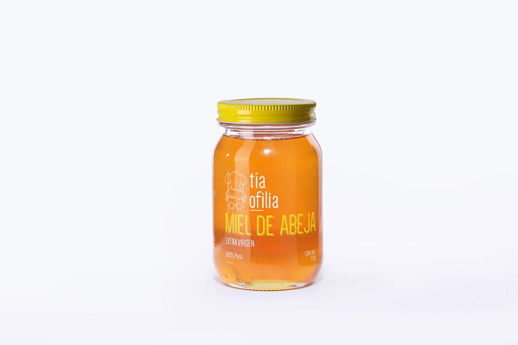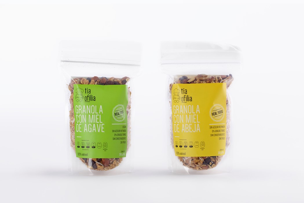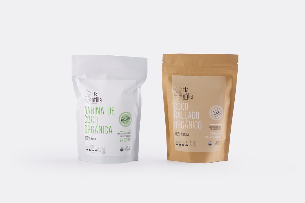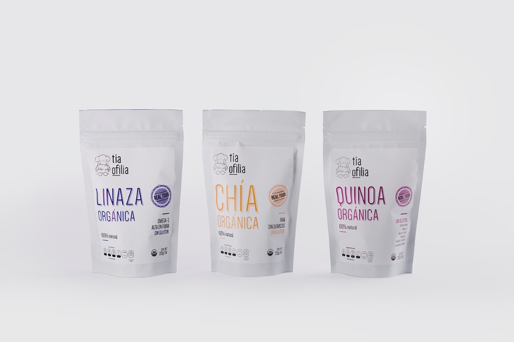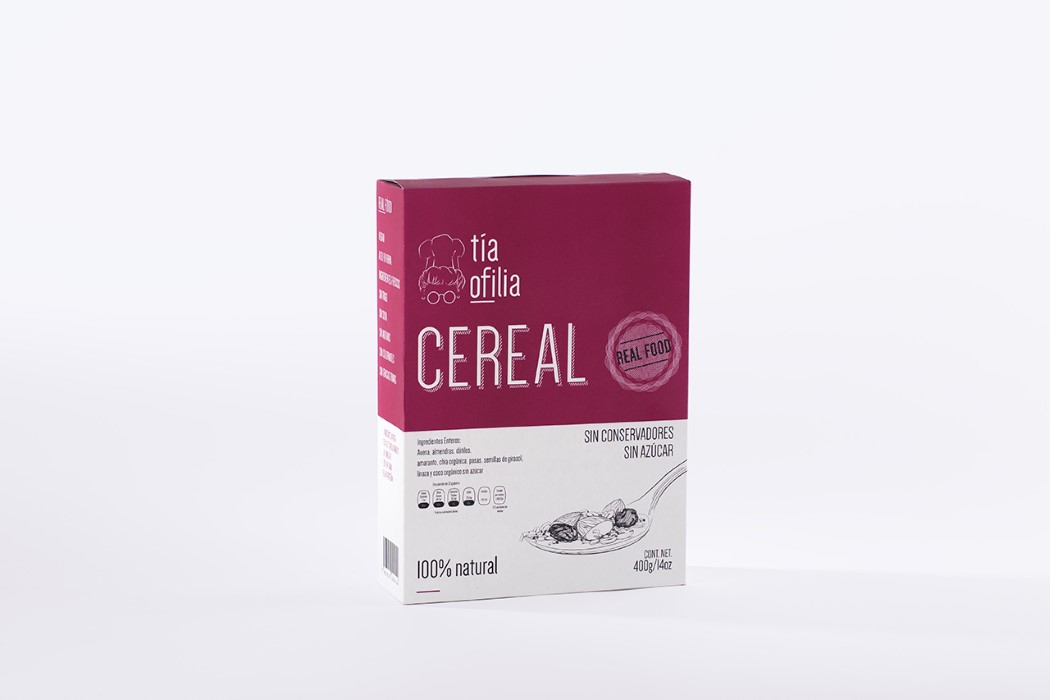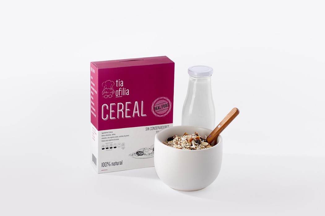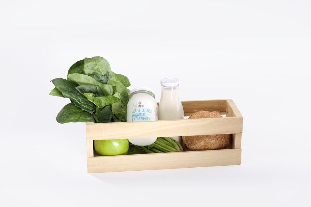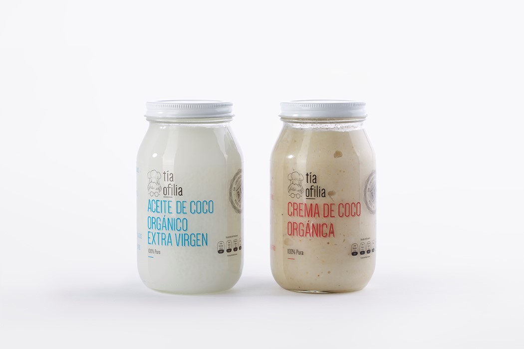
Good design shouldn’t be restricted by discipline. Even as a product designer, I myself have scrolled through graphic design websites, branding case-studies, etc. Tia Ofilia’s packaging takes on a comfortable style that gives it that pleasing, pure and fresh look, making you instantly have a warm connection with the product and the brand. The Packaging revamp is done by Shift for Tia Ofilia (Mexican for Aunt Ophelia), an organic foods brand from Monterrey, Mexico. The shapes, contours, and colors are all familiar and harbor trust. Minimal usage of design translates into people perceiving the product as raw and pure, just the way home-made organic food should be!
Designer: Shift