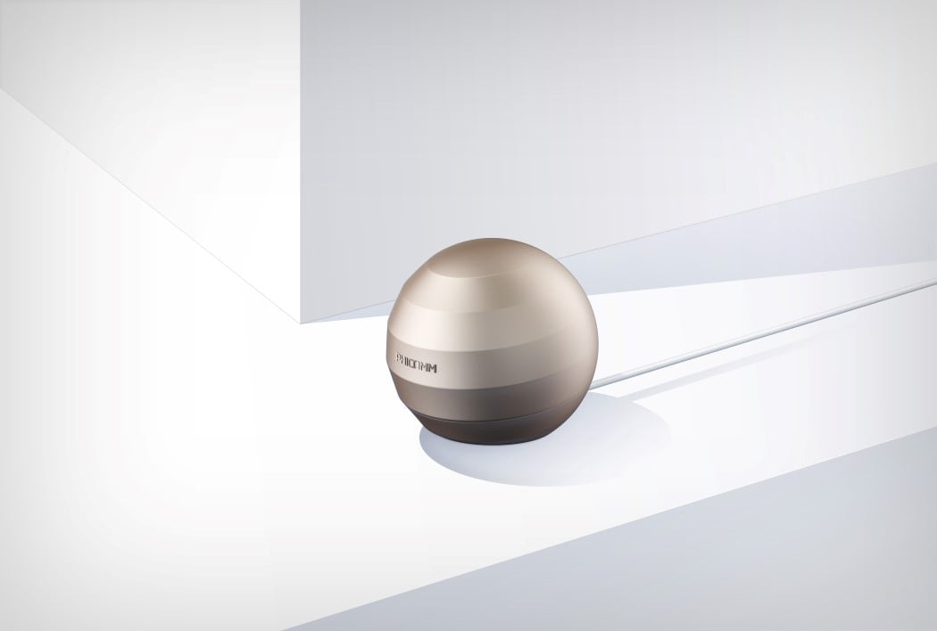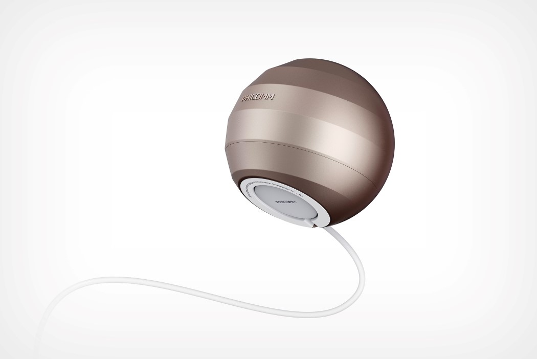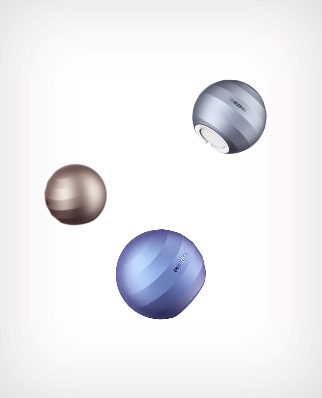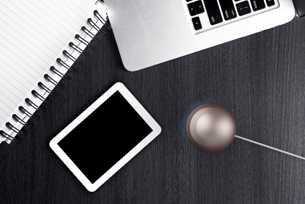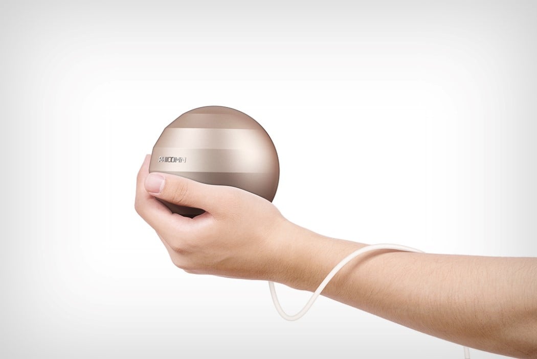
I use the term ‘perfect’ sparingly, reserving it for the rare occasions when something wows me and makes me realise that there’s nothing that I’d want to change about it. The Smart Router by Xia Kai is refreshingly different, but it’s perfect because it’s also strangely familiar. Look at it long enough and you’ll see it look almost like the icon of an internet browser! Its shape looks like a planet with the ridges being the paths of the satellites that revolve around it. Look at the Internet Explorer icon and you’ll notice the iconic yellow swirl that pretty much does the same thing. It’s clever, that the Smart Router makes that connection, and in doing so, designs a product that becomes an icon of the service it provides. Plus, look at the ridges from the top and you almost see them forming the Wi-Fi logo! Shrewd, and undoubtedly beautiful! I’ll take the metallic blue one for myself, please!
Designer: Xia Kai