Basic Beauty
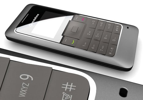
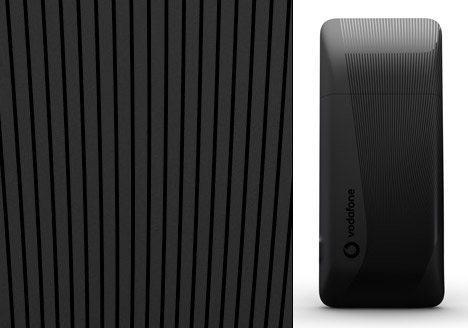
nr21 DESIGN together with Vodafone Design Team introduces one of its latest designs, the Vodafone 135. This will be one of the most affordable mobiles on the market. The Vodafone 135 is a classic candy bar phone, designed to make mobile communications affordable in developing markets, thanks to a short two line black and white display suitable for calls and texts. It will be available this summer on prepay tariffs.
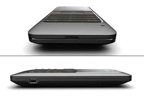
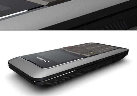
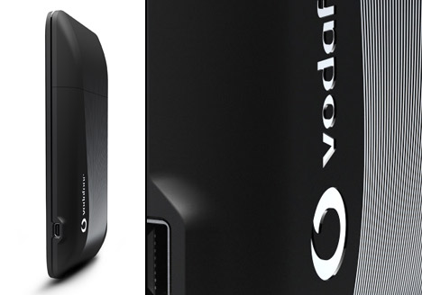
The pure and slim shaped VF 135 shows a high level of precision and detail compared to other entry devices, due to the clear geometry and an interplay between matte and glossy areas. All keys are integrated in one rubber matte with a prominent relief for improved haptic feeling. The matte rubber material shows a clear contrast to the high-gloss display lens. A molded pattern on the backside gives the handset a modern and appealing look.
Designer: Nr21 Design


23 Comments »
m says
Hmm….
What a ugly phone……
John q. says
why? its easy to say something is bad. at least support your opinion….
m says
If I said it was good….. Do I still need to support my opinion? Idiot….
john q says
yeah if you said it was good it wouldn’t hurt to put an opinion either. Reason you should say why you think its ugly is because i thought otherwise and was wondering if you had a good point. Obviously you’re just being a douche. its easy to say something is bad on this site, because so much of it is only a starting point of a design where this is an actual product. whatever
m says
Ok, here are a few points:
1. Design is a solution to a product problem, not just a fashion statement. The back is done very nicely, but the front (the only important portion of the phone) is poorly executed. No one will see the back of the phone.
2. Technically speaking, surfacing, proportions and relation of radii between keyboard / lens and outside perimeter are quite unrefined.
3. General proportions are awkward in the front view.
4. How does the front side relate to the back? Two different designers?
Would you like me to keep going, or should that suffice?
john q says
no thats perfect. thanks for the input
fux says
I love it and would buy it if i could get it in Germany ! Only the Display is to small.
Betsy says
I feel like I’m looking at a phone from 2001…
zippyflounder says
basic phone, i like it.
Arun Rave says
like the back … nice texture
sushee says
If only Verizon allowed such things…
Francis says
the minimalism concept is awesome. Less is More
Luke says
Except this cuts back on features and adds needless aesthetic elements. Two words: hand salsa.
I’d say it’s overdesigned rather than minimal, and generic rather than awesome. If it’s got a simple feature set, it’s form should reflect and complement that.
But that’s just the way I see things.
Barton Smith says
Nice profile. I think the keyboard could have been worked a little more so it didn’t look so chunky and clunky.
Gunner says
Looks interesting but reminds me of those old phones with Black and White displays… not really sure I dig it personally but perhaps some people will.
Eric says
Ya I feel this is a step backward for phone design. It looks like SLVR version 10.0 without advancement in tech…
john q says
considering the goal was to make ‘one of the most affordable mobiles on the market’ how can you expect it to be super thin? when you account for the compromise of cheaper, larger components this phone is quite nice.
martin says
i want to downgrade my mobile phone, old phones were much more fast, but not use a old phone with poor batteries, so this model can make go rubbish my too much featured nokia, ups! IRdA wanted
Noki says
Why would you not go for a 5310 then? http://europe.nokia.com/link?cid=PLAIN_TEXT_367464
vatsal says
awesome back …..liked the sleekness
btw all are awesome products i just stumbled upon this site thru some friend’s link and i am really awestruck
vicky says
A real good design under the cost limitation.
small and slim !
Only resin color but good effect having the full gloss and matt contrasting. Well done!
Trackbacks