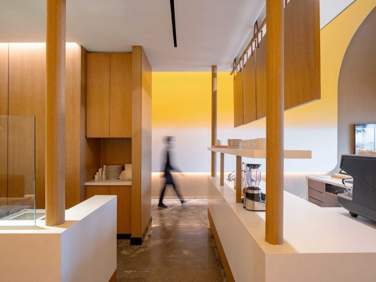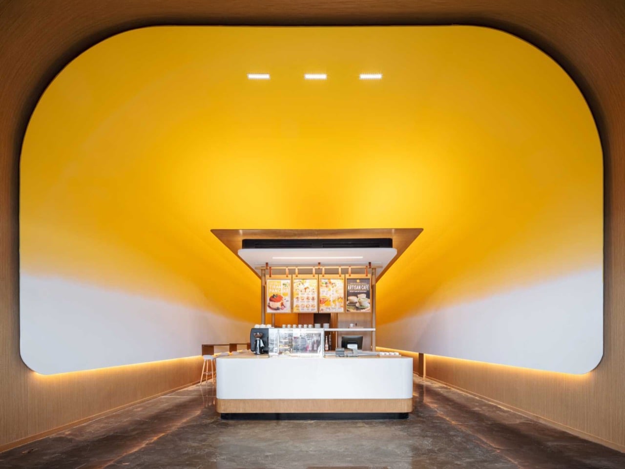
Walk into Fuwa Fuwa Golden Square and your stomach reacts before your brain does. The ceiling curves overhead in a deep, glossy yellow that fades downward into cream, and the effect is unmistakably appetizing. You have seen this color before, in a warm pan, sliding off the edge of something soft. The room does not represent butter so much as it behaves like it. The longer you stand there, the more your appetite gets ahead of your eyes.
That is the trick Studio Yimu pulled off in this cafe. The yellow sits richest at the crown of the curve, then thins as it falls, mimicking the way melted fat rides above the milk solids that settle below. The pale lower walls finish the thought. It is abstraction with an appetite, a minimalist gesture that happens to make you very, very hungry the longer you stand inside it. The shop sells Japanese soufflé pancakes, and the architecture has already started selling them for you.
Designer: Studio Yimu
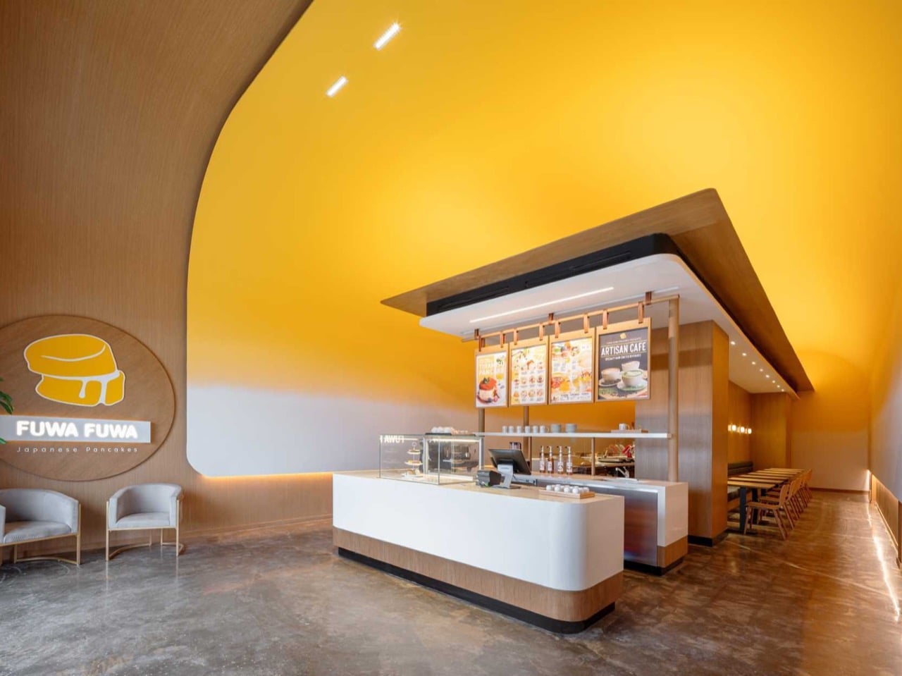
Melt a pat of butter and it separates within seconds, the golden fat lifting while the white milk solids sink to the bottom of the pan. Studio Yimu translated that split into a ceiling, saturating the crown of a sweeping curve in deep yellow before dissolving it into pale cream along the lower walls. The vertical order matters more than it first appears. Flip it, run white overhead fading down to yellow, and the whole room would feel subtly upside down, like butter defying gravity. Every corner rounds over with a soft fillet rather than meeting at a hard edge, so the color reads as poured rather than painted, pooling into the low points the way a liquid actually would.
The pancakes on the menu carry the same two tones, golden brown where the batter kisses the pan and pale along the tall fluffy rim that steams itself before it ever sears. Fuwa Fuwa’s logo splits the difference, a stack of soufflé pancakes with a pat of butter sliding down the seam in matching gold and cream. Studio Yimu took that little mark and scaled it up until it became the architecture you stand inside. The same story now plays at three sizes, the butter in the pan, the pancake on the plate, and the room itself. One ingredient, understood deeply enough to repeat across every scale without announcing itself, anchors the entire identity.
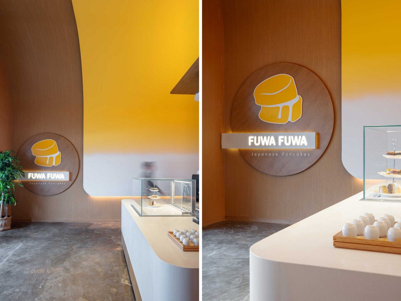
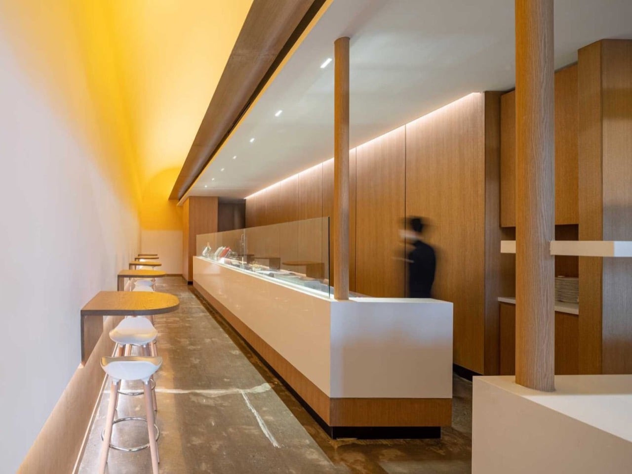
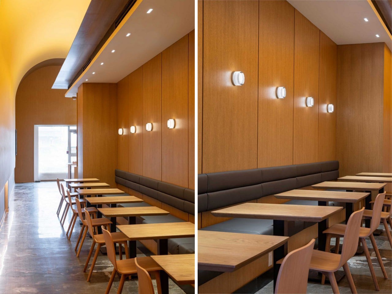
Beneath the color, the plan does real work splitting the cafe into two moods. One side runs wall-mounted tables and stools facing the service counter, built for a quick stop and a clear view of the pancake theatre behind the glass. The other side tucks long banquette seating into a wood-lined alcove, warmer and enclosed, sized for people who want to linger over a plate and a coffee. Studio Yimu concealed every light source behind signage, above the counter, and along the wall bases, so the glow spreads evenly and the architecture never competes with a visible fixture. Concrete floors and oak millwork ground all that sweetness, keeping the butter metaphor from tipping into a theme-park cartoon of itself.
Temple is the word the project keeps getting tagged with, borrowed from the shrine-like volume framing the central counter, and it undersells what makes the space land. Reverence does not sell breakfast. Appetite does, and Studio Yimu engineered appetite straight into the walls with two colors and a single curve. The restraint is the achievement, a piece of retail design confident enough to abstract one ingredient into a full spatial language and trust diners to feel it before they can name it. I walked away convinced more brands should study their own logo this closely, because Fuwa Fuwa found an entire building hiding inside a drawing of a pancake.