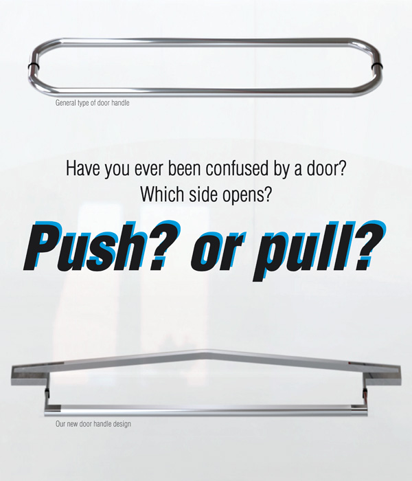
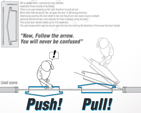
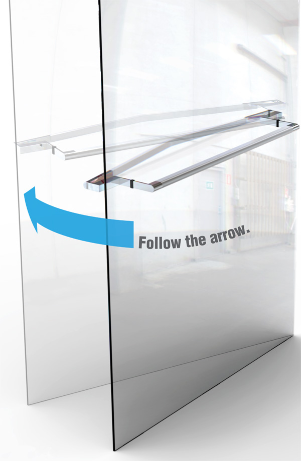
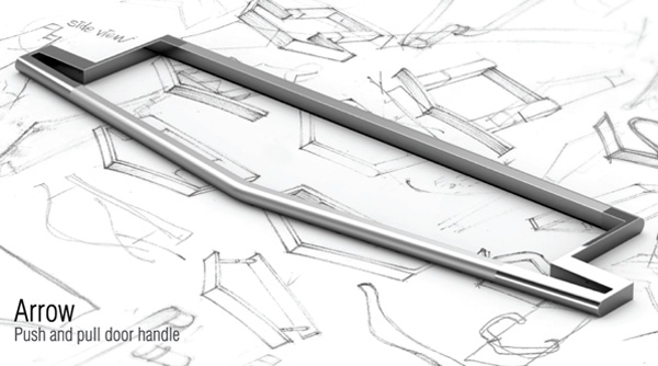
Just the other day I walked into a glass door of a store, simply because the design of the frame was ‘invisible’ to my cluttered mind. What I mean to say is that doors in public places can be a source of embarrassment to many. You can end up pulling a knob or pushing the wrong way, much to amusement of your companions. An easy and intuitive solution is this Arrow Door Handle. You’d have to be a fool not to figure out which is the right way to open!
Designers: Eun Ah Kim, Jinhyuk Rho & Maria Rho
hmm…
First, they should read Norman’s “The Design of Everyday Things” well.
Interesting. Certainly not subtle, but it gets the point across.
I’ve been thinking about the reason there are two handles on these types of doors; I believe it is to facilitate the need to pull a door closed due to an auto-latch system keeping the door open.
So yes, this is a good idea.
the contractor will just end up putting the handle on backwards.
Maybe a flat surface for the push side and a handle for the pull side would have been a more efficient way to tell people which is which…
clever!
Hah, pretty genius. I never would have thought of that.
http://www.coroflot.com/elodiedelassus/aro-door-handle
Same name, same concept ^^
CX, that is the first thing that came to my mind; read The Design Of Everyday Things. But there are many buildings out that need to redesign their doors.
I think this is a clever design!
This design would work in some place some time. However, under some situations like when peolple in hurry, they less likely would pay attantion to such special designed door handles.
Isn’t the universal standard that a bar = push and a handle = pull?
Most people would try to push both sides of this, it only looks like an arrow from the top down, which no one will ever see.
LOL! nice design!