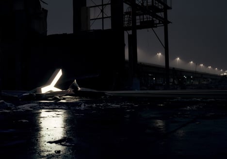
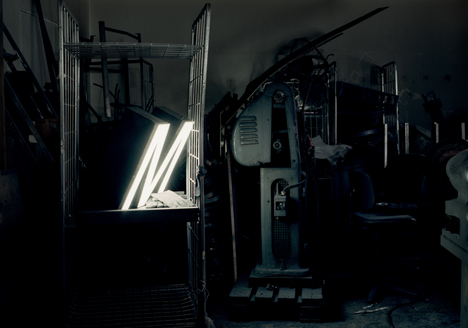
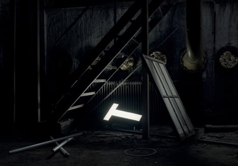
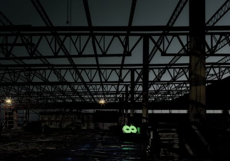
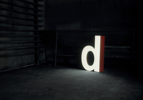
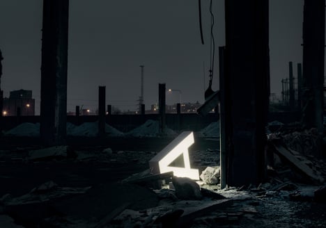
It is set upon me to congratulate the simplest and most why-didn’t-I-do-that designs, I think. Here’s one of them. It’s brilliant. These folks decided it was lamp time, and having seen the way of the modern design-driven world, decided that giant characters would be in order. And wow! If their idea of refurbishing isn’t the most pleasant bit of sustainable lampatude I’ve ever set eyes upon.
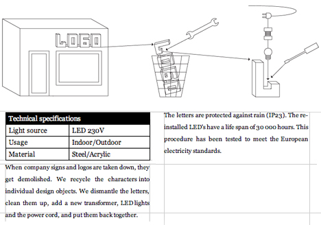
Aleksi Hautamäki and company are currently in the “production” phase. They’ve got their sources for old light-up signs, they’ve got the technology, and they will rebuild them!
“Sustainability of this product is not superimposed, but in the very essence of it. The second life cycle creates new value for everybody involved, the sign maker, the producer, the retailer and the customer.” – Aleksi Hautamäki
The reinstalled LEDs have a life span of 30,000 hours, which means that if the light is on for 8 hours a day, they last the minimum of 10 years. The letters will have been tested to meet the European electricity standards.
I will take the Helvetica Neue Bold Capital “A” as well as the Futura Standard Extra Bold Condensed Oblique “D” for my collection. Yes that would be lovely.
Designer: Aleksi Hautamäki for Character
