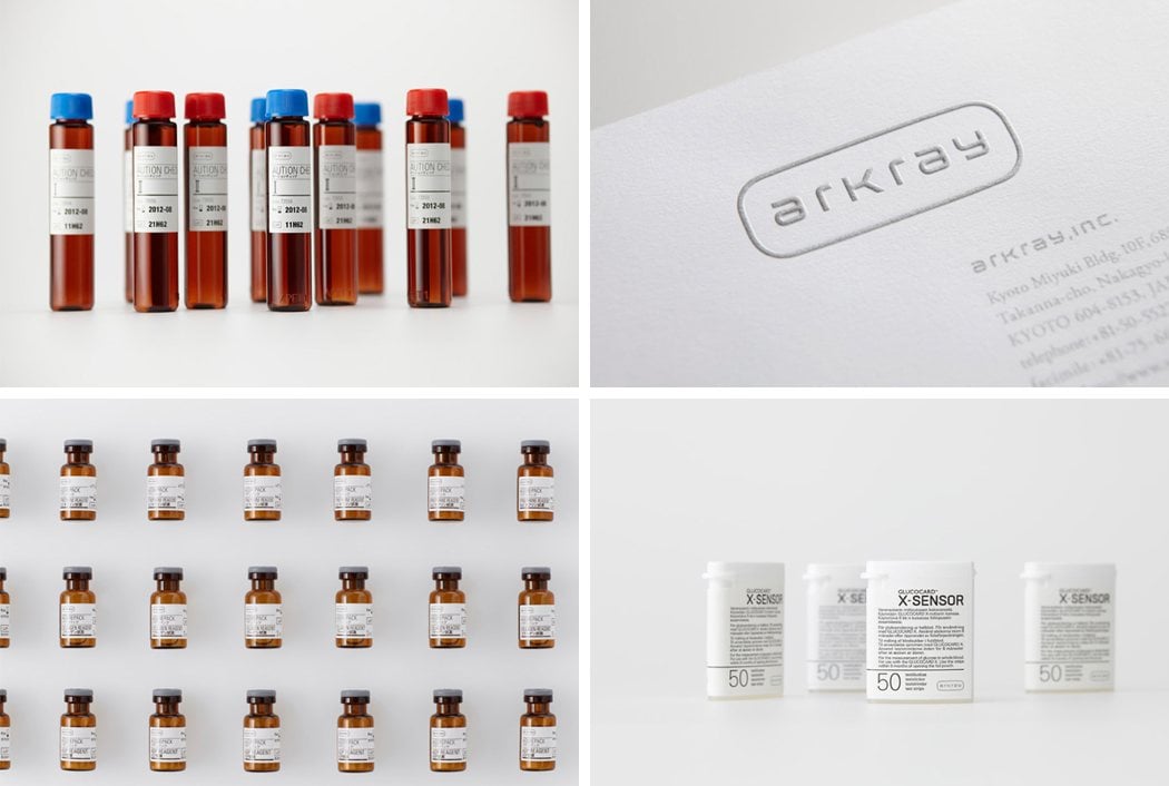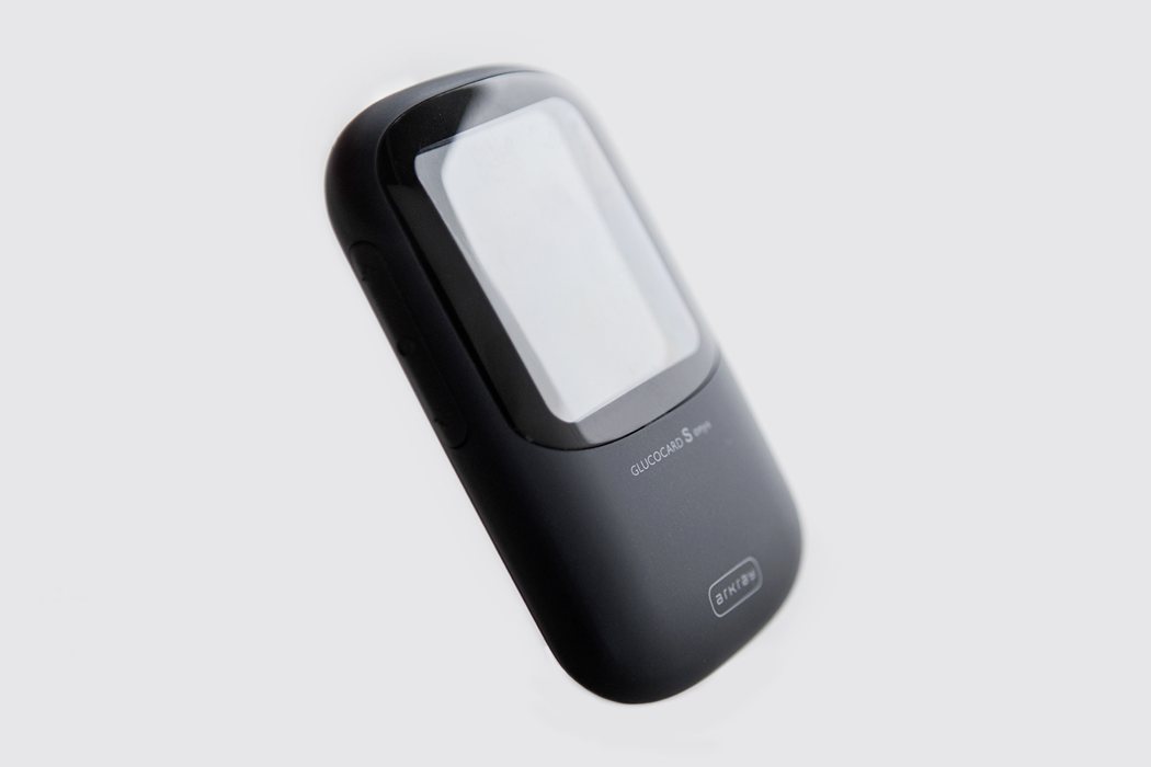
Medical devices are often generic looking, boxy edged products with poor material finishes and a string of afterthoughts. This can make sense due to the limited number of batches produced yearly, margins, visibility of product etc. That’s why it’s so nice to see the complete rebranding and stunning redesign of the Arkray glucometer. In 2012, Kenya Hara (former director of Muji) asked Yeongkyu Yoo (founder of cloudandco) to redesign the Arkray glucometer to match the brand vision and UI design language set in place by Kenya Hara, and after much anticipation, here it is.
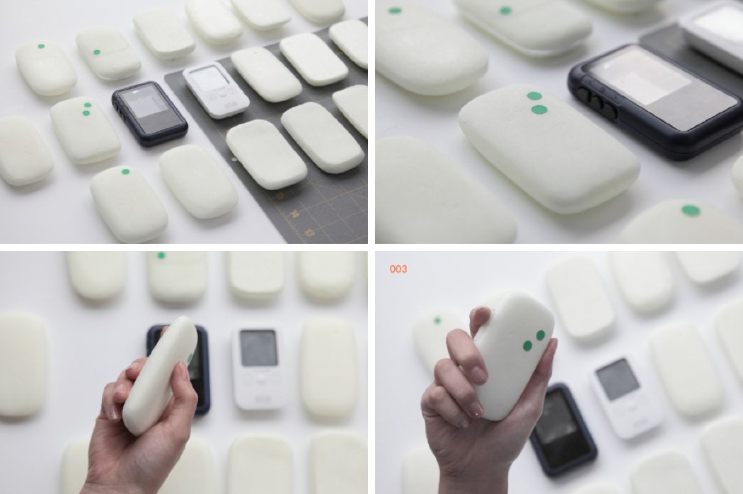
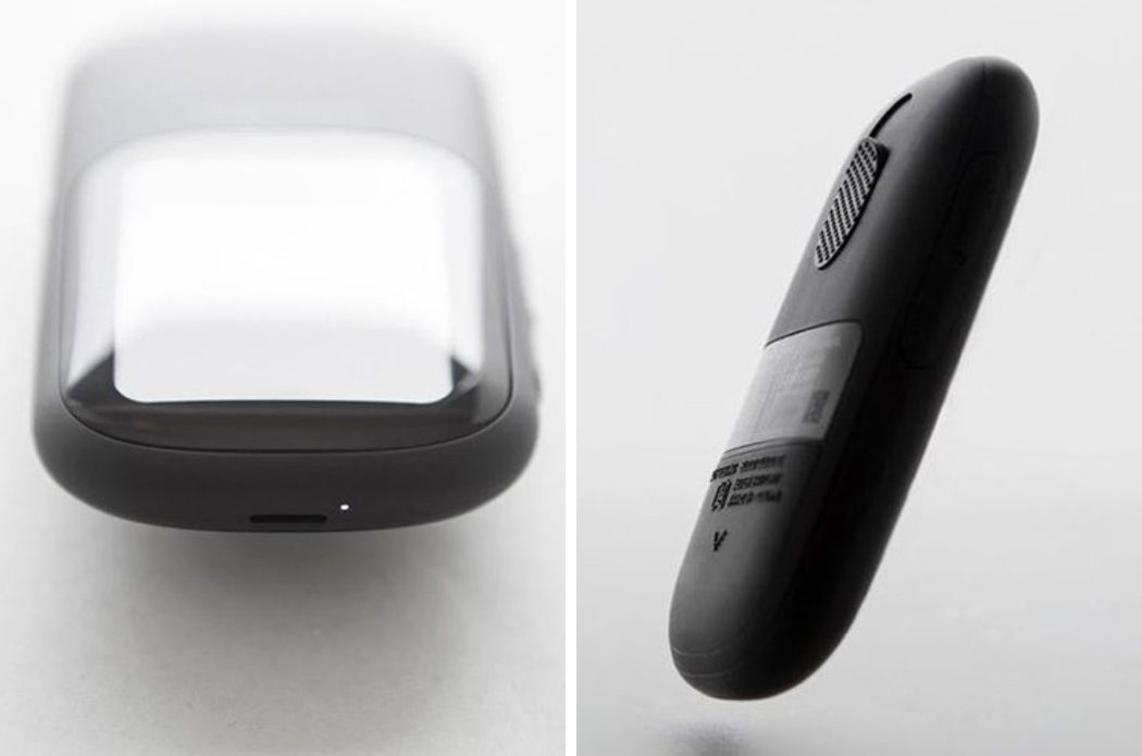
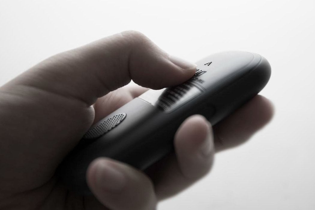
Yoo did this in spectacular fashion, with what can only be described as a positively gorgeous upgrade – the glucometer has a somewhat pebble shape to it, fitting softly into the hand. The interface is located on the front of the device, large enough to be seen clearly but not too large as to be obstructed by the user’s hand while holding the device. The glucometer is covered in a powder coated ABS material, soft to the touch, with very simple branding located below the screen and towards the bottom of the device. The interaction points on the rear of the device are very straightforward and elegant, making this product a strong foot forward in the innovation and rejuvenation of medical devices. I certainly hope that Hara and Yoo are taking on more medical companies because if this definitely showing us how it’s done.
Designers: Yeongkyu Yoo of cloudandco & Kenya Hara