
I’ve always thought shells are underrated as design references. They’re one of nature’s most perfect spirals, built by something soft and unassuming, yet the shape ends up looking engineered on purpose. L’Objet and jewelry designer Jessica McCormack clearly feel the same way, because their new collaboration turns that spiral into the backbone of an entire tableware collection, and it works because the shape never feels decorative for its own sake. It feels structural, like the whole line was built around it rather than sprinkled with it.
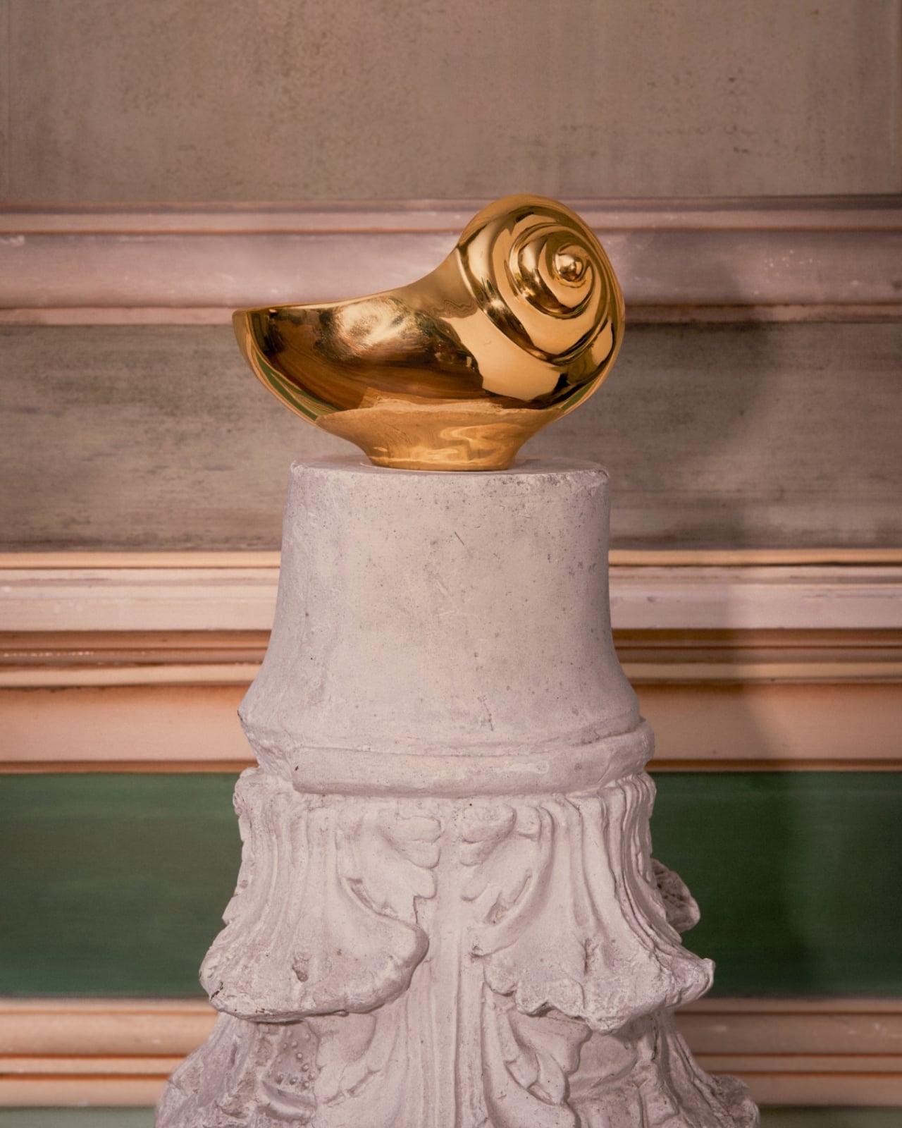
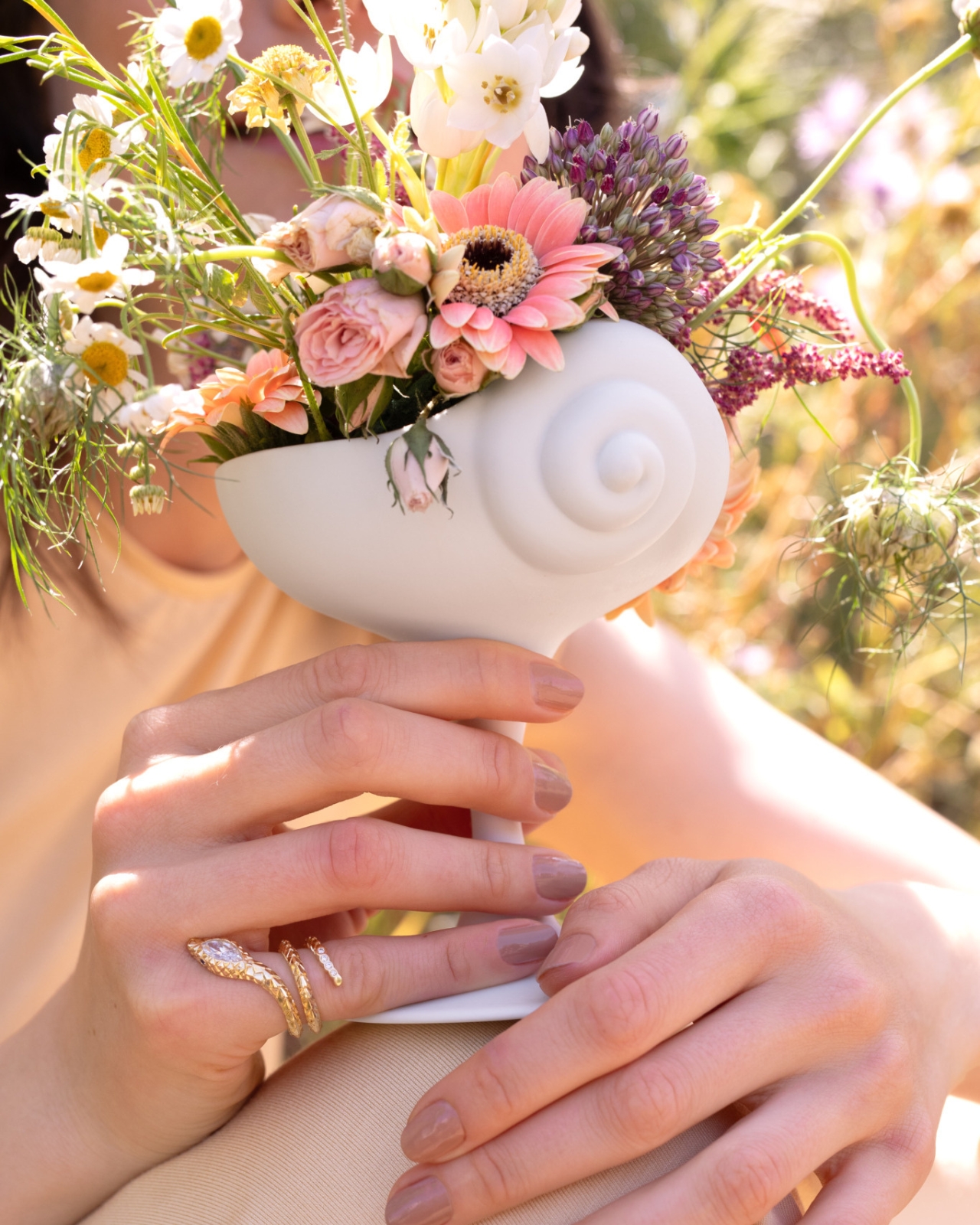
The problem this collection solves is a simple one. Most home collections borrow a motif and slap it everywhere until it loses meaning. A shell shows up on a napkin ring, then again on a candle, then again on a coaster, and by the third repetition it’s just noise. McCormack and L’Objet avoid that trap by treating the shell and its spiral as a load-bearing idea rather than a sticker. The swirl becomes a vase, its opening tilted just enough that flowers spill out at an angle instead of standing at attention. The same spiral, cast in gold, becomes a standalone object on a pedestal, polished until it looks like something pulled from a jewelry vitrine rather than a shelf.
Designer: Jessica McCormack
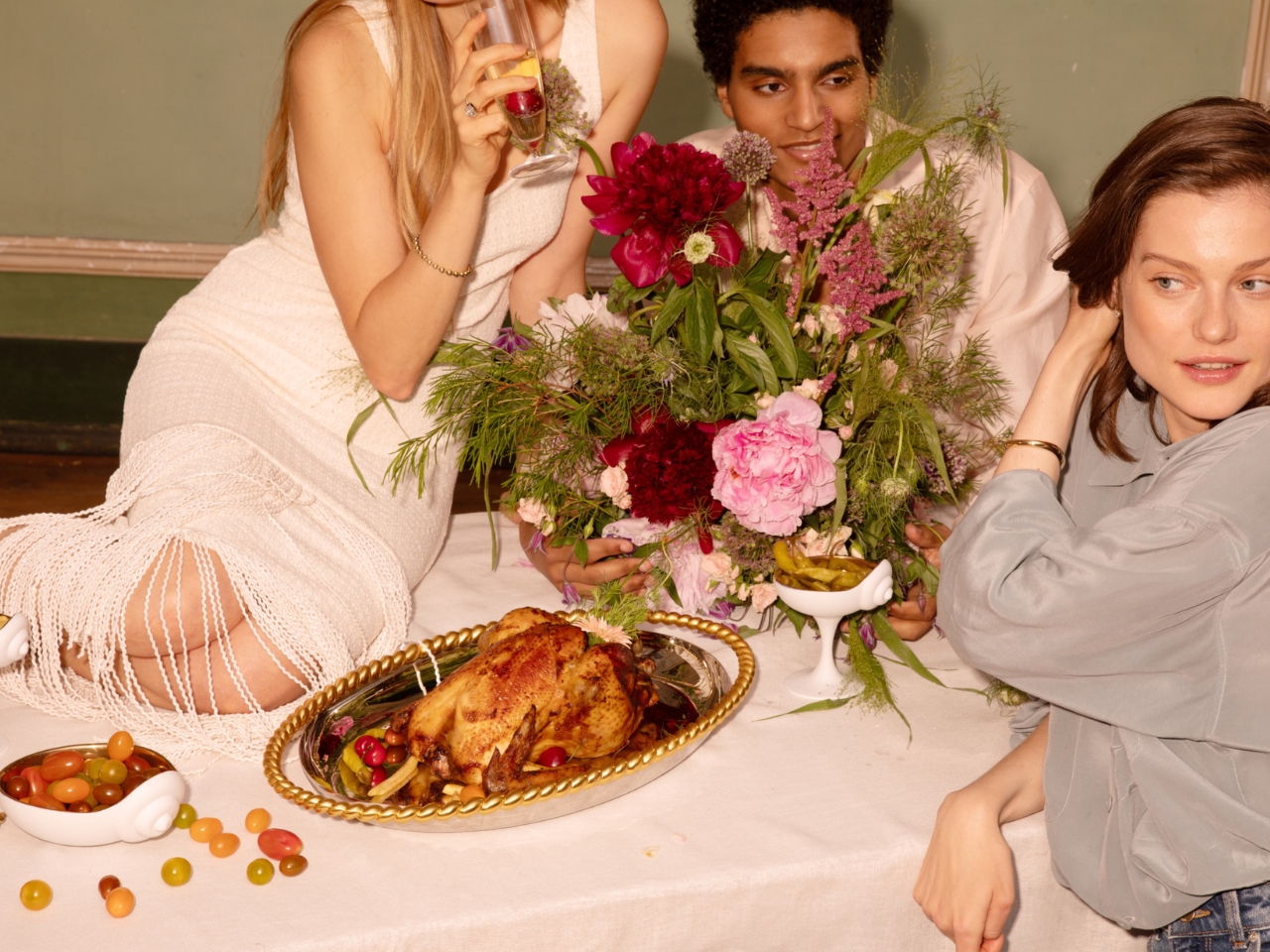
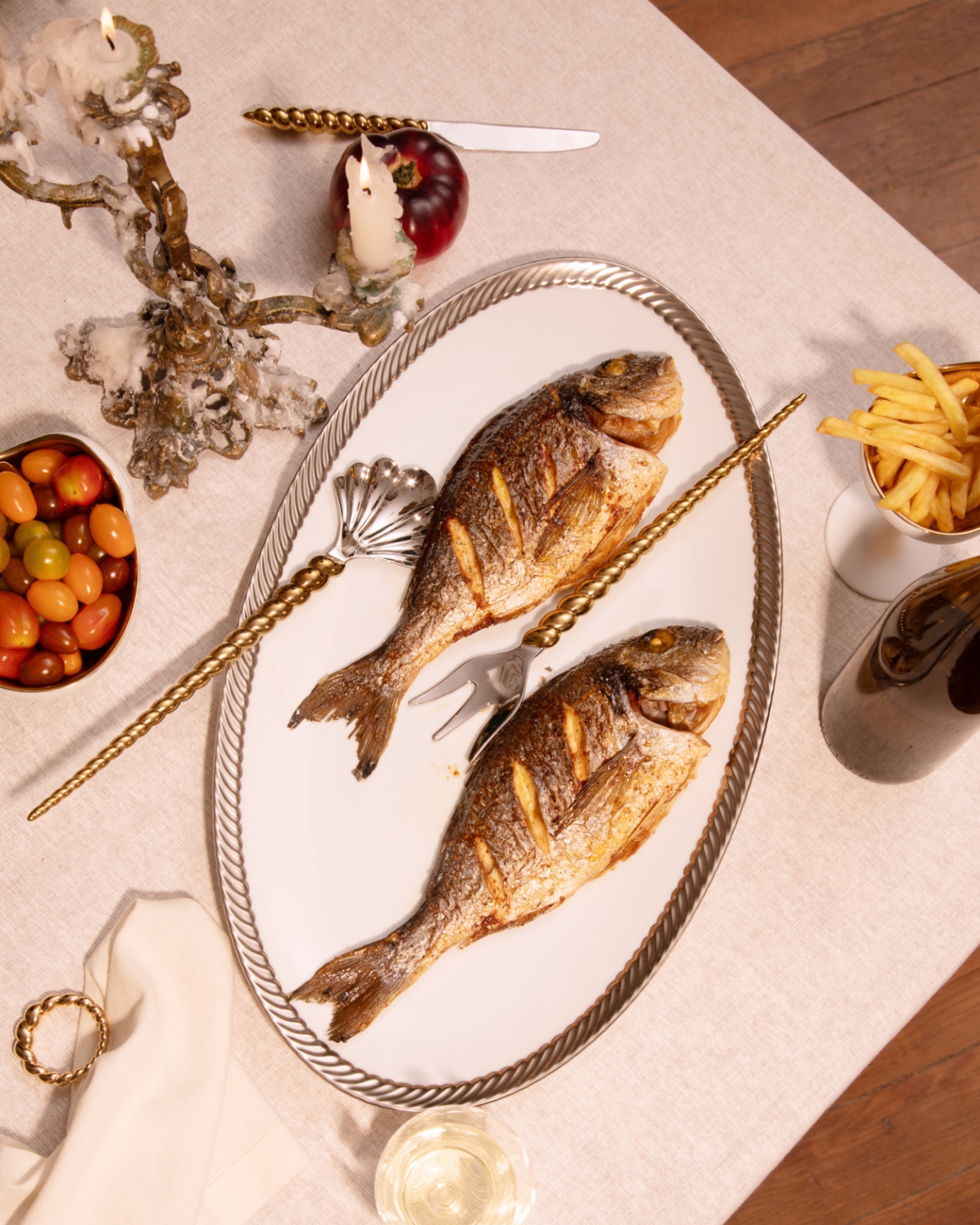
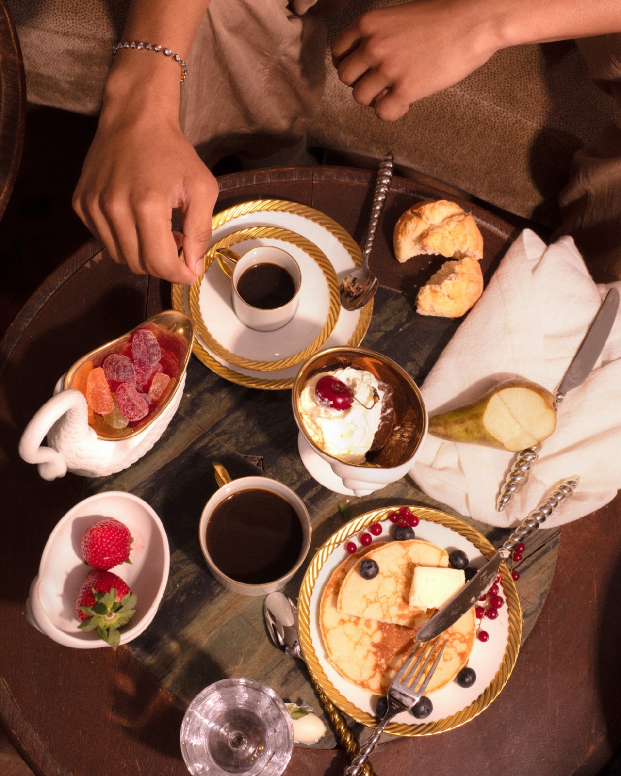
What sells the whole thing is the rope detail running through nearly every piece. Twisted cord, the kind you’d expect on a jewelry clasp or the trim of an old evening bag, wraps around the rim of an ice bucket, lines the edge of gold-rimmed plates, and forms the handle on a champagne cooler tucked into a velvet scallop-back chair in one of the campaign shots. It’s a small, consistent gesture, and that consistency is what makes the collection read as a single idea rather than a grab bag of pretty objects. You see the rope on the frame of a picture, then again on the handle of a fish server, and your eye starts connecting dots without anyone telling you to.

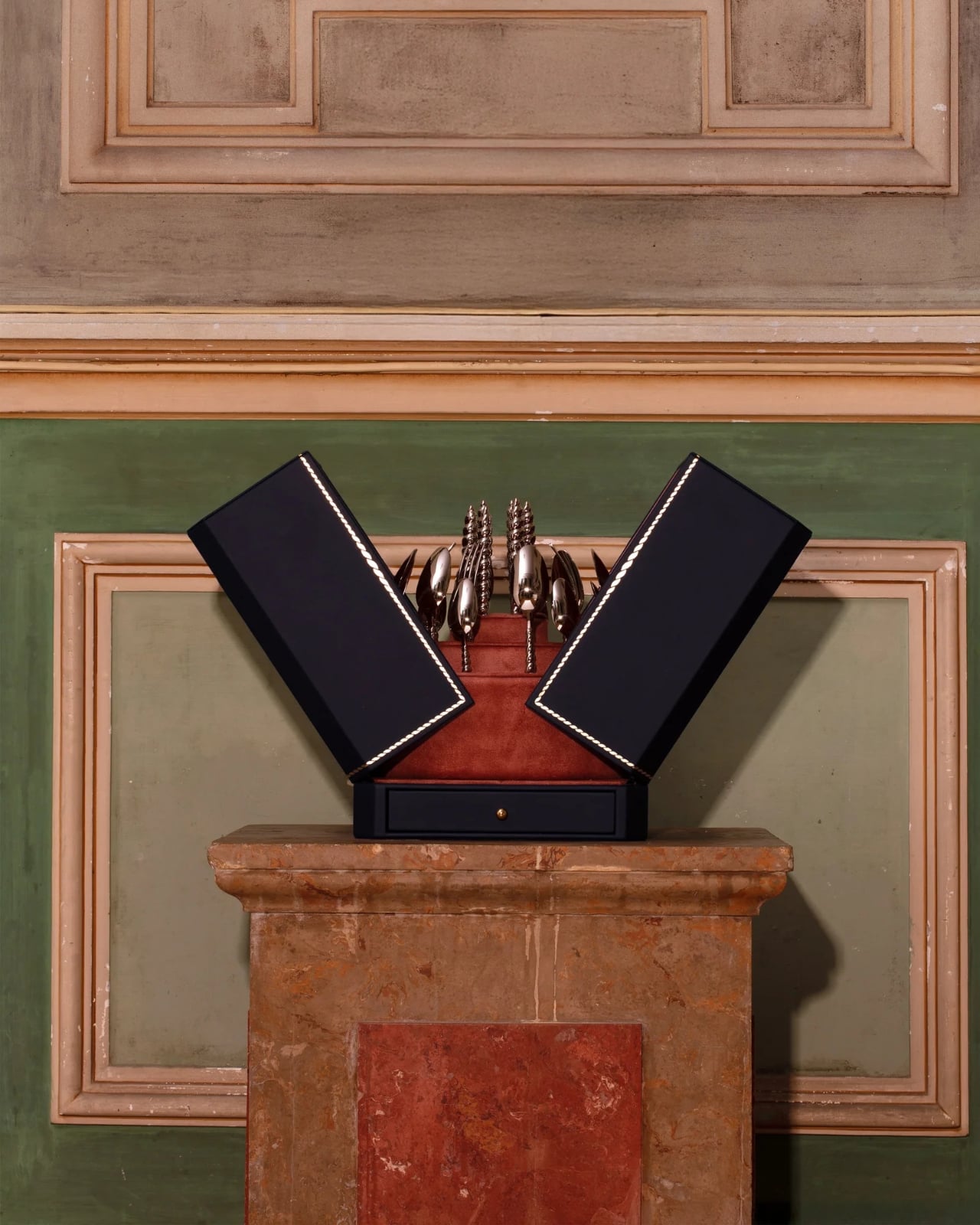
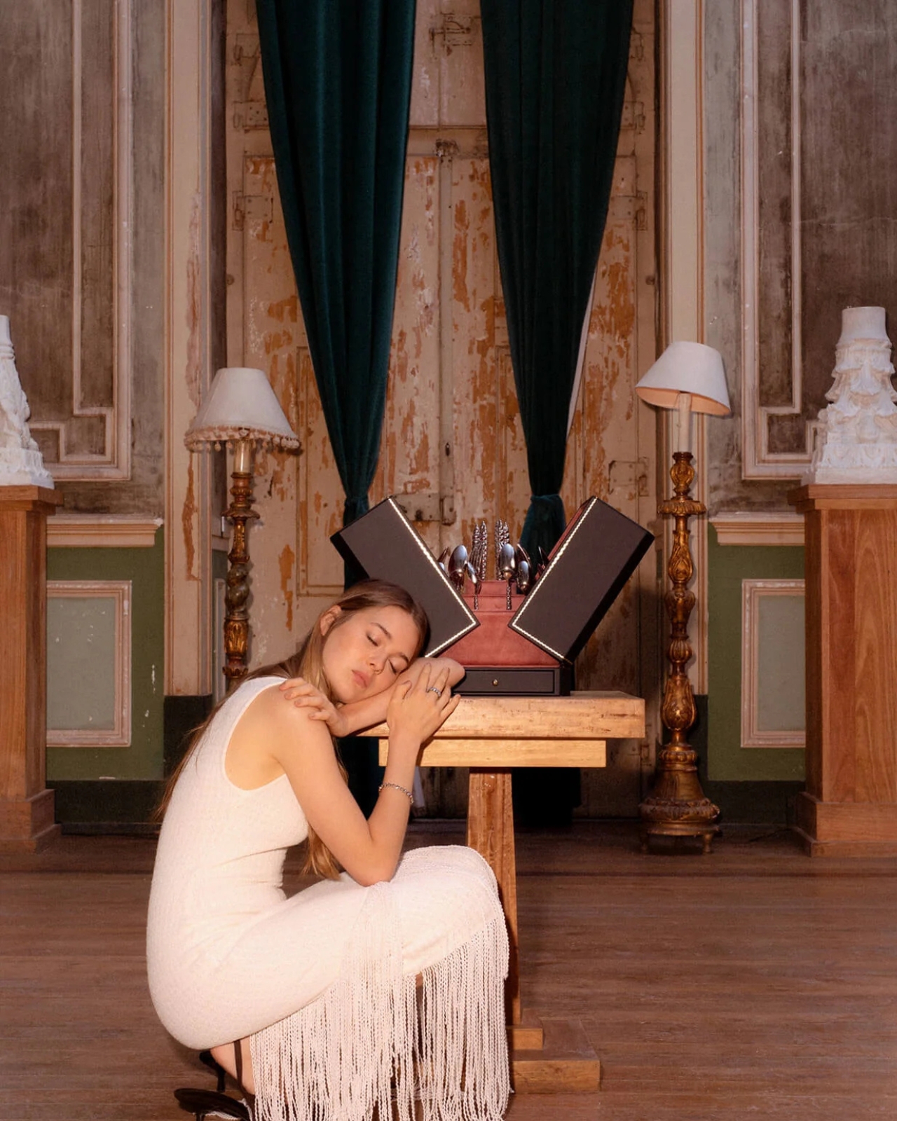
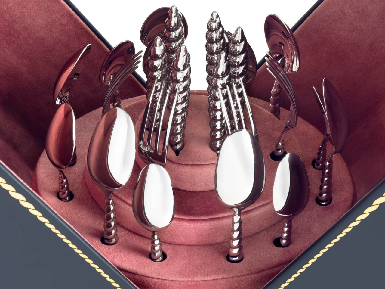
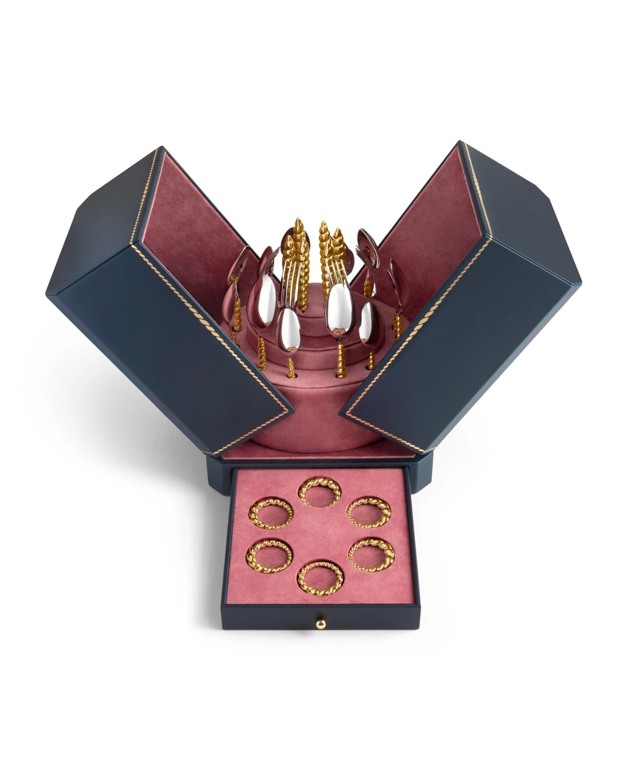
That fish server is part of the collection’s biggest milestone, even if it doesn’t announce itself as one. This marks L’Objet’s first-ever cutlery collection, and the brand chose to debut it wrapped entirely in the shell-and-rope language rather than starting with something safer. The flatware handles curl into spiraled shells, cast in the same gold finish as the rest of the tableware, so a fork looks less like an accessory to the collection and more like a piece of jewelry that happens to also feed people. For a house that’s spent years building a name in porcelain and glass, launching into cutlery through this particular design vocabulary feels less like a cautious first step and more like a statement about what the shape can do.
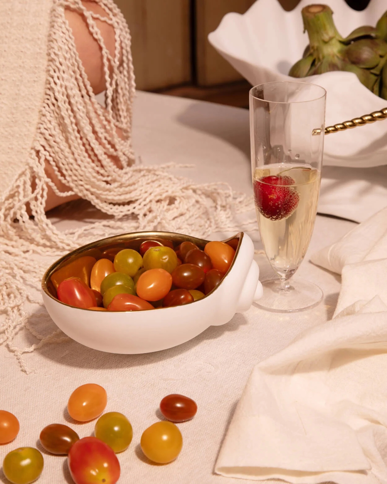
The serving pieces are where the shell shape gets the most literal, and that’s the right call. A bowl shaped like a conch shell, glazed in white with a gold-lined interior, holds a pile of cherry tomatoes in one shot and looks completely at home doing it. It’s not pretending to be a jewelry box. It’s a bowl that happens to have grown out of a shape usually reserved for something you’d wear. Two shell-handled forks pierce a pair of roasted fish on a rope-trimmed platter in another image, and the detail barely announces itself. You’d have to be looking for it. That’s the quiet confidence running through this whole release. Nothing here is shouting for attention, even when the materials, fine porcelain, hand-gilded gold, polished metal, would give it every right to.
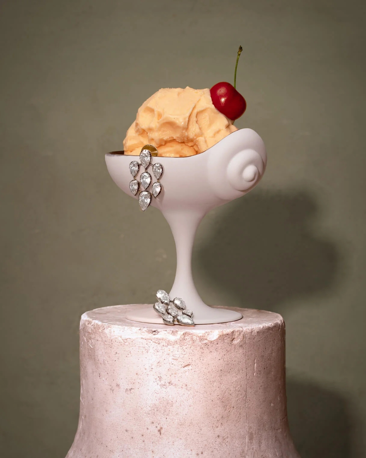
McCormack’s jewelry has always leaned into antique reference points without feeling costumey, and that instinct translates cleanly into tableware, cutlery included. Her Georgian-era motifs, the twisted rope, the shell curves, were never really about the ocean specifically. They were about movement frozen into something solid, the same way a chain looks like it’s still swaying even when it’s sitting still on a table. L’Objet’s Mediterranean sensibility meets that idea halfway, and the result feels less like two brands cross-promoting and more like two people who see the same shape in different materials and decided to build a table setting, flatware and all, out of the overlap.
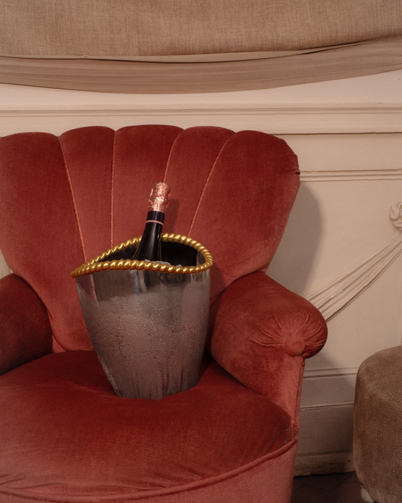
None of this needed a marine theme to feel cohesive. Shells and spirals could easily have read as a summer gimmick, gone by September. Instead they’re used as structure, the same way a good building leans on a repeated column rather than a repeated slogan. A gold-rimmed teacup, a swirl-handled vase, a shell-handled fork resting beside a scallop-backed chair holding an ice bucket shaped like the same curve, none of it needs an explanation once you notice the pattern. It just clicks into place, the way a good spiral always does, curling back toward its own center without ever quite repeating itself.