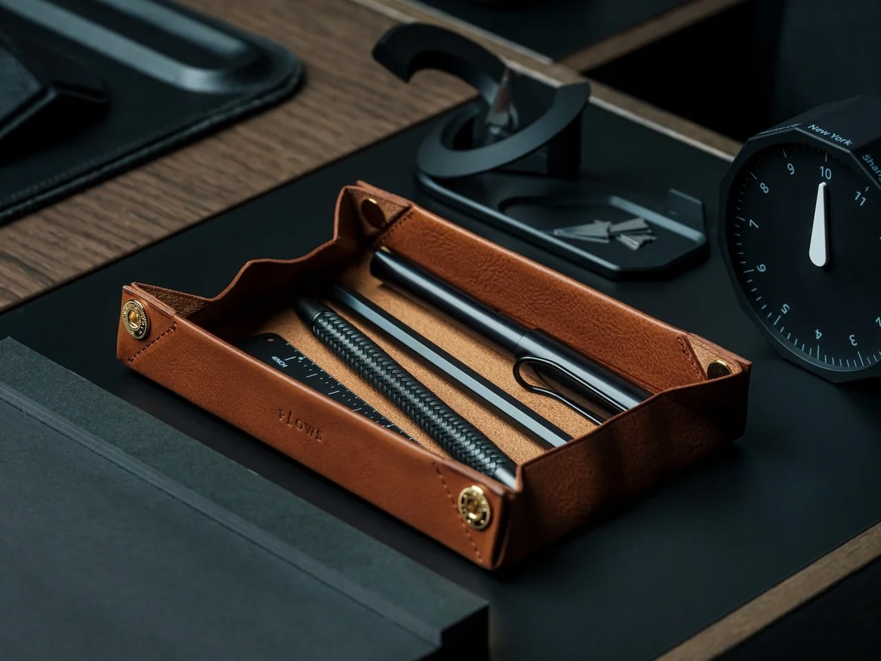

Japanese stationery operates on a different logic than most desk goods. The best pieces don’t announce their design—they reveal it through use, the third time you reach for the same tool the same way and realize the motion has become automatic. The seven products in this list were made by people who understand that distinction. They’re not objects that perform their quality. They demonstrate it quietly, over time.
This month’s picks span leather, wood, paper, and pre-inked rubber — materials that share nothing except the care with which they’ve been worked. Some of these come from studios you’ll already know. Others come from makers who’ve spent decades building things for people who pay close attention to how their tools feel. Whether you’re equipping your own desk or looking for a gift worth keeping, all seven earn a permanent place.
1. FoldLine Pen Roll
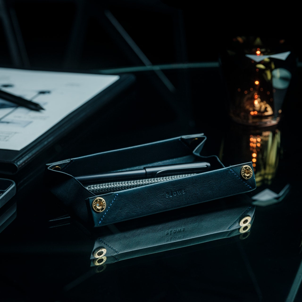

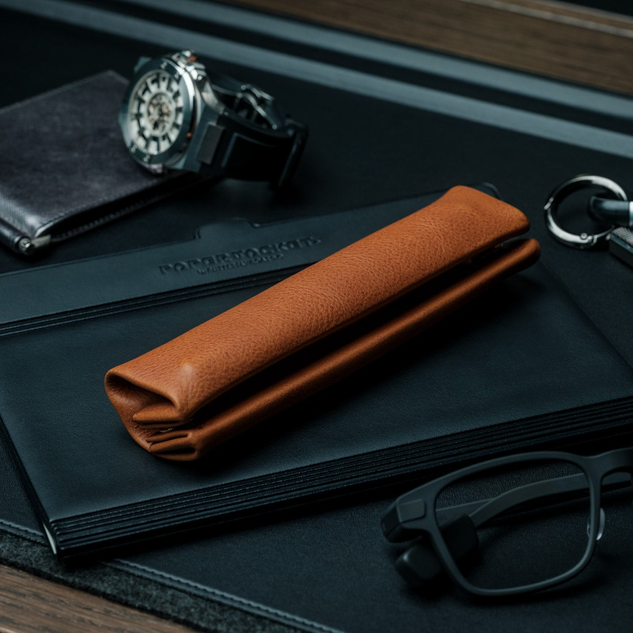
The FoldLine Pen Roll is a leather carry system built around a single fold, not a zipper or snap closure. Each pen sits in its own slot along the interior, and the whole thing folds flat before closing with a leather strap. It reads less like a pencil case and more like a craftsman’s tool roll — which, for anyone who carries a considered set of pens, is a more honest description of what the object actually is.
At $135, it’s the most expensive piece on this list, and the construction warrants the price. The fold mechanism means there are no moving parts beyond the strap — no zipper to catch, no snap that loosens after a year of daily use. The leather breaks in around the specific pens you carry, developing a memory for your particular arrangement. That’s the kind of specificity most storage solutions reach for and don’t achieve.
Click Here to Buy Now: $135.00
What we like:
- The fold mechanism is the most durable carry design in this category. No zipper or snap means nothing mechanical to fail over years of daily use, and the strap is the only component that ever needs attention.
- The leather develops a personal fit over time, molding around your specific pen collection until the roll opens to exactly the arrangement you use every day.
What we dislike:
- At $135, the price removes this from casual or spontaneous gifting territory. It’s a commitment piece that requires confidence about what the recipient actually carries.
- The slot format is sized for standard pens and pencils. Wider barrel markers, brush handles, or oversized tools won’t sit correctly without distorting the leather over time.
2. Japanese Geometric Scissors

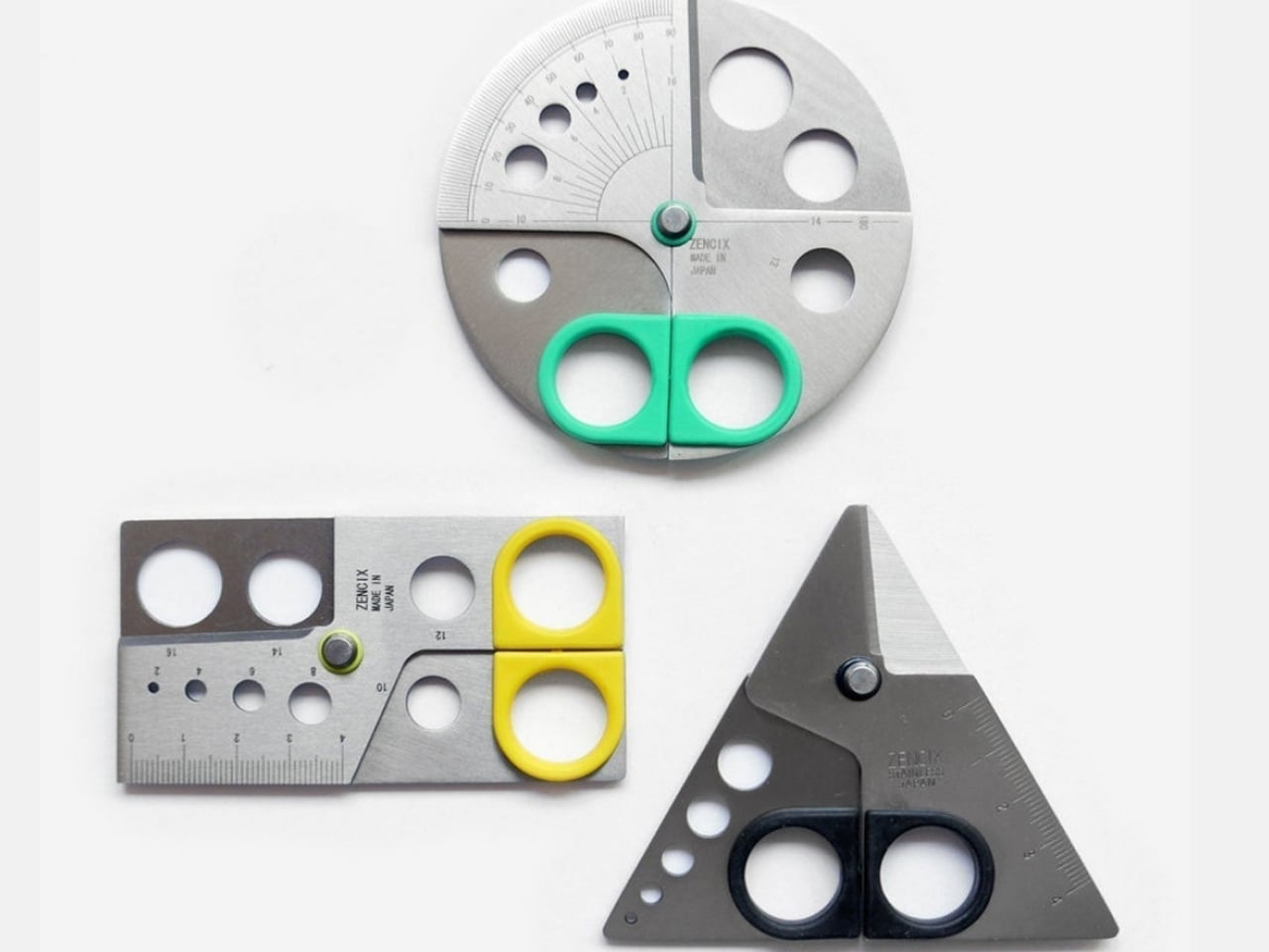
These scissors carry a geometric cut pattern along the blade that doubles as a drafting template. Before you cut, you can use the blade itself to trace shapes directly onto paper — a triangle, a hexagon, a clean angle — without reaching for a separate ruler or stencil. It’s a small insight that collapses a two-tool workflow into one, and it’s the kind of functional logic that surfaces in Japanese stationery more consistently than anywhere else.
The dual function works best when you’re already in a cutting workflow, and the template step is simply folded in. Scissors tend to be invisible tools, grabbed and set down without much thought. These invite one extra second of consideration, then behave exactly like scissors should: precise, quiet, and out of the way once the shape is on the page. For paper craft, journaling layout, or light drafting, that compression of steps adds up across a session.
What we like:
- The template function is integral to the blade geometry, not a surface treatment or decorative addition. It’s a genuine design decision that changes how the scissors are used rather than simply how they look sitting in a cup.
- It collapses two separate tools into one without compromising the cutting performance, which is the kind of economy that makes a desk feel less like a collection of gear.
What we dislike:
- The geometric template shapes are fixed by the blade’s design. You can trace what’s there, but you can’t adapt them to custom dimensions or modify the angles for non-standard work.
- The template function is most useful in flat, straight-cut contexts. It offers little advantage for freeform cuts or curved work.
3. Kokuyo Campus Roll Sticker
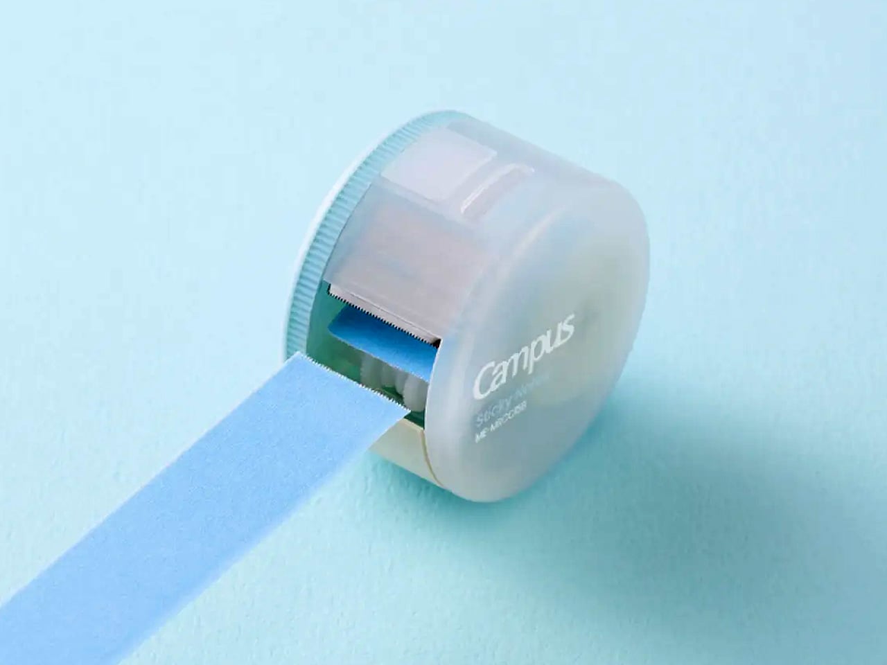
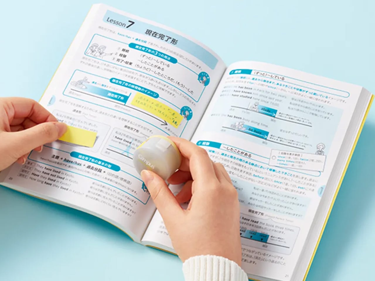
Kokuyo’s Campus Roll Sticker is a continuous roll of repositionable sticky labels in a compact twist-dial dispenser. The format is straightforward: pull the strip, tear at the desired length, apply. No peeling individual tabs from a backing sheet, no hunting for the right size, no wasted label from a crooked tear. Kokuyo built the Campus line for daily working use, and the Roll Sticker fits that brief precisely by removing friction from a task that happens dozens of times across a long session.
The label surface takes most ballpoints and fine-liners cleanly, and the repositionable adhesive holds without committing — you can move a label without tearing the page beneath it. For annotation-heavy reference work, marking passages in a book you’d rather not write in, or flagging a filing system you’ll need to revise, the continuous roll changes the rhythm of the process. One motion replaces three. It’s a small improvement in a category nobody redesigns, which is exactly why it reads as a design object.
What we like:
- The continuous roll format replaces the peel-separate-apply sequence with a single pull-and-tear motion. That simplification compounds quietly across a long work session in a way that’s difficult to explain until you’ve used one for a week.
- Repositionable adhesive means labels can be relocated after application without leaving residue or lifting the surface of the page beneath.
What we dislike:
- Label width is fixed by the roll format. There’s no option for a wider annotation strip if your notes or reference marks need more surface area than the standard roll provides.
- The dispenser housing is plastic, which feels lightweight relative to the precision and build quality of the Campus line’s other products.
4. Ito Bindery × Yanko Design Drawing Pad
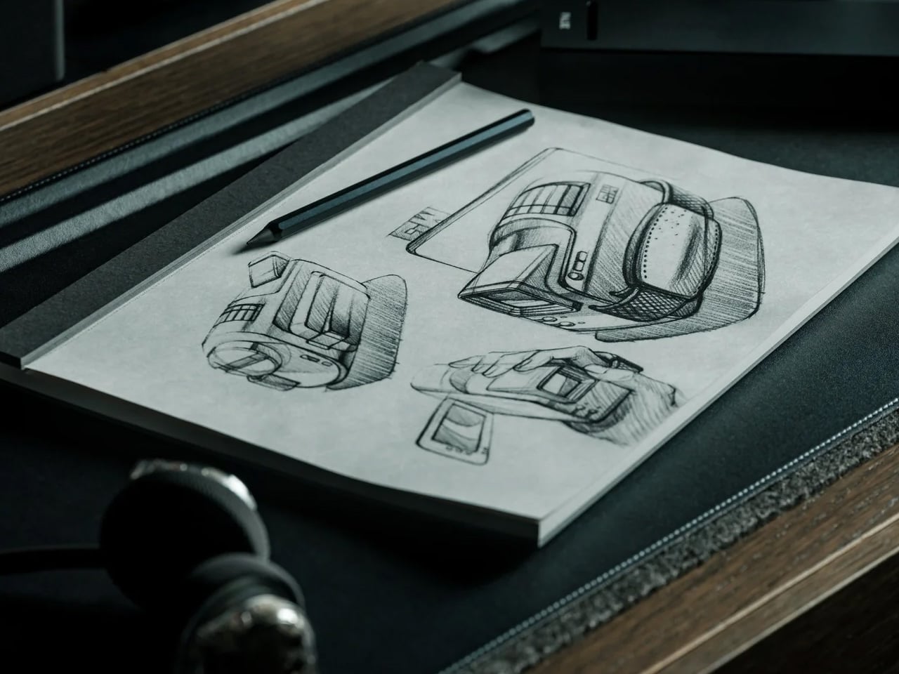
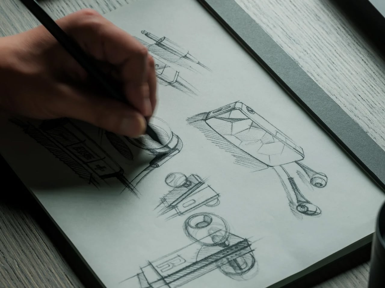
The Ito Bindery × Yanko Design Drawing Pad is a coverless drawing pad produced through a collaboration between a Japanese binding house and YD. The paper is weighted and surfaced for pencil and fine-liner work, and the no-cover format is a deliberate design position: it removes the bulk and the sense of occasion that a bound cover creates, leaving just the paper and the surface. For daily drawing or ideation work, that removal is the whole point.
Ito Bindery builds bindings to be invisible. The paper is the product, and everything else serves it. That philosophy is legible from the first page: the pad lies flat without being held open, the sheets tear cleanly at the perforation, and the paper handles ink without bleeding through to the sheet below. At $40, it’s priced as a working tool rather than a keepsake, which matches the coverless format. It’s made to be used through and replaced without ceremony.
What we like:
- The binding lies flat from the first page with no spine resistance to fight, which matters more than it sounds across an hour of continuous sketching or ideation work where the pad needs to stay open without a hand on it.
- The paper surface and weight are calibrated specifically for pencil and fine-liner use, not optimized for ballpoint or printing as most generic pads are.
What we dislike:
- The coverless format offers no protection in a bag. The top sheet is exposed from the moment you pack it, which limits how this travels compared to a conventional pad with a cover.
5. Midori Yuru Log Stamps
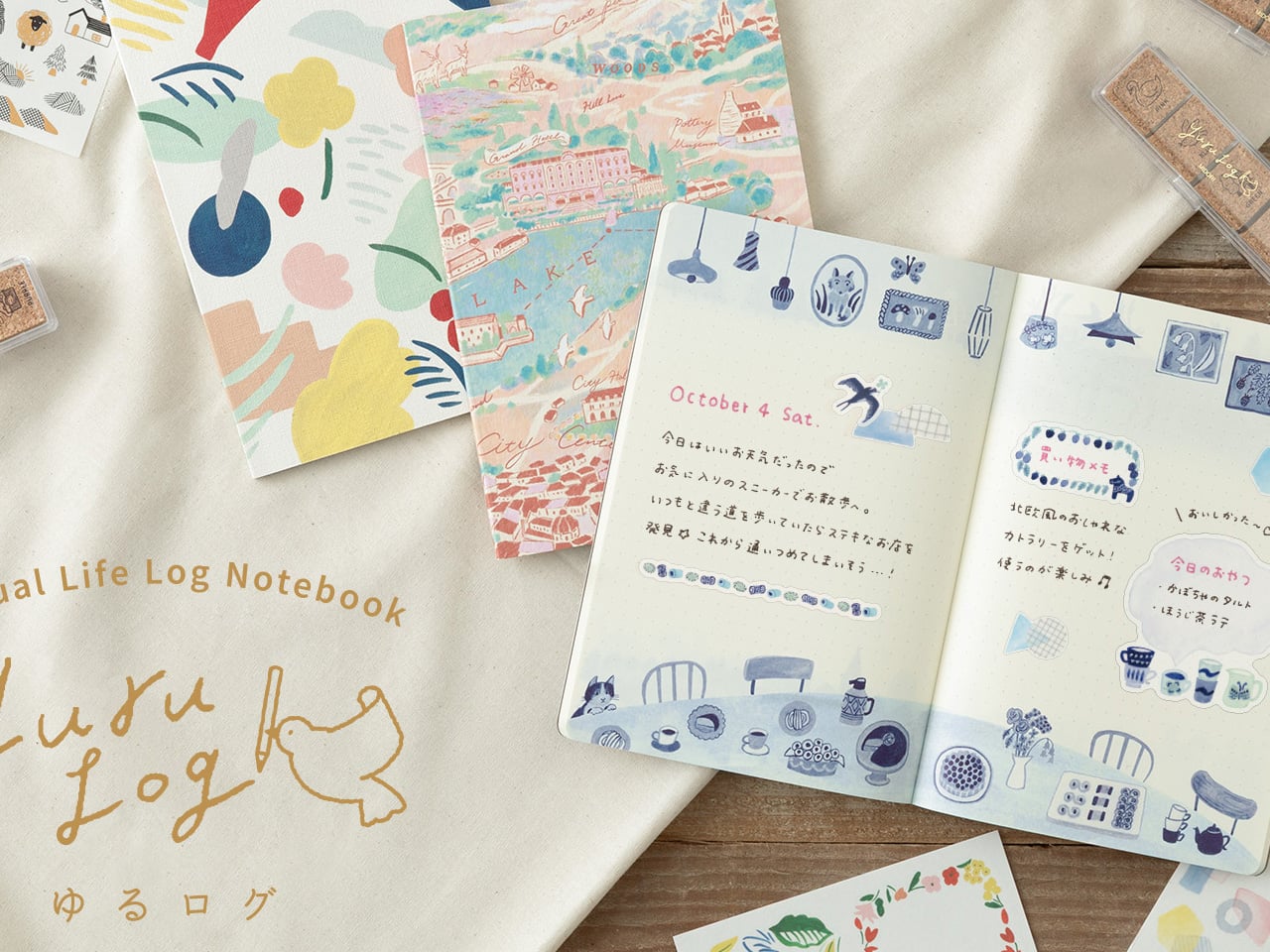
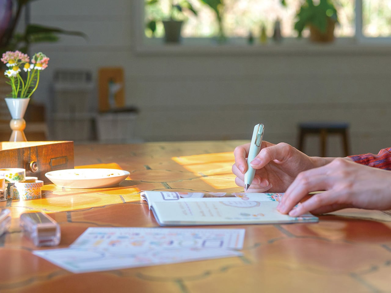
Midori’s Yuru Log Stamps are a set of pre-inked stamps with loose, illustrative designs — small icons for weather, daily activity, food, and mood — printed in waterproof ink. They’re part of Midori’s Yuru Log system, which treats the journal page as a casual daily record rather than a structured planner. The stamp designs carry that spirit: they’re quick marks, not declarations. A few stamps and a line of handwriting beside them, and the day is already documented more clearly than a blank page would allow.
Pre-inked means no separate stamp pad and no setup. You uncap and stamp directly onto the page. The waterproof ink is a genuine quality decision: it holds when wet and doesn’t smear when you write across a stamped area with a water-based pen. For anyone building a daily journaling habit, the stamps do something subtle but important. They reduce the blank page from a commitment to a starting point. One stamp and the page is already in motion.
What we like:
- Waterproof ink layers with pen, fine-liner, and watercolor without smearing. The stamps work as a base layer for more detailed annotation rather than having to be placed carefully around existing marks.
- The pre-inked, cap-off format removes the stamp pad from the journaling setup entirely, simplifying a process that tends to accumulate accessories and surface area over time.
What we dislike:
- The Yuru Log icon vocabulary is built specifically for daily life logging. It serves that use case well and offers little for professional note-taking, task management, or any structured planning context.
- Pre-inked stamps can’t be re-inked with a different color once the original ink runs out. The stamp is spent when the ink is gone.
6. Stalogy 365 Days Notebook (B6)
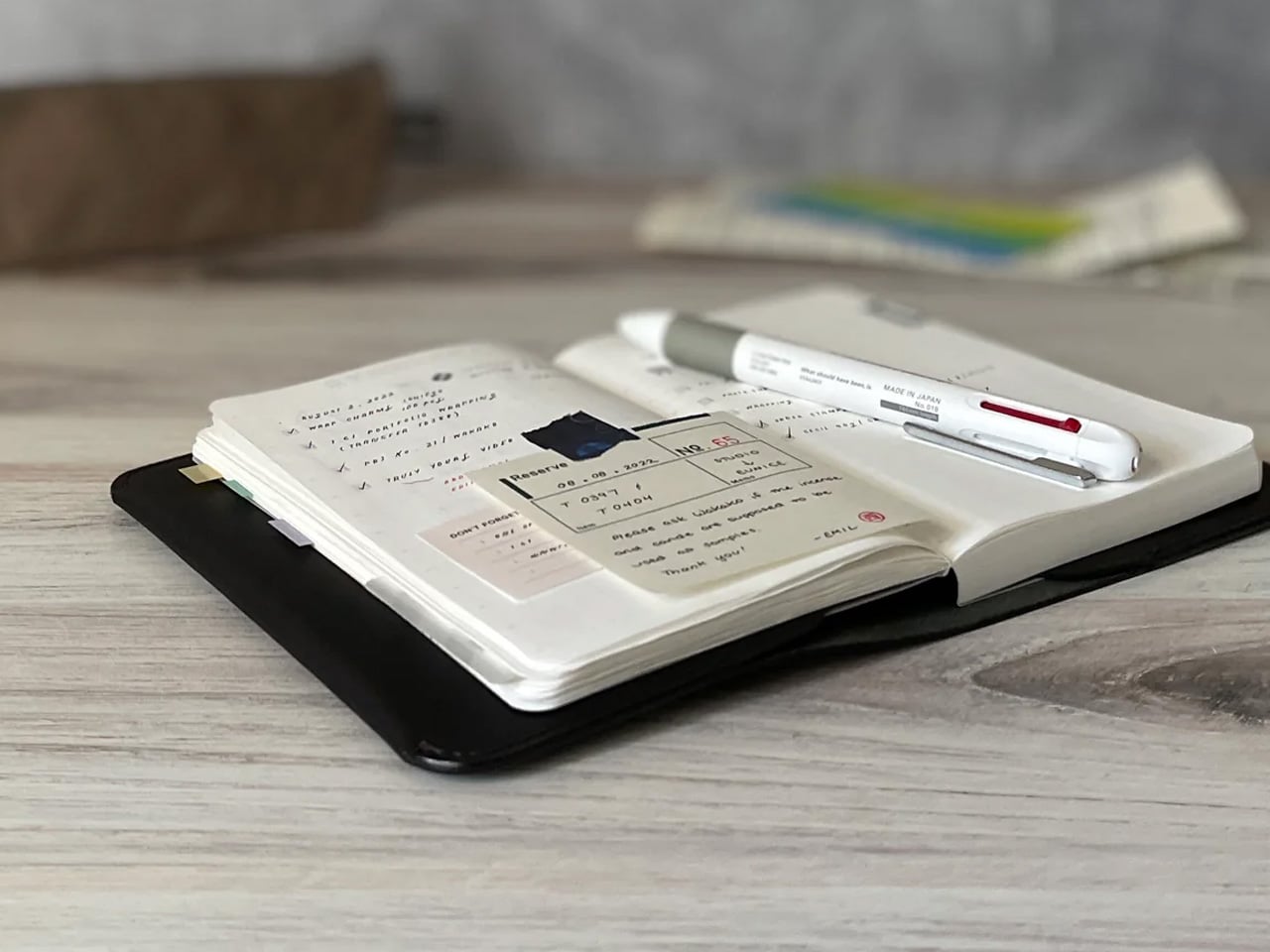
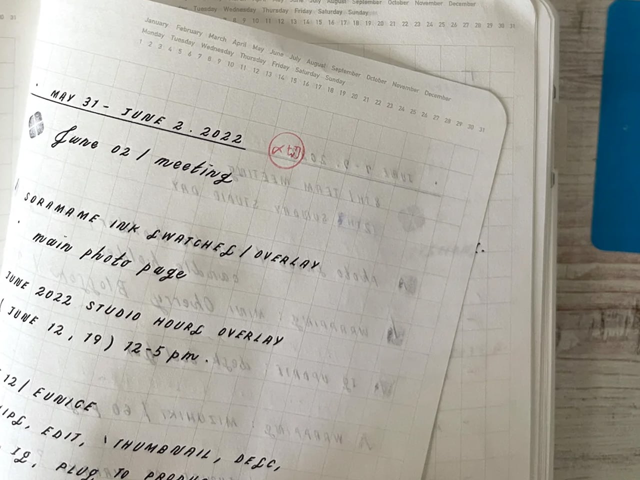
The Stalogy 365 Days Notebook runs 368 pages of thin, smooth paper in a B6 body — a size that sits between A6 and A5, pocketable without feeling cramped. The layout is minimal: a faint date-recording strip at the top of each page and a grid below that functions equally well as a bullet journal, a daily log, or plain note paper. Stalogy built no structure beyond that strip. Whether you record the date or ignore it entirely is left entirely to the person holding the pen.
The paper is the notebook’s clearest argument. Thin enough to keep 368 pages in a compact body, smooth enough that fine-liners and fountain pens move without catching. Ghosting is present with heavier inks but controlled — visible when you look for it, invisible during normal use. At $31 via Tokyo Pen Shop, it’s priced as a working notebook meant to be filled and replaced, not preserved. That clarity of purpose is part of what makes the format work so reliably across a full year of daily use.
What we like:
- 368 pages of fountain-pen-friendly paper in a genuinely pocketable B6 format. The combination of volume and size is rare in a single notebook at this price point, and the paper quality punches well above it.
- The date strip at the top of each page is optional infrastructure. You can run it as a planner or ignore it entirely without the page layout working against either approach.
What we dislike:
- Ghosting is visible on the reverse side with heavier fountain pen inks or brush pens. Lighter-handed writers won’t notice, but heavy ink users will need to account for it in how they use both sides of a sheet.
- No elastic closure or bookmark ribbon. The notebook relies on the cover wrap alone, which feels minimal for a product designed for daily carry.
7. Classiky Chestnut Postcard Case
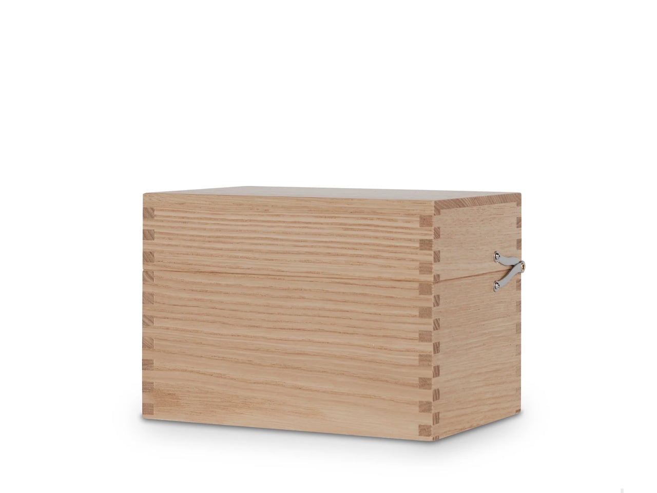
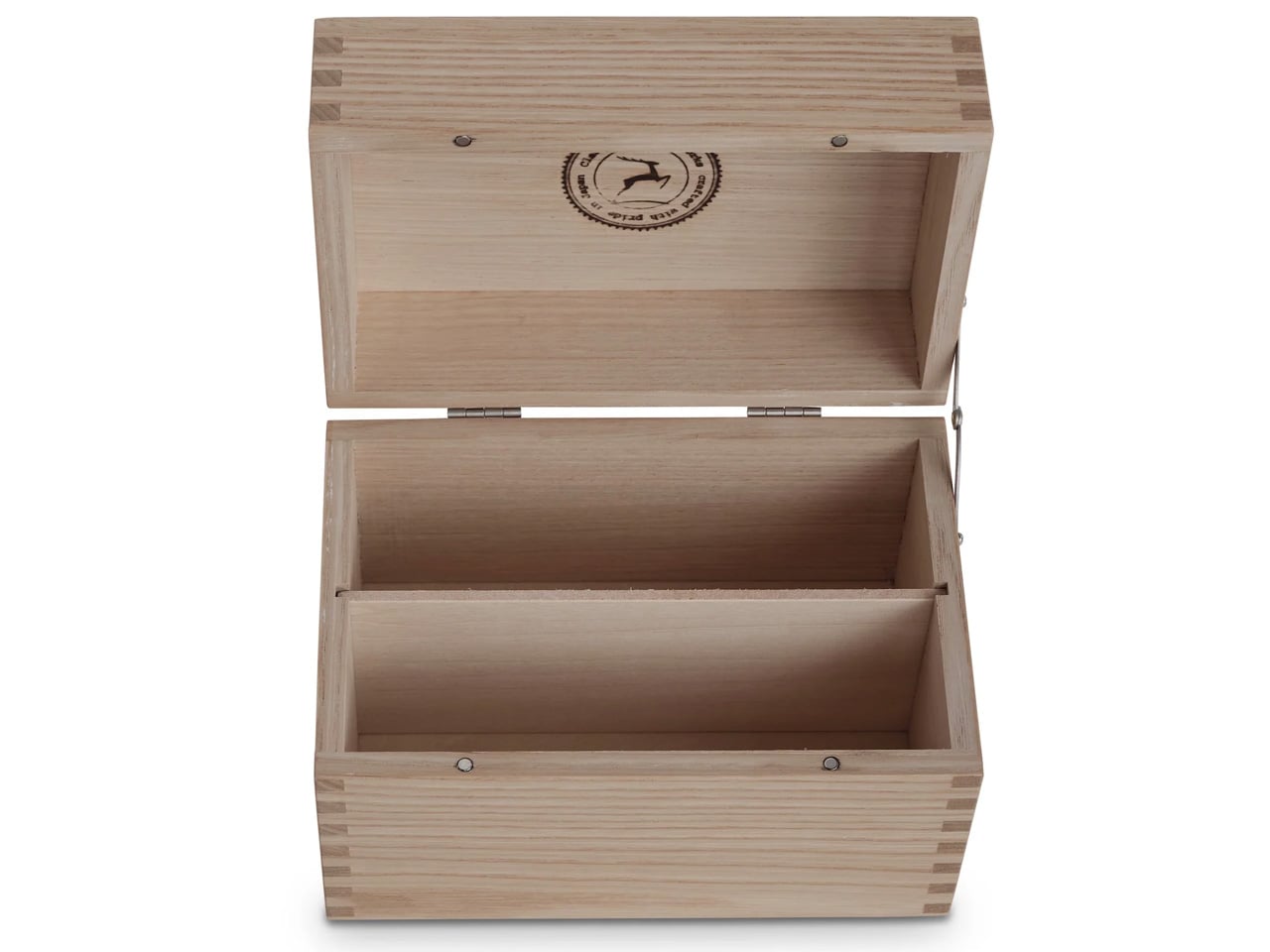
The Classiky Chestnut Postcard Case is a solid chestnut wood box built to hold postcards, letters, and small paper goods, modeled on the wooden storage boxes Japanese craftsmen use to protect ceramics and lacquerware. Inside, two removable dividers organize the contents without being fixed in place, and a magnetic closure keeps the lid shut between uses. Classiky is a Kobe-based craft goods maker, and the postcard case is one of their quietest pieces — an object that makes the act of storage feel considered rather than merely practical.
At $67 via NOMADO Store, it occupies a price point that makes sense once the box is in hand. It’s heavier than photographs suggest, and the grain reads differently in different light — close and pale in indirect, warmer and more textured in direct sun. The magnetic closure is well calibrated: firm enough to feel secure, light enough to open single-handed. For a desk that collects paper — postcards, receipts, small prints, folded letters — the chestnut case gives those things a home worth keeping visible.
What we like:
- Solid chestnut construction with a surface finish that reads the grain clearly and develops a light patina with handling. It’s the kind of material that improves with use rather than wearing in a way that reads as damage.
- The magnetic closure is firm and precise. It shuts cleanly without requiring two hands and doesn’t rattle or shift when the box is moved around the desk.
What we dislike:
- At $67, the price requires some confidence. It’s a meaningful spend for what is, at its most functional, a storage box for paper goods that could live in a drawer.
- The fixed internal dimensions don’t accommodate larger format cards or A5 folded correspondence. If your paper collection runs larger than standard postcard size, the case becomes limiting quickly.
The Quiet Logic of Japanese Stationery
Japanese stationery at its best works through constraint — one problem resolved with unusual precision, everything else left open. What connects these seven pieces isn’t a shared aesthetic. It’s a shared approach: a fold instead of a zipper, a continuous roll instead of a backing sheet, a date strip instead of a full calendar grid. That restraint is harder to design than it looks, and consistently rarer than it should be outside of Japan.
Whether you’re building out your own desk or looking for a gift that communicates something about how you think about work, any of these holds that weight without requiring explanation. They speak through use — the first time the leather fold settles around your pens, or the first time the paper takes the ink exactly right. September’s best Japanese stationery looks like this: nothing excessive, nothing missing, and nothing you’ll want to replace before you’ve used it through.

