• About
    • Advertise
    • Contact Us
    • Privacy Policy
  • Categories
    • Product Design
      • Accessories
      • Bathrooms
      • Furniture
      • Lighting
      • Kitchen
    • Technology
    • Automotive
    • Architecture
    • Interiors
    • Yanko Design Awards
      • About the Awards
      • Editors’ Choice
      • Best of Events
    • Events
      • CES
      • MWC
      • Maison & Objet
      • Salone Del Mobile
  • Submit a design
  • SHOP
  • Jobs
Yanko Design - Modern Industrial Design News
  • Product Design
    • KeysMe Lunar 02 Numpad Keyboard Adds Playful Power to Your Workspace
      KeysMe Lunar 02 Numpad Keyboard Adds Playful Power to Your Workspace
    • 5 Best Retro Designs You Need in Your Home For Instant Vintage Charm
      5 Best Retro Designs You Need in Your Home For Instant Vintage Charm
    • This 16g Titanium Blade Might Be the Most Compact, Versatile EDC Tool Ever Made
      This 16g Titanium Blade Might Be the Most Compact, Versatile EDC Tool Ever Made
  • Tech
    • KeysMe Lunar 02 Numpad Keyboard Adds Playful Power to Your Workspace
      KeysMe Lunar 02 Numpad Keyboard Adds Playful Power to Your Workspace
    • Handheld gadget concept lets you go on a digital detox while being connected
      Handheld gadget concept lets you go on a digital detox while being connected
    • BEYOND Expo 2025 Wants to Transform Uncertainty Into A Trigger for Innovation
      BEYOND Expo 2025 Wants to Transform Uncertainty Into A Trigger for Innovation
  • Automotive
    • Lunar Harvester plans to tap into the Moon’s Helium-3 Reserves to accelerate Quantum Computing
      Lunar Harvester plans to tap into the Moon’s Helium-3 Reserves to accelerate Quantum Computing
    • Skoda reimagines its 1899 Slavia B motorcycle in the shape of a futuristic electric concept
      Skoda reimagines its 1899 Slavia B motorcycle in the shape of a futuristic electric concept
    • Scout Traveler SUV: Reviving a Legend Through Calculated Design Restraint
      Scout Traveler SUV: Reviving a Legend Through Calculated Design Restraint
  • Architecture
    • This Innovative Transparent Library With A Portable Design Is Reinventing Public Infrastructure
      This Innovative Transparent Library With A Portable Design Is Reinventing Public Infrastructure
    • Triangular house is a case study in urban renewal and sustainability
      Triangular house is a case study in urban renewal and sustainability
    • This 1970s House Gets a Sustainable Cork Makeover And It’s Disrupting London Architecture
      This 1970s House Gets a Sustainable Cork Makeover And It’s Disrupting London Architecture
  • Sustainable
    • Terrazzo-like table brings electronic waste to life with closed-loop design
      Terrazzo-like table brings electronic waste to life with closed-loop design
    • Philips Fixables 3D Printed Parts Make Repairs a Breeze
      Philips Fixables 3D Printed Parts Make Repairs a Breeze
    • Off-grid Living: The 5 Key Principles Behind Sustainable Homes
      Off-grid Living: The 5 Key Principles Behind Sustainable Homes
  • Deals
    • This 16g Titanium Blade Might Be the Most Compact, Versatile EDC Tool Ever Made
      This 16g Titanium Blade Might Be the Most Compact, Versatile EDC Tool Ever Made
    • Ace Your Tennis Training with Acemate’s Revolutionary Rally Robot
      Ace Your Tennis Training with Acemate’s Revolutionary Rally Robot
    • RitFit 3-Section Adjustable Weight Bench: Your Ultimate Workout Partner
      RitFit 3-Section Adjustable Weight Bench: Your Ultimate Workout Partner
  • Reviews
    • CMF Buds 2 and Buds 2 Plus Review: Playful, Talented, and Affordable
      CMF Buds 2 and Buds 2 Plus Review: Playful, Talented, and Affordable
    • Nubia Z70S Ultra Review: A Nod To The Cameras That Changed The World
      Nubia Z70S Ultra Review: A Nod To The Cameras That Changed The World
    • OPPO Find X8 Ultra Review: An Impressive Flagship That Most of the World Won’t Experience
      OPPO Find X8 Ultra Review: An Impressive Flagship That Most of the World Won’t Experience
  • + Newsletter

Mazda’s New Minimal Logo Is An Excellent Example Of Rebranding Done Right

By Sarang Sheth 02/03/2025

Rebranding is a delicate dance between honoring legacy and embracing modernity. Done right, it feels like a natural evolution. Done wrong, you get something like what Jaguar did, nuking every bit of goodwill it had within its fanbase. In recent years, automotive brands have rushed to flatten their logos in a bid to appear more digital-friendly, often stripping away years of recognizable depth and character in the process (case in point, BMW, Volkswagen, Aston Martin, etc.). Jaguar’s recent logo rework, for instance, took a leap into sterile minimalism, leaving behind all of its rich, heritage-driven design language. Mazda, on the other hand, has taken a more thoughtful approach—proving that modernization doesn’t have to come at the cost of identity.

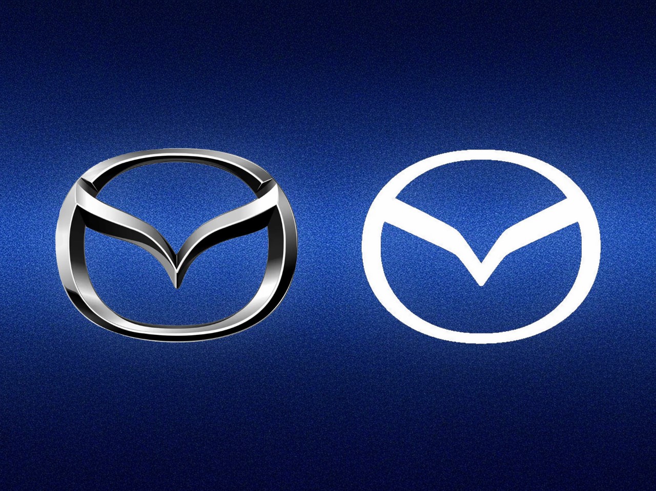
Mazda’s newly unveiled emblem is a great example of refinement over reinvention. The company has transitioned from its glossy, beveled 3D insignia to a flatter, more streamlined version, but it hasn’t abandoned the core elements that make it unmistakably Mazda. The signature “M” remains intact, its outstretched wings still evoking a sense of movement and ambition. What’s changed is the execution: the lines and angles are sharper, the presentation cleaner, and the result is a logo that feels equally at home on a car’s grille as it does on a smartphone screen.

Respecting Heritage While Stepping Forward
Historically, Mazda’s logo has featured a stylized “M” enclosed within an oval or wing-like shape, evoking both movement and a certain sense of fluidity that ties in with their automotive roots. Over the decades, the symbol evolved, but it never lost its recognizable silhouette or abstract nod to wings—part of Mazda’s storied identity that has grown in tandem with the company’s product design language (think “Kodo” design philosophy in their cars).

In their new iteration, Mazda’s design team has chosen to preserve these core elements, keeping that “M” and its winglike enclosure intact. What changes is the level of detail and the visual treatment: out goes the metallic gloss and fine detailing, and in comes a crisper, more geometric rendering that evokes edginess. After all, cars are going from curvilinear beauts to angular beasts – so why not logos? The result is an emblem that instantly resonates with Mazda’s heritage, yet feels distinctly contemporary.

By contrast, take a recent look at Jaguar’s rebrand, which many critics have described as jarring and disconnected from the brand’s storied past. Where Jaguar’s approach can be perceived as a step away from the brand’s iconic imagery—stripping it down almost to the point of anonymity—Mazda’s approach says, “Yes, we’re changing with the times, but we remain true to who we are.”

A Masterclass in Subtle Refinement
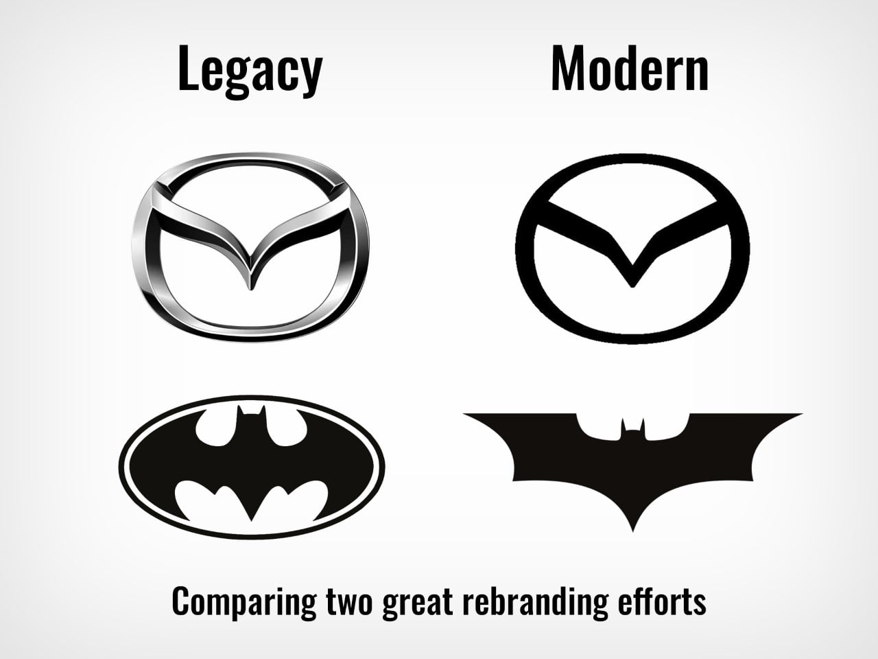
The overarching principle behind Mazda’s new logo is subtlety. Flattening a logo is often simpler said than done; you need to ensure that once you remove shadows, gradients, or dimensionality, the shape that remains still conveys the brand’s essence at a glance. For Mazda, that shape has been polished over decades: the winged “M” is timeless enough that it gracefully endures even under this flat treatment. Plus, that new angular makeover reminds me of how the Batman logo got reinvented post-2000, going from that iconic ellipse shape in the Clooney era to something a lot more modern when Christian Bale reprised the role.

There’s an inherent discipline in stripping away superfluous elements and focusing on the purity of line and shape. If executed poorly, the result can look generic. If done well—by distilling the design to its most symbolic form—you get something as timeless as the Nike Swoosh or Apple’s half-eaten apple mark. Mazda’s new look tilts toward the latter category. It’s unencumbered, distinctive, and speaks to the brand’s personality: smooth, energetic, forward-thinking, and confident.

Designed for the Smartphone Era

We live in a time when the first experience people have with a logo is often through a mobile app icon or a social media avatar, usually measuring mere millimeters across on a phone screen. That’s a key reason why flat design has become prevalent—it scales better in digital environments, where clarity at small sizes is crucial.

Mazda’s design team openly acknowledged this, ensuring the new emblem renders crisply whether it’s on a large-scale billboard or the corner of your smartphone screen. This “digital-first” mindset is part of what makes their redesign so pertinent. It’s not about chasing a trend; it’s about functionality. They recognized the need for a mark that works as beautifully on a 6-inch device as it does on the grille of a car.

A Study in Restraint and Intelligent Evolution
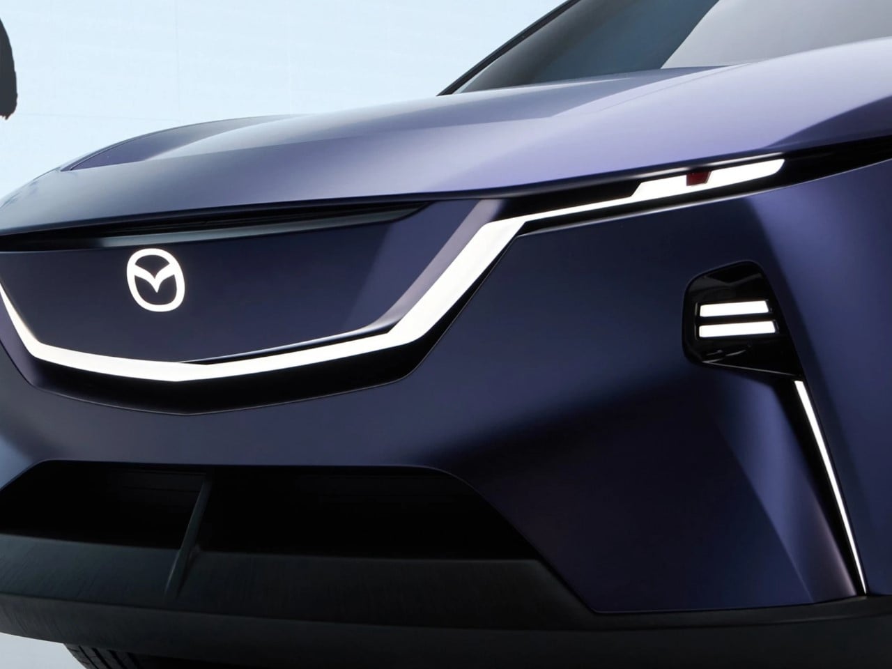
While many corporate rebrands try to “turn a new leaf” by completely discarding any trace of the previous look (*cough* Jaguar *cough*), Mazda proves you don’t have to demolish the old to welcome the new. In design circles, we often discuss the value of evolution over revolution when it comes to brands with deep historical roots. A sudden, radical shift can alienate loyal fans and diminish the cultural memory embedded in the brand’s imagery.

Yet, evolution requires a delicate hand. How do you respectfully and creatively retain the spirit of a brand while giving it a modern face? Mazda manages this balancing act with aplomb. They cleaned up the visual lines, embraced a flat style for digital platforms, and stood by the iconography that’s served them well for decades.


Lessons for Other Brands

Mazda’s new flat logo demonstrates a few key takeaways for anyone considering a brand refresh:

  1. Don’t Trend-Grab; Purpose-Build
    Align your redesign with genuine brand and user experience needs, not just aesthetic fads.
  2. Keep the DNA
    If your existing emblem carries recognizable, iconic elements—don’t throw them away. Adapt them to modern contexts instead.
  3. Think Digital
    Your logo may appear an inch wide on a website, or as a tiny avatar on social media. A simplified mark is often clearer and more impactful in these contexts.
  4. Look Within Your Own Evolution
    A brand identity can (and arguably should) evolve in increments. Stand on the shoulders of what came before to build continuity and brand equity.
  5. Refinement Over Reinvention
    A subtle, considered refining of a logo can pay long-term dividends in recognition and brand loyalty.

SHARE

  • Click to share on Facebook (Opens in new window) Facebook
  • Click to share on X (Opens in new window) X
  • Click to share on Pinterest (Opens in new window) Pinterest
  • Click to share on Reddit (Opens in new window) Reddit
  • Click to share on LinkedIn (Opens in new window) LinkedIn
  • Click to share on Tumblr (Opens in new window) Tumblr
  • Click to share on Pocket (Opens in new window) Pocket
  • Click to email a link to a friend (Opens in new window) Email
  • Click to print (Opens in new window) Print
  • More
  • Click to share on Telegram (Opens in new window) Telegram
  • Click to share on Threads (Opens in new window) Threads
  • Click to share on WhatsApp (Opens in new window) WhatsApp
  • Click to share on Mastodon (Opens in new window) Mastodon
  • Click to share on Bluesky (Opens in new window) Bluesky
  • Click to share on Nextdoor (Opens in new window) Nextdoor
283 Shares

Related Posts

This Magnetic Pen Hovers in Mid-Air and Now Fits in Your Pocket

The Hoverpen that broke the internet in 2018, winning multiple design awards and ushering in a series of levitating stationery – it’s now back in…

Declutter and Power Up Your Desk with the DockOrb 12-in-1 Dock & Qi2 Wireless Charger

Managing the tangle of cables and connectors that come with modern computing can feel like wrestling an electronic octopus. We’ve all experienced the frustration of…

Apple’s AI Future Begins With The M4 Mac Studio… Not With Apple Intelligence

AI models demand serious horsepower. Training a large language model, running Stable Diffusion, or processing high-res video with machine learning usually means turning to high-end…

2023 Nissan Z Review

Z isn’t just the last letter of the alphabet. It’s one of the most storied sports cars of all time, and this particular iteration of…

Harley-Davidson unveils a stunning e-bike that pays homage to their iconic 1903 design!

Harley-Davidson’s journey started more than a century ago putting power to two wheels – surviving the great depression, and evolving new ways to hit the…

Intricately detailed Ferrari 296 GT3 replica model is perfect for passionate motorheads

Amalgam Collection has created a niche for itself in the car scale model-making craft and they go down to the last-minute details, leaving nothing to…

Tags

LogoMazdarebranding
Previous articleThis Japanese performance electric bike delivers mind-blowing acceleration in 10 seconds flat
Next articleDeepSeek Will Teach You Bomb-Making At Home But Won’t Let You Search Tiananmen Square

Newsletter

Featured Posts

  • This Magnetic Pen Hovers in Mid-Air and Now Fits in Your Pocket

About Yanko Design

We’re an online magazine dedicated to covering the best in international product design. We have a passion for the new, innovative, unique and undiscovered. With our eyes firmly focused on the future.

Editorial Standards and Ethics / Privacy Policy

    Official Partners

    Official Partners
    Official Partners
    Official Partners
    Copyright © Yanko Design 2002-2024
    Back to top