In contemporary lifestyles dominated by digital communication, stationery remains a tangible and cherished commodity. The OZ Stationery collection is a testament to the creativity that can be put into an often-overlooked market. The journey of creating this unique collection began with a comprehensive study of the stationery market, aiming to find a distinctive niche in an already saturated industry.
Designer: Kashyap Masiwal
Market analysis and a thorough SWOT analysis revealed that the creative stationery market is experiencing rapid growth, with a Compound Annual Growth Rate (CAGR) of 13.8%. Furthermore, individuals associated with creative stationery tend to be the highest spenders on personal stationery. Leveraging this insight, the OZ Stationery collection was designed to cater specifically to the creative demographic.
Extensive research unveiled that stationery is not just a utilitarian item but also one of the most gifted commodities. With this in mind, the creators of OZ Stationery aimed to develop products that not only served practical purposes but also reflected the personality and artistic inclinations of the user.
The core idea behind OZ Stationery was to create a series of personal stationery products representing popular art movements and their philosophies. The target audience was identified as creatives who resonate with specific artistic emotions, movements, or artists. This collection serves not only as a means of self-expression for the user but also as a thoughtful and unique gifting option. Choosing conceptual art as the overarching theme, the creators delved into the idea that the concept behind the artwork is more crucial than the finished product. This led to the development of three key concepts for the stationery collection: Clear Ideas, Deconstruction, and Expressions.
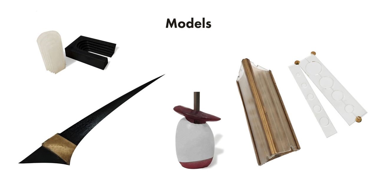
Pen: The Mightier Than the Sword

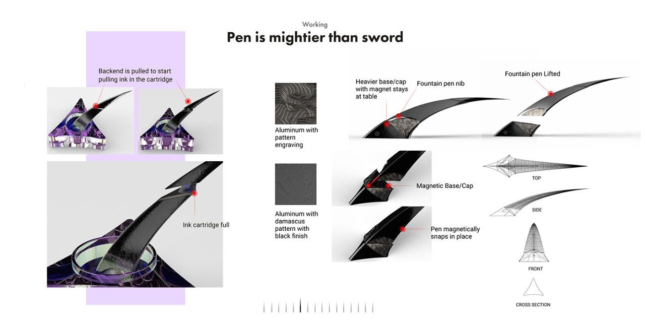
Drawing inspiration from the sword’s swooping motion and the iconic Excalibur (Excalibur is the mythical sword of King Arthur that may possess magical powers or be associated with the rightful sovereignty of Britain.), the pen incorporates a magnetic base and cap, providing a unique and secure closure.
The pen is crafted from aluminum with pattern engraving, emphasizing both form and function.
Inkpot: Ink it Down

Taking inspiration from the cross-section of a pen, the inkpot is designed in a prism shape, harmonizing aesthetics and functionality.
Sharpener: From the First Promethean Ember
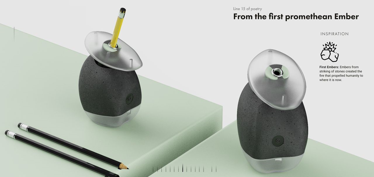
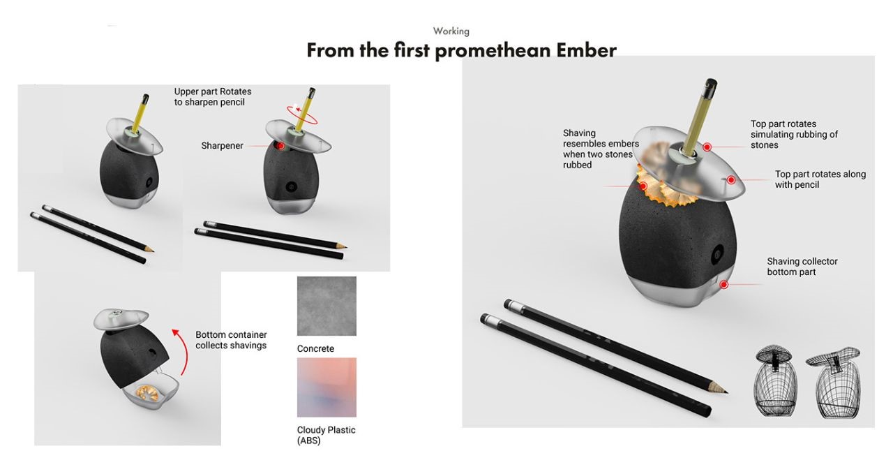
The sharpener draws inspiration from the first embers produced by striking stones, utilizing concrete and cloudy plastic materials.
The top part rotates to sharpen a pencil simulating the rubbing of stones, while the bottom container collects shavings resembling embers.
Erasers: Poetic Significance in Every Detail
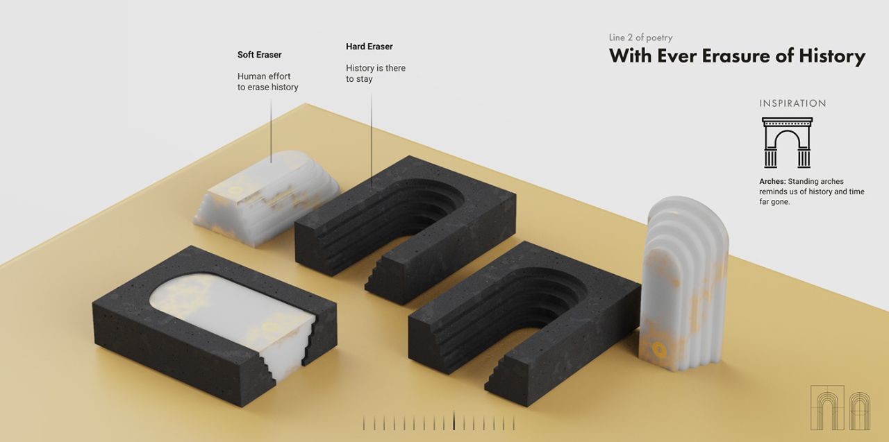
Soft and hard erasers symbolize the human effort to erase history and the permanence of historical events. Both erasers perfectly fit together, representing the continuous erasure of history.
Ruler: Paramount Structures in Time
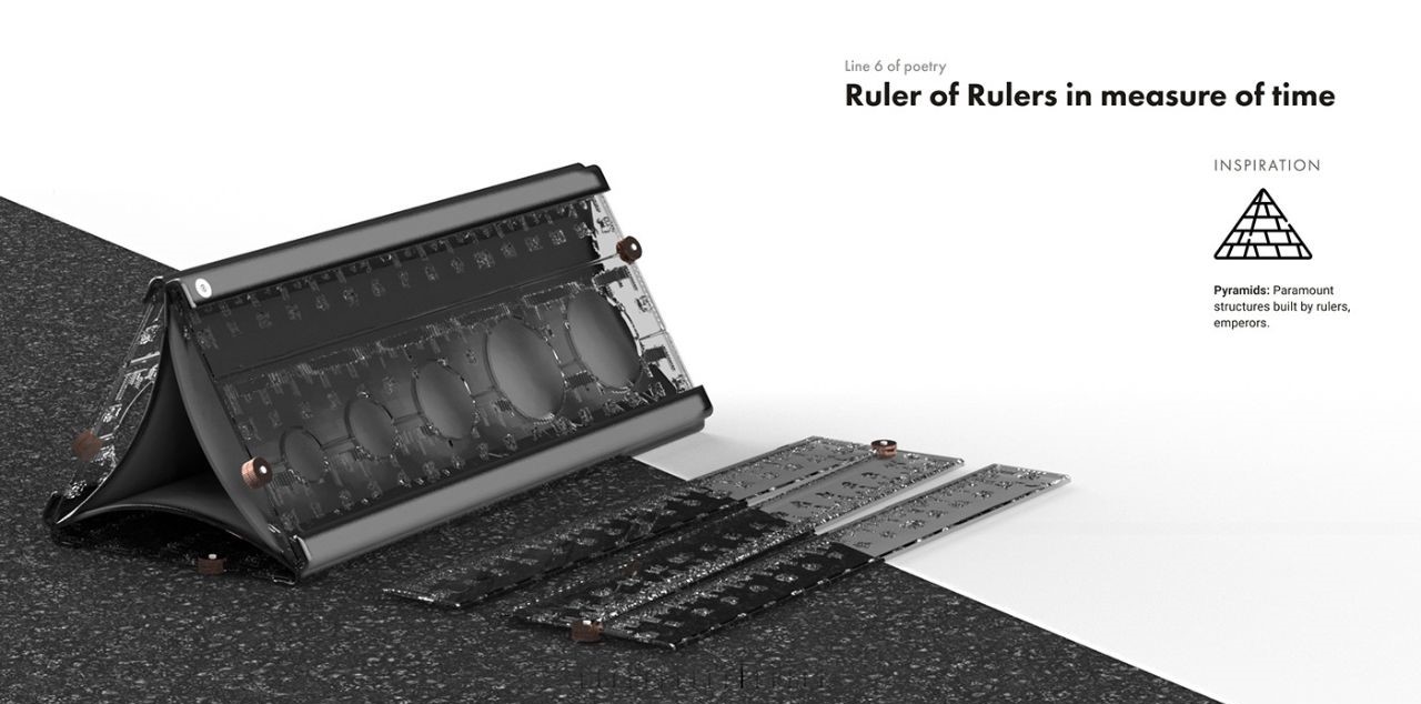
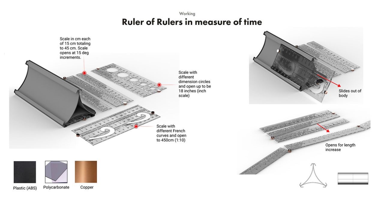
Drawing inspiration from pyramids and standing arches, the ruler symbolizes the rulers of history and time. Crafted from plastic, polycarbonate, and copper, the ruler unfolds to reveal various dimensions and curves.
Tape: Joining Broken Pieces
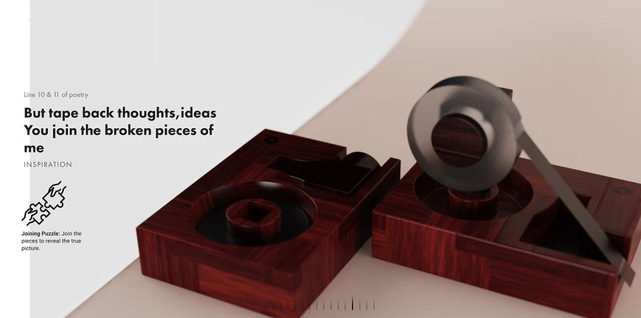
Inspired by joining puzzles, the tape represents the act of connecting fragmented thoughts and ideas. Each product in the OZ collection carries a poetic significance, making it stand out in its uniqueness.
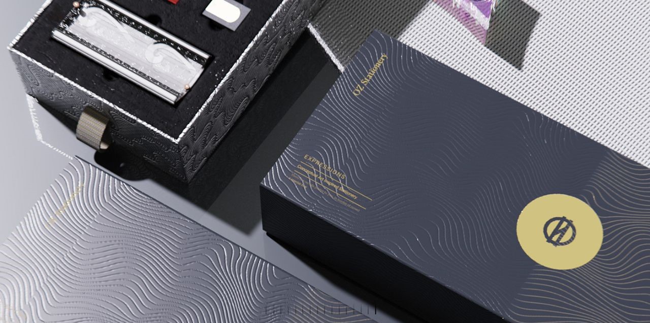
Packaging:
The name “OZ” is derived from the famous poem “Ozymandias,” which explores the theme of time’s relentless passage. This thematic connection is reflected in the packaging, reminding users that time and tides wait for none.