Color can set your home’s tone and energy level; you may have noticed that some spaces feel restful while others feel energized. As per scientific studies, colors have energy and different emotions are attached to each hue. Hence, color has the potential to calm stress, stimulate creativity, foster visual thinking, and create an experience. In addition, color can have a long-lasting effect on us, and it is one of the essential tools of interior design that can set up a specific atmosphere and mood within a given space. Since hues impact the room’s mood, strategically using colors can create the energy and mood we seek.
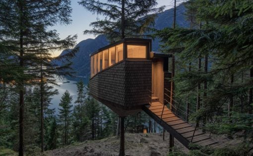
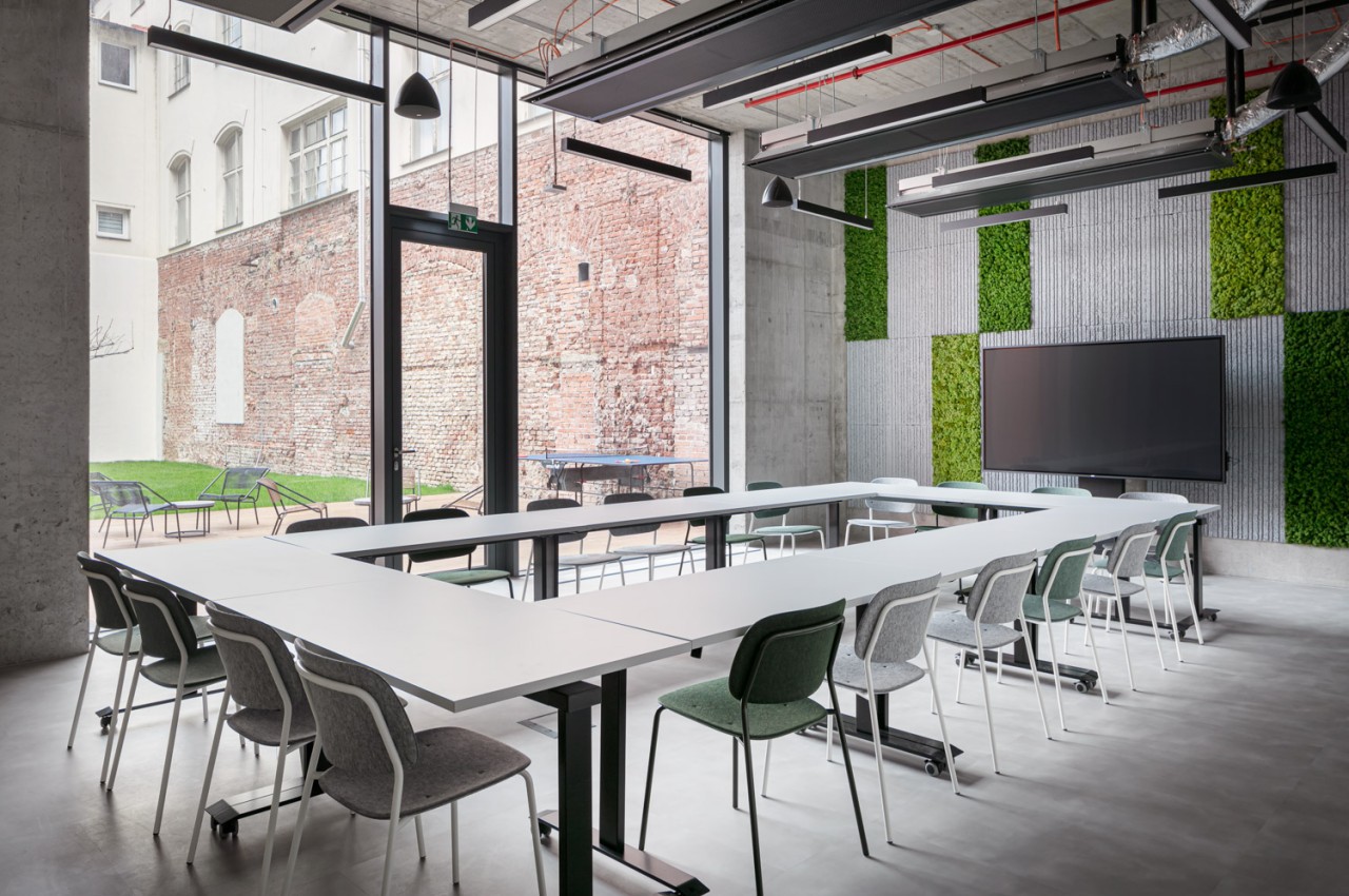
Designer: Klik Architekti
What is Color Psychology?
Color psychology is a study between color and human behavior about how color can affect a person’s mood, well-being, productivity, and creativity. This study is based on the scientific effect of different hues on the brain. According to physics, color is how our brain and eyes react to different wavelengths of light reflected from objects. The seven spectrum colors include VIBGYOR or violet, indigo, and blue, which are cool colors with a short wavelength. Green is a medium wavelength and restful, while yellow, orange, and red are warm colors with a larger wavelength. Cool colors are relaxing and meditative and are ideal for bedrooms. Pastel shades promote relaxation, while warm colors such as cream, beige, etc., are suitable for common areas of the house, such as the living room, dining area, and balcony.
Color Basics
The basic colors are primary colors like red, yellow, and blue, as these colors cannot be produced by mixing other colors, but with these colors, one can create any color. The secondary colors are located between the primary colors and include shades of green, orange, and purple. Intermediate colors are produced by mixing different proportions of secondary colors.
Color Psychology in Interior Design
Color can make or break the look of the space, where the color of the walls, ceiling, furniture, upholstery, and flooring determine any room’s color scheme. It is always crucial for the end user to decide the color scheme of the place, as each person reacts differently to a particular color. One can use a burst of color or apply it to the whole walls and create the right ambiance in each space. Another method is to pair it with light, softer color upholstery and accessories for a less overwhelming, far more pleasing aesthetic.
Here is the psychology behind some of the most common colors used in interior design:
Red
One of the most vibrant and intense colors of the color spectrum, red is an attention-grabbing hue and an excellent color that intensifies the room’s energy. This color is highly recommended in a couple’s bedroom, as it stimulates intimacy and passion and provokes strong passion. In addition, it triggers ambition and energy, so it is highly recommended for the home office or study area. Introduce it on one wall or an accent chair to make sure living room areas feel warmer.
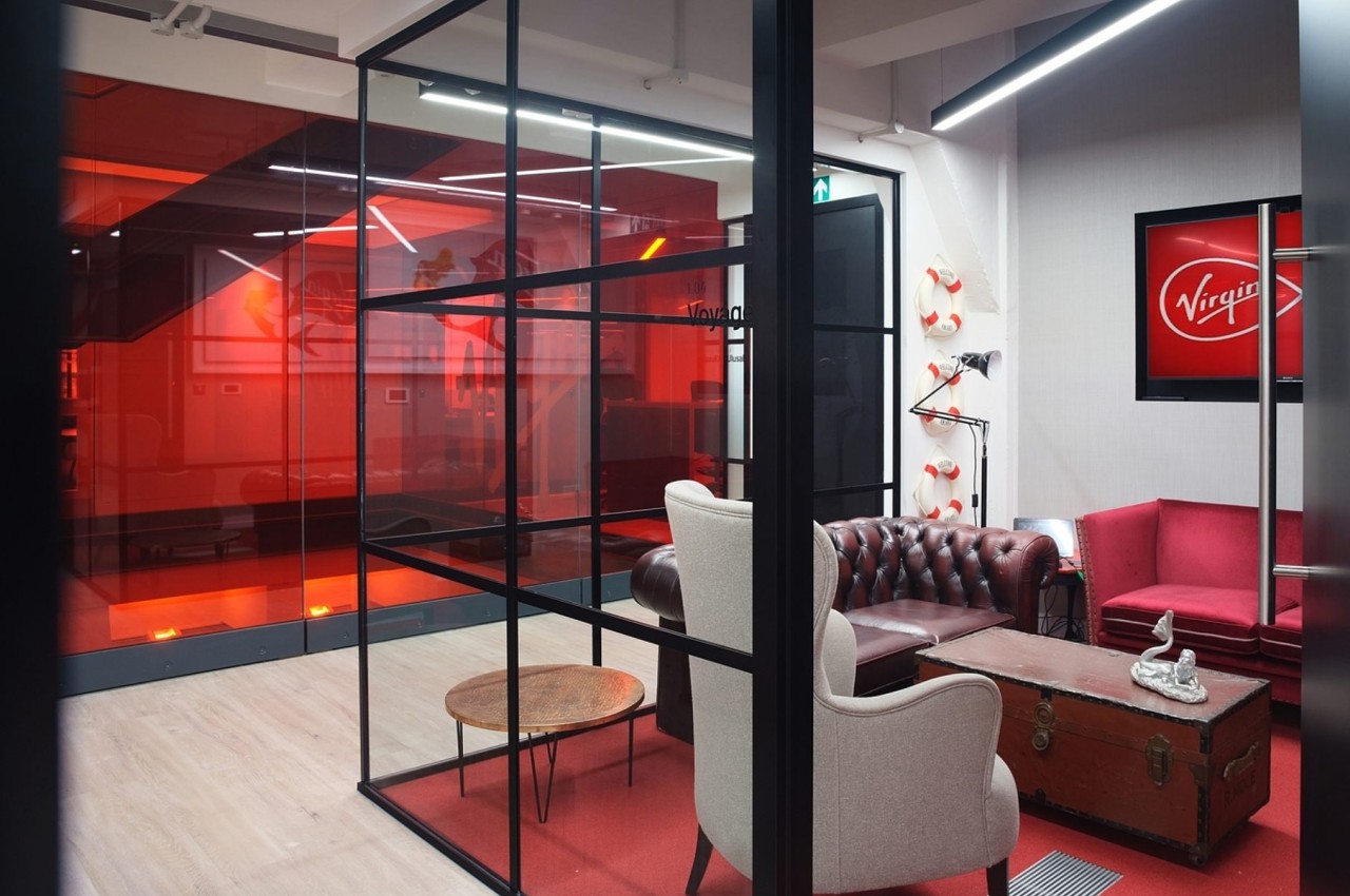
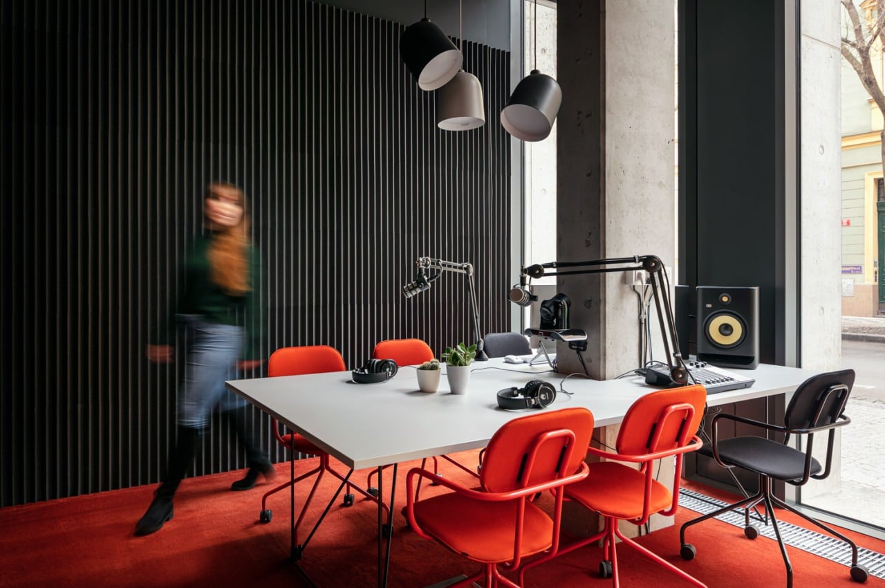
Designer: Morgan Lovell
Yellow
Capture the positive hues of sunshine and happiness with yellow color. The sunny and energetic hues of yellow uplift the spirit. It creates a warm and welcoming ambiance and infuses lightness into the space. The psychology of yellow color is joy and optimism, but it is not a relaxing color because its brightness can be overpowering in large doses. Therefore, selectively use yellow color and style the space with statement pieces of yellow furniture and accessories. It is best suited for Boho or maximalist interiors.
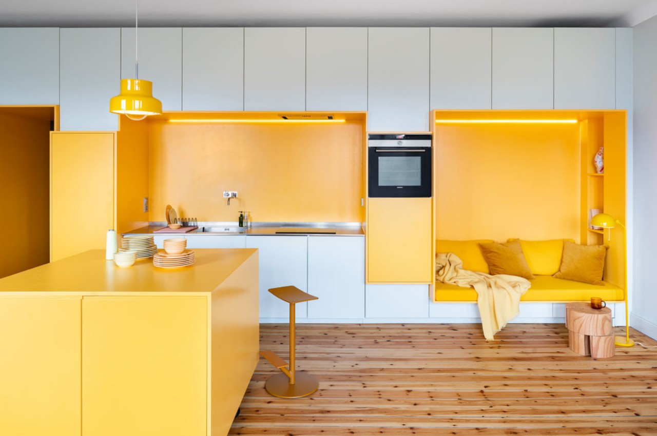
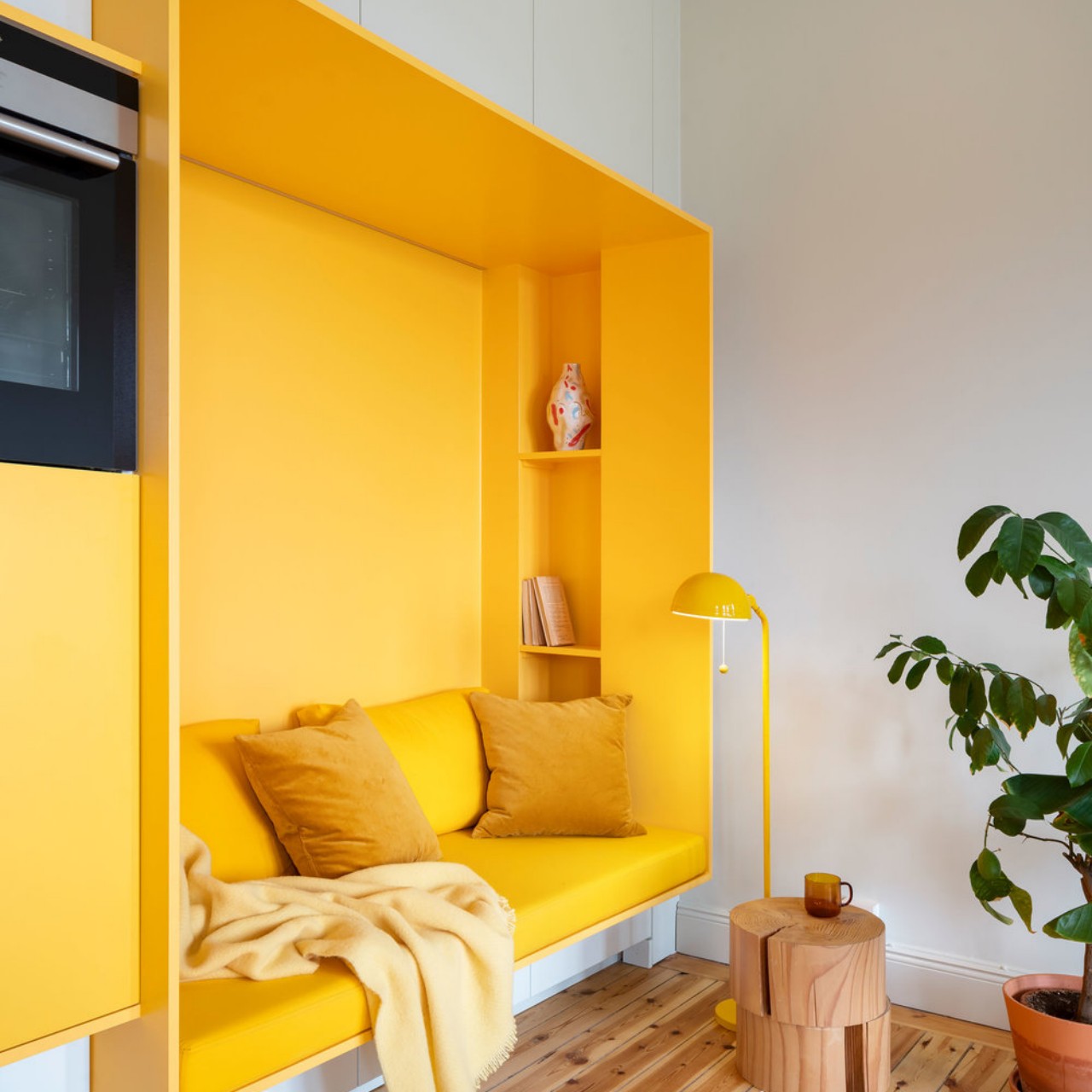
Designer: Lookofsky Architecture
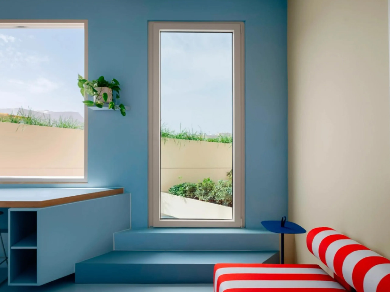
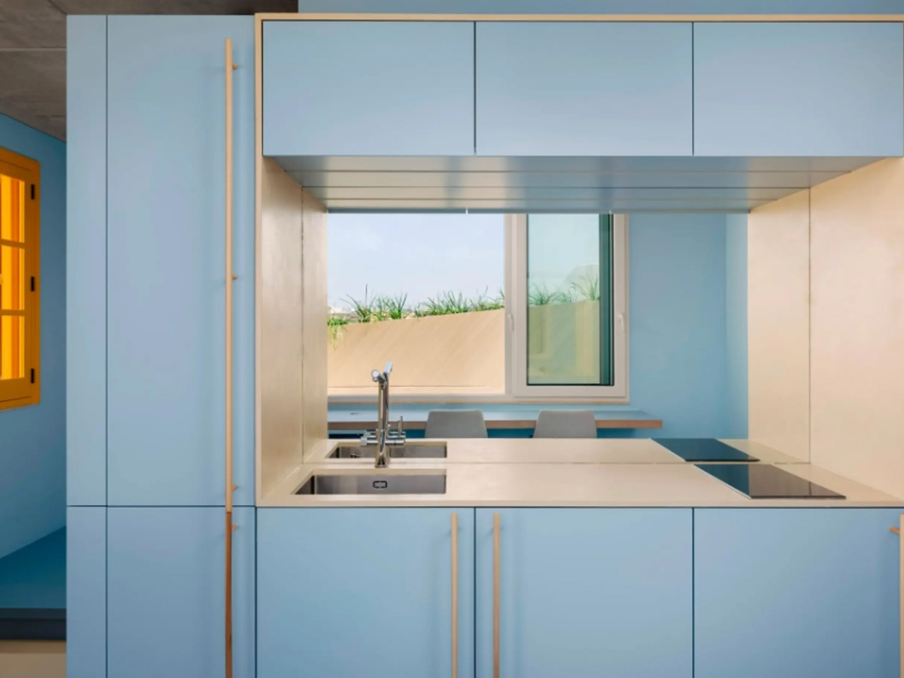
Blue
Blue is the hue of the sea and the sky. It creates a calm, serene, and relaxing environment and substantially impacts our well-being. Light blue shades have a soothing and healing effect on the mind and promote good sleep. It helps us to relax better and is perfect for areas like the bedroom, living room, and bathroom where one wants to rejuvenate. Blue is a soothing color and goes well with other color tones like red, grey, and lilac, to name a few.
Green
It is a cheerful color that immediately draws one towards nature and symbolizes freshness, harmony, and growth. It fosters the feeling of abundance while having a soothing and relaxing impact on children and adults. It improves the child’s focus and offers a sense of security. Popular emerald, jade, and sage green hues suit areas like the kitchen and study room. This color exudes an organic vibe and adds life, depth, and dimension to the space. Living in an urban city apartment is a great way to reduce anxiety and bring the freshness of nature indoors.
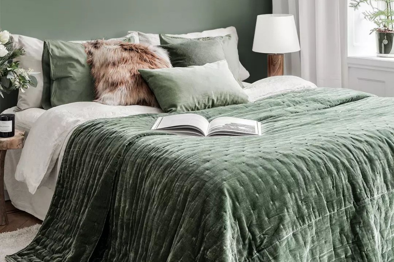
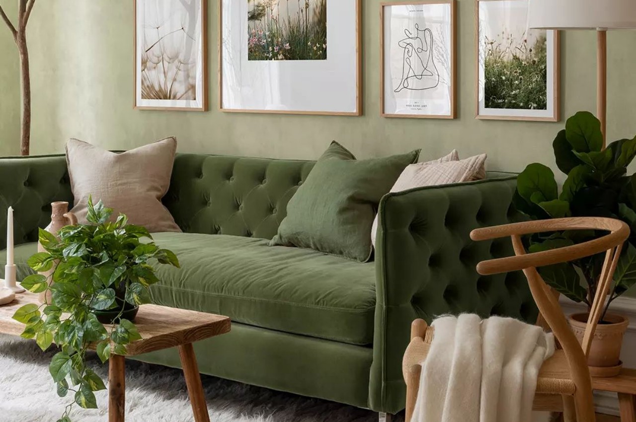
Designer: Poster Store
Purple
Purple is a spiritual and imaginative color and is formed by mixing red with blue. It is associated with elegance and royalty and fosters creativity. Purple is a symbol of luxury and depth and is perfect for the home’s living room and entertainment areas. Purple is a powerful color, so limit the use of purple to accent pieces of furniture or an accent wall.
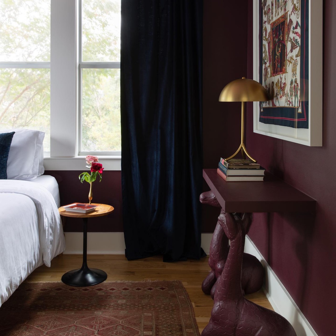
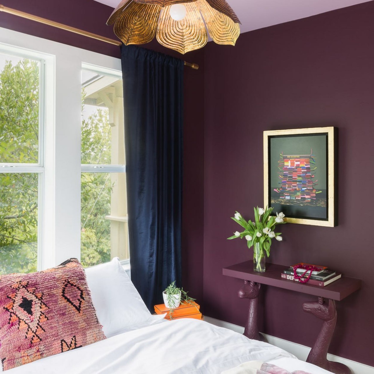
Designer: Allison Crawford Design
Orange
Bright and punchy, the orange color is socially inviting and promotes a sense of cheerfulness. The psychology of orange is that it is a fun and energetic color that boosts creativity and encouragement in young people. Since orange is a bold color, consider peach, as it is a softer hue of orange. It is perfect for areas like the gym and the bedroom.
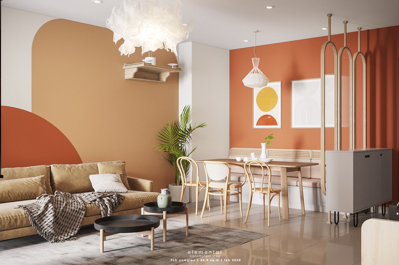
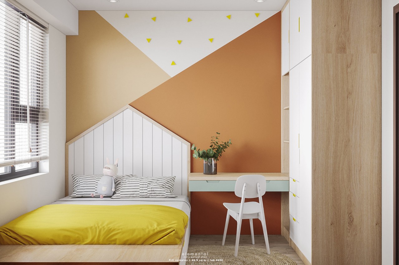
Designers: Hang Vu, Elemental Design
Brown
Brown is considered a neutral and natural hue that adds an element of coziness and works well with modern and traditional spaces. Associated with all things earthy, brown imparts a relaxing vibe and evokes the feeling of warmth, comfort, and earthiness.
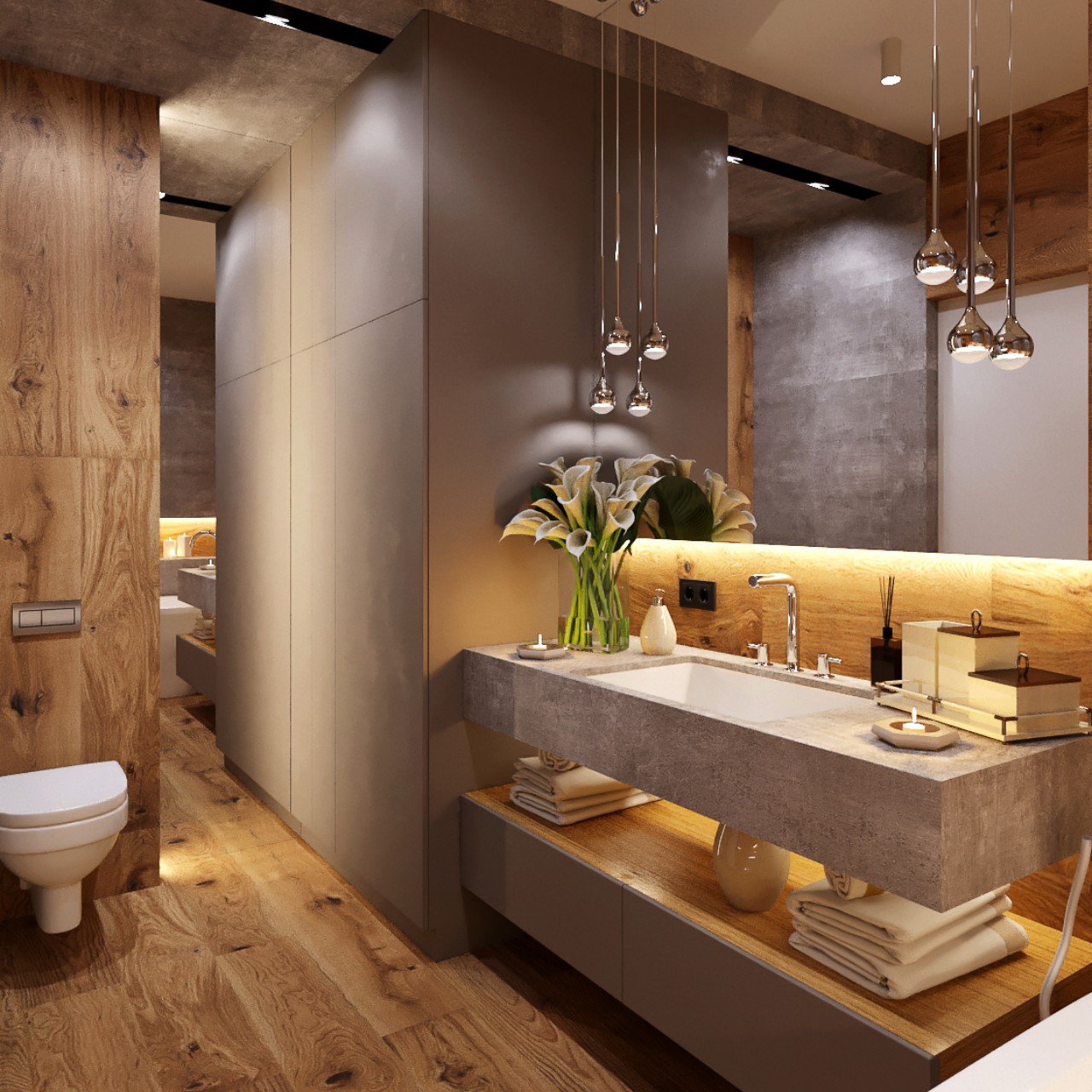
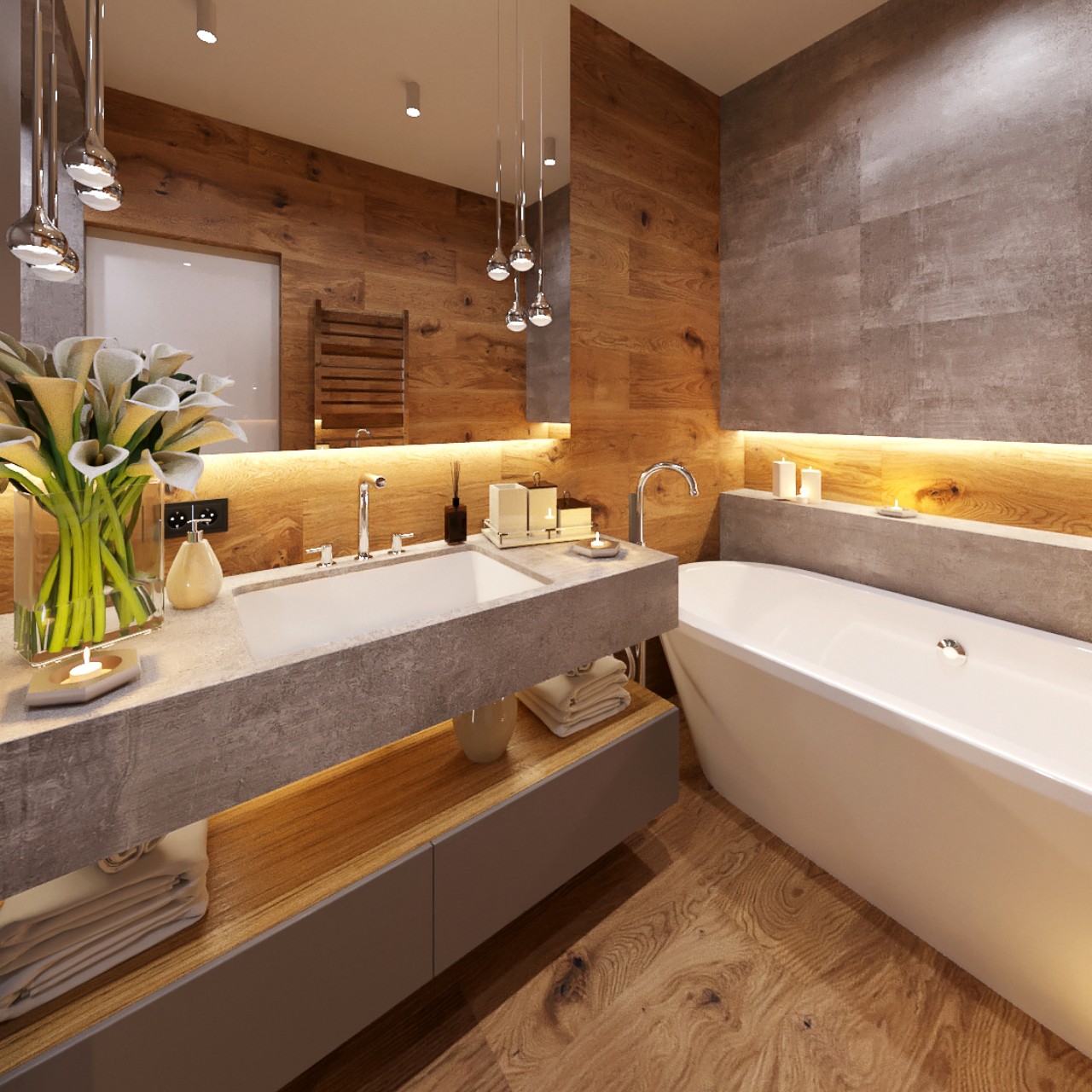
Designer: Natalia Bohachova
Pink
When light falls on pink, it radiates a subtle glow, making the space look brighter and better. Pink instigates the feeling of love and compassion. It is known to be a feminine color that instantly adds softness, uplifts the mood, and adds brightness. It is also associated with the beauty and fragrance of pink flowers that are found in nature. Magenta is a darker hue of pink. It can be used as a pop color and in the textures and patterns of cushions and throw pillows.
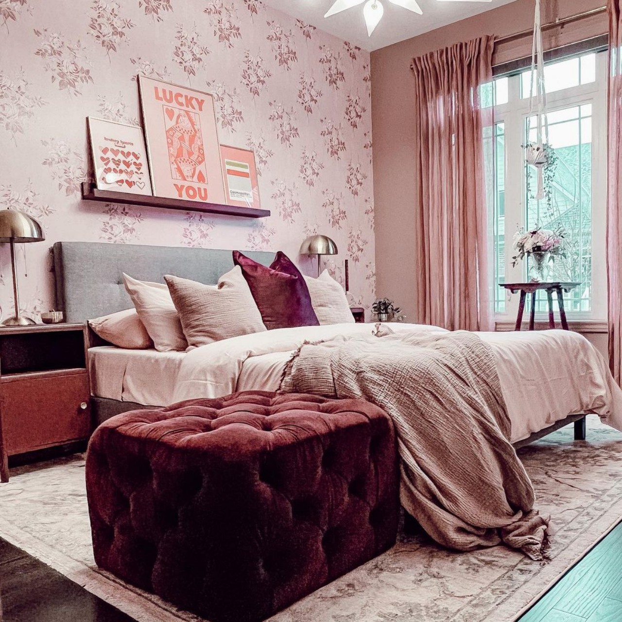
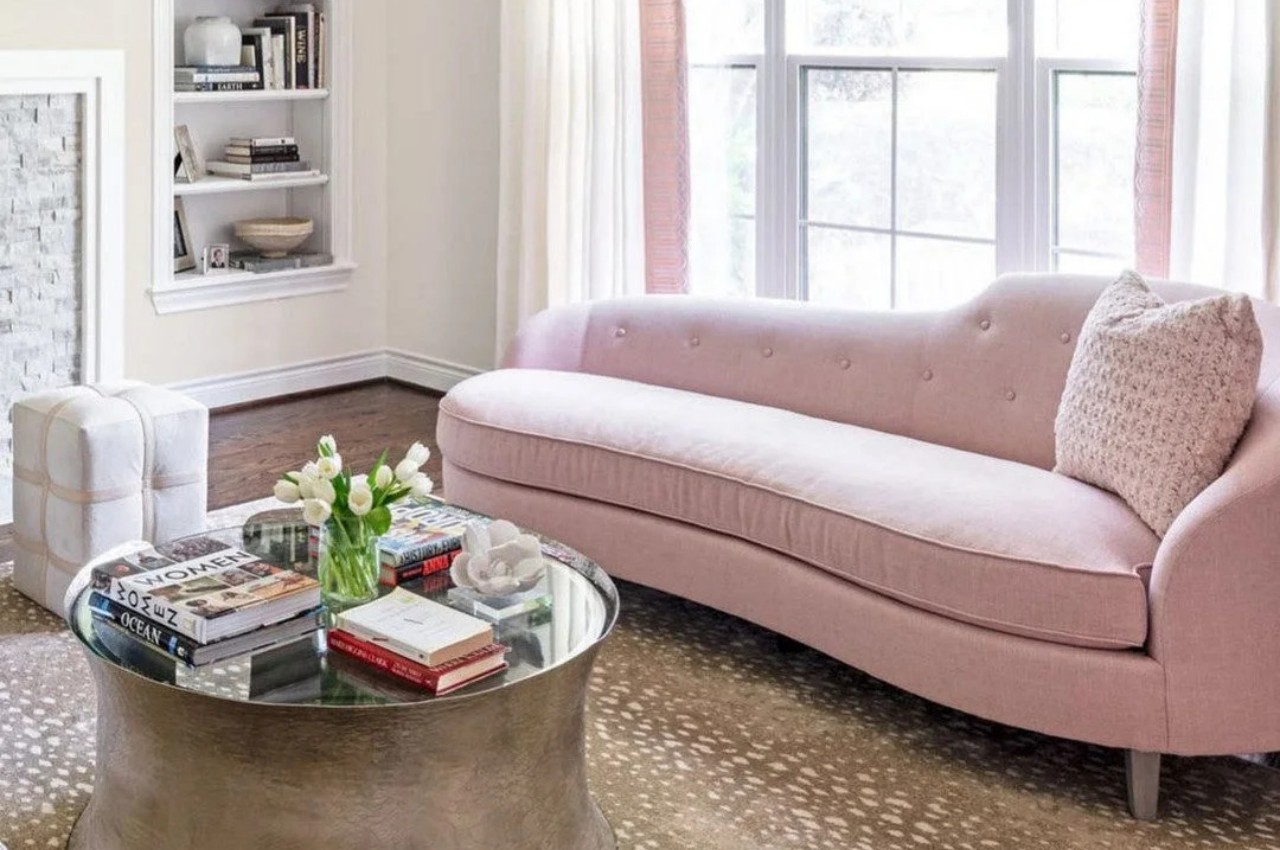
Designer: Ashley Stark
Black
Black is an elegant and dominating color with a contemporary appeal. It’s a dramatic color that infuses sleek sophistication and simplicity into a modern design. The psychology of black color is that it adds drama and symbolizes power.
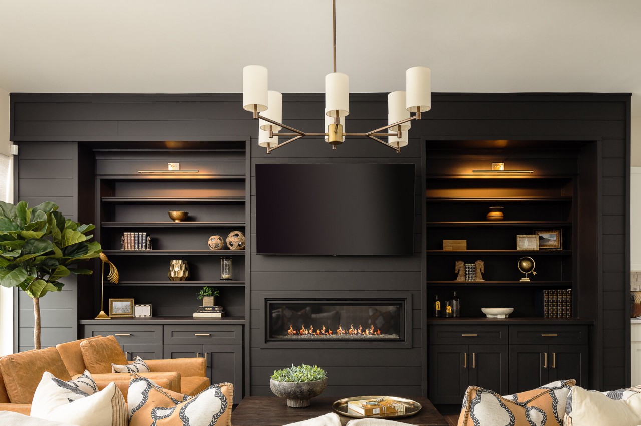
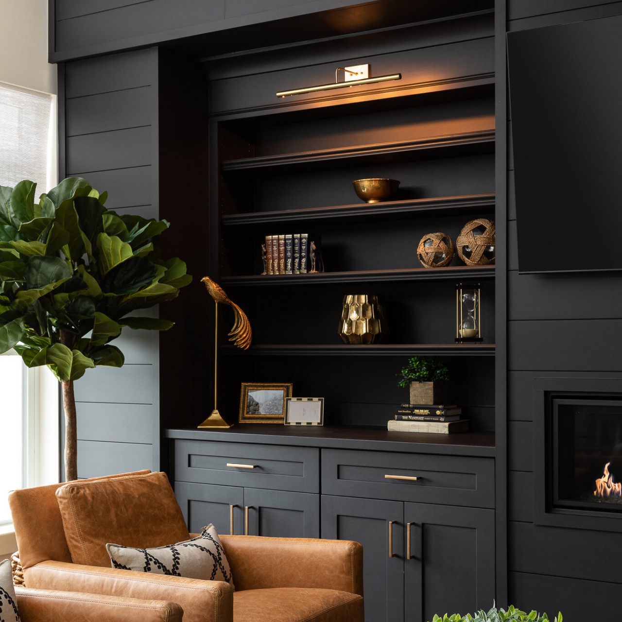
Designer: Bummer Lamb
Gray
Grey is a neutral color that exudes elegance, style, and sophistication into any space. The color also offers a sense of security and creates a calm and serene vibe.
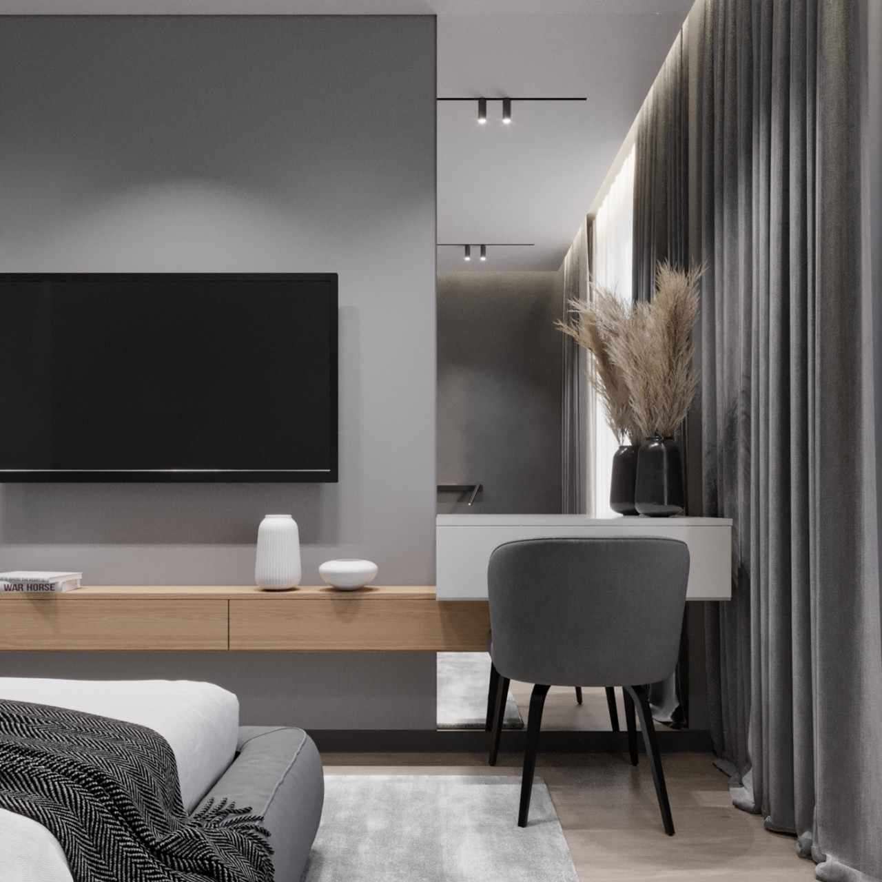
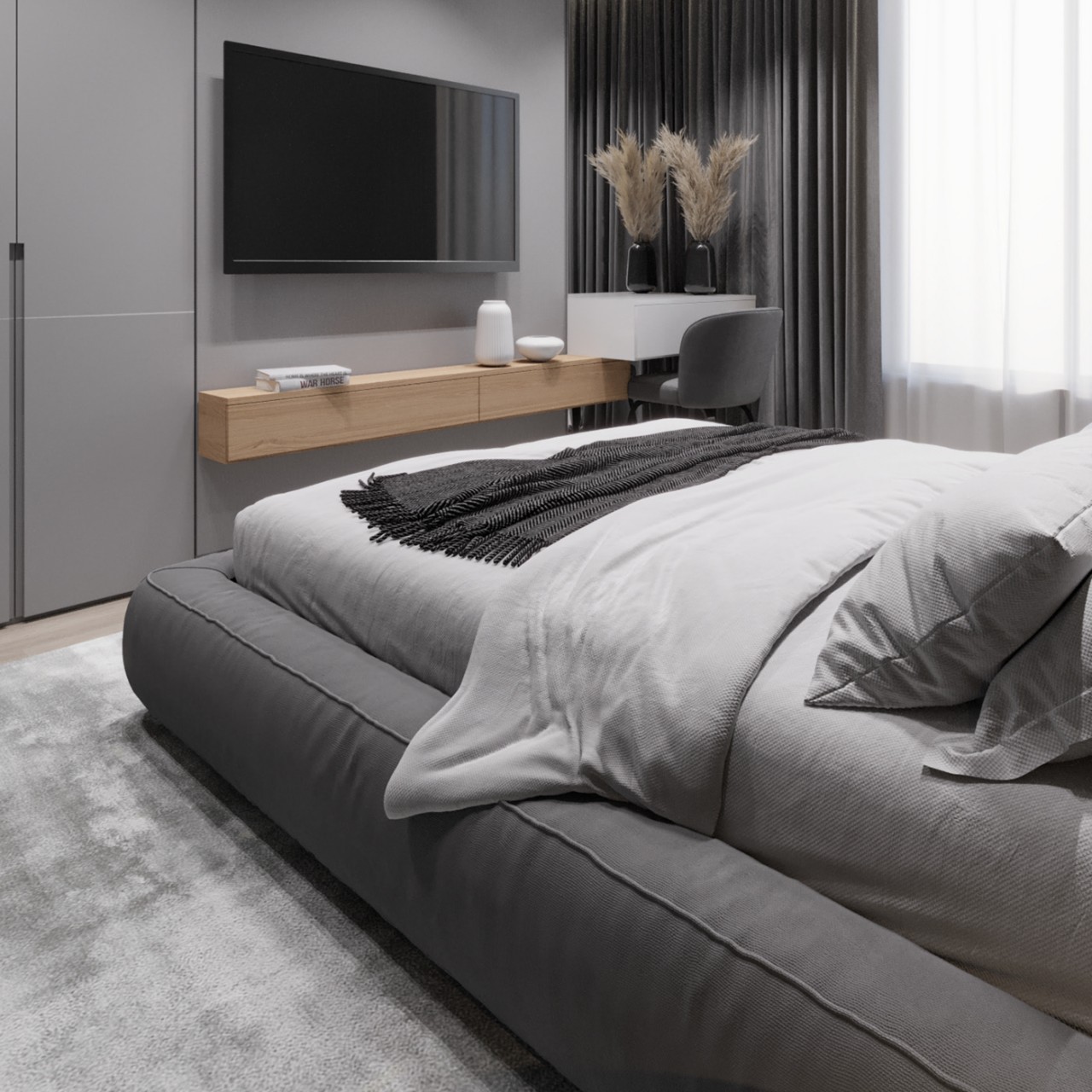
Designer: Nicoleta Jelihovschi
White
White is a color that stands for purity, cleanliness, and innocence. For some, white may look sterile and cold, so one can incorporate pops of color to energize the space. Perfect for minimalist interiors, beach houses, and outdoor patios, white combines well with wood and glass. White color creates a bright and airy look and makes the space look larger than it is.
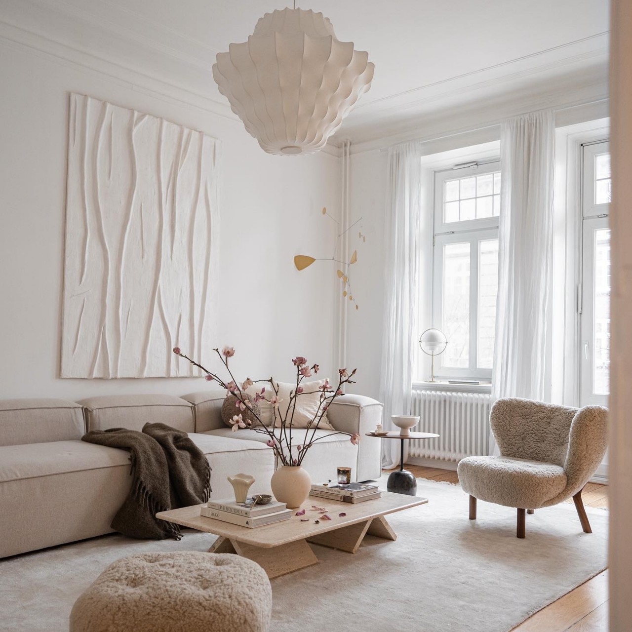
Designer: Johanna (scandinavian.interior)
Choose your colors wisely and ensure they make you feel comfortable and aesthetically pleasing. This is because the surrounding colors determine the feelings a space can evoke.