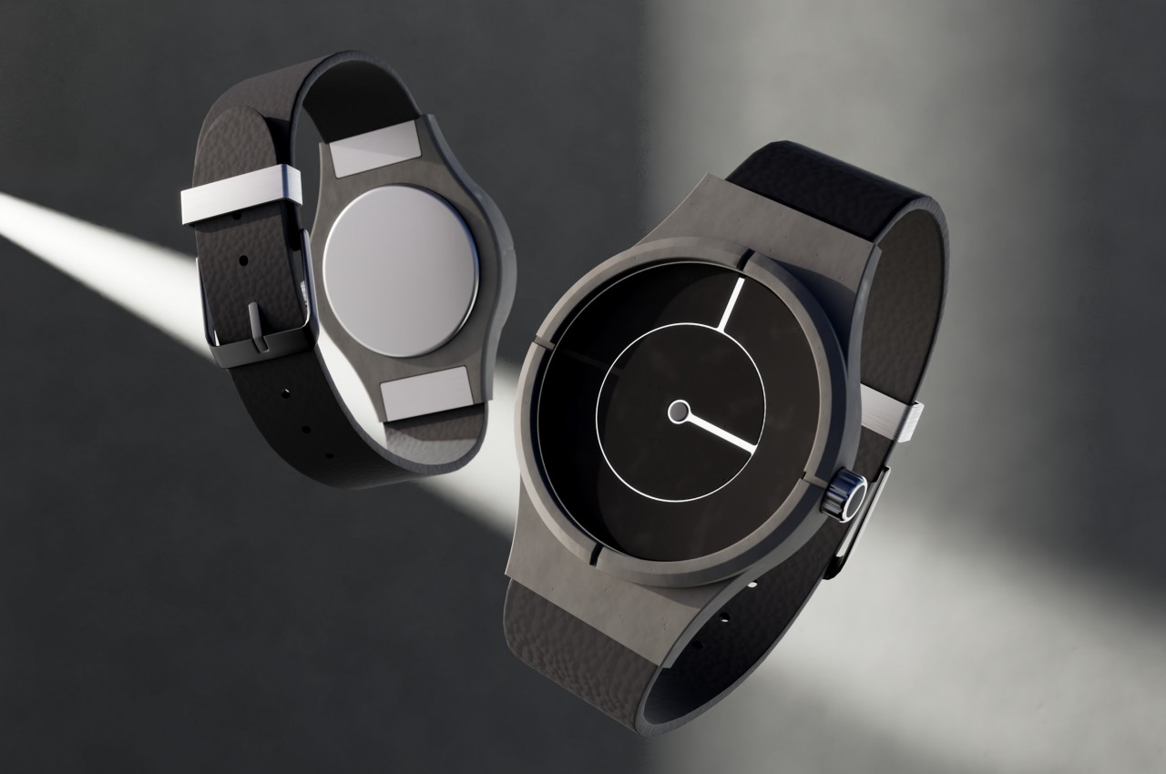
Watches were originally invented to be able to tell the time whenever and wherever we are, but they have evolved to become fashion pieces and lifestyle choices over the decades. Even without considering smartwatches that can have a multitude of different faces, watches now come in a variety of designs that do more than just tell the time. In fact, there are some designs that make it harder to tell the time at a glance but are so eye-catching, attractive, or intriguing that it’s difficult to give them a pass. This minimalist watch concept design does make it a chore to guess even the hour beyond 3, 6, 9, and 12, but its play on the contrast between dark and light gives it a particular visual character that some sci-fi and pop culture fans might associate with TRON’s iconic design.
Designer: Daniel Wu

The actual inspiration for this minimalist design is the Church of Light by Japanese architect Tadao Ando. Although the design has deep spiritual undertones, the contrast of light and darkness, as well as solid and space, give it an almost otherworldly atmosphere. Light shining through thin lines against a solid or dark background, however, is also a hallmark of the sci-fi franchise TRON, where glowing lines visualize how the lines on a circuit board could light up if the electricity that passes through them were visible.


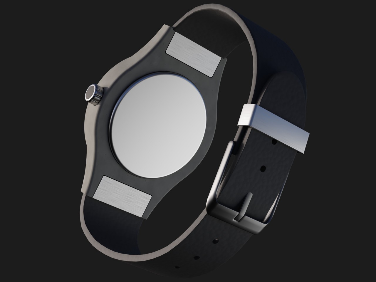
To be fair, the Light watch isn’t even trying to aim for a sci-fi motif, and the rest of the timepiece implies a more classical bent. The straps are meant to be made of leather, with what seem to be metal clasps and buckles to join them together. The main body’s material is a bit harder to guess, but it would be shocking if it wasn’t metal that was painted or coated with something that would make it look like concrete to go in line with the Church of Light origin.
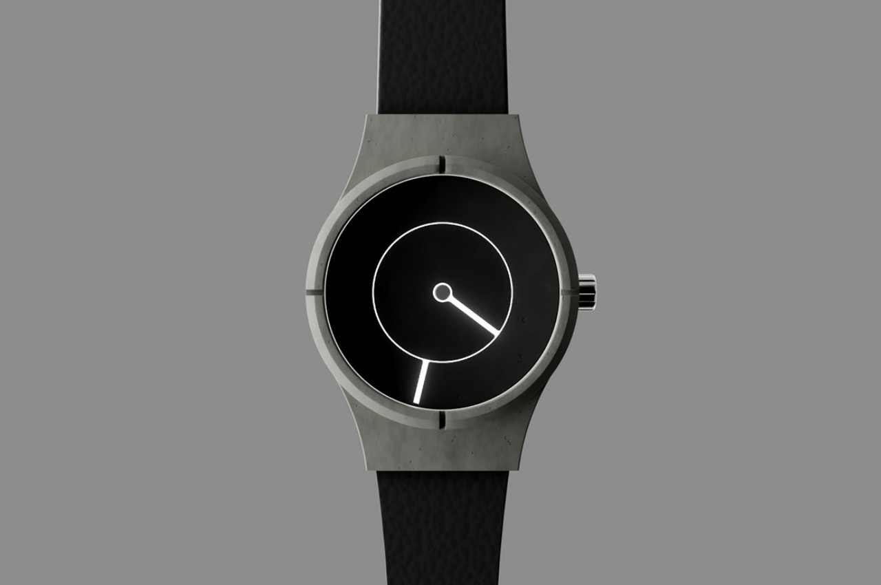
The face of the watch continues that concrete-like material appearance and is composed of two concentric circles that have thin gaps that let what seems to be a backlight shine through to create the desired visual effect. It’s probably going to be a drain on the battery, but that’s why this is simply a concept design. Actually, this watch would be a beautiful but impractical concept, and not just because of that battery consumption.
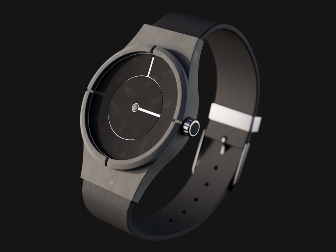
It’s easy enough to tell which is the hour hand and which is the minute hand by their proximity to the edge of the watch, but telling the exact time from their positions would be a bit of a challenge. There are grooves on the watch’s bezel pointing to the four cardinal directions, making it a bit easier to tell if the hands have hit those four hours. Anything in between, however, would be a guessing game instead, which actually defeats the purpose of having a watch on your wrist, no matter how beautiful it is.