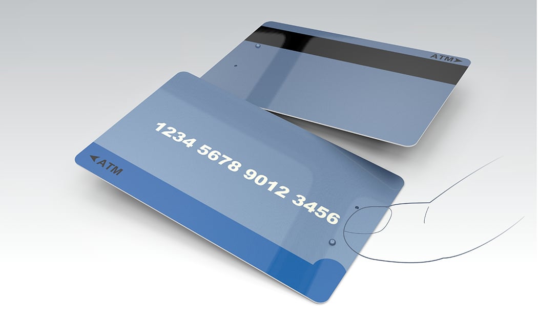
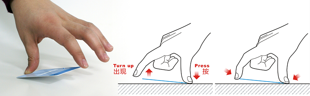
Now here’s something refreshingly brilliant. Designer Li Wenkai raised a fundamental question. Why is the Credit Card flat? Does it need to have a seamless flat surface? Picking one off a table or counter is near impossible because of this flat design.
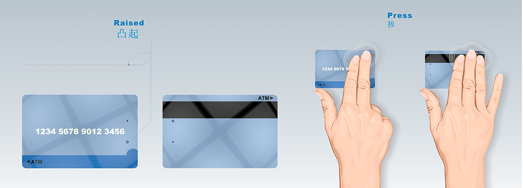
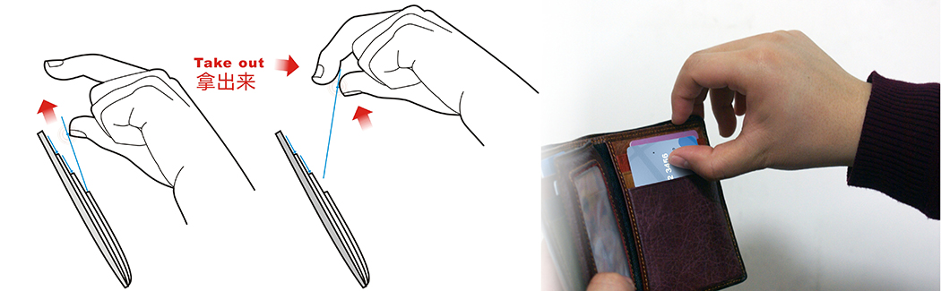
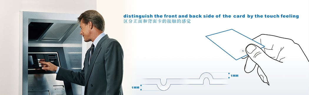
The Fulcrum revisits how cards look, with one simple but life-changing element. It adds a bump and a depression on one side of the card. Enough to break the surface in a way that allows you to pick, hold, and use the card with ease. The bumps are obviously placed in a spot that doesn’t affect the magnetic swipe. In a way the bumps are a lot like the old cards that had the Cardholder names embossed on them. Just that these are there on your card with the express purpose of enhancing your experience!
Designer: Li Wenkai
SHARE