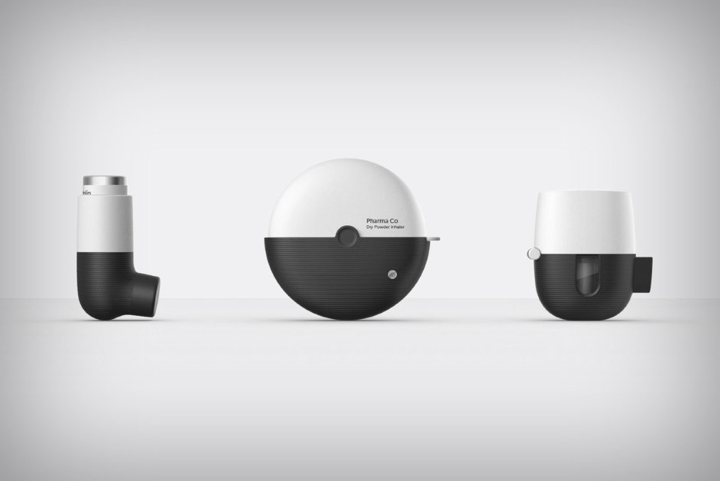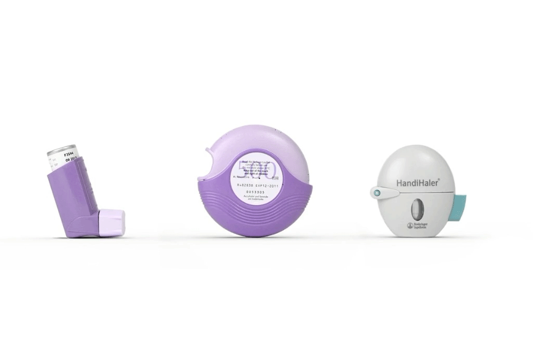
Why do medical products look the way they do? That’s a question I’ve asked so many times on this website, it’s beginning to become my catchphrase. Look at the GIF above. The first couple of products you see look instinctively medical. Why so? My theory is that because in an attempt to not overpower the function, less attention was paid on form. This makes medical products look functionally reliable. In short, the more functional it looks, the more functional it must be.
However, designers are working to change that now. Medical products should be functional without looking ugly under the ruse of functionality. You can have a medical product that looks incredibly stylish and yet does a remarkable job of saving lives. So look at the GIF above. Look at it some more. The inhalers transform from functional to fabulous, breaking all norms of medical product design, a trend we’re beginning to see a lot these days.
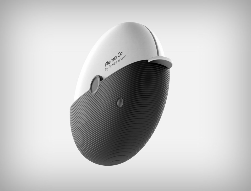
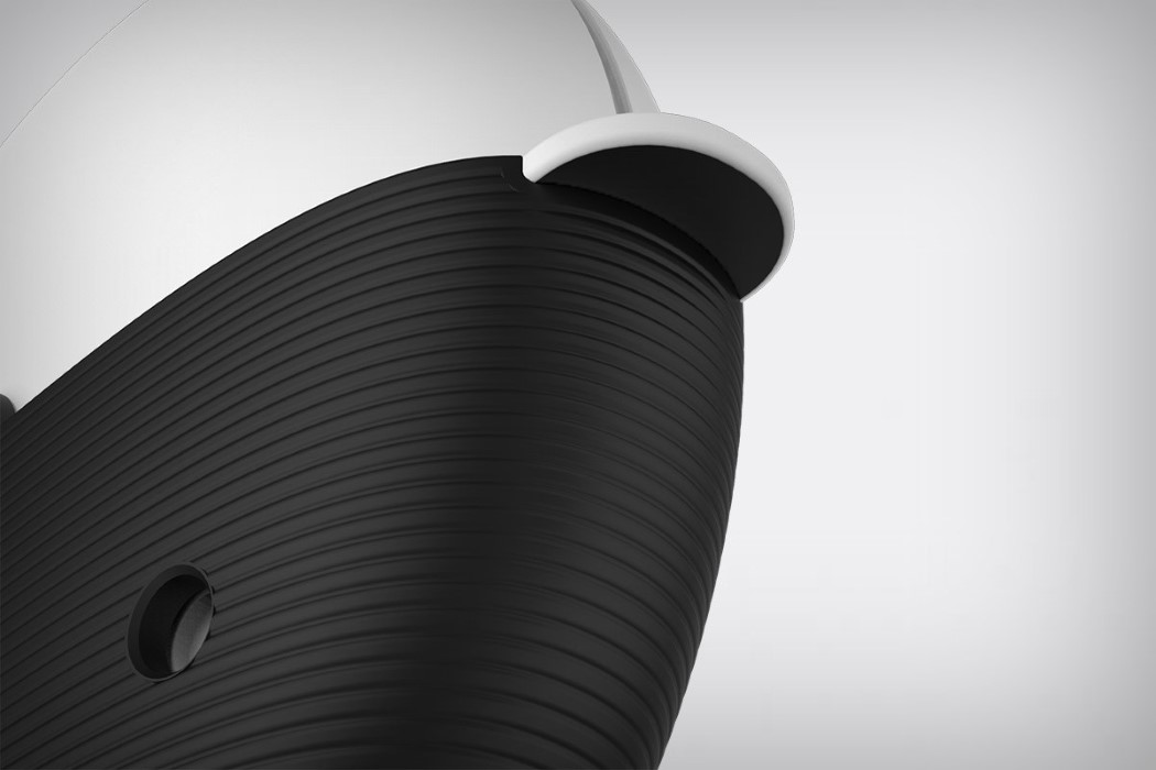
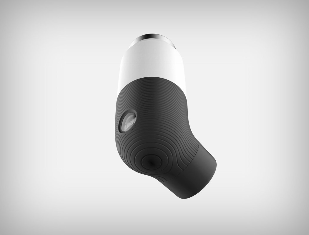
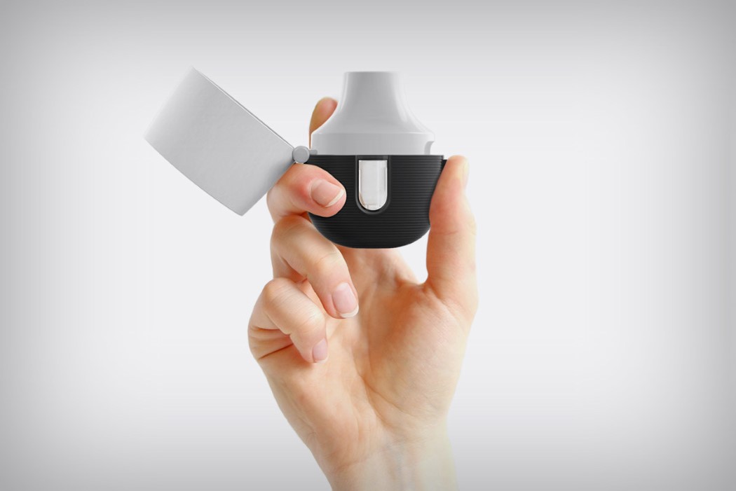
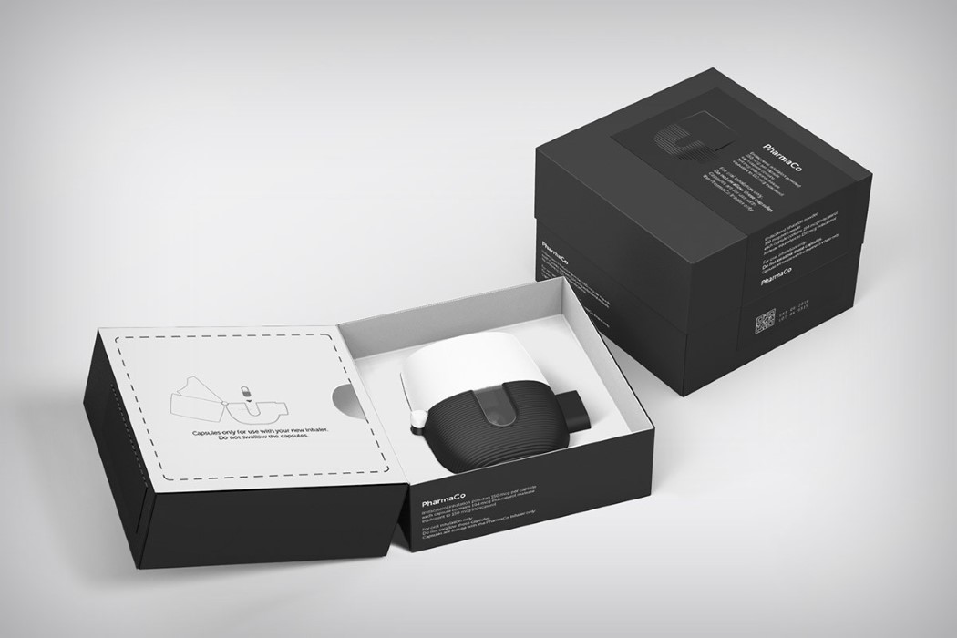
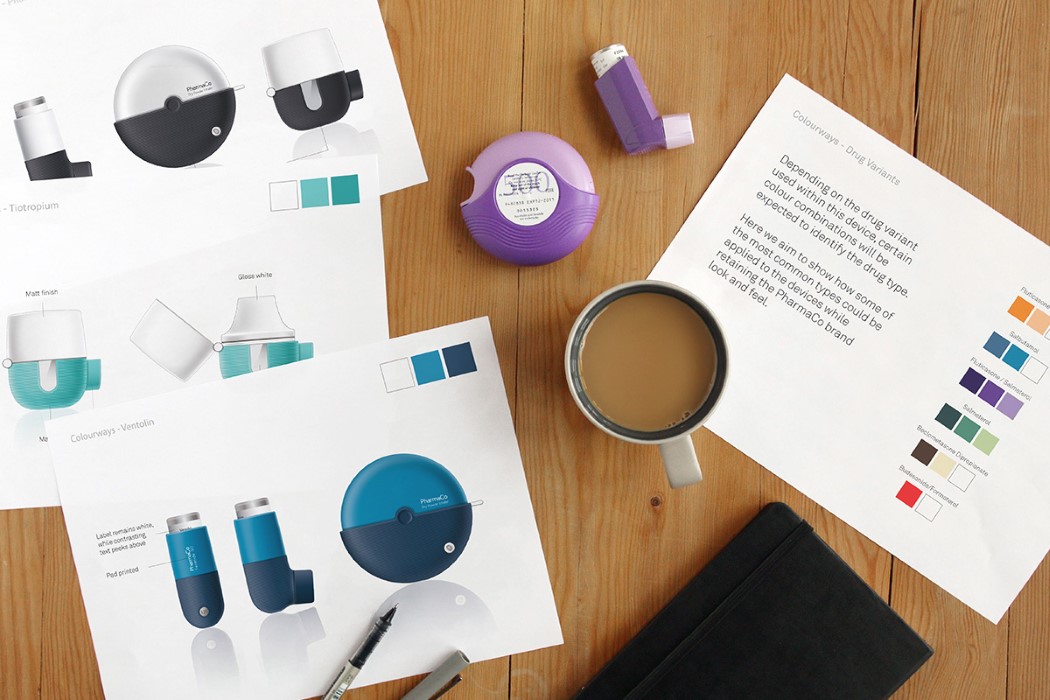
Simple and desirable, these black and white inhalers don’t just break the stigma of carrying an inhaler, they also look striking enough that you’d instantly spot it on the shelves (helping the brand reach customers). They embody a characteristic not often used with medical products. Iconic. The black and white body helps create a contrast while cutting the visual bulk of the product. The white part of the product lies on top and doesn’t interact with the user’s hands much, while the bottom is mainly used for gripping, and comes molded in a matte black rubbery material for easy and comfortable gripping. The three inhalers, although different in design, look like a part of the same visual family, and do a remarkable job of making medical products desirable and instantly iconic.
Designers: Craig McGarrell, Dawn Tang and Agata Guz (Team Consulting)