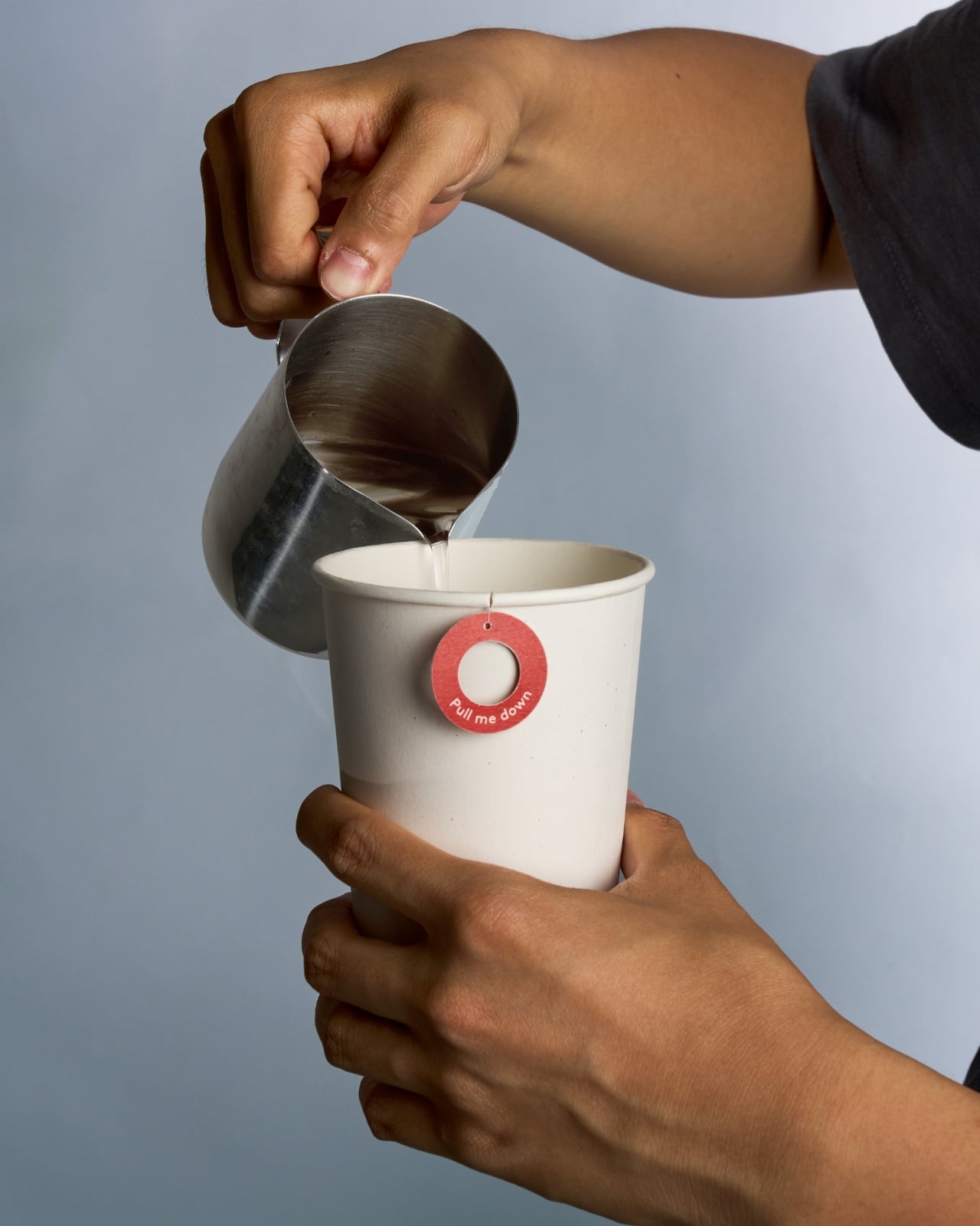

Most people who drink tea on the go will admit, at some point, that they’ve committed the great tea crime: leaving the bag in too long. You meant to pull it out at three minutes. You got distracted by a notification, a phone call, someone asking you a question mid-sip. By the time you remember, the damage is done.
The cup is now a bitter, tannic situation you’re going to drink anyway because you paid for it and you’re already running late. Designer Elwin Kang clearly understood this particular brand of morning failure, because his concept packaging, Dot to Dot, is essentially a solution built around the most human of habits: forgetting.
Designer: Elwin KANG
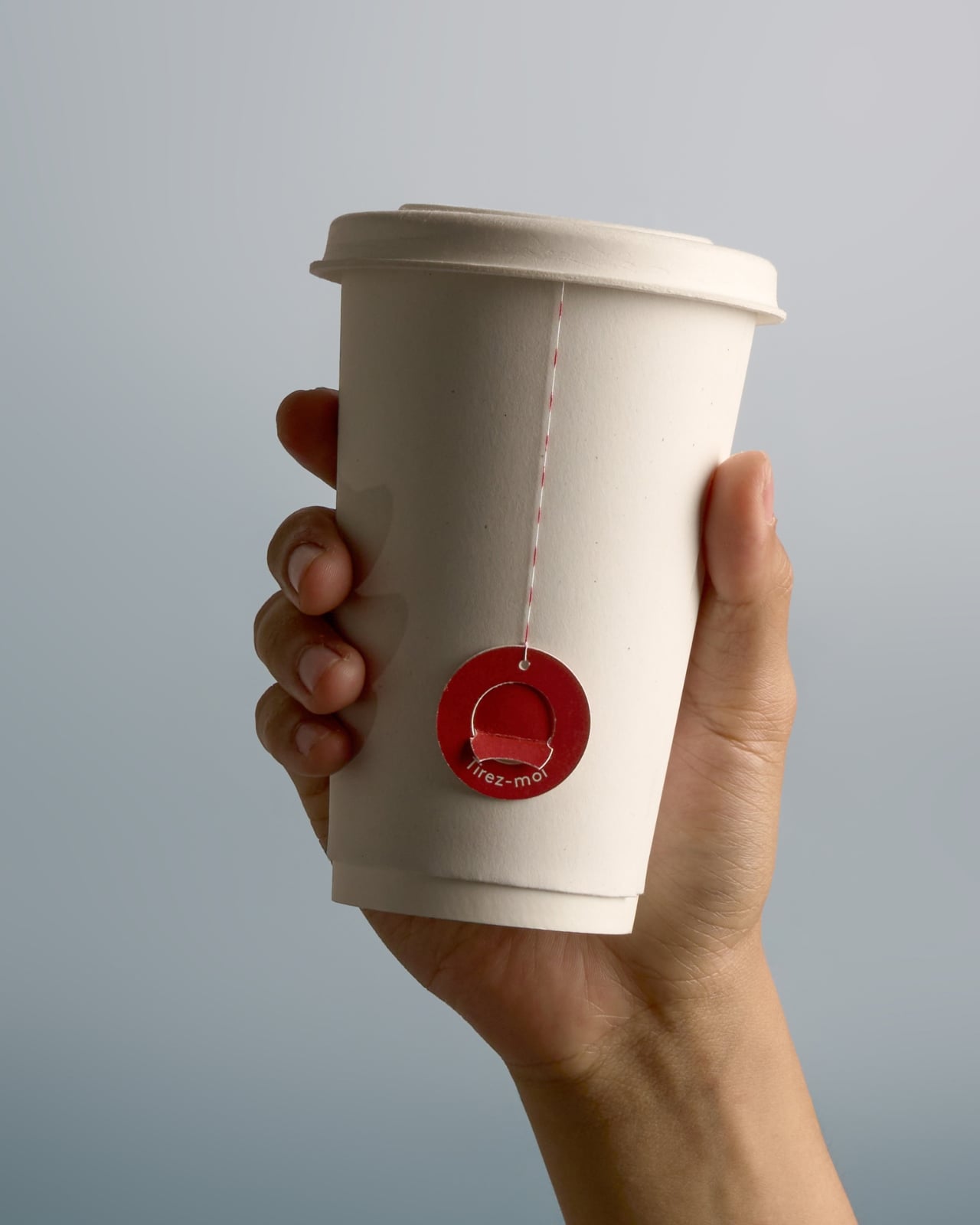

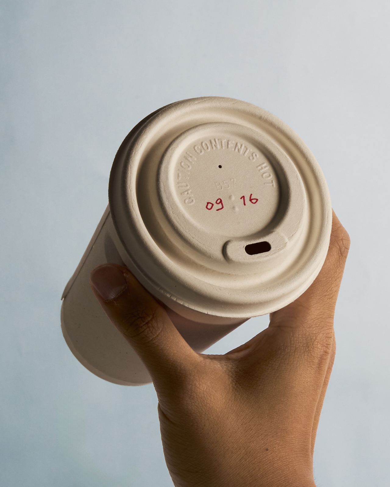
The concept is for a takeaway tea cup that integrates the tea bag, lid, string, and label into a single, choreographed interaction. Before the lid goes on, the barista or café staff writes the recommended finishing time directly onto it by hand. That’s the first clever move. It’s not an app notification or a timer you have to remember to set yourself. It’s just a time, handwritten and staring back at you from the top of the cup, the way a sticky note from a friend might. Hard to ignore. Easy to act on.
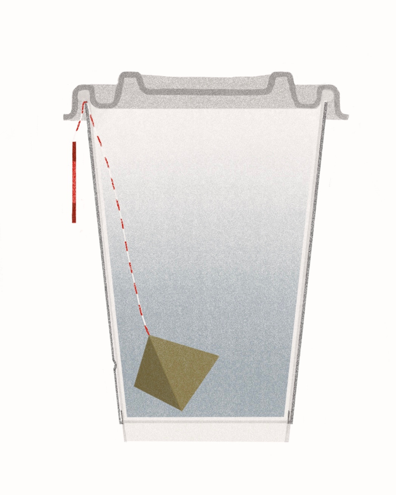
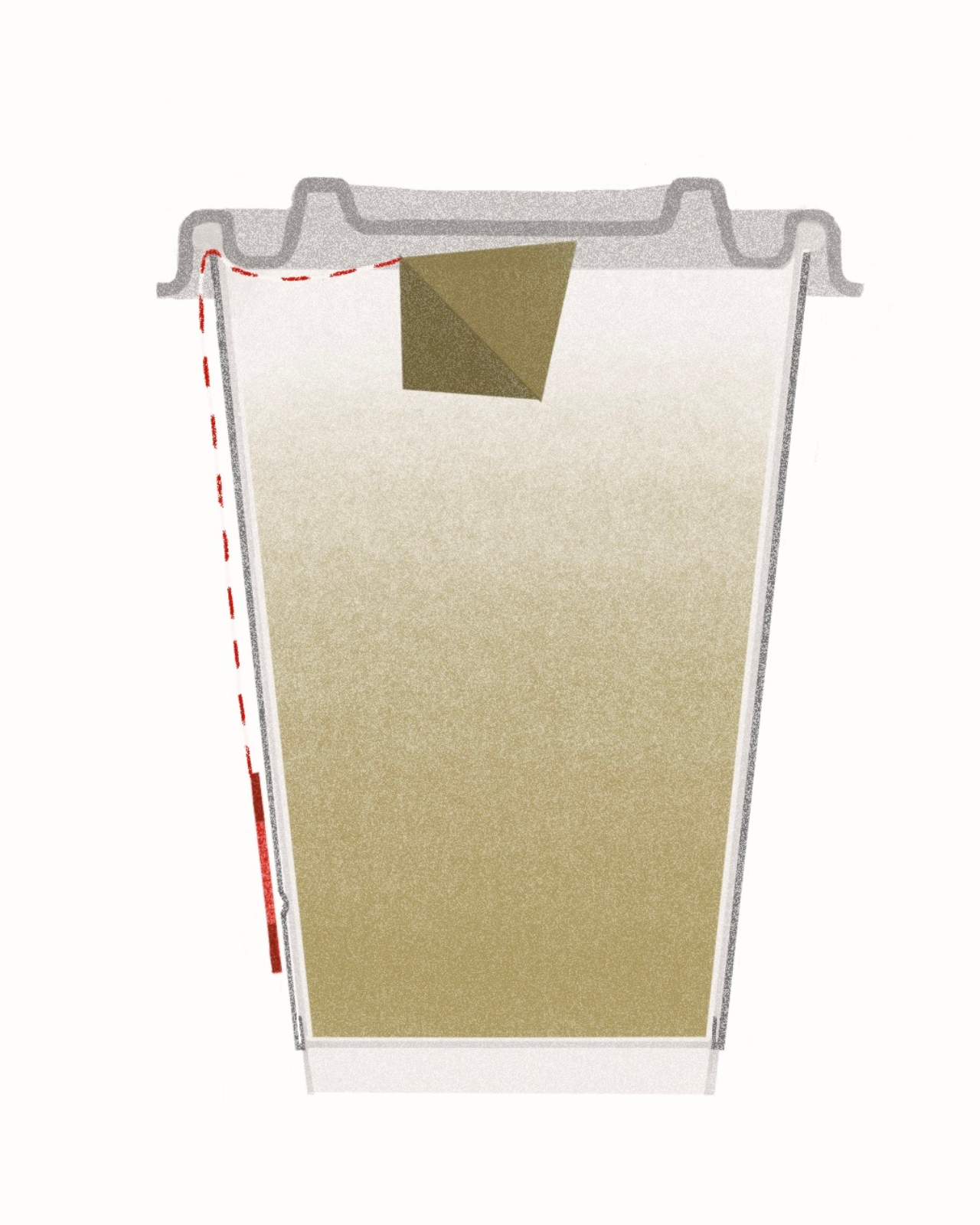
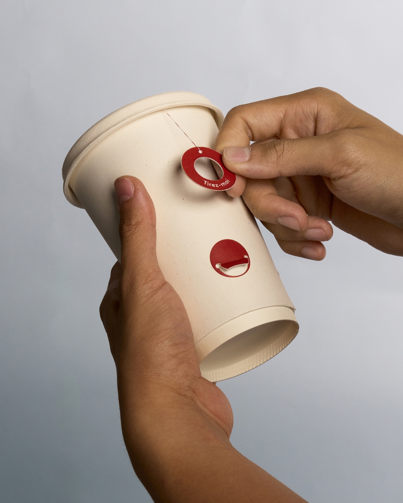
When that time arrives, you pull the circular label downward. The label is red, small, and stamped with a gentle instruction. Pulling it lifts the tea bag out of the water and suspends it just beneath the lid, stopping the infusion without you needing to fish the bag out with your fingers, find a bin, or carry it loose in your hand while you navigate a crosswalk. The used bag stays sealed inside the cup for the entire journey. Contained. Out of the way. Done.
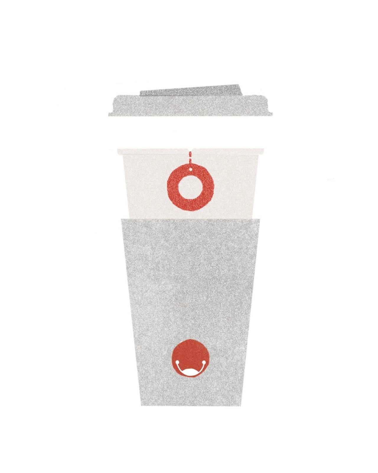
What makes the interaction satisfying, beyond the practical side of things, is the visual logic underneath it. The label is a circle with a hole in the center, like a ring or a small donut. The attachment point on the side of the cup is a solid filled circle. When you press the label onto the attachment point, ring over dot, the two shapes complete each other. A circle becomes whole. Dot to Dot. The name isn’t just clever wordplay; it’s the actual gesture, expressed in form.
That kind of layered meaning is rare in packaging design, which tends to treat function and aesthetics as separate departments. Kang made them the same conversation, and that’s worth pausing on. Most packaging either looks good or works well. This concept does both, without the two qualities cancelling each other out.
I’ll be honest: Dot to Dot hits that particular nerve that good design tends to hit, the sense that the solution was obvious in retrospect but nobody had quite articulated it yet. Over-steeped takeaway tea is such a common, low-stakes frustration that most of us have simply accepted it as an unavoidable condition of the modern commute. Kang treats it as a problem worth solving, which is a design choice in itself. Not every brief begins with a grand crisis. Sometimes it starts with a too-bitter cup of Earl Grey on the way to the office.
There’s also a quieter argument embedded in the concept about slowing down within an otherwise rushed context. You’re still getting your tea to go. You’re still multitasking. But the design builds in a small moment of attention, one pull, one click, one completed circle, that gently asks you to be briefly present with what you’re drinking. That’s a surprisingly generous thing for a disposable cup to offer.
Whether Dot to Dot ever moves from concept to commercial production is another matter entirely, and the distance between a beautiful prototype and an actual supply chain is rarely short. But as a piece of design thinking, it earns its place. It’s specific, it’s human, and it leaves you wondering why every takeaway tea cup hasn’t worked this way all along.