Nobody has ever looked at the red squiggle under a misspelled word and thought, “that should be a wall hook.” Nobody, apparently, except four designers from Korea who looked at the most universally annoying symbol in digital life and decided it deserved better. The result is Redy, a 2025 ambient product series by Jiwon Kim, JeongWoo Eom, Davina Jeon, and Seunghyun Nam, and it might be the most fun a design concept has had with a single visual idea in a while.
The premise is straightforward: take the red underline, strip away the judgment, and rebuild it as a physical object that quietly signals what needs your attention before you head out. But the concept only gets you so far. What makes Redy genuinely worth paying attention to is how committed the design is, across every piece, to making that idea look really good.
Designers: Jiwon Kim, JeongWoo Eom, Davina Jeon, Seunghyun Nam
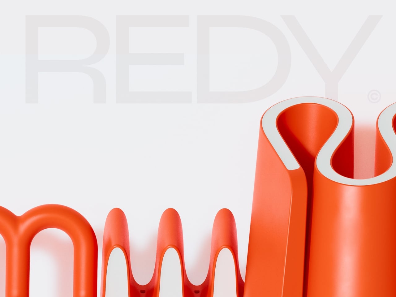
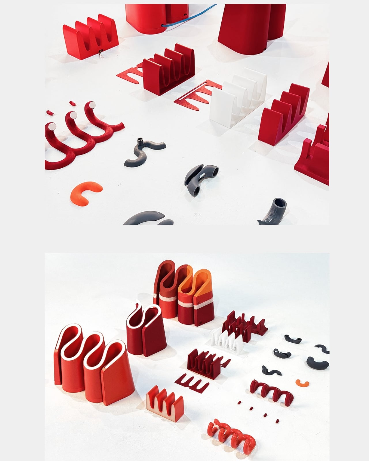
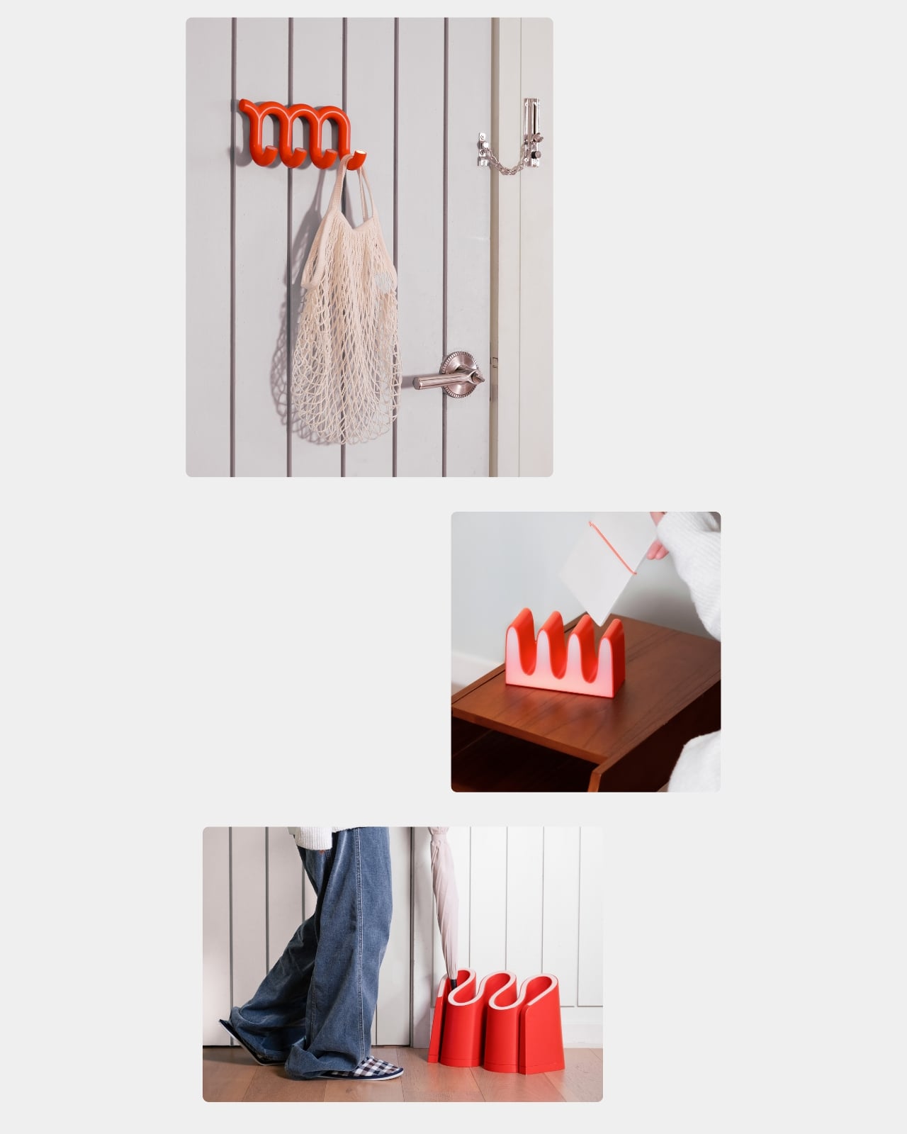
Start with the color. That specific red-orange is not subtle, and it’s not trying to be. It’s the same energy as a correction mark on a page: urgent, graphic, impossible to miss. But then the inner surfaces of every piece are lined in pale blush-pink or off-white, and that contrast completely changes the mood. The two-tone treatment adds depth to the forms, softens the intensity of the exterior, and highlights the negative spaces in a way that feels far more considered than a simple colorway decision. It’s the detail that makes the whole series feel designed rather than just styled.
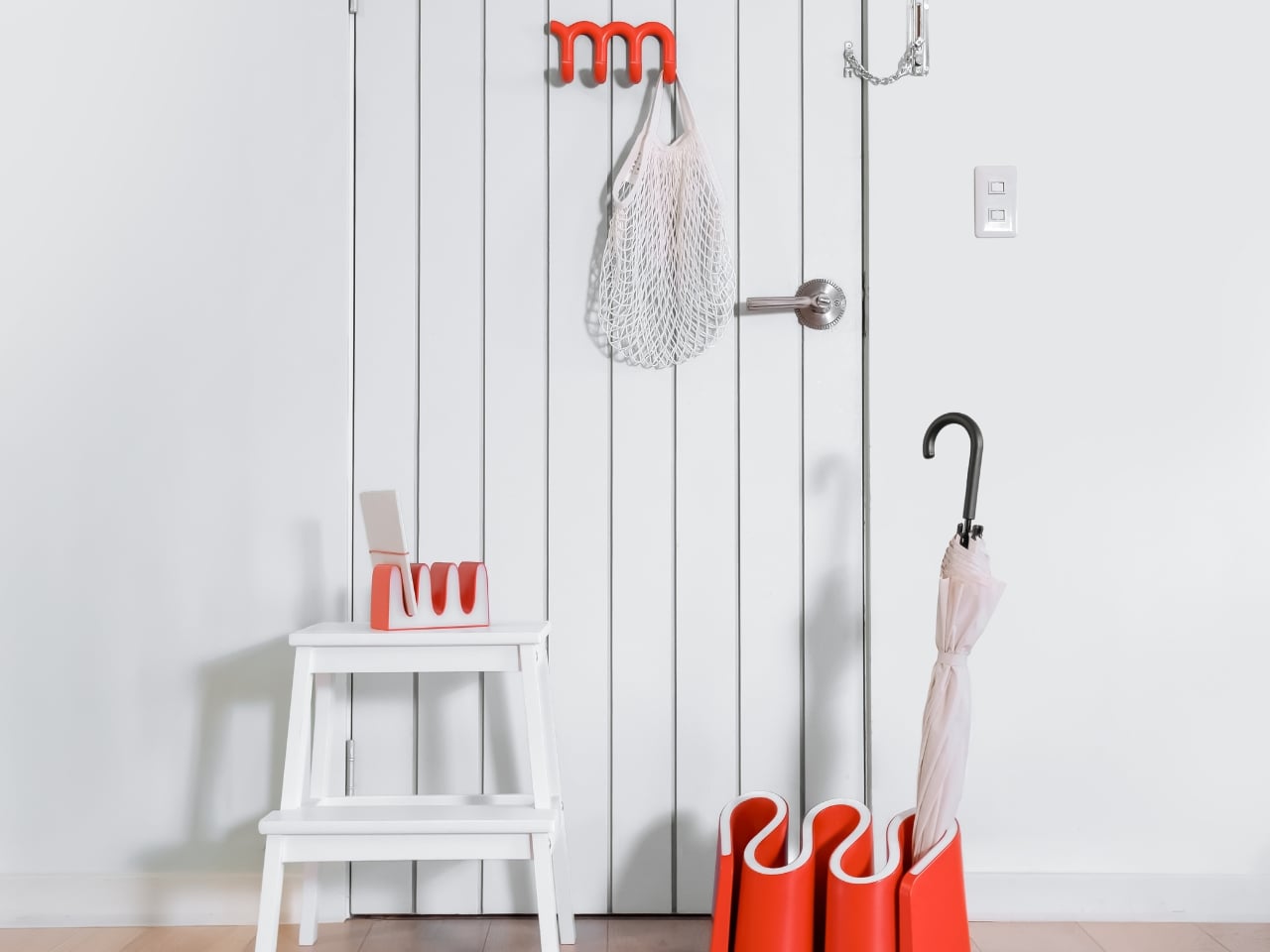
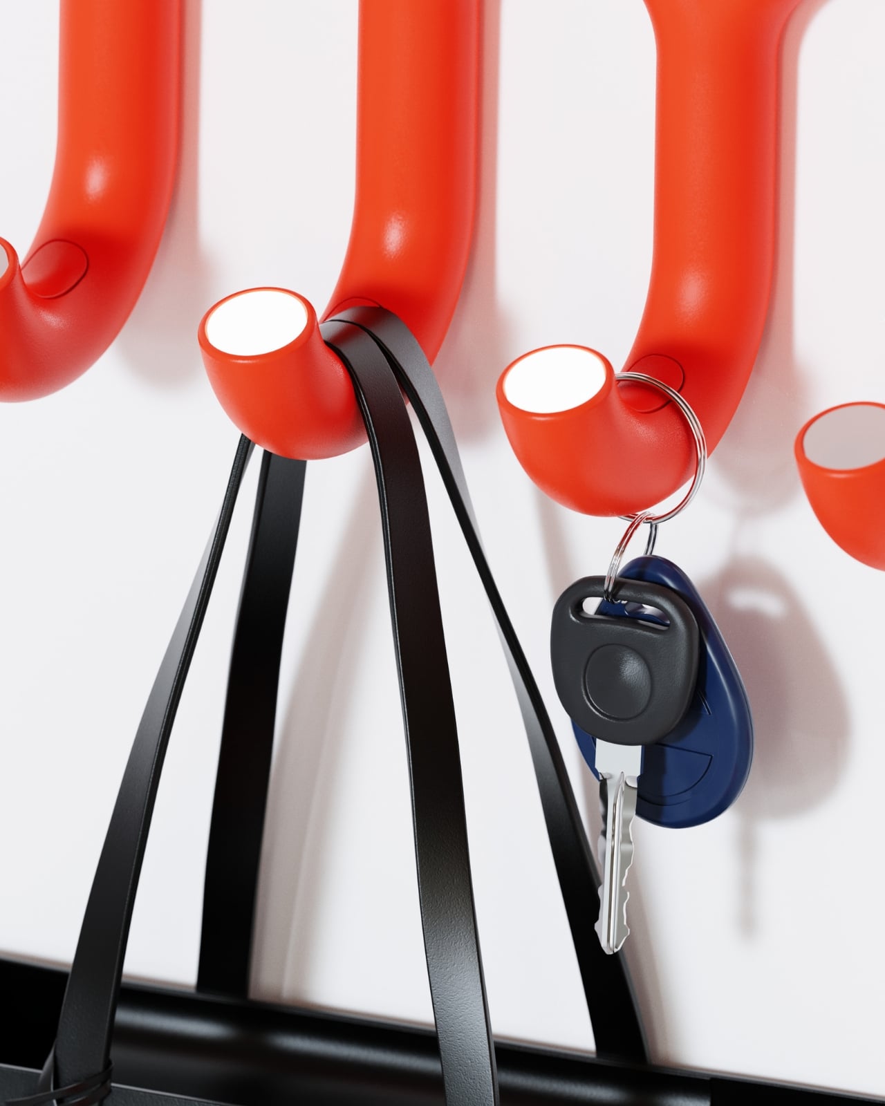
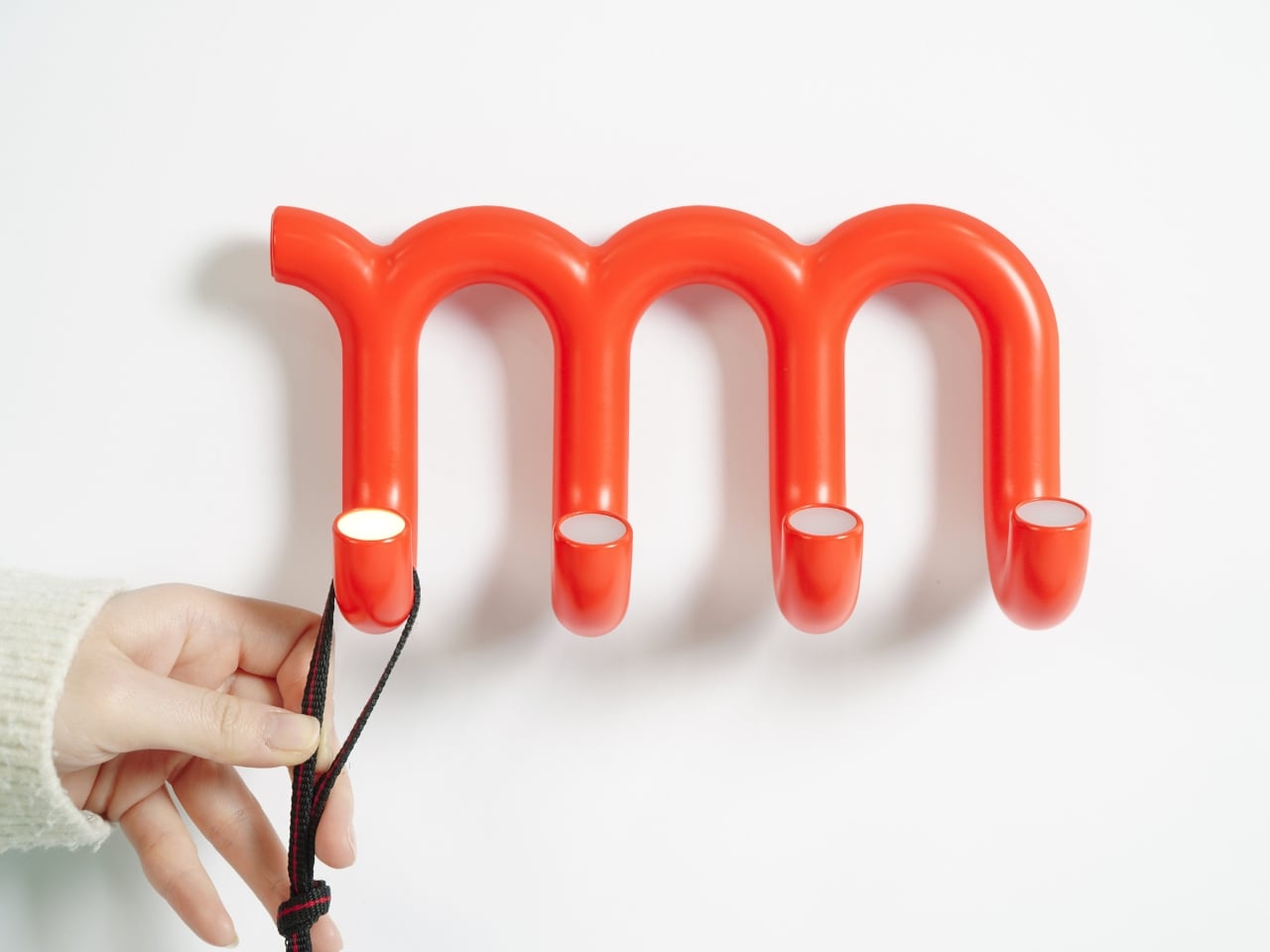
The Hanger is where the concept lands most cleanly. It mounts to a wall as a single continuous tubular form that loops up and down in a curving wave profile, with four downward-pointing hook tips at the base of each arc. In silhouette, it is unmistakably the red underline in three dimensions. Each hook tip is smoothly rounded and capped with a small flush-mounted LED indicator, sitting at the very end of the tube like a tiny lit eye. When one activates to signal a reminder, it reads as a design detail first and a functional alert second. That’s a hard balance to get right. Redy gets it right.
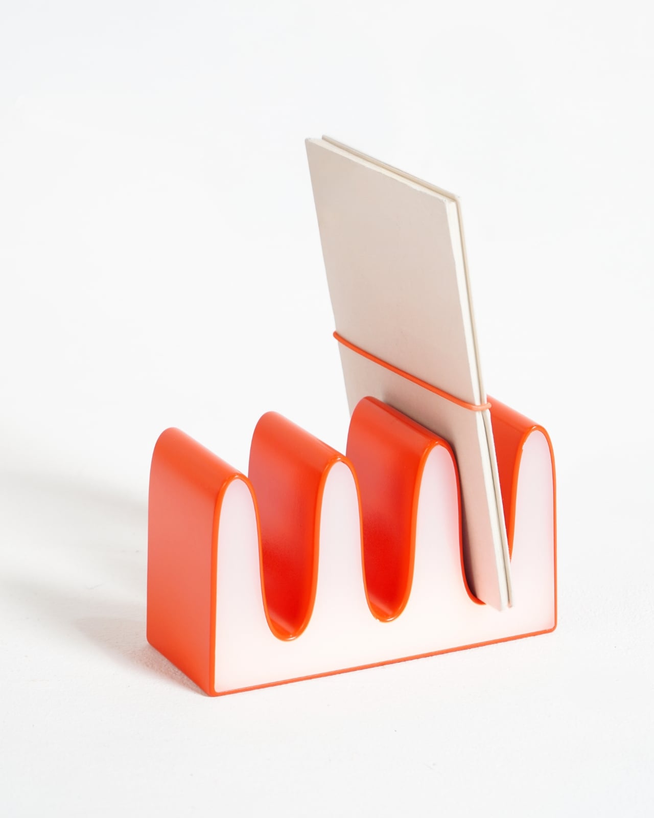
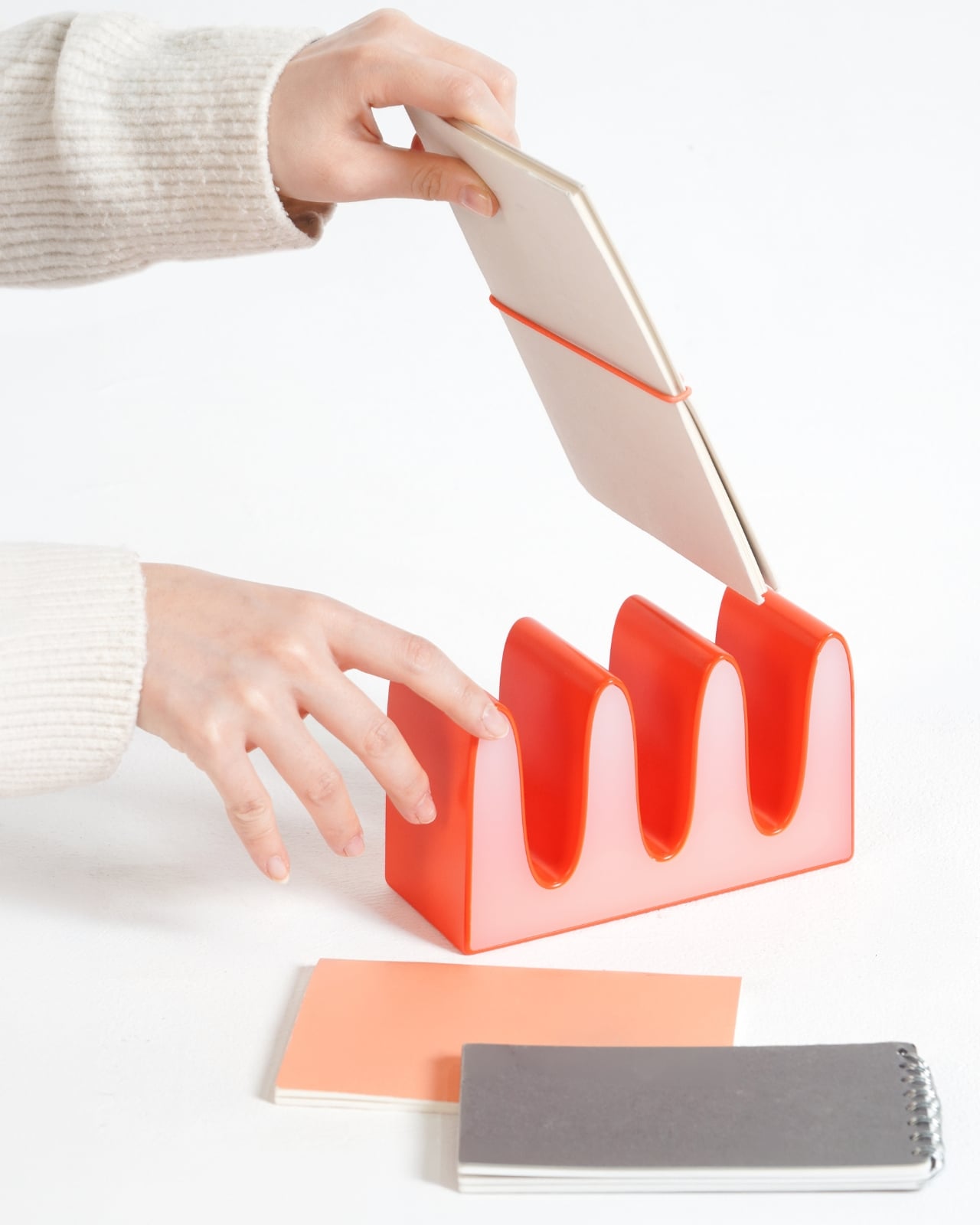
The desk organizer takes the squiggle in a different direction. Its rectangular base sprouts wave-form dividers that create open slots for cards, notebooks, and flat objects. Seen head-on it looks almost typographic, like a letterform you can’t quite name. From the side it reads closer to ceramics than product design. It’s the quietest piece in the series and the one most likely to confuse someone who doesn’t know what they’re looking at, which is frankly part of its appeal.
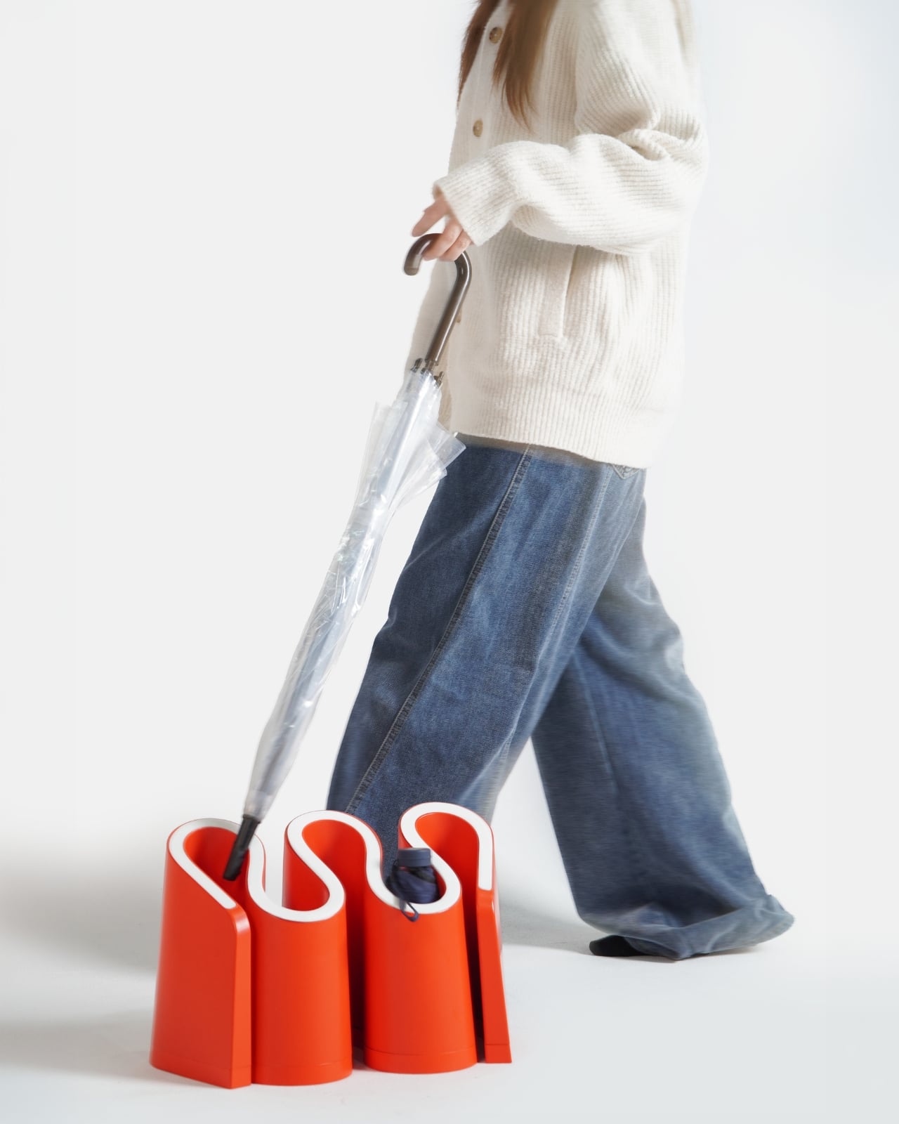
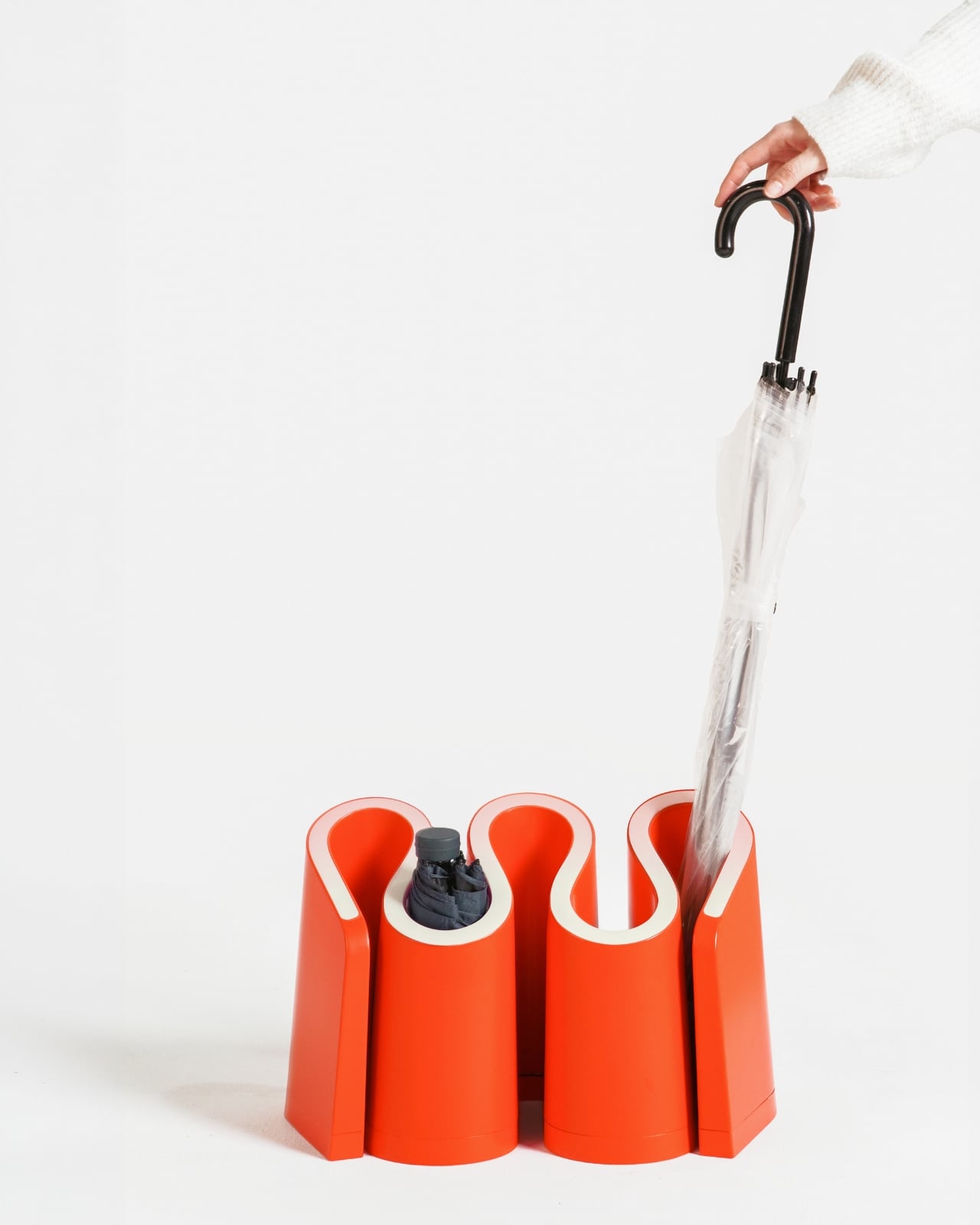
Then there’s the umbrella stand, which takes the most creative liberty with the motif. Instead of one continuous wave, it clusters cylindrical columns together, with the gaps between them curling into S-shapes that echo the underline’s profile. It’s the most abstract piece, and because of that, the most interesting to study up close. Empty, it reads as a sculptural object. With a single umbrella dropped into it, it still looks like it belongs somewhere considered. Most umbrella stands cannot say that.
The thing that elevates Redy from clever concept to genuinely impressive design work is the consistency of the language across three objects that do completely different things. Wall, desk, floor: the series covers an entire entryway without repeating itself or losing coherence. Each piece is fully resolved on its own. Together they make a space feel like someone actually thought about it, which is rarer than it should be.
Redy is still a concept, currently featured in Behance’s curated product design gallery. But it has that specific quality of feeling like it already exists somewhere and you just haven’t found the right store yet. The red underline spent decades telling us we got something wrong. Turns out, all it needed was the right designers to finally get it right.