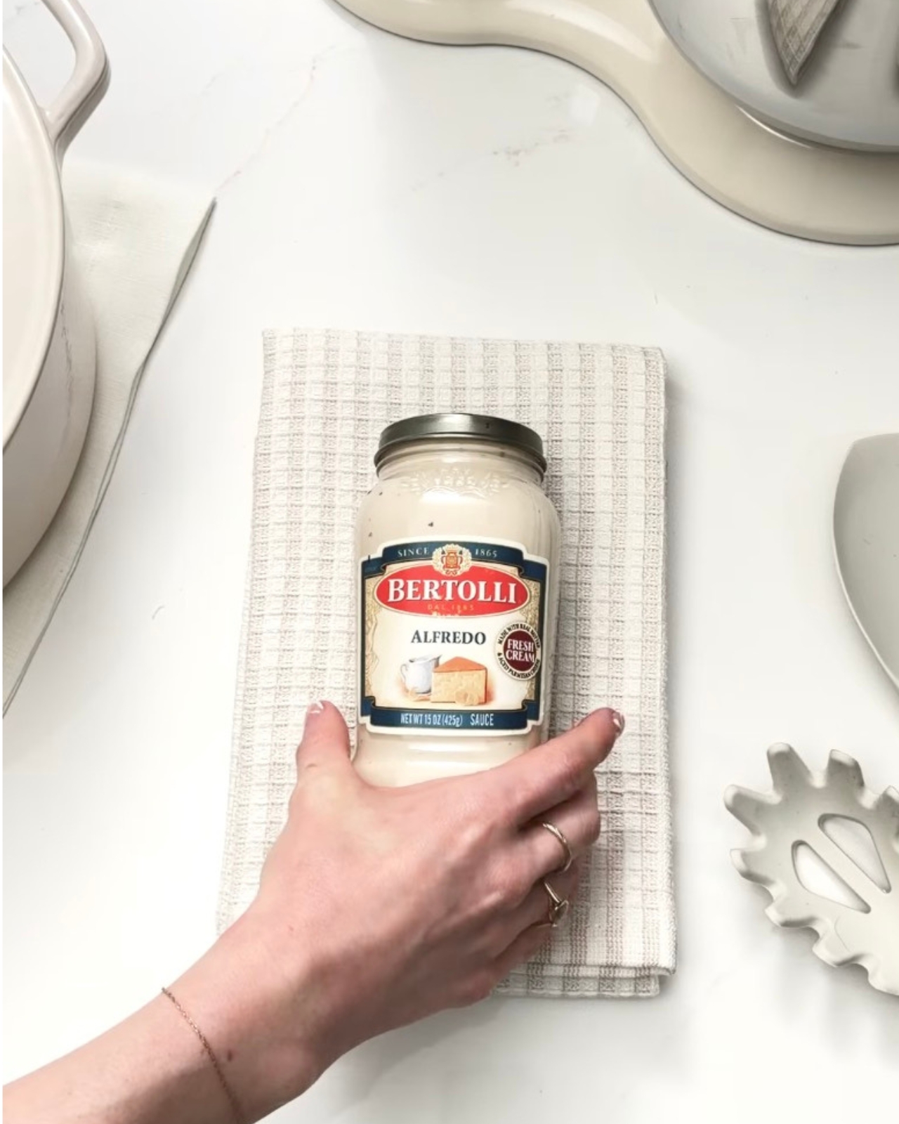
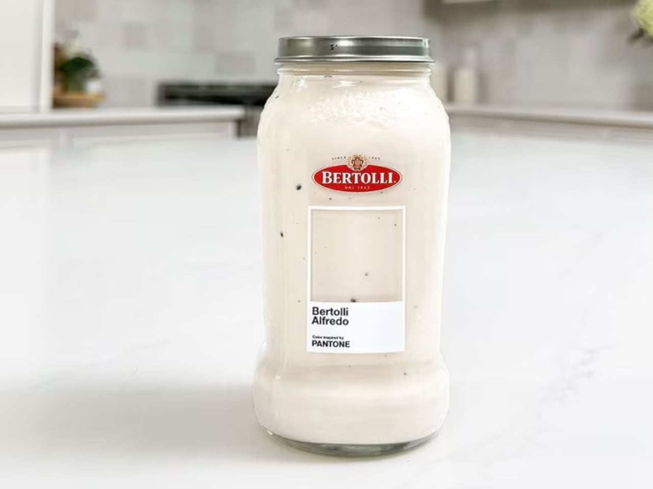
Pantone has officially colored pasta night, and I’m not even slightly mad about it. Bertolli, the Italian food brand that’s been a pantry staple since 1865, just partnered with Pantone to give its best-selling Alfredo sauce an official “Inspired by Pantone” color. The shade? A creamy, off-white hue that’s as comforting to look at as it is to eat. And while some might chalk this up to a clever marketing stunt, I think the collaboration is actually doing something more interesting than it appears.
Let’s start with what Pantone actually does, because it matters here. Pantone doesn’t just slap its name on a color for fun. For decades, the brand has been the definitive authority on color across industries ranging from fashion to interiors to product design. When Pantone certifies a color, it assigns it cultural and commercial weight. It says: this hue means something. Giving that recognition to a pasta sauce is either absurd genius or genuinely inspired branding, depending on your appetite for that sort of thing. Personally, I lean toward the former.
Designer: Bertolli x Pantone
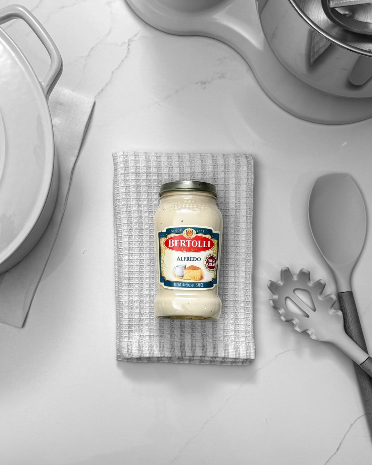
The campaign introduces the creamy off-white as Alfredo’s defining visual identity, with limited-edition Bertolli jars wrapped in Pantone-inspired branding that puts the color front and center. The familiar Pantone square appears on the jar packaging, with a transparent cutout so the sauce itself becomes the swatch. It’s a clever design choice. You’re not just looking at the color, you’re looking through the label to see it in its most natural state.
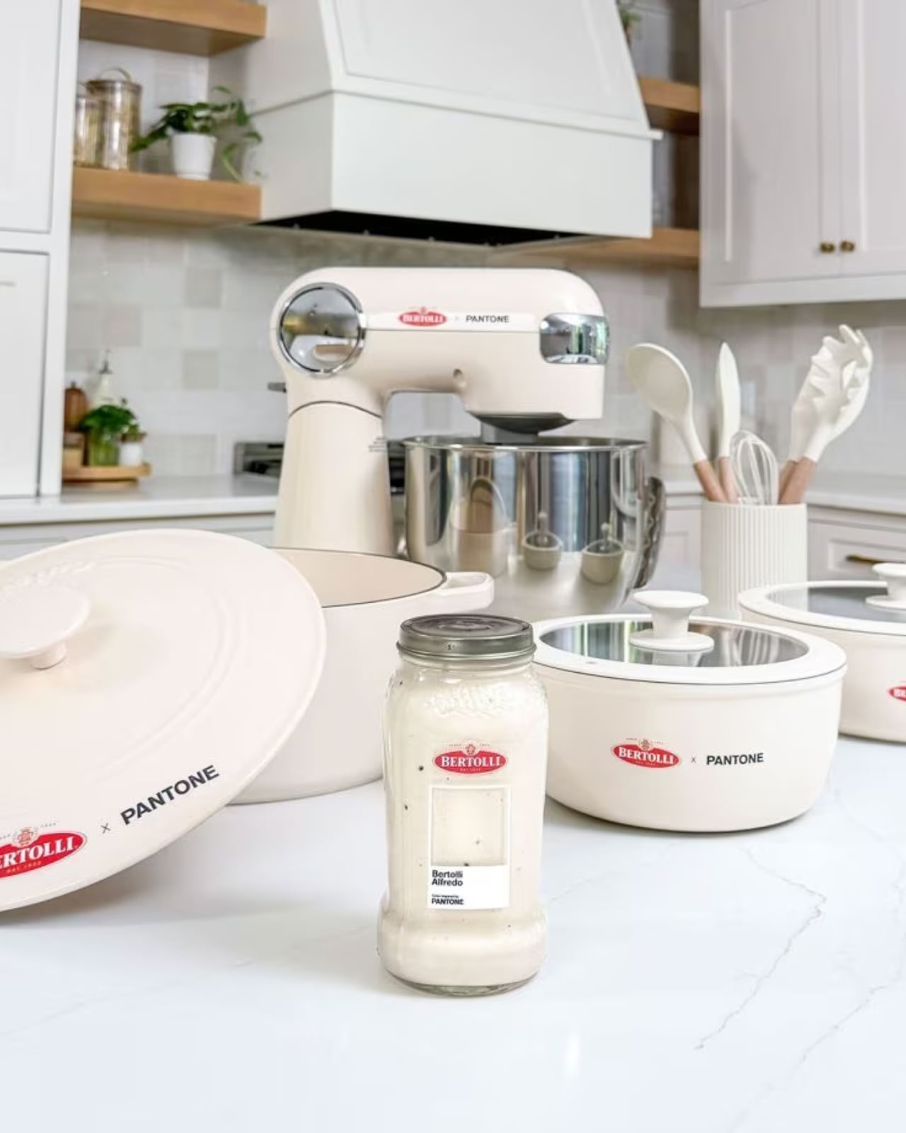
The brand also ran a sweepstakes giveaway with cookware and kitchen accessories curated in the same creamy off-white palette. Think: a stand mixer, pots and pans, a Dutch oven, cooking utensils. All in Alfredo. The fact that Bertolli thought to extend the color story beyond the jar itself shows real creative confidence. A kitchen dressed in Alfredo white is, objectively, a mood.
Now, is this a bit of a marketing flex? Yes. Absolutely. But brands claiming colors as their own is nothing new. Tiffany Blue has its own Pantone number. UPS brown is officially trademarked. Owning a color is a legitimate form of brand identity. The difference is that Alfredo sauce has always had an identity problem. Tomato sauce gets the cultural spotlight. Marinara is the classic. Arrabbiata gets the personality points. Alfredo, despite being wildly popular, tends to get lumped into “the other one.” Rich, creamy, beloved by practically everyone who has ever sat down to a bowl of pasta, but rarely celebrated on its own terms.
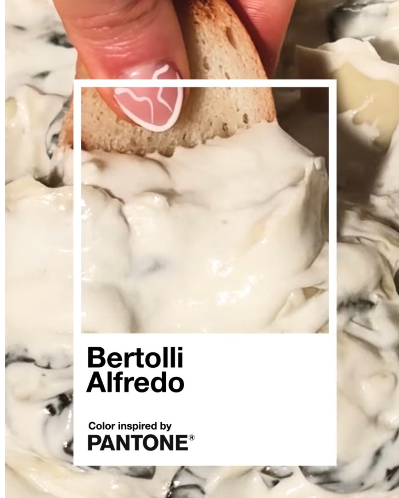
This is Bertolli’s argument that Alfredo deserves its own moment, its own aesthetic language. And credit where it’s due: using Pantone to tell that story is a smart move. Color is one of the most immediate, emotional forms of communication we have. When Pantone named Viva Magenta the Color of the Year, people talked about it for months. Attaching that same institutional gravitas to a sauce most people have in their fridge right now? That’s a cultural bridge worth crossing.
The campaign also encouraged people to “Take the Alfredo” through social media activations and influencer partnerships. The phrase is a little clunky, but the intention behind it is clear: they want Alfredo to feel like a statement, not just a side dish.
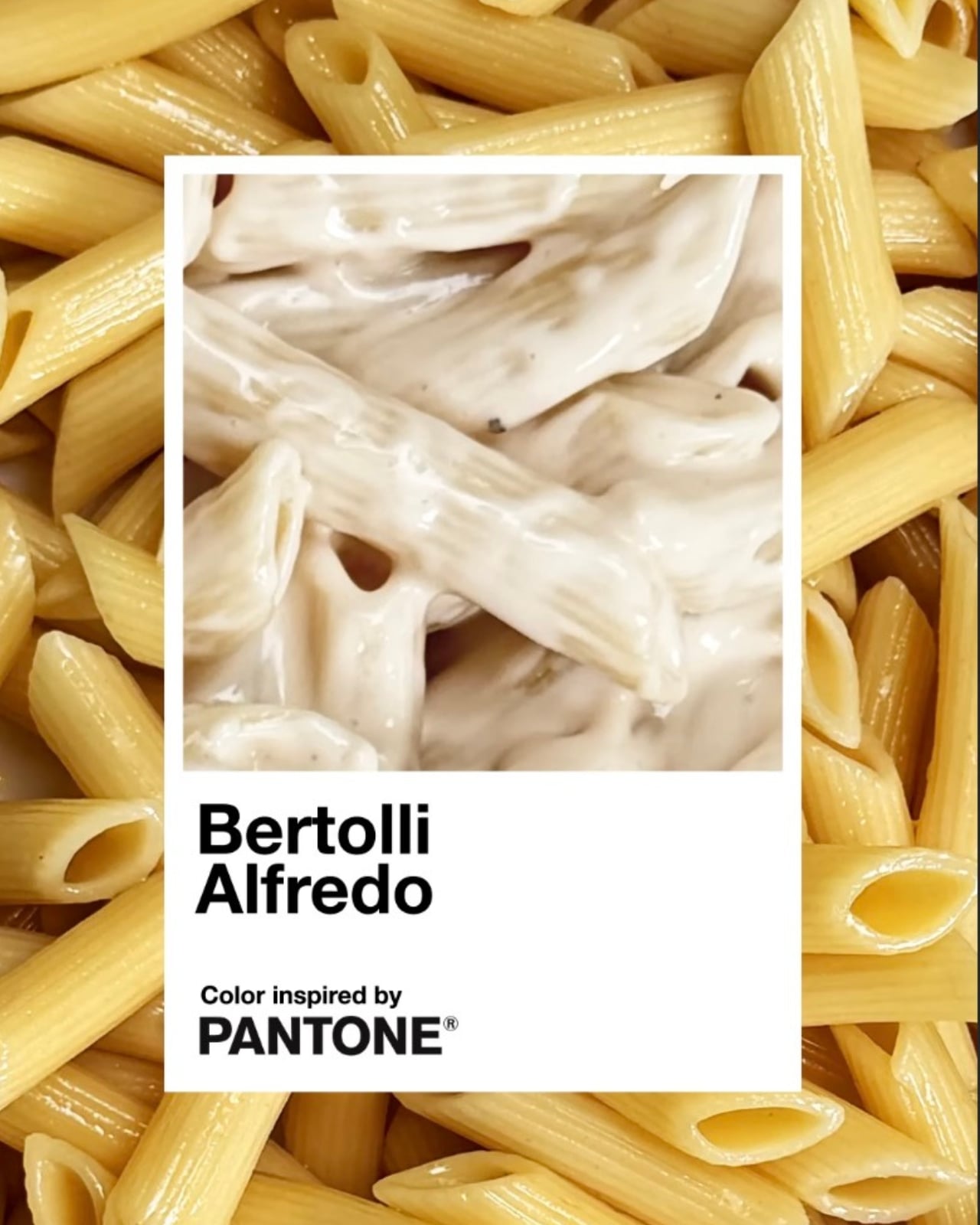
I do think the success of a campaign like this lives or dies by whether it earns its concept, and this one mostly does. The visual execution is clean and considered. The product and the partner make intuitive sense together. Pantone’s “Inspired by” series has previously drawn from art and culture, so extending it to food isn’t much of a leap when you think about how central color is to the way we experience appetite. We eat with our eyes first, and that creamy off-white carries its own quiet appeal.
Bertolli has been feeding people for over 150 years. Getting Pantone to officially say the brand’s signature sauce has a color worth naming? That’s just a long overdue introduction.