The first time I stumbled upon an image of the new Mac Pro, I honestly thought it was a photoshopped meme. Touted as Apple’s most professional high-performance offering, the Mac Pro isn’t new to ridicule. Its previous avatar was compared to a trash-can, thanks to its cylindrical shape. This time, the design team went back to a CPU-esque cuboidal form factor, like in the beloved 1st generation of the Mac Pro… but I’ll be honest. Something is definitely amiss.
Here are a few thoughts from someone who’s followed Apple’s journey as a fan as well as an industrial designer myself. Apple’s ‘behind-locked-doors’ design team is finally beginning to feel the effects of their secrecy and isolation. Touted as one of the most secretive companies when it comes to product launches, Apple tries hard to escape leaks from manufacturing plants, and from whistleblowers… but most importantly, it has a blatant disregard for public feedback. That disregard saw itself manifesting multiple times… in the release of the dustbin Mac Pro, the removal of the headphone jack from the iPhone, and more recently, in the introduction of the notch (the iPhone was the first to do so, remember?).
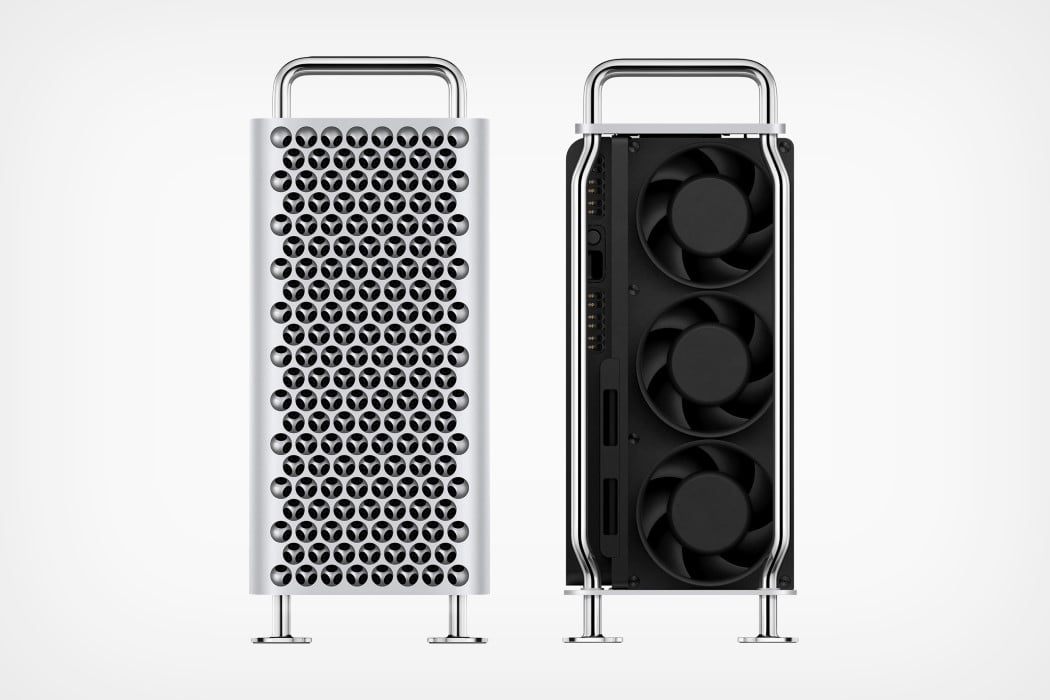
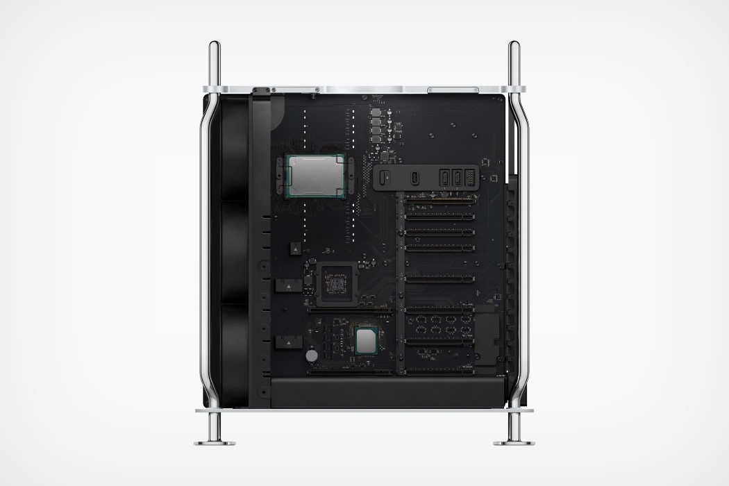
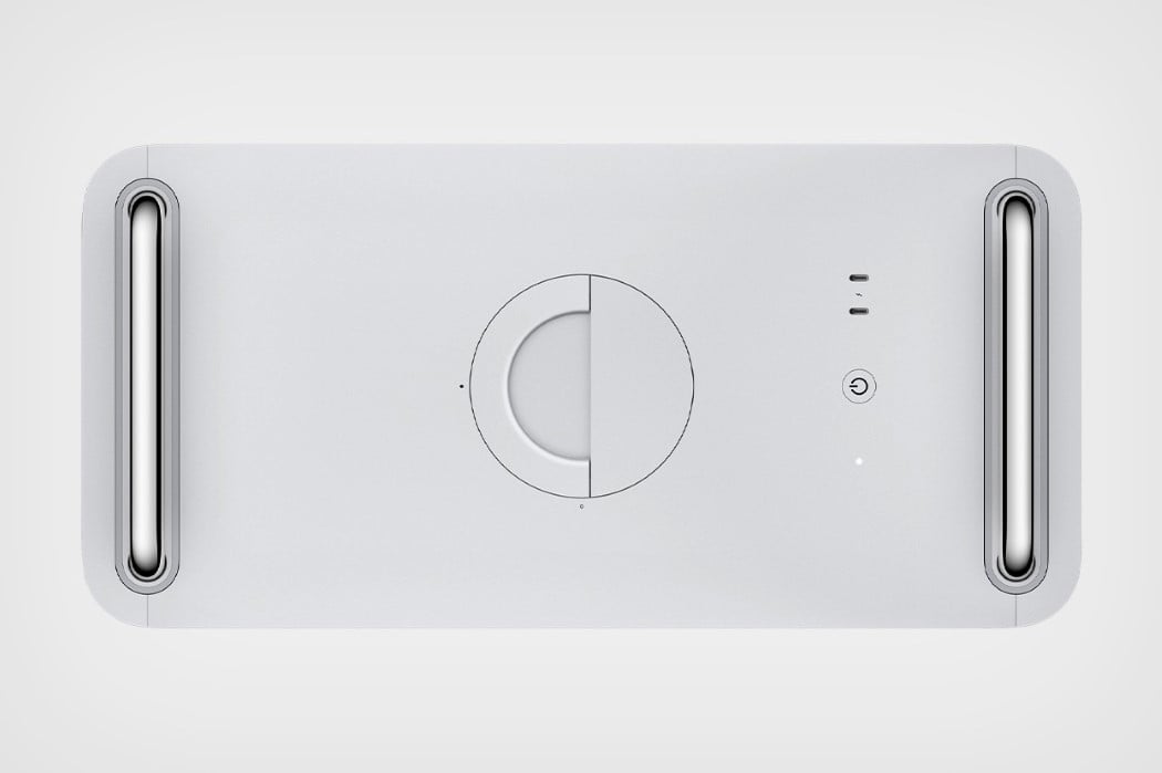
The new Mac Pro looks like it was built to functionally fulfill every single one of its clientele’s needs… and it does. It’s infinitely customizeable, has what Apple calls the world’s most powerful graphics card, and a new fan layout system that is capable of cooling all components swiftly and quietly. The components themselves sit within a steel framework that’s reminiscent of the old 1st generation Mac Pro from 2006, but there’s something about the design that leaves us wanting more. It feels too industrial, with its pipe-based structure, and it comes with an aluminum clad that features what I’d consider one of the most awkward looking grilles that look less “computing behemoth” and more “$5,999 cheese grater”… Or worse, a “trypophobe’s worst nightmare”. The grille is virtually purely utilitarian, with a layered circular design that’s complex to manufacture, and just visually seems not worth the trouble. Borderline disgusting even (as a slight trypophobe myself). Move over to the vault-esque locking mechanism on the top and one must wonder even more, whether the design team at Apple truly can design/create beautiful products in this void of theirs where nothing goes in or comes out.
“Our preoccupation with utility and function defines the design of the Mac Pro”, says Ive. He couldn’t be more right. The Mac Pro has gone from being a powerful, beautiful beast, to an evolved monster of computing power… but in the process, has lost the beauty we once saw, perhaps a decade ago.
Designer: Apple