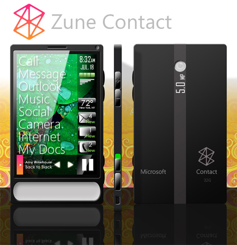
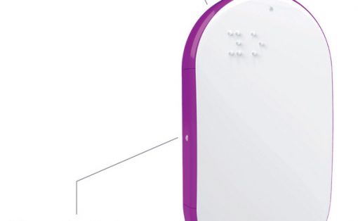
I know a lot of you out there are just waiting for the Zune phone – Microsoft’s answer to the current king of multitouch telephonic devices. Until they actually confirm, check out the Zune Contact concept by Adam Huffman. He’s revamped the interface, made the body madly thin, slapped on a 5 MP camera and went all touchscreeny. Sure it’s just pie-in-the-sky now but who knows, something similar may come from Redmond Washington. Oh BTW, that big white button at the bottom is really a soft cushy thumb rest. . . yeah.
Designer: Adam Huffman
Uuuuugly
dreaming doesn’t mean forgetting all the design constraints.
No space for the receiver
no space for the web cam
every LCD screen has a metal frame around, so not enough space around the screen
side buttons… a disaster, they are too big, you forgot the wall thickness!
and the rendering quality…
oh and the big white area, it doesn’t follow the squary formal language of the phone, the radius are too big!
Sorry I stop now.
You know, stuff like this really increases the signal to noise ratio on this otherwise fine blog.
I wish you’d stick to actually designed things that show some real innovation, love to detail or just anything genius.
Anyone with a 3D modeler and too much time can throw together something boring like this. And no, there’s no design involved here.
What especially enrages me are phrases like “made the body madly thin, slapped on a 5 MP camera and went all touchscreeny”.
He didn’t do ANY of this, no. He put a little texture on his model that’s _supposed_ to be a camera. He didn’t make the body madly thin, since there is no body, it’s just a hollow geometric model on his computer with no electronic innards to worry about and he certainly didn’t go all touchscreeny. A touchscreen in itself is nothing to brag about anymore these days unless you can back it up with a user interface that makes sense of it and not some Photoshop mockup.
You get enraged over this? Damn you might need to go on holiday or something because this is nothing to boil over about.
Not this one in particular but the frequency by which really worthless stuff is posted here from time to time.
This post is just a prime example.
I have a Zune player….and I adore it. But this is bordering scary. The great thing about the Zune is its interface, and it is quite jumbled in this. The phone isnt so pretty either. :-/
Submit something better or STFU, you haters.
pretty cool; but looks pretty generic.
i’d rather blow a similar price on samsung i900
It doesn’t look that bad, its looks nice
The iphone also looks nice.
But thats about it, need functionality? WM6? 😛
Nausea.
this nice? common, it is fucking ugly.
Whoa, look at all these trackbacks… That piece of unispiredness doesnt deserve 1% of the buzz it gets. This is not even a design, its a mediocre rendering!
I’d get one.
me yamo yanko es verda o si no yamat al 658494429
i’ll consider if the thickness is around 0.5cm…
Don’t worry people, I assume this isn’t an official design. Because damn this is ugly. Why are amateur concepts always so ugly!?!?! It’s like someone took a zune, and plastered it with cheap bumperstickers, with the worst typeface they could find!
Hi! I was surfing and found your blog post… nice! I love your blog. 🙂 Cheers! Sandra. R.
It doesn’t look that appealing, hope it has some very good applications and functionality; otherwise its a massive dud.
Superior thinking demonstreatd above. Thanks!
this post is pretty pointless, but without concept DESIGNS (which is in the url or this website) we have no way to dream of the future and by extension, no moving forward in technology and/or what is invented.
It’s going to be end of mine day, but before finish I
am reading this enormous paragraph to increase my experience.