Current Currency

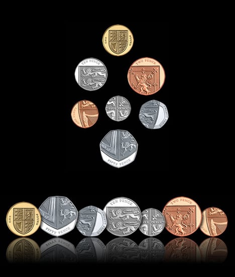
Great Britain is set to change their change. Their Royal Mint just announced the winning designs for their coin currency refresh. 26 year old graphic artist, Matthew Dent’s heraldic design was chosen as the new face of British booty. He designed a set of clever cut-aways of the Shield of the Royal Arms. Each denomination is a part of this shield and when brought together, the shield looks complete. The Royal Arms is divided into four parts: England being represented by the three lions passant guardant in the first and fourth quarters, the Scottish lion rampant in the second and the harp of Ireland in the third, with all four quarters spread over the six coins from the 1p to the 50p. Completing the new range of coins is the £1 coin featuring the shield of the Royal Arms in its entirety, uniting the six fragmented elements into one design. Anyway you look at it, I am still six pence none the richer…

Designer: Matthew Dent

If you liked this design, you would also be interested in:

Keep up with the latest designs by subscribing to our RSS or Newsletter.

21 Comments »

Comment by ModuleS
2008-04-03 11:21:01


by far the coolest currency to date now!

 
Comment by Dansker
2008-04-03 15:12:14


great design!
they look like old roman coins where the imprint on the coin wasn’t in the center because of lousy manufacturing quality- sometimes the face of the kaiser on the coin was half out and half of the coin was just flat… only on those new coins it is on purpose and it gives the design of the coins smart pseudo-historic feeling
excellent job

 
Comment by TH
2008-04-04 00:10:46


This is a brave redesign, and I think it’s great. The only questionable aspect is that the designer has decided to only have the denominations in writing, not in numbers. While the coins stay the same size, shape a colour, this is probably not going to be an issue for the British themselves, but might add to the confusion foreigners inevitably have with foreign coins.

Although there’s a clear logic in the order of the coins (based on shape and material), the first instinct with coins (at least for us accustomed to the euro) is that bigger is more valuable. With the British coins this isn’t the case. The quid is much heavier than the others, and thicker, so it’s easy. Strangely, the 50p and 2p are about the same size, 10p is larger than 20p and 1p again larger than 5p. Having numbers on the coins helps in identifying them quickly.

I predict longer queues in shops, especially the ones that attract lots of tourists. Luckily the British have excellent queuing skills. :-)

 
Comment by BHR
2008-04-04 10:07:47


Terrible design. Agree with the above comments, but I don’t give the designer the benefit of the doubt. It looks like web design meets coin design, and in a bad way.

Totally agree they are not easily differentiable.

 
Comment by blahh
2008-04-04 15:26:32


Dont like it. Ireland isnt a part of Great Britain . N. Ireland is , and since the harp is the main symbol of ireland then it kind of misrepresents.. N.ireland should be represented by something else.

 
Comment by XaviER
2008-04-04 21:35:12


I really like the new design! Although It would be better to have the numbers on them. But I like them anyway

 
Comment by Benoit
2008-04-04 22:53:56


I think they’re wonderful. I agree with the comment about invoking the Roman aesthetic–very clever!

 
Comment by lstp0136
2008-04-05 09:53:17


brilliant!

 
Comment by dangerdude
2008-04-06 05:21:54


pretty / smart design. it’s like coin 2.0
it will last as long as web 2.0

(i assume the other side of the coin has the numbers?)

 
Comment by NinjaElf
2008-04-06 05:28:20


.. Although there are no numbers, these can be printed/ stamped on the back of the coin, can they not? And secondly the design is beautiful, and even if tourists can’t understand it, they can understand that concept of this beauty XD

 
Comment by Rubie
2008-04-07 15:34:14


I’m like design

 
Comment by TONY
2008-04-07 20:14:21


There is a reverse side to the coins, however like Australian coins, that side is reserved for the queen (Heads- her head, Tails- design of choice). You could still add the number without ruining the design, as with most competition winners the design gets changed before production.

 
Comment by Audrey
2008-05-08 17:35:41


Where’s the two-quid?

 
Name (required)
E-mail (required - never shown publicly)
URI
Your Comment (smaller size | larger size)
You may use <a href="" title=""> <abbr title=""> <acronym title=""> <b> <blockquote cite=""> <code> <em> <i> <strike> <strong> in your comment.