PROS:
- CNC machined artwork creates depth that printed graphics can't replicate
- Carbon fiber and aluminum deliver genuine material contrast
- Decennium Gold colorway builds a collaboration-specific design language
- Thermal architecture integrates visibly into the surface composition
- Multiple configurations give collectors several compositionally distinct angles
- Shinkawa's design vocabulary translates to hardware without dilution
CONS:
- Static chassis can't capture the kinetic energy of Shinkawa's illustrations
- Tablet weight limits comfortable handheld use beyond fifteen minutes
EDITOR'S QUOTE:
Most limited editions wear an artist's name. The Z13 KJP wears an artist's hand.

When the artist holds the pen, the object changes at a structural level. ASUS calls the ROG Flow Z13 Kojima Productions Edition a collaboration with Yoji Shinkawa, but the result reflects authorship rather than endorsement. Shinkawa drew the design elements directly. The angular chassis cutouts reference Ludens’ armor, the same character he originally created as Kojima Productions’ icon. The Decennium Gold colorway exists because Shinkawa chose it. The carbon fiber integration, the custom keycap typography, the vent laser etching: these trace back to his visual direction, not ASUS’s interpretation of it. The geometry, materials, and graphic hierarchy don’t feel applied to an existing chassis. They feel drawn into it.
Shinkawa himself described the process as designing a gadget that “belongs to Ludens” and integrating that into the PC design. That framing tells you where creative authority sat. The artist didn’t adapt to the hardware. The hardware adapted to the artist.
Kojima Productions as Design House
Calling Kojima Productions a game studio accounts for what the company ships, not what it builds. The studio’s visual identity, shaped primarily by Shinkawa since its founding, represents one of the most distinctive aesthetic vocabularies in entertainment. Shinkawa’s style blends bold brushwork with intricate mechanical detail: fluid motion rendered with precision, emotion conveyed through futurism. The characters, vehicles, and environments of Metal Gear Solid and Death Stranding share a visual language that’s immediately identifiable: heavy contrast, dynamic composition, mechanical forms that feel organic.
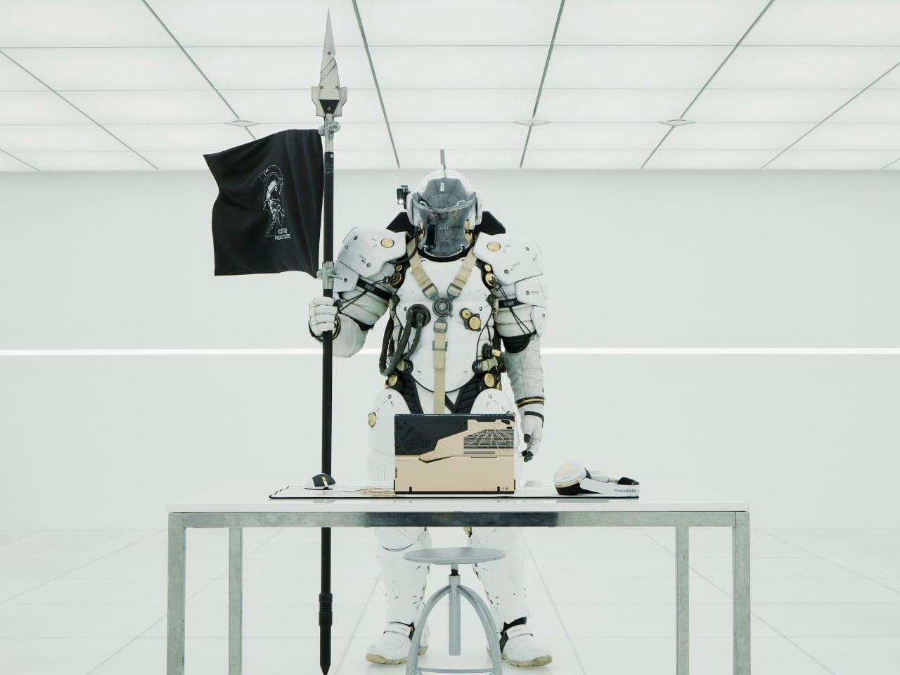
Ludens, the company’s mascot, embodies this philosophy. Designed as a collaboration between Kojima and Shinkawa, Ludens wears an “extravehicular creative activity” suit: part knight armor, part astronaut gear. The character represents “those who play” (Homo Ludens), and the visual design merges protective functionality with exploratory optimism.
The motto: “From Sapiens to Ludens.” The Z13 KJP’s tagline: “For Ludens Who Dare,” combining Kojima Productions’ philosophy with ROG’s established “For Those Who Dare.” Even the marketing language operates as a design decision.
The Chassis as Canvas
The CNC-milled aluminum chassis does something unusual for limited edition hardware: it uses premium manufacturing as the design medium rather than premium materials as decoration.
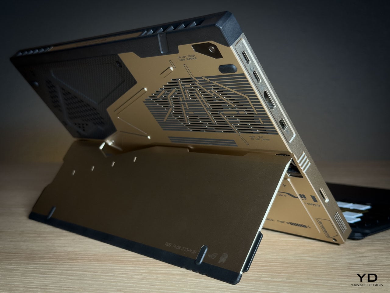
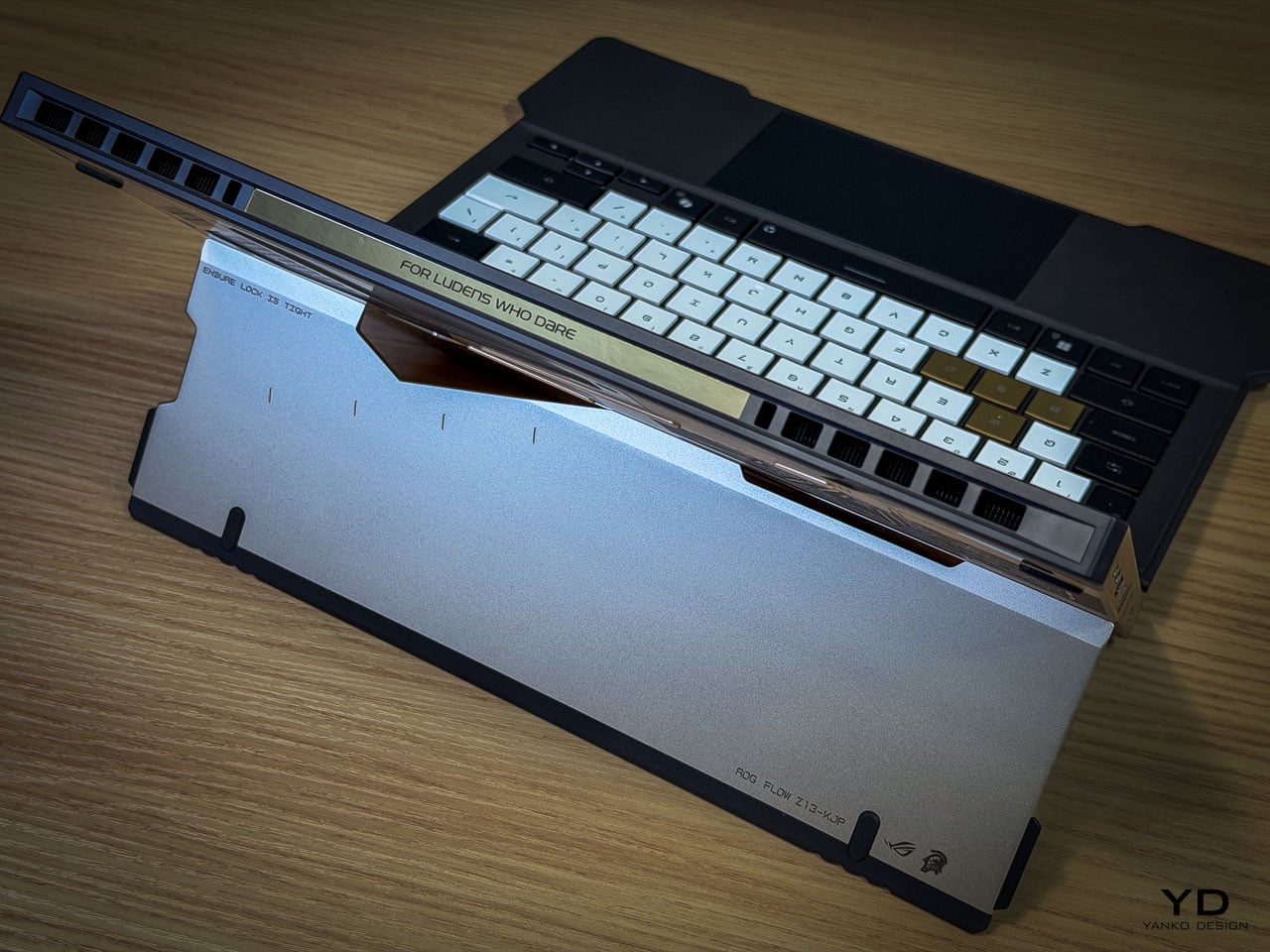
Angular cutouts carved into the aluminum reference Ludens’ armor plating. These aren’t applied graphics or printed textures. They’re machined into the body with tolerances you can feel with a fingernail. The cutting angles create shadow lines that shift with viewing angle, adding depth that flat surfaces can’t achieve.
The Decennium Gold colorway breaks from gaming hardware convention. ROG products typically live in blacks, dark greys, and aggressive reds. Shinkawa chose a palette that references neither typical gaming aesthetics nor typical Kojima aesthetics. It’s a new color vocabulary specific to this collaboration, one that reads as industrial warmth rather than decorative accent.
Vent laser etching creates a subtle pattern across thermal exhaust areas that reads differently depending on lighting. At a glance, it’s texture. Up close, it’s deliberate patterning that maintains the Ludens visual motif even on functional surfaces.
Surface Detail as System
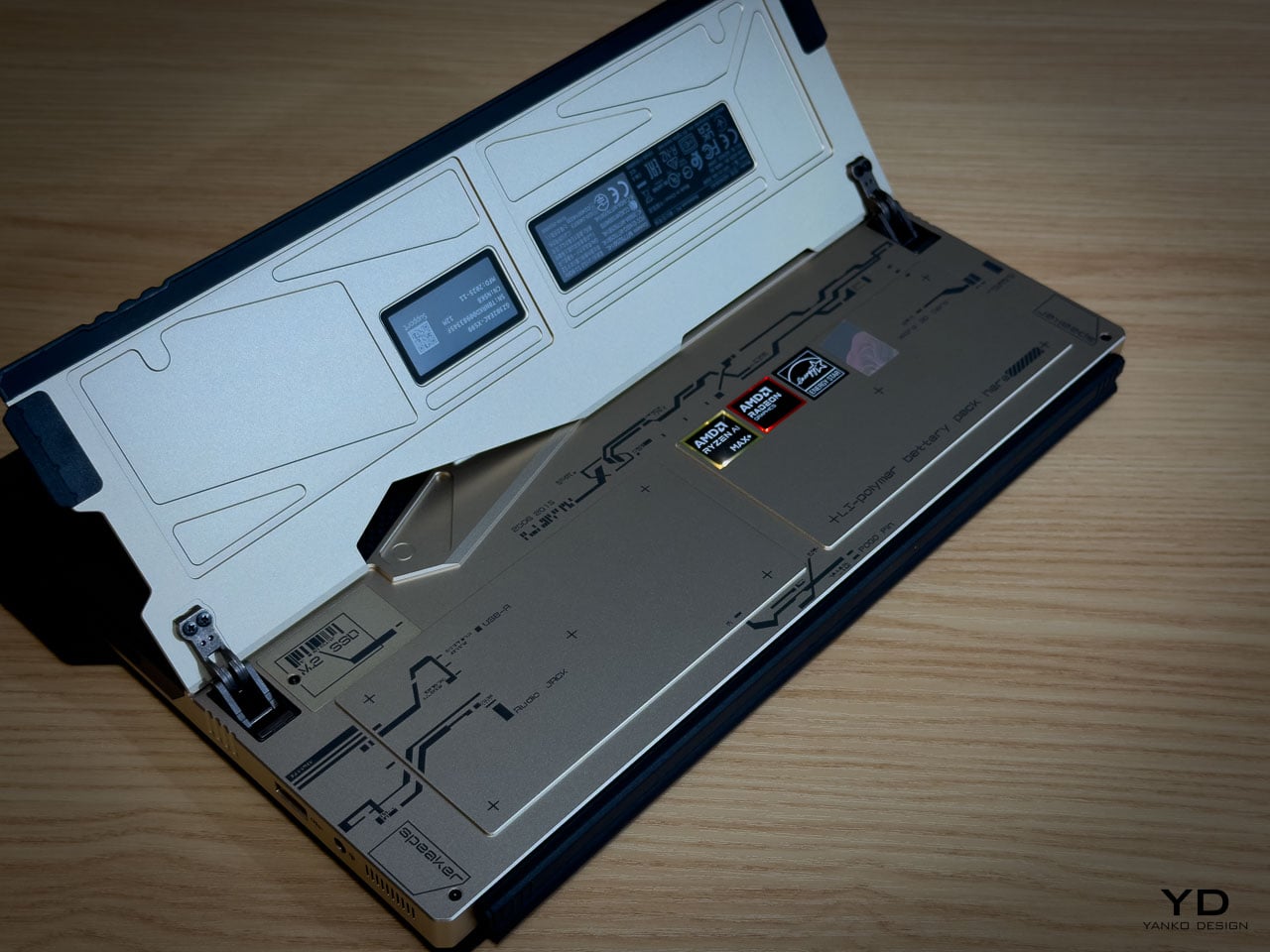
The rear panel artwork is layered in three visual weights, each serving a distinct compositional role. Fine parallel lines establish a base grid across the aluminum while medium thickness strokes intersect at angles that echo Ludens armor plating. Deep black ventilation apertures anchor the composition as functional shadow fields. Some lines are laser etched while others are machined recesses, and the vents aren’t hidden beneath the artwork but integrated into it.
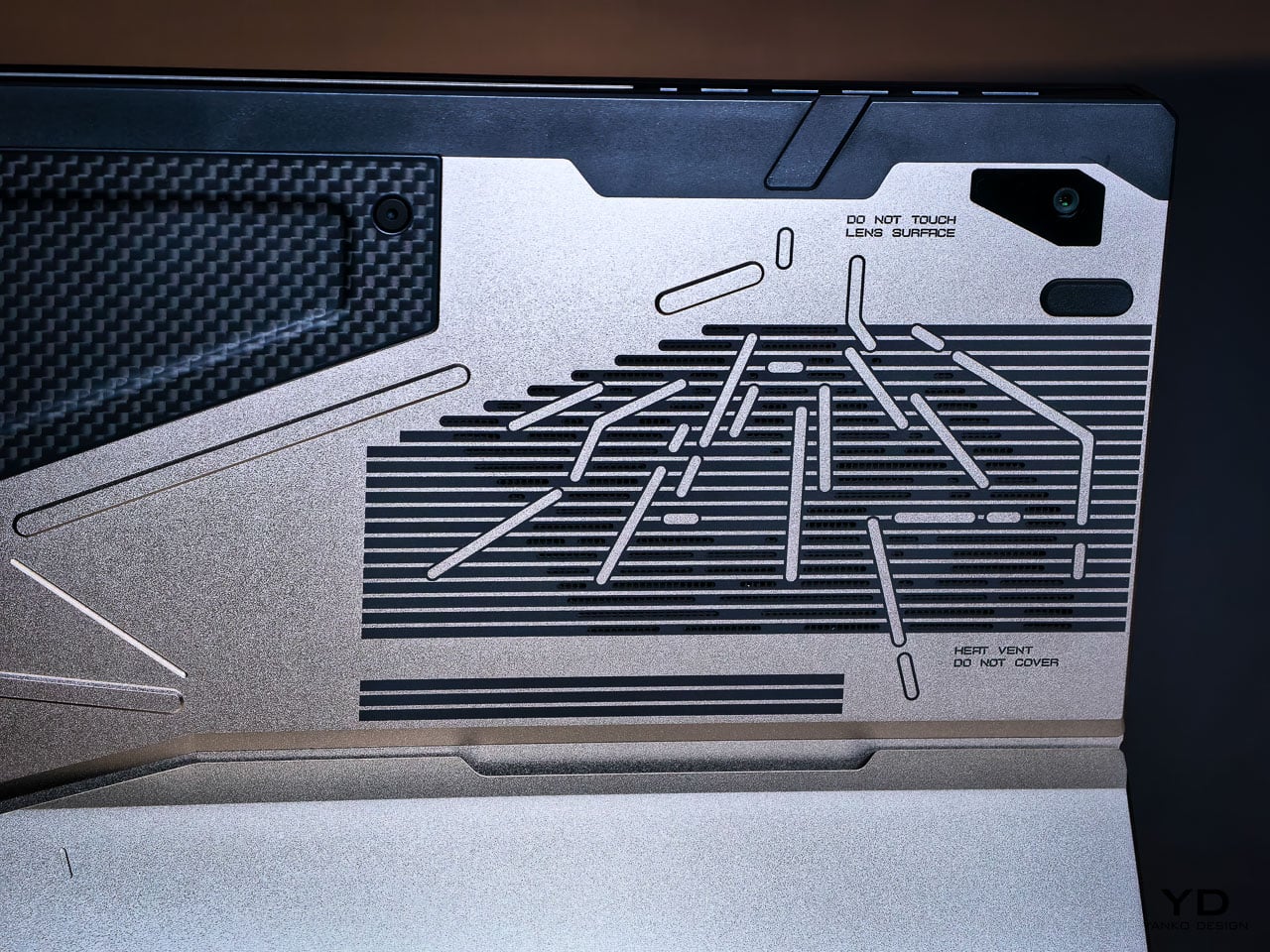
This is where the detail level becomes clear. The vent field doesn’t interrupt the art but completes it, with perforations radiating in controlled clusters. Horizontal exhaust lines align with printed striations, while thicker strokes deliberately break alignment to preserve composition. It reads less like decoration and more like a technical schematic of something operational.
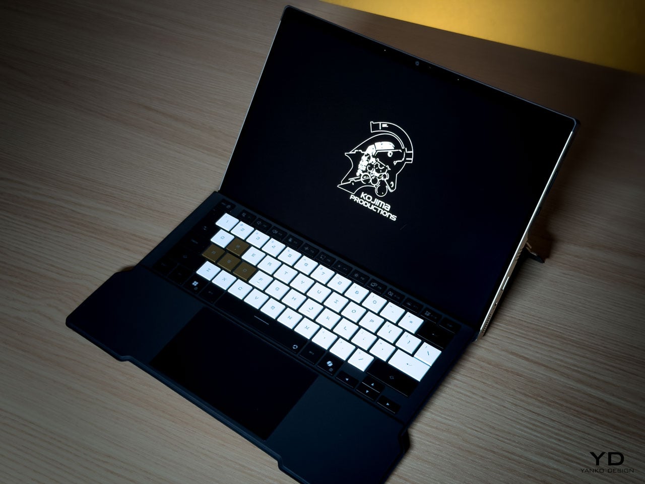
Micro typography reinforces the illusion. “Ensure lock is tight” sits near the kickstand mechanism. “Do not touch lens surface” frames the rear camera. “Li polymer battery pack here” is printed as if this were an exposed prototype rather than a sealed device. The language mimics field equipment labeling. It creates narrative without becoming parody.
What elevates the rear panel from decoration to design system is physical depth. The CNC bevels catch and redirect light differently depending on the angle of incidence, so the composition’s visual weight shifts throughout the day without any element disappearing. Under diffuse lighting, flat artwork would lose definition. Machined geometry holds contrast even when the room goes dim.
Carbon Fiber as Material Language
The carbon fiber elements operate as material contrast rather than structural marketing.
The weave is visible and directional. Under angled light it shifts between matte absorption and subtle reflection, creating tonal variation that the aluminum can’t replicate. This is real carbon fiber, not printed simulation. It introduces organic texture into an otherwise machined surface vocabulary.
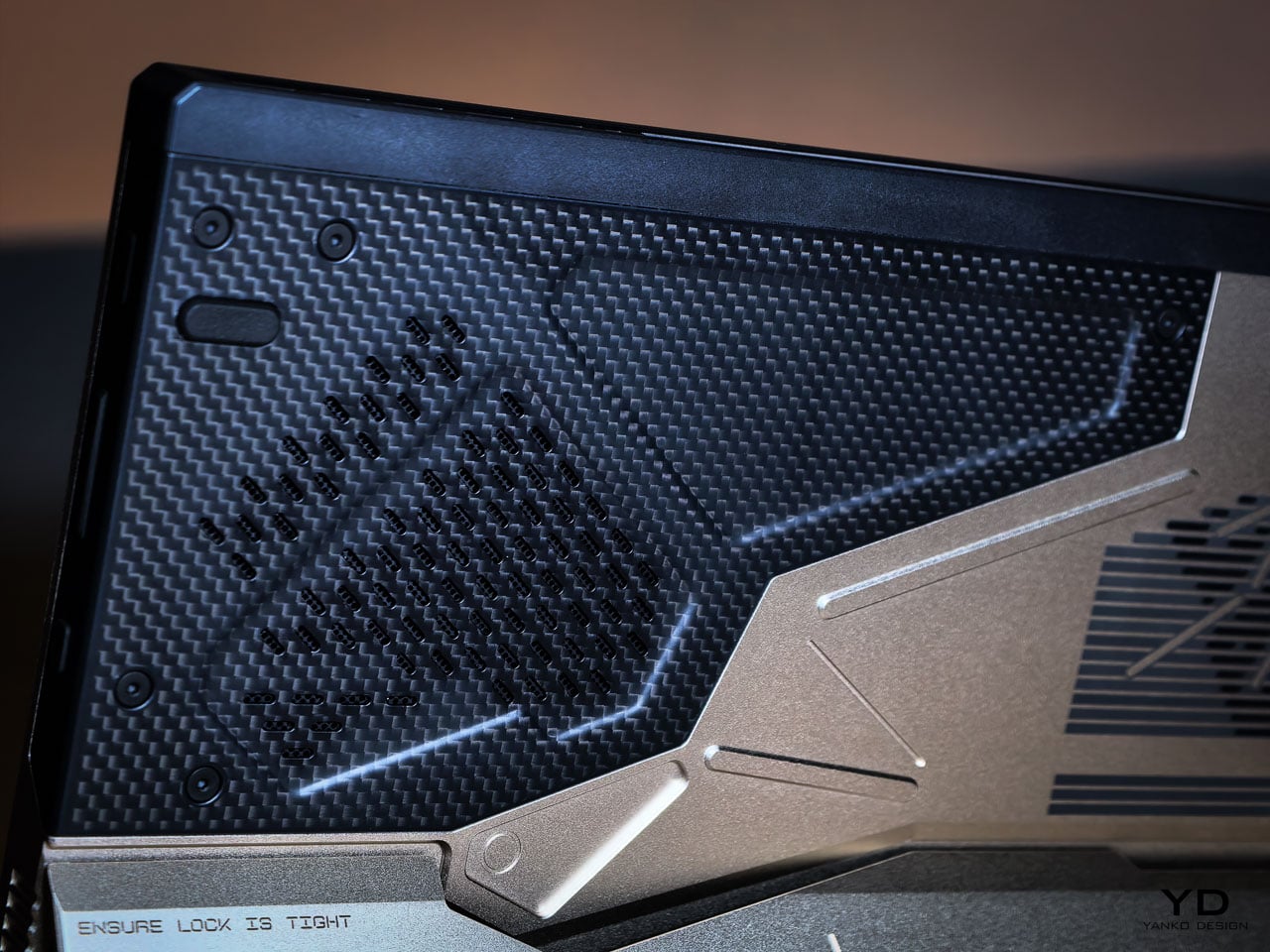
Placed adjacent to CNC milled aluminum, the fiber changes how the entire rear panel reads. Woven composite beside bead blasted metal creates tension between engineered precision and tactile irregularity. That pairing echoes Shinkawa’s broader design instincts. Mechanical forms feel inhabited rather than sterile. Armor suggests use rather than abstraction.
Thermal Architecture Shapes the Exterior
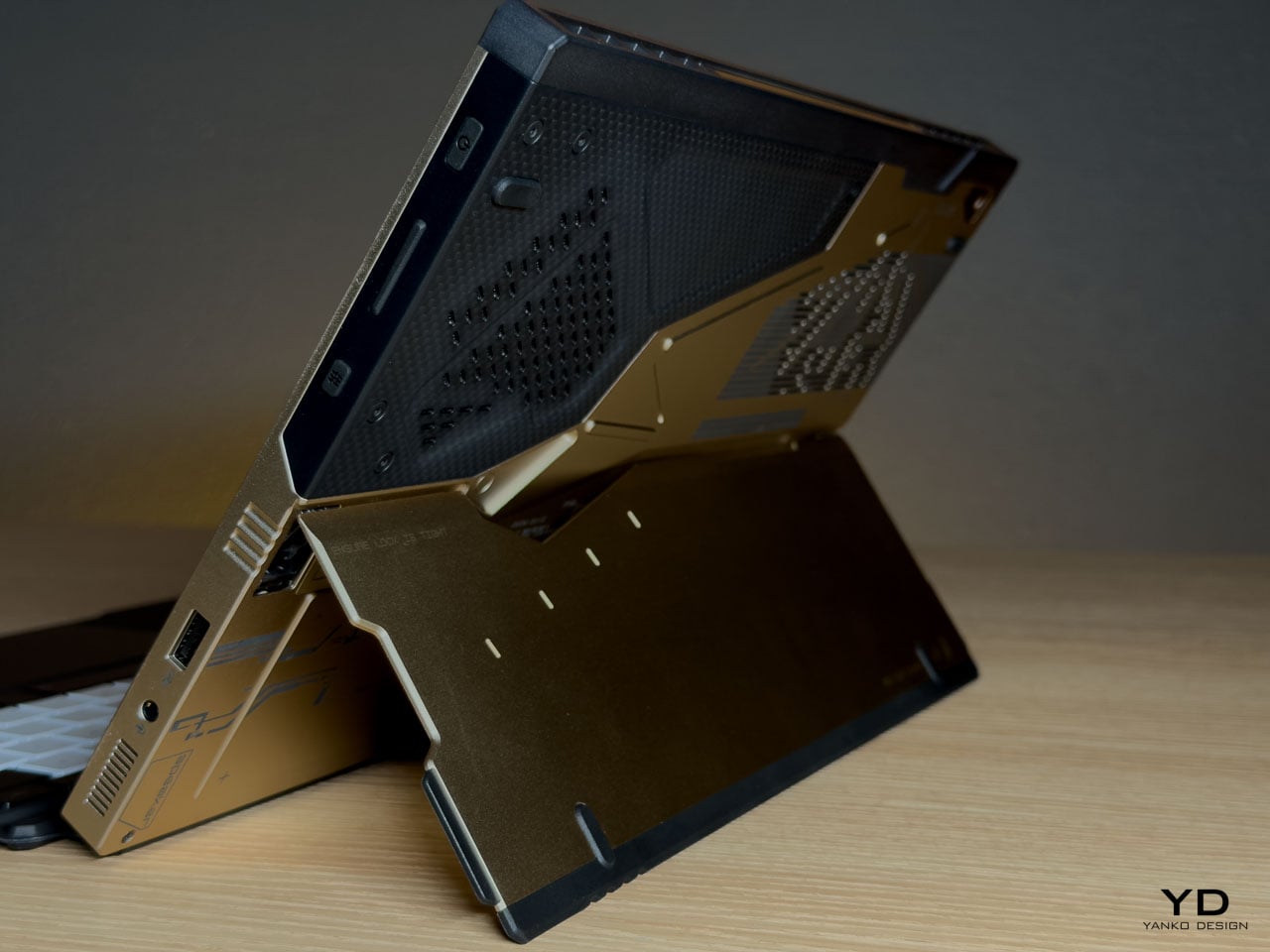
The Z13 KJP’s tablet form forces its cooling system to live within a flat plane rather than a hinged clamshell cavity.
ASUS integrates larger fans and a wider vapor chamber because the device lacks a traditional hinge exhaust path. An airflow channel under the display helps reduce touchscreen surface temperatures. These engineering decisions directly influence vent placement and rear panel geometry.
The diagonal vent cluster embedded in the carbon fiber panel isn’t arbitrary styling. It exists where airflow demands it. The long horizontal vent array on the aluminum side stretches across a composition already defined by linear etching. Function determines location. Design determines how it’s expressed.
The Z13 KJP treats cooling infrastructure as compositional material. The vents, channels, and exhaust geometry participate in the rear panel’s visual rhythm rather than interrupting it, which is why the thermal sections don’t read as engineering compromises from any distance.
Form Factor as Design Statement
The detachable keyboard format makes the Z13 KJP a design outlier among limited edition laptops.
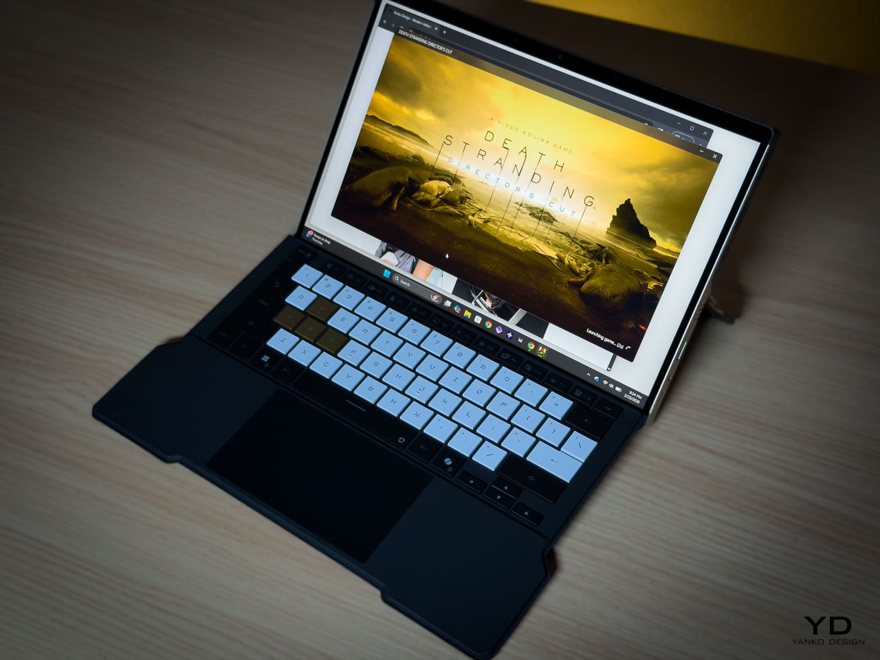
Most collector hardware comes in clamshell form. You see it closed or open. The Z13 KJP presents differently depending on configuration. As a tablet, it’s a slate with the Ludens-inspired chassis as the primary visual element. With the keyboard attached, custom KJP keycaps and typography add detail at interaction distance. On a kickstand at an angle, it shows the chassis rear and carbon fiber panel simultaneously.
This multiplicity matters for display-oriented owners because each configuration foregrounds different design decisions, from the macro geometry of the rear panel to the micro detailing of keycap typography. Most limited edition hardware offers a single hero surface. The Z13 KJP offers several, and they’re compositionally distinct.
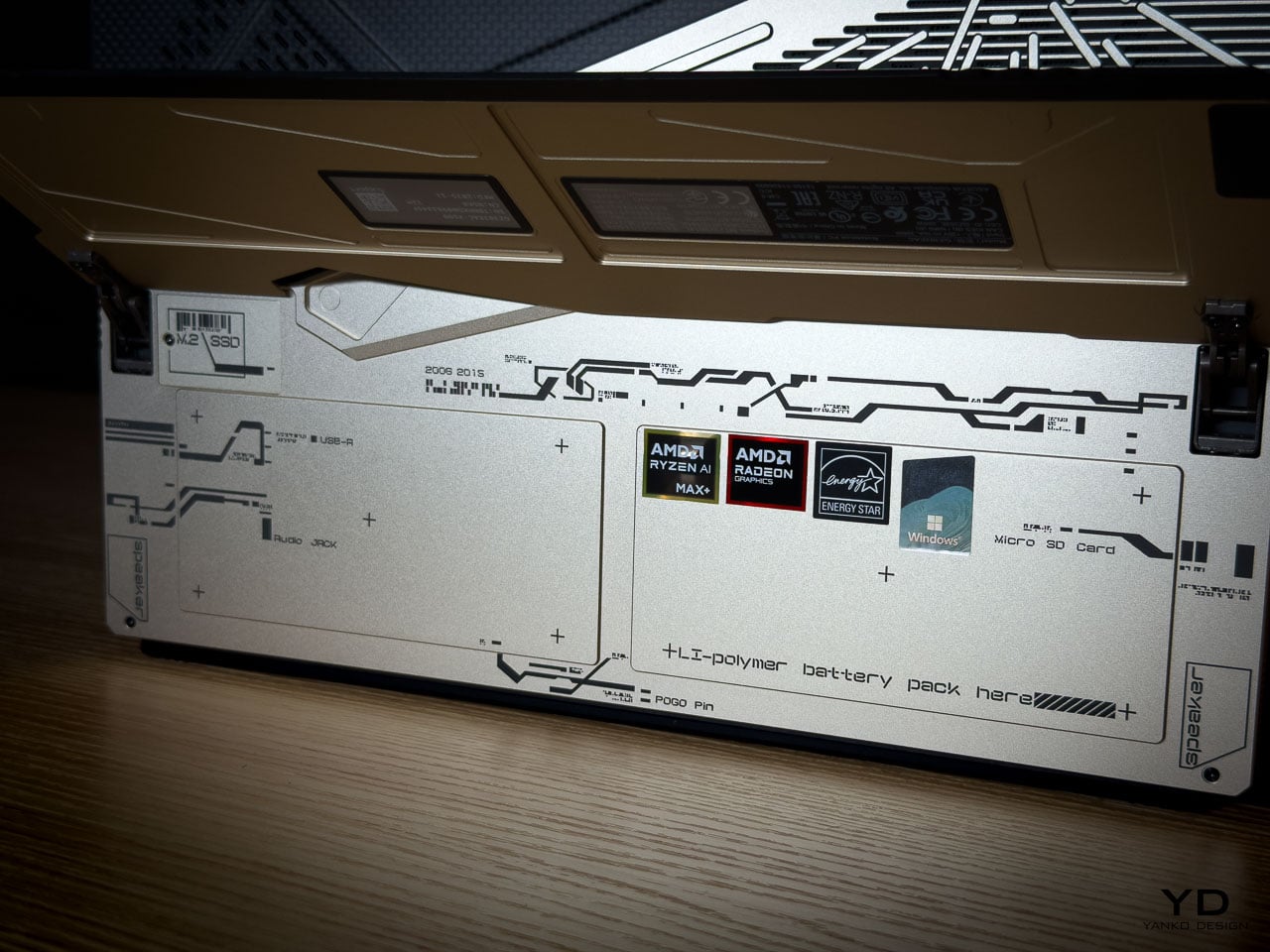
At 1.25 kilograms as a tablet and 1.72 kilograms with the keyboard attached, the Z13 KJP balances density with portability. Inside the 300.28 by 204.5 millimeter footprint at 14.56 to 14.99 millimeters thick sits an AMD Ryzen AI Max Plus 395 processor paired with Radeon 8060S graphics up to 80 watts, 128GB of LPDDR5X 8000 quad channel memory, and a 70Wh battery supporting 100 watt USB C charging with a 50 percent charge in 30 minutes claim.
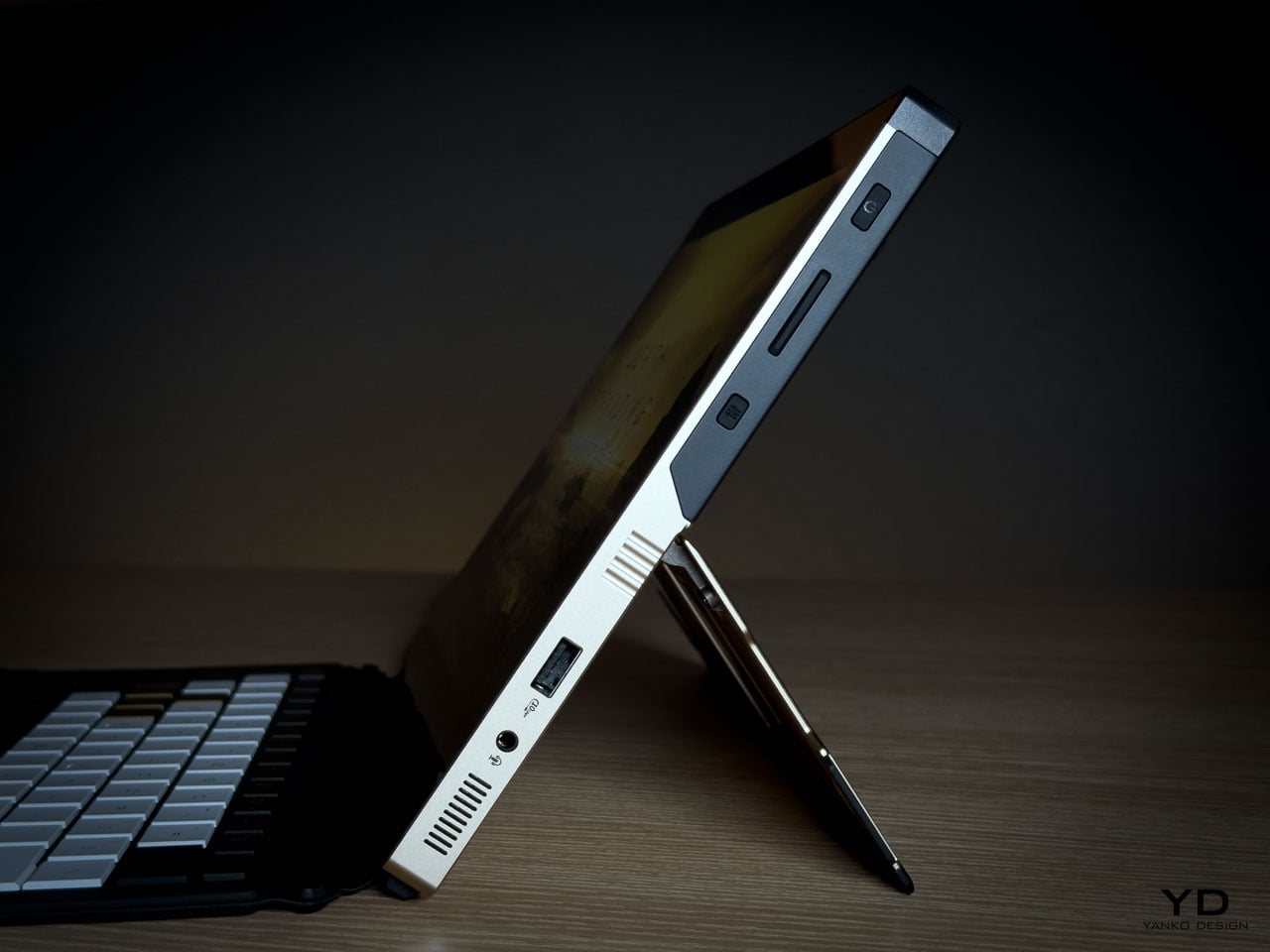
Ports and Edge Composition
Edge design is where themed hardware often collapses into generic product. The Z13 KJP maintains consistency.
HDMI 2.1 FRL sits alongside dual USB4 ports supporting DisplayPort 2.1 and Power Delivery 3.0. A USB A 3.2 Gen 2 port anchors legacy connectivity. The microSD UHS II slot hides beneath the kickstand, an industrial design decision that preserves side silhouette integrity. Even the Command Center button is placed without disrupting the visual rhythm of the edge.
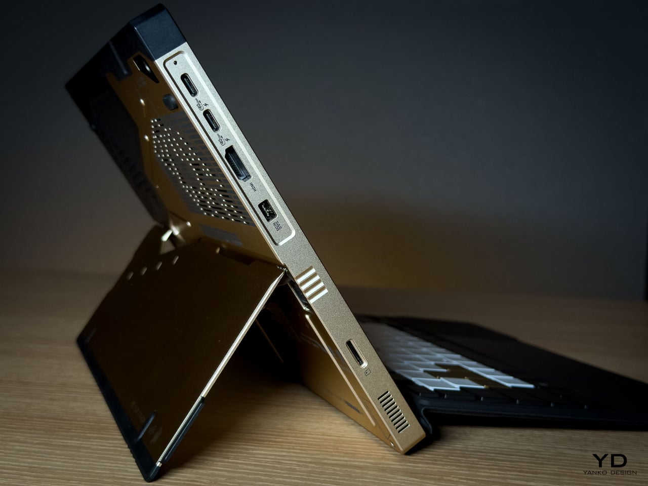
The port cutouts are clean and deliberate, preserving the angular language established on the rear panel rather than fracturing it. Negative space between each cutout prevents the edge from reading as a fragmented utility strip. Black rubberized edge guards introduce a darker boundary layer that frames the Decennium Gold aluminum, visually grounding the device while protecting high contact surfaces.
On a device this compact at 300.28 by 204.5 millimeters and under 15 millimeters thick, edge discipline determines whether the hardware reads as composed or cluttered. The Z13 KJP maintains its visual argument all the way to the perimeter.
Display as Primary Surface
As a tablet first device, the display isn’t a spec line but the dominant interaction surface and the largest uninterrupted plane on the hardware. Everything else on the Z13 KJP supports or counterbalances what happens on this 13.4 inches of glass.
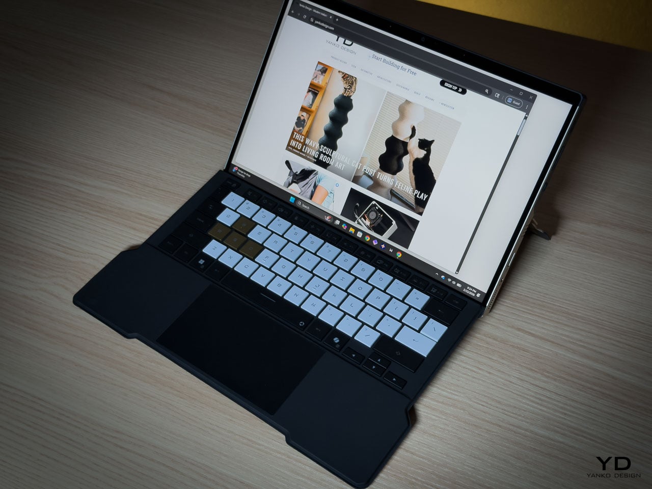
The ROG Nebula Display runs at 2560 by 1600 resolution across a 16:10 WQXGA panel, 180Hz with 3ms response time and 500 nits of brightness, covering 100 percent of the DCI P3 color space. Gorilla Glass DXC provides the protective layer, which ASUS positions as glare resistant. In a tablet configuration where the screen faces ambient light directly, glare resistance becomes a design-critical material choice rather than a spec sheet footnote.
The glass side operates as deliberate counterweight to the rear panel’s visual density. Where the aluminum layers machined geometry, etched lines, carbon fiber, and micro typography into a complex composition, the display presents smooth, unbroken optical neutrality. That restraint is functional. The front surface stays quiet so it doesn’t compete with whatever content the owner puts on screen.
Ergonomically, the 16:10 aspect ratio provides vertical space for document work and browsing without forcing a width that compromises single-handed grip. When held as a tablet, the device balances expressive density on one side with functional clarity on the other, each surface serving a role the opposite can’t.
The Unboxing as Ritual
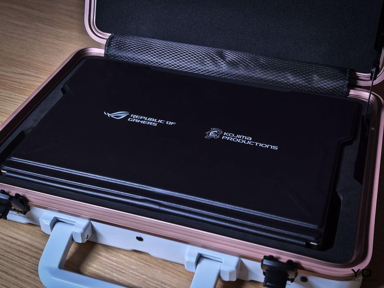
Limited edition hardware typically includes printed documentation and perhaps a numbered certificate. The Z13 KJP bundle creates a curated experience.
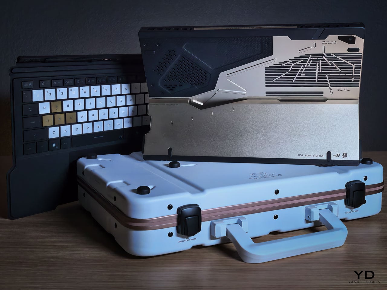
The carrying case uses the same Decennium Gold design language as the laptop. A flight tag bears ROG × KJP dual branding. A sticker sheet includes “For Ludens Who Dare” and branded designs that extend the aesthetic to wherever the owner applies them.
The centerpiece is the thank-you card. Front: Yoji Shinkawa’s original early sketches of the Z13 KJP, developmental drawings that preceded the final product. Back: personal messages from Hideo Kojima and Yoji Shinkawa with their signatures.
For a collector, this card may become the most valued item in the box. Original Shinkawa sketches of any kind command significant prices. Printed reproductions on a thank-you card aren’t originals, but they’re the closest most people will get to Shinkawa’s developmental process for this specific product.
The peripheral ecosystem extends the language: ROG Delta II-KJP headset, ROG Keris II Origin-KJP mouse, ROG Scabbard II XXL-KJP mousepad. All three bear Shinkawa-illustrated design elements. Sold separately, they allow the aesthetic to extend from the laptop to the entire workspace.
Living With the Design
Design analysis happens at arm’s length. Living with hardware happens at fingertip distance, and the Z13 KJP reveals different priorities depending on which distance you’re evaluating from.
The Decennium Gold finish reads as muted industrial alloy rather than jewelry. Under warm lighting it deepens slightly without turning brassy, and under cooler overhead light it holds its tone without washing out. That tonal stability means the device doesn’t shift personality depending on where you set it down. It looks the same on a coffee shop table as it does on a studio desk, which is rarer than it should be for hardware at this price point.
Fingerprints are the inevitable test. The bead blasted aluminum shows contact marks under direct light, particularly on the flatter surfaces between CNC channels. The machined geometry helps break up the visual uniformity that makes prints obvious on polished metal: shadow lines and textured transitions camouflage minor contact marks rather than highlighting them. The carbon fiber panel resists prints more effectively because the woven texture absorbs oils differently than the metal. Over a work session, the aluminum side shows use while the carbon fiber side stays visually cleaner.
At 1.25 kilograms in tablet mode, the Z13 KJP is honest about what it is. Extended handheld use past ten or fifteen minutes reminds you that there’s an AMD Ryzen AI Max Plus 395 and 128GB of memory packed inside a 14.56 millimeter chassis. The angular cutouts on the rear don’t create sharp pressure points against the palm because the CNC beveling rounds the internal edges enough to prevent digging. But the density concentrates in a footprint compact enough that you feel the weight per square centimeter more than you would on a larger device. The carbon fiber section provides a subtle grip advantage over the aluminum, with the woven texture catching skin differently at reading angles where hold confidence matters.
The CNC channels and etched line work invite a question most design pieces avoid: does precision age well? The machined recesses are shallow enough that casual dust isn’t immediately visible, but deep enough that compressed air works more effectively than a cloth for thorough cleaning. The vent apertures, which serve as compositional anchors from a design perspective, become maintenance zones from a use perspective. The rubberized edge guards show no visible wear patterns at high contact points, and their slightly softer surface provides meaningful grip improvement along the edges where you naturally hold the device when repositioning.
The kickstand deploys with firm, deliberate resistance that holds angles confidently. The hinge mechanism doesn’t feel fragile or provisional. When the device sits on its stand with the rear panel facing outward, the visual density of the artwork becomes ambient rather than demanding. You stop reading individual design decisions and start seeing a unified surface that happens to be more interesting than anything else on your desk.
Where the Translation Lands
What the hardware can’t fully capture is the kinetic energy of Shinkawa’s original illustrations. His drawings imply velocity and force through brushstroke dynamism, qualities that a static consumer electronics chassis isn’t built to reproduce. The etched line work creates layered visual complexity, but complexity isn’t motion. The silhouette doesn’t shift with posture. The energy remains implied rather than kinetic, frozen into surface detail rather than expressed through form.
Where the translation succeeds is in its commitment to depth. The design vocabulary lives inside the hardware’s structure rather than on its surface, which is why scrutiny rewards rather than punishes. Move closer and the layering intensifies. Change the lighting and the composition shifts weight without losing coherence. That durability under inspection is rare for any consumer electronics product, let alone one bearing an artist’s name.
A design theme needs its best angle and its ideal lighting. The Z13 KJP doesn’t have a weak configuration or a viewing distance where the intent falls apart, because the intent is embedded in the object itself. Whether the price premium over the standard Z13 is justified depends on how you value that kind of manufacturing commitment. But as a precedent for what artist collaborations in hardware can actually achieve, nothing in the laptop category has come this close to letting the original vision survive production intact. Pre-order starts today at ASUS Store.