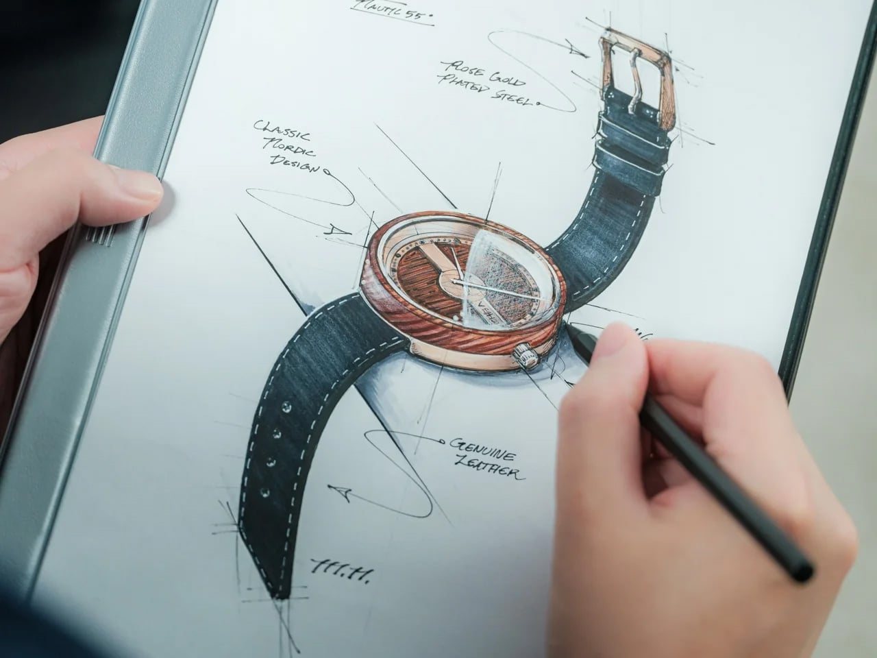

Japan has a stationery obsession, and the rest of the world is finally catching on. The country treats writing tools and paper goods the way it treats everything else: with an almost unreasonable level of care, precision, and quiet restraint. What looks simple in the hand rarely is. These eight pieces are proof that back-to-school shopping has a ceiling, and most of us haven’t come anywhere close to hitting it.
Every item on this list earns its place for the same reason: it solves something. Not in a Swiss-Army-knife way, but in a quietly elegant way that makes you wonder why the version you’ve been using for years never worked this well. Stock up your stationery collection with these unique essentials, and feel the difference they make to your everyday routine.
1. MagBoard Clipboard
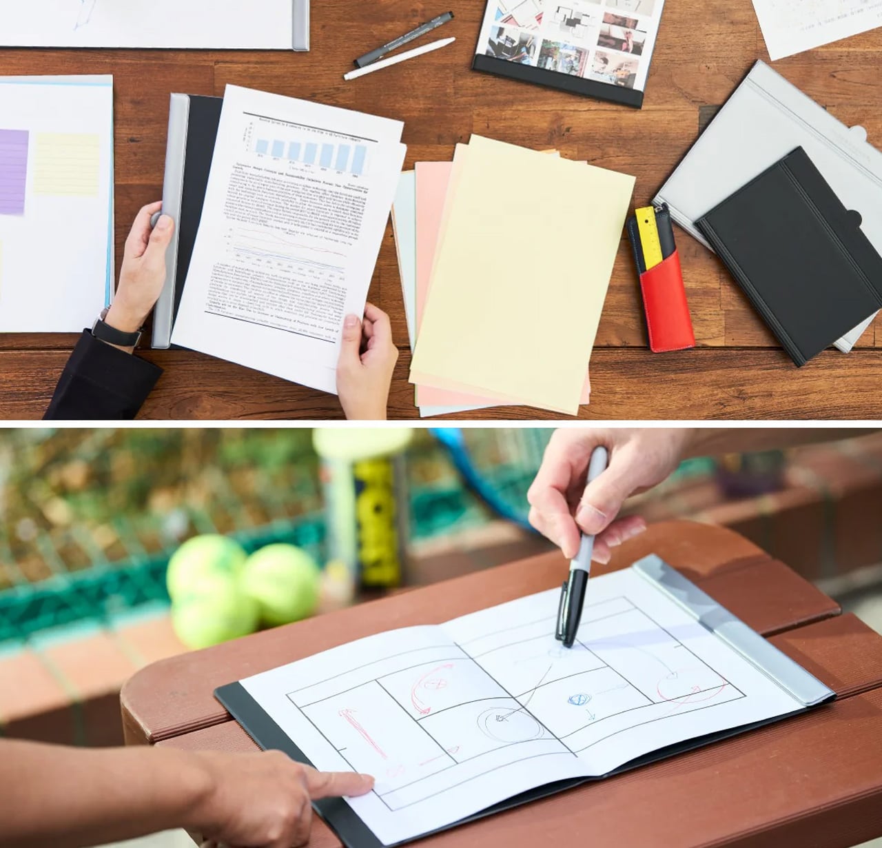


Most clipboards are an afterthought, a plastic spring hinge you buy simply because you had to. The MagBoard is different in the way that good Japanese design tends to be: the function is unchanged, but the thinking behind it is completely rebuilt. A magnet and lever mechanism holds up to 30 sheets of paper in place without the usual clip aggression, and the hardcover backing is stiff enough to write on comfortably while standing, no desk surface needed at all.
The surface is water-resistant and easy to wipe clean, which matters when it travels between meetings, job sites, or a classroom. At A5, it fits in most bags without crowding them, and the cover opens completely flat so there’s no awkward curl mid-note. For anyone who moves through their day between different spaces and needs to take legible notes rather than just keep a surface dry, this is the clipboard that actually earns a permanent spot in the bag.
What we like
- The magnet-and-lever mechanism replaces spring clip tension without sacrificing hold, managing up to 30 sheets at once
- Water-resistant surface makes it genuinely travel-ready, not just desk-ready
What we dislike
- A5 format won’t accommodate US letter-size paper without folding, which won’t work for everyone
- At $45, it’s a significant premium over what most people expect to spend on a clipboard
2. Sonic Kakusta Portable Pen Stand
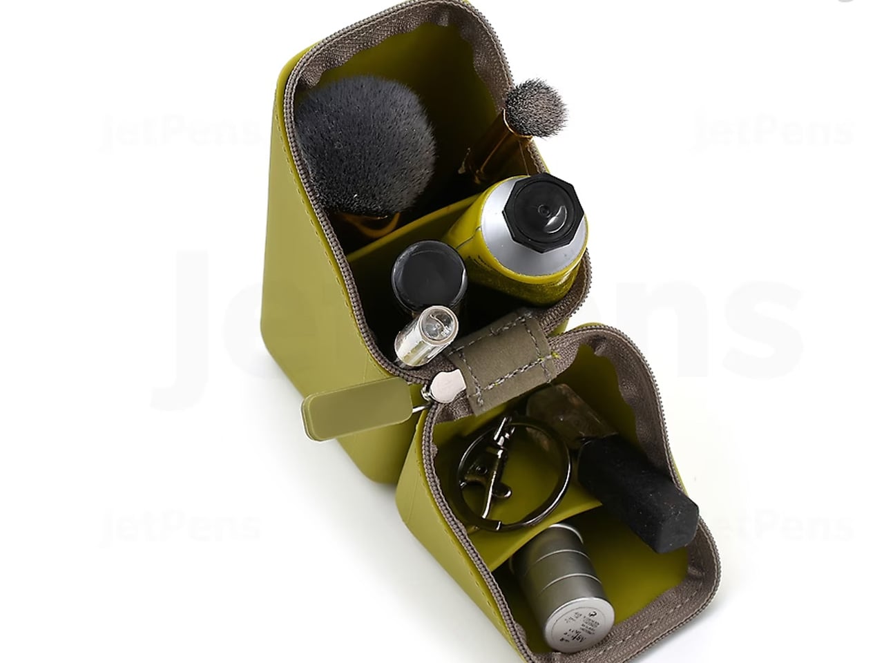
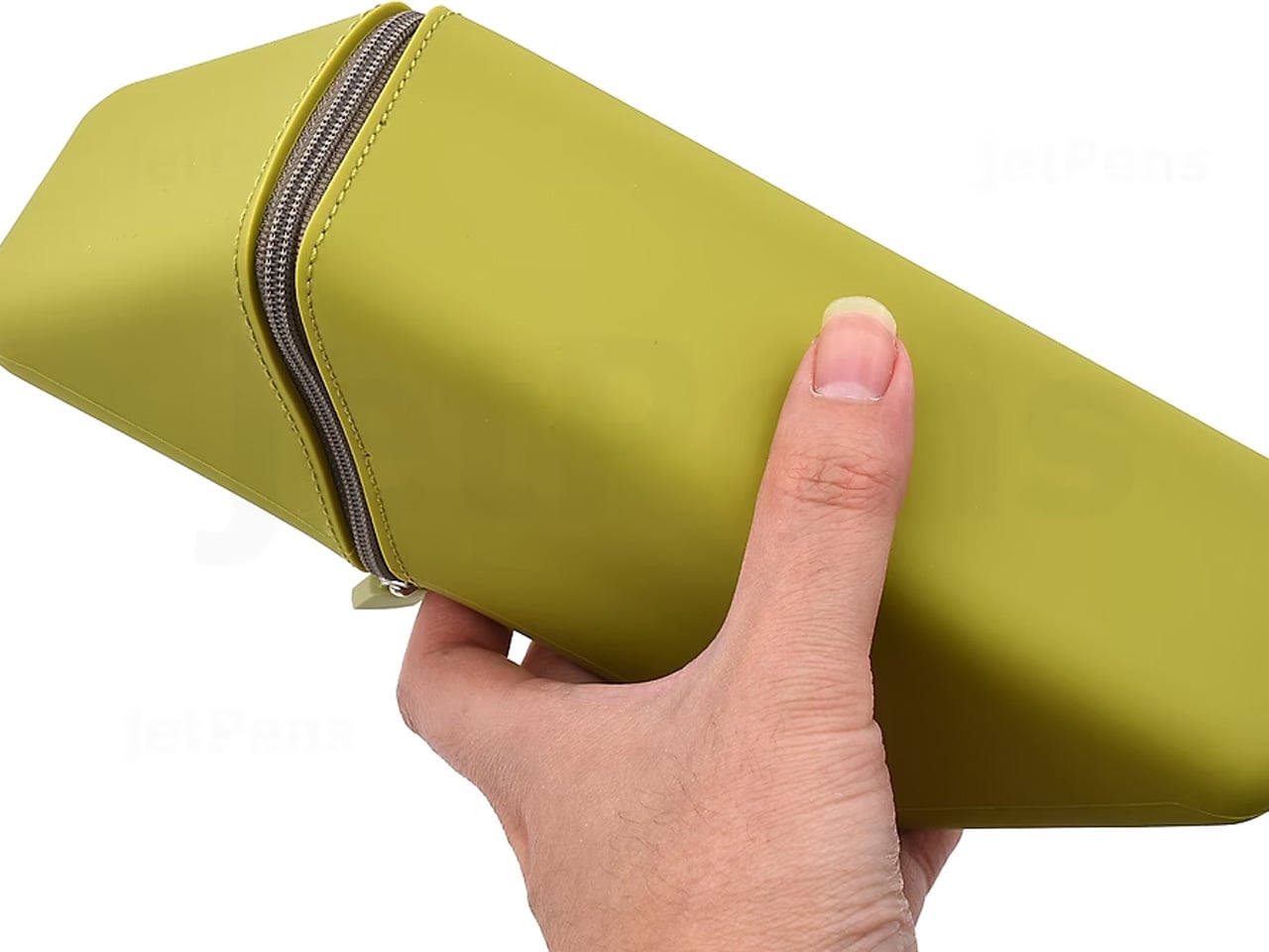
The Kakusta looks like a soft pencil case until you set it on a desk. Unzip it, fold the lid back, and the whole thing becomes a stand that props your pens at a 60-degree angle, everything visible, everything reachable in one motion. Sonic, the Japanese stationery brand behind it, didn’t add a separate stand component. The fold itself is the stand. That kind of thinking, where the packaging is the product, is what separates it from anything you’d find at Target.
The triangular cross-section when open isn’t accidental. It creates a stable base that doesn’t tip or slide even on slightly uneven surfaces, and when class or the workday ends, everything folds back into the case in seconds. For students who shift between desks, libraries, and coffee shop tables, not having to manage a separate pen holder is genuinely useful. The Kakusta doesn’t ask you to change how you work. It just eliminates one more thing to carry and set up.
What we like
- Case-to-stand transformation happens in one fold, no extra components to lose
- The 60-degree angle keeps every pen visible rather than buried at the bottom of a flat case
What we dislike
- Capacity is on the smaller side, so larger pen collections won’t fit comfortably
- The fabric exterior picks up lint faster than a hard-shell case would
3. Stalogy Editor’s Series 365 Days Notebook
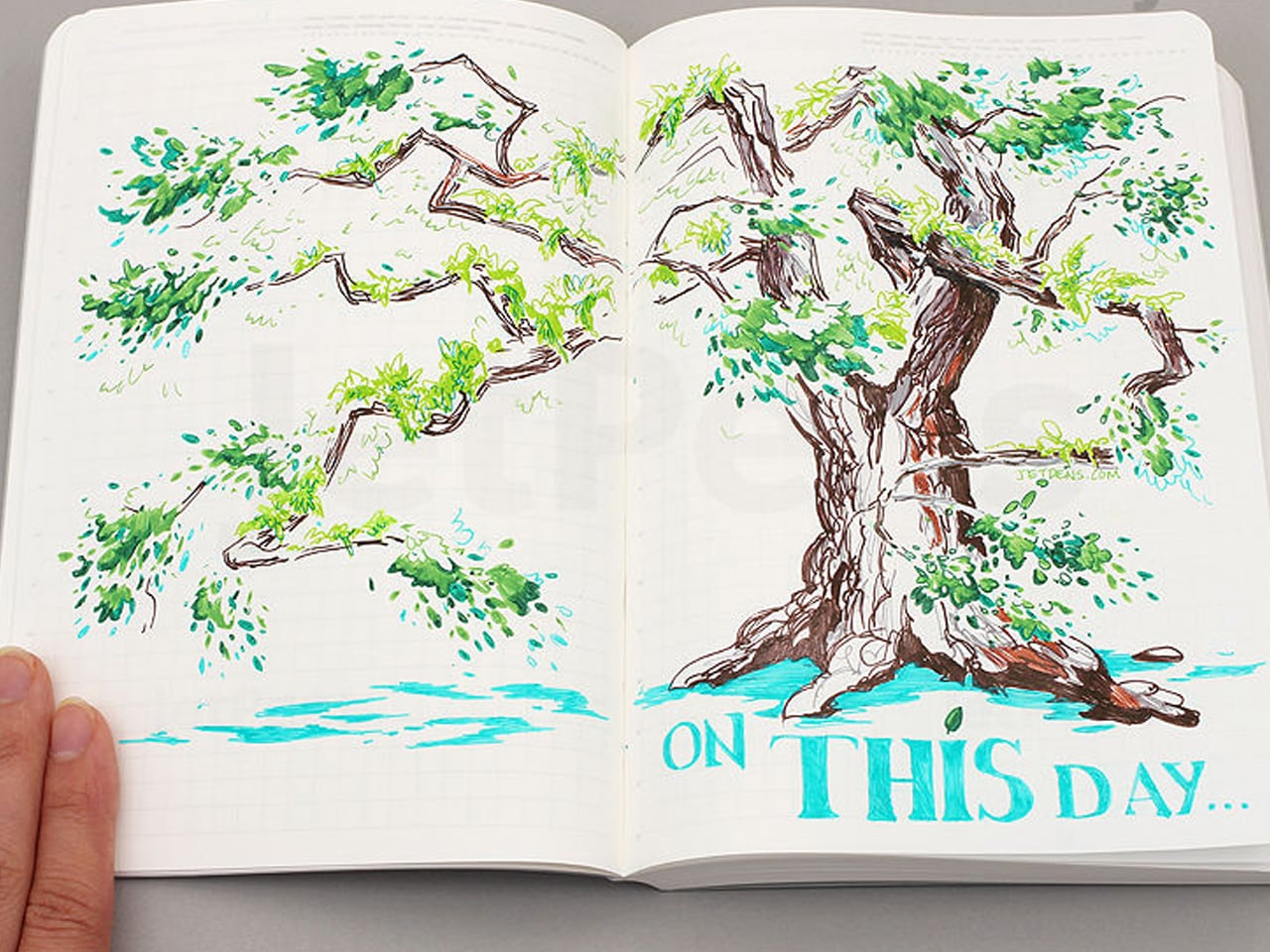
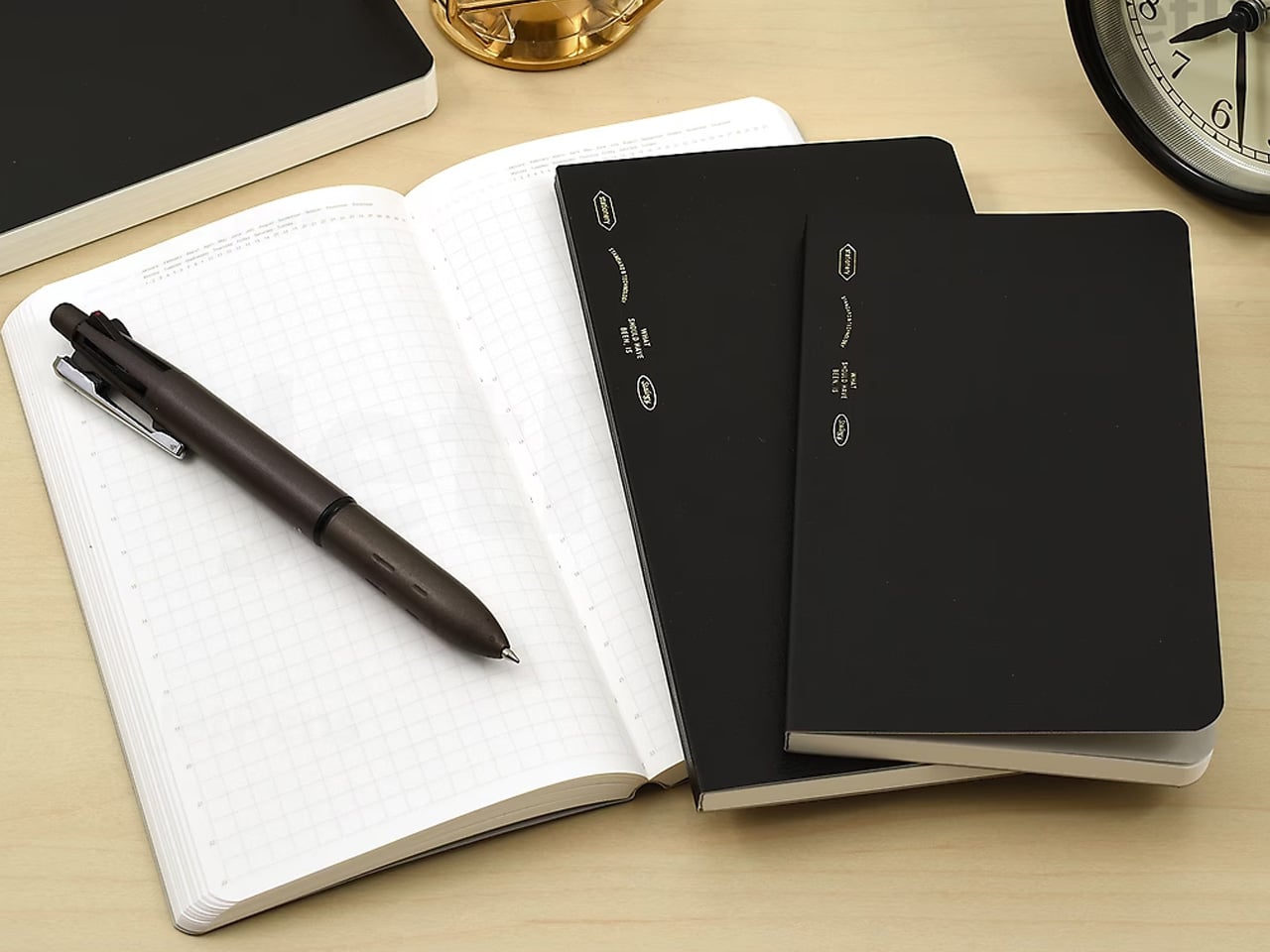
The 365 Days Notebook wasn’t designed for bullet journaling that requires stickers and color-coded spreads. It was designed for editors: people who use a notebook to capture ideas, track timelines, make lists, and sketch rough diagrams all in the same session, sometimes on the same page. The cream-toned dot grid is subtle enough that it doesn’t compete with what you’re writing, and at A6 the whole thing fits in a coat pocket without any compromise.
With 368 pages, it holds a full year of daily writing without exhausting itself by October. The binding opens completely flat without tension, which means pages stay where you put them rather than creeping closed between entries. For someone who writes in transit, between calls, or at lunch, a notebook that opens flat and stays flat is worth more than any feature list could describe. This one simply gets out of your way.
What we like
- 368 pages comfortably handle a full year of daily use across writing, planning, and sketching
- Lays completely flat when open without needing a hand to hold the page in place
What we dislike
- A6 is small for anyone who writes in long form or needs room to sketch at scale
- Cream-toned paper, while easy on the eyes, shows ink colors less vividly than bright white
4. Levitating Pen
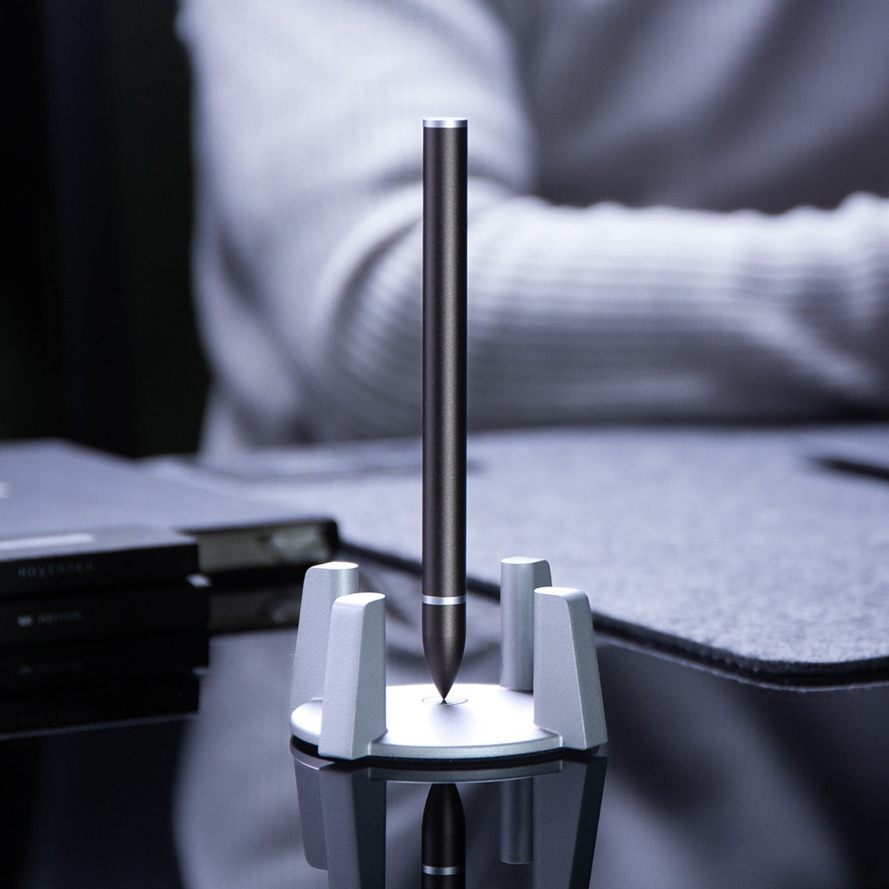

The Levitating Pen stands upright on its base without batteries, electronics, or tricks. It balances vertically through a precisely calibrated magnetic pedestal that holds the pen in a stable position, and the whole arrangement is quiet enough that it reads as a desk object rather than a gadget. Picking it up takes a half-second more than reaching for a pen lying flat on a desk, but that pause changes how you think about the act of writing. It feels deliberate in a way that cheap ballpoints never do.
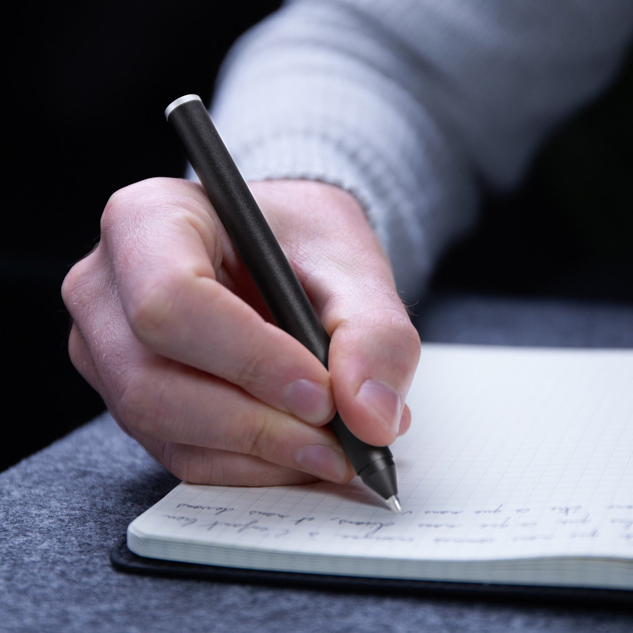
Write with it, and the ballpoint performs exactly as expected: smooth, consistent, without drama. The benefit isn’t in the ink delivery. It’s in what the pen does to the space around it. A desk with a Levitating Pen on it looks considered, and that visual cue tends to set a tone for the work that follows. For someone who moves between focused writing sessions and longer thinking stretches, having a tool that signals “this is where the work happens” is worth more than most productivity hacks.
What we like
- Balances upright through a magnetic pedestal with no electronics or batteries required
- Functions as a smooth ballpoint and a distinctive desk object in equal measure
What we dislike
- The base adds desk footprint that might not suit a minimal or already-crowded setup
- The levitation effect can become a distraction in a shared or open-plan workspace
5. King Jim Visual Bar Timer (VBT10)
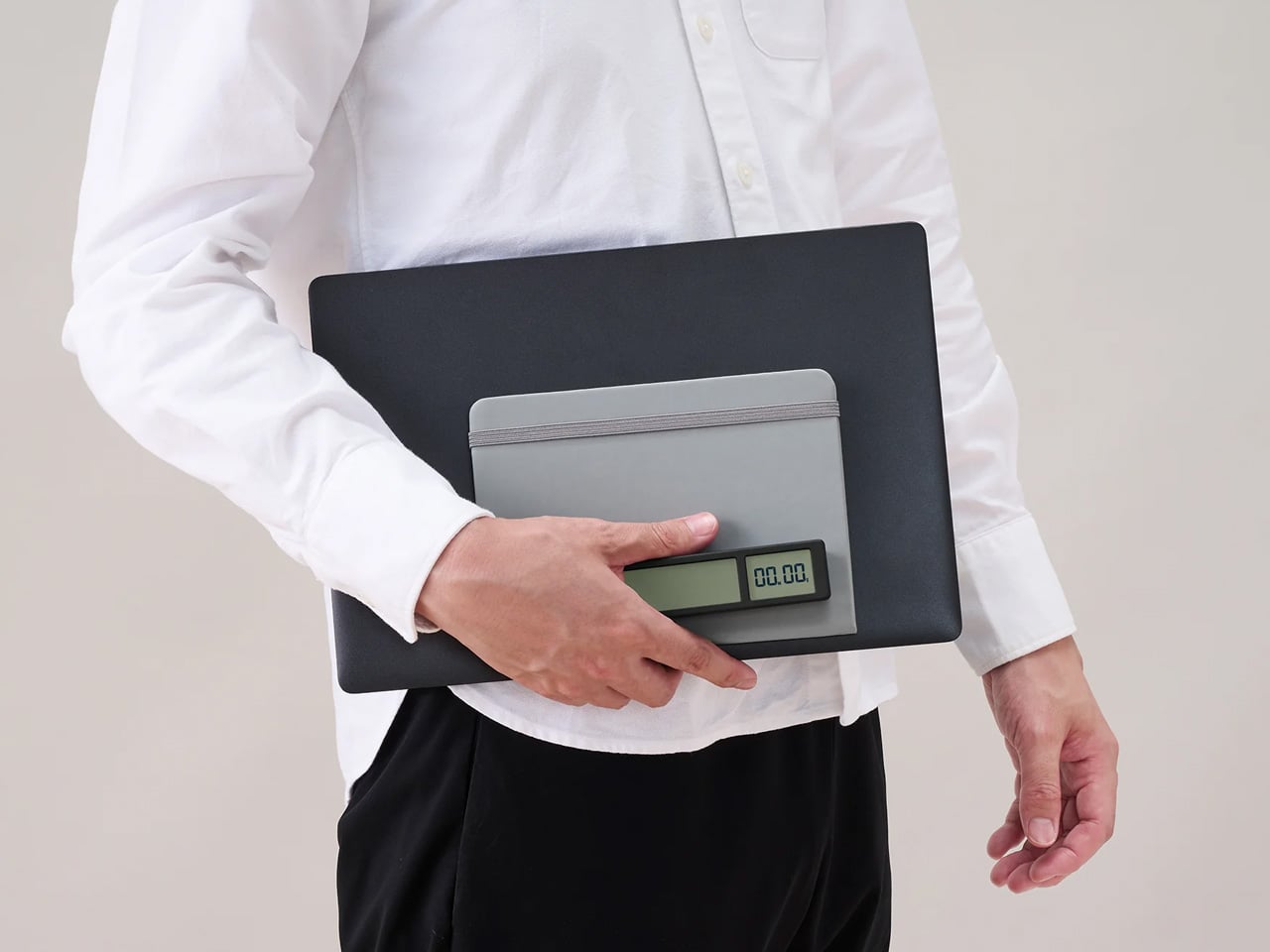
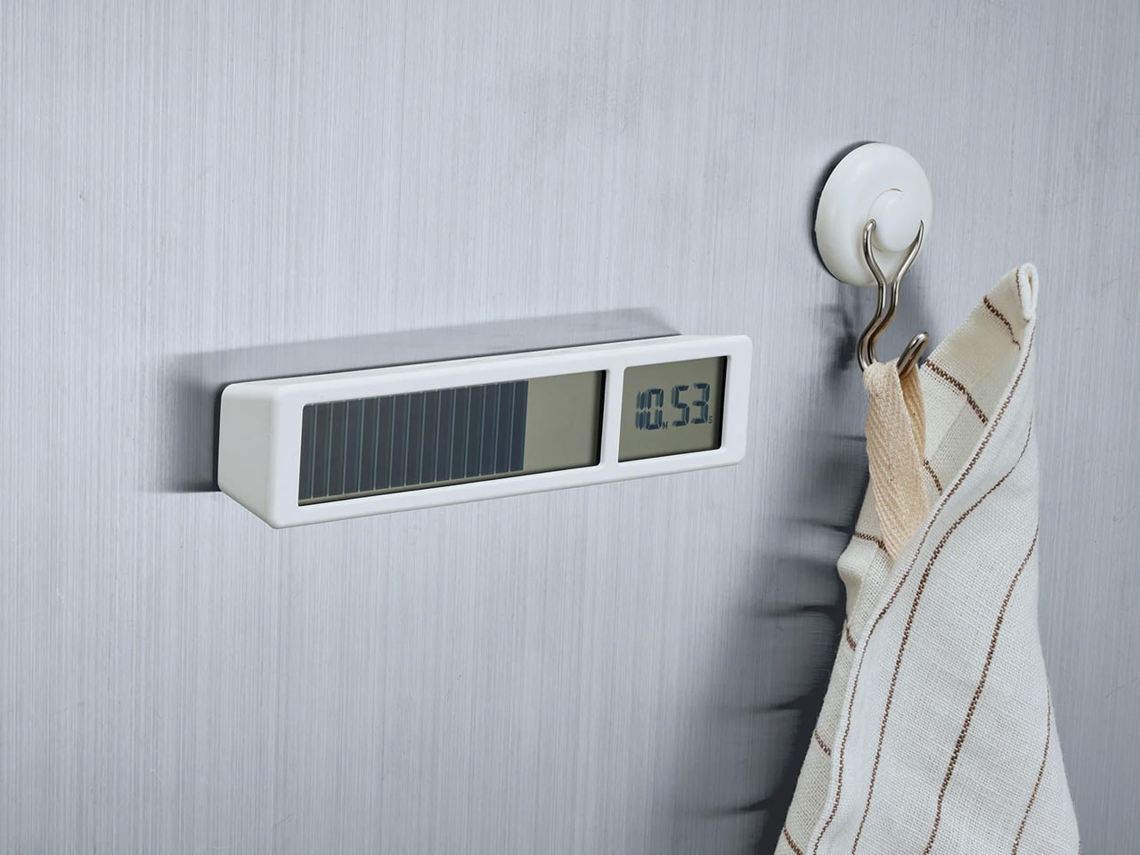
Most timers count up or display numerals. The King Jim VBT10 does something simpler and more useful: it shows a row of large LCD segments representing remaining time, and as the countdown progresses, segments disappear from right to left. No digits to read, no beeping at intervals, just a visual progress bar legible from across a room at a glance. It’s the kind of design decision that seems obvious once you see it, but that no Western manufacturer thought to build first.
For anyone who works in timed blocks, whether that’s the Pomodoro method, writing sessions, or class periods, having a physical timer rather than a phone or laptop notification means focus stays on the task rather than the device. The VBT10 sits on a desk without demanding attention, and the countdown is readable enough to track peripherally. For students and remote workers who need structure without constantly checking a screen, this is a more disciplined option than anything most productivity apps currently offer.
What we like
- Visual bar display reads instantly from a distance without requiring you to parse numerals
- Physical format keeps attention off screens during timed work or study sessions
What we dislike
- Pricing and availability vary outside Japan, and shipping times can stretch considerably
- LCD has limited visibility in direct sunlight or high-glare environments
6. Shachihata Consolidated Number Stamp
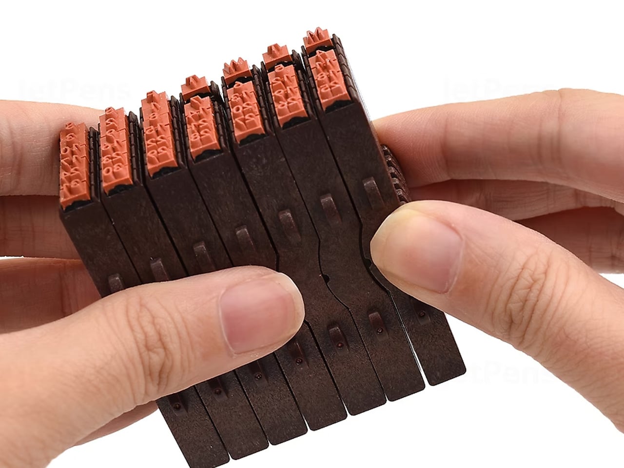
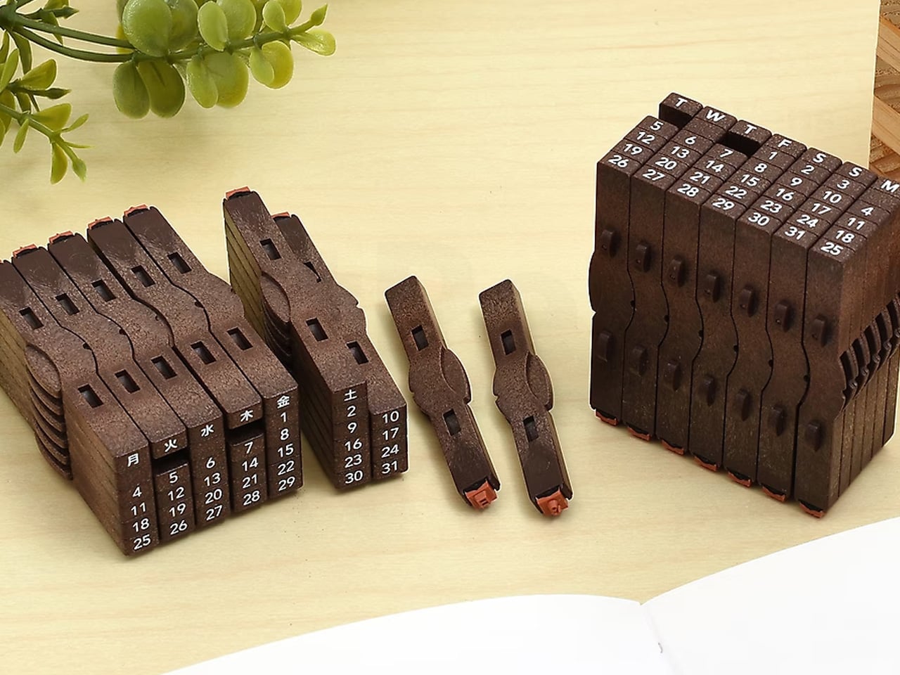
Shachihata makes the Consolidated Number Stamp as a set of individual pieces: 31 dates and 7 days of the week that snap together along two different axes to build any calendar configuration you need. The stamps connect cleanly, ink together evenly, and produce a compact, legible date block that a printed sticker or pre-made date stamp can’t match, because those are fixed and this one isn’t. You build the date you need, stamp it, then rearrange for the next entry.
It’s a genuinely analog solution to a problem most people solve with digital tools or pre-printed labels, and it’s more satisfying than either. For planners, journal keepers, and anyone who archives physical documents by date, having a stamp that adapts rather than repeating the same fixed format is a meaningful upgrade. The ink is self-contained in each piece, and the stamps align precisely enough that the resulting date block looks intentional rather than assembled. That precision is classic Shachihata, and it shows.
What we like
- Modular design lets you configure any date on demand without a fixed preset format
- Self-inking pieces snap together and align precisely, producing clean, legible date blocks every time
What we dislike
- Keeping 38 individual stamp pieces organized requires more discipline than a single fixed stamp would
- Not suited for high-volume stamping where speed matters more than customization
7. Lihit Lab Firm Book End
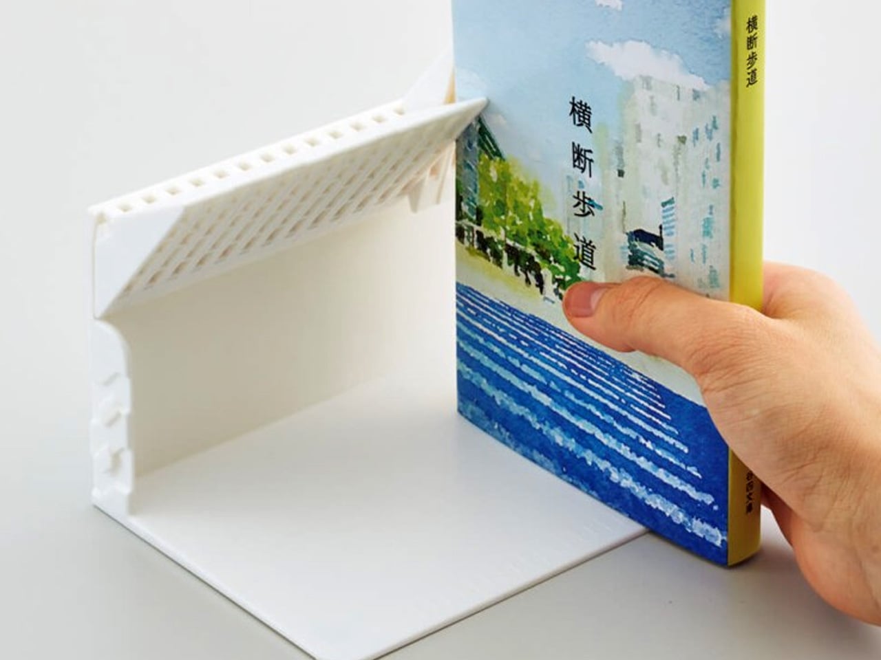
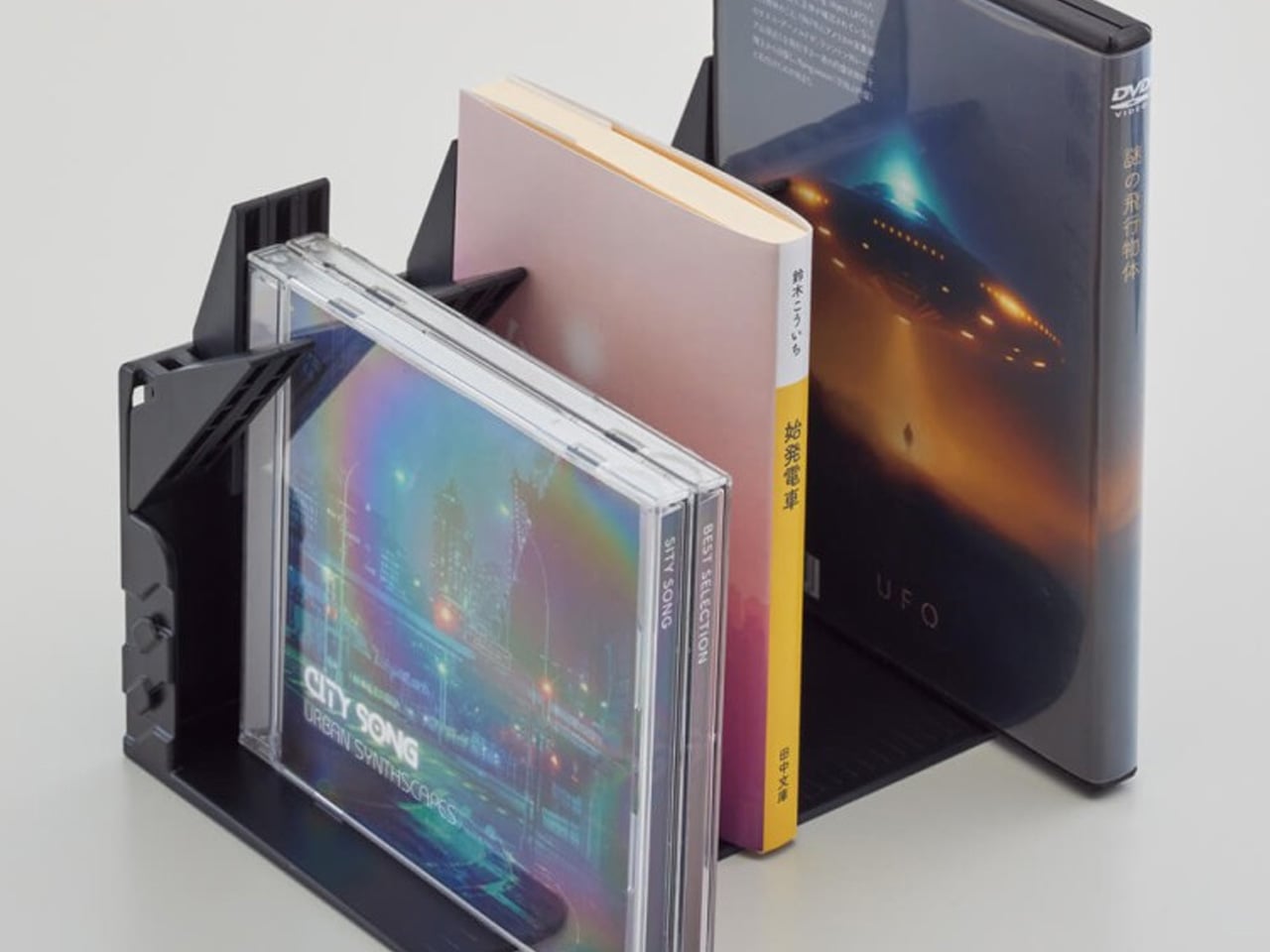
A book end that holds books upright when neighbors are present is not a remarkable product. One that lets a single book stand on its own without leaning against anything is. The Lihit Lab Firm Book End achieves this through a gravity-activated stopper that flips down when the book end is upright, supporting the book from behind. Remove the book and the stopper lifts back up, held out of the way by the book end’s own weight. Nothing to adjust manually.
The mechanism means you can remove a single book from a shelf without the rest collapsing, a small but real frustration that anyone who uses bookshelves regularly will recognize immediately. At A4 scale, it handles textbooks and binders as well as standard books, making it useful for student desks and office shelves alike. For people who work daily with physical reference materials and are tired of the toppling-book routine, this is one of those objects that solves a problem so quietly you forget it ever existed before it arrived.
What we like
- Gravity-activated stopper lets a single book stand independently without any manual adjustment
- Handles books, binders, and textbooks up to A4 scale across home, office, and student setups
What we dislike
- Availability outside Japan is currently limited to the brand’s own site, adding shipping time and cost
- The stopper mechanism can feel stiff during early use before it settles into regular operation
8. ITO BINDERY × YANKO DESIGN Drawing Pad
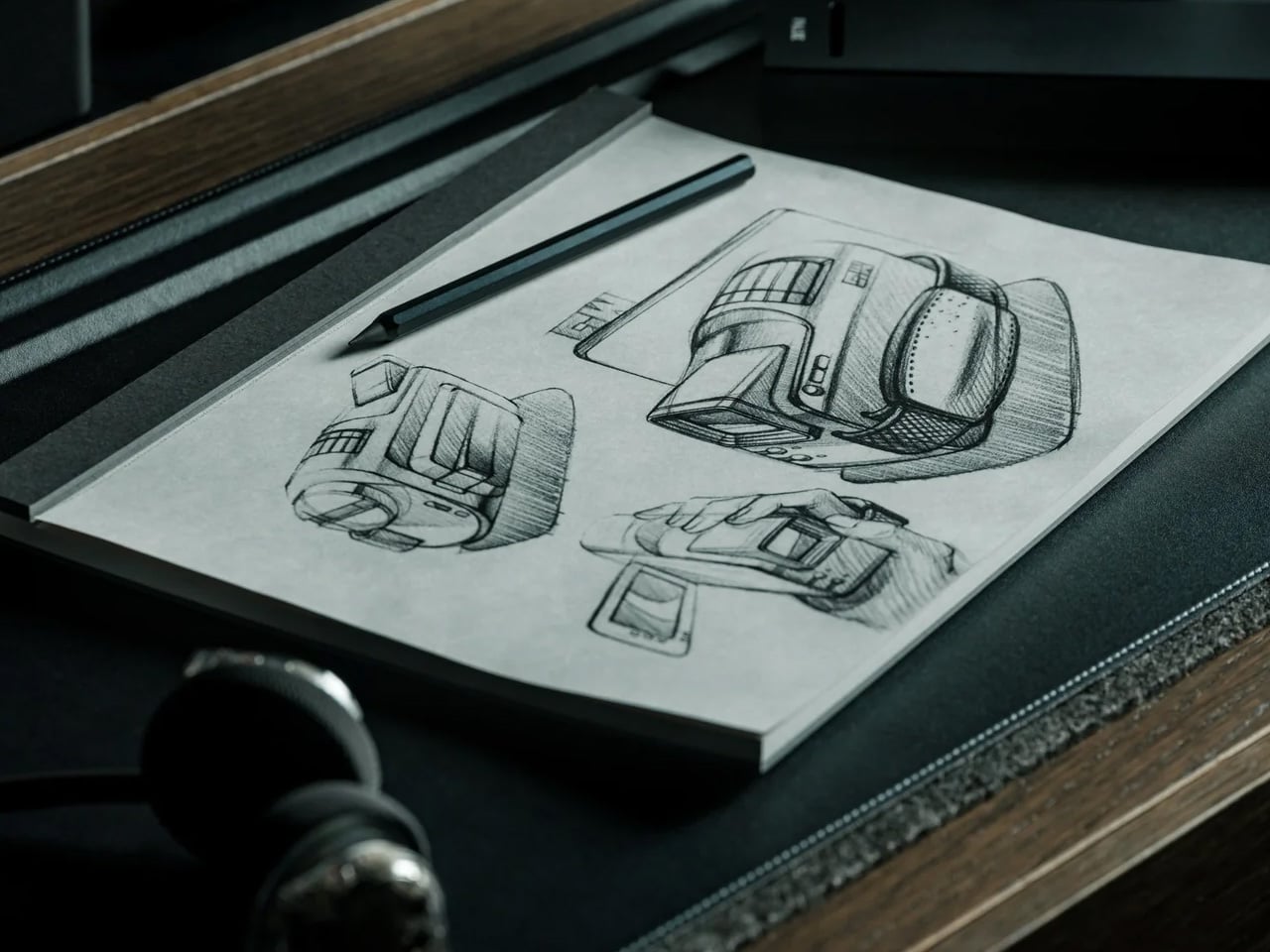
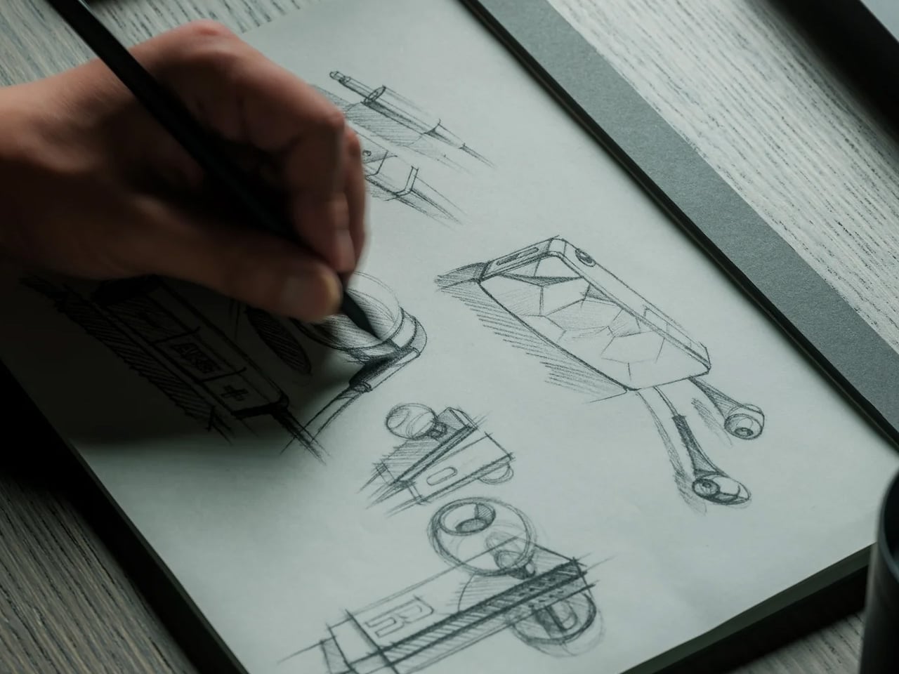
ITO Bindery has been making books by hand in Hachioji, Tokyo since 1938. The Drawing Pad that came out of its collaboration with Yanko Design carries that lineage in the details: binding glue applied by hand with a specialized brush, microperforations inspected sheet by sheet by experienced craftspeople, and a construction that holds through daily use without stiffening at the spine. Each size is limited to 100 individually numbered pads, available exclusively through YD Select, making it as much a document of craft as a writing surface.
Each sheet tears away cleanly along the microperforation, leaving the page intact and ready to pin up, share, or arrange alongside other work in progress. For designers, illustrators, or anyone who treats drawing as a thinking tool rather than a performance, a pad that separates cleanly and doesn’t fight the process is exactly the right kind of equipment. The paper handles pencil, pen, and light marker work without bleed-through. At this build quality and limited-edition scale, $40 is an argument for paying more attention to where your tools come from.
What we like
- Hand-crafted by ITO Bindery, founded in 1938, with construction quality visible from the very first page
- Microperforated sheets tear cleanly without damaging the sketch, making each page easy to display or share
What we dislike
- Limited to 100 numbered pads per size means stock won’t last once the list picks up attention
- Not suited for wet media or heavy-wash work; designed for dry and light-marker use only
Buy Less. Buy Better.
What makes Japanese stationery worth attention isn’t the aesthetic. It’s the reasoning. Every product here started with a specific problem and arrived at a solution that feels like it was always obvious, even when it clearly wasn’t. The attention to material, mechanism, and user behavior that goes into something as ordinary as a clipboard or pen stand reflects a standard of care that changes what you expect from your tools.
None of these require a lifestyle overhaul or a dedicated setup. They slot into how you already work and make that work feel slightly more resolved. Back-to-school season is usually about quantity: more notebooks, more pens, more highlighters. These eight argue for the opposite. One good clipboard beats five bad ones. One pad that holds together properly lasts longer than anything that falls apart by Thanksgiving. Buy less. Buy better.