
The design museum makes one quiet argument. Certain objects deserve to be looked at, and how a thing is made can matter as much as what it does. Most people accept this on a Saturday afternoon in front of a Noguchi lamp or an Eames chair, then go home to a shelf full of things nobody chose with the same intention. That gap is worth closing, and it does not require a renovation budget.
These six objects cost somewhere between a round of drinks and a dinner for two. None are functional in the way a charging cable is functional. They are functional in the way a good room is, changing how a space reads and getting noticed before anyone can articulate why. That quality has very little to do with price and everything to do with knowing where to look for it.
1. Carte Blanche Ceramics
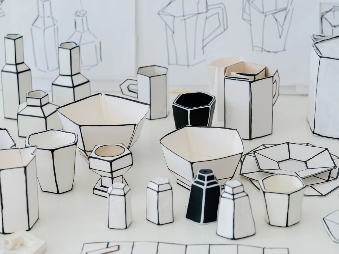
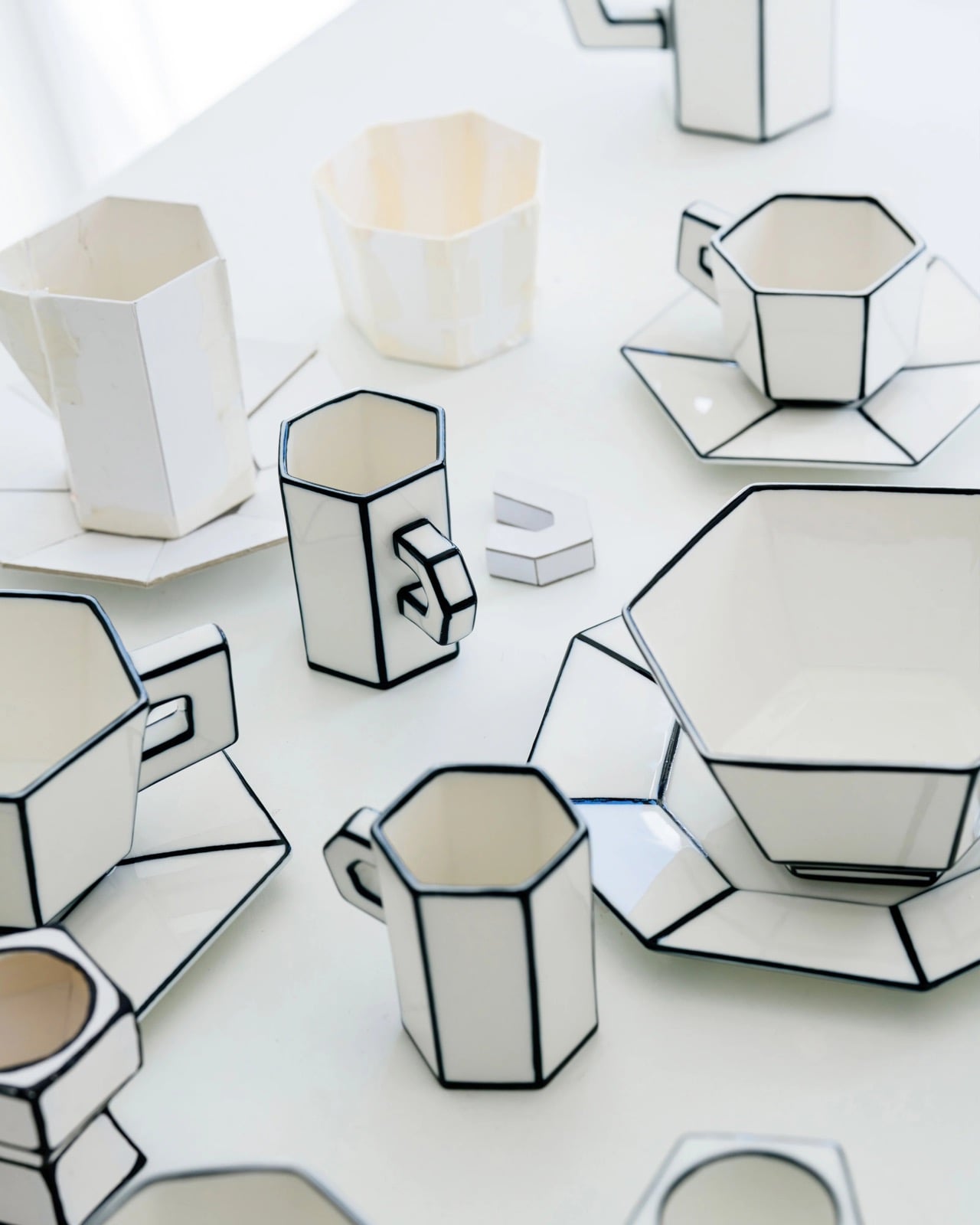

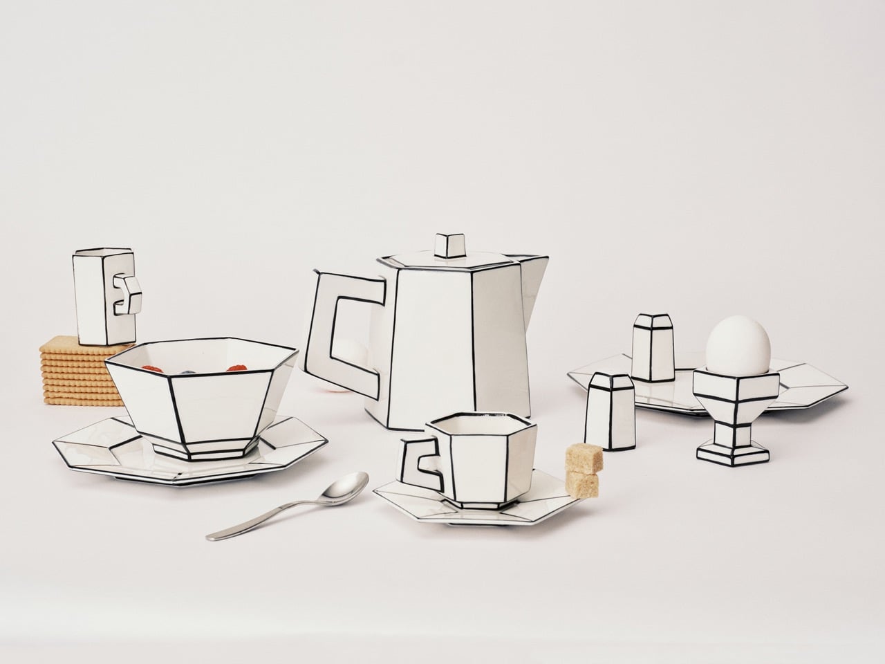
Dutch designer Annebet Philips began this collection in cardboard rather than clay, cutting shapes with deliberately uneven edges and treating the paper prototype as the design language itself rather than a step to be discarded. Belgian brand Serax carries the result through to porcelain: a coffee and tea service that has since grown to include plates, a breakfast bowl, an egg cup, and a salt and pepper set. Every piece started as a childlike cutout on a blank page. Nothing about that origin was smoothed away in production.
What makes each piece genuinely strange is that it reads as a drawing of itself. Hand-painted black lines trace every fold and seam, giving cups and saucers the flattened quality of ink on paper rather than fired ceramic. Photographed straight on, a cup collapses into what looks like a quick sketch, the handle reading as a doodled loop rather than a ceramic ear. Everything is microwave and dishwasher safe, which keeps the concept in daily use rather than retreating to a shelf nobody touches.
What we like
- The trompe-l’oeil effect holds in person, not only in photographs
- Dishwasher safe at a design level that rarely permits it
What we dislike
- Sold through Serax stockists rather than one direct channel, which makes sourcing specific pieces more work than it should be
- Hand-painted lines vary slightly between pieces, which is part of the concept but can feel inconsistent in a matched set
2. ECHO Ceramic Speaker
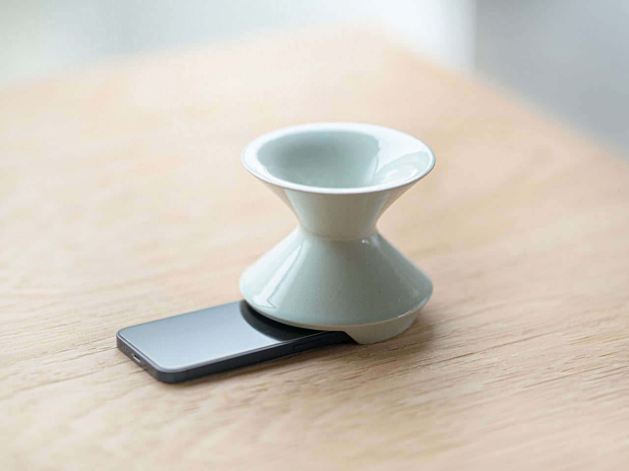
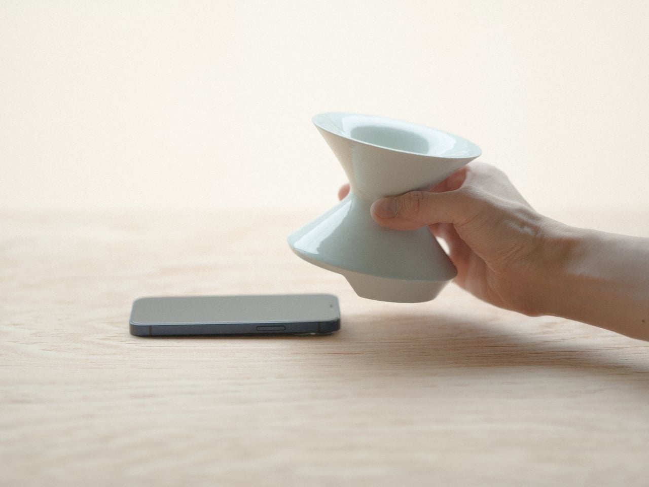
Most speakers announce themselves. They sit on surfaces with blinking lights and trailing cables, with the general suggestion of being placed there temporarily. Kenji Abe’s ECHO arrives from the opposite direction. It is a glazed ceramic chamber built on the acoustic logic of a seashell and a cupped hand that looks exactly like a small vase. Slide a phone underneath, and the cavity carries audio outward in soft, diffused waves. No power. No pairing. Nothing to charge or set up.
The decision to use ceramic was not incidental. Ceramic belongs to the visual grammar of a home, the language of objects that have simply always been there, and ECHO uses that familiarity to disappear into a room entirely. A guest would not identify it as a speaker. The glazed surface catches light the way pottery does, and when the phone is gone, it stays on the shelf with the composure of something that was never trying to perform in the first place.
What we like
- Looks like a ceramic piece because it is one, not a speaker wearing a vase disguise
- No charging, no pairing, no batteries to deplete or replace
What we dislike
- The amplification is warm and subtle rather than loud, better suited to a quiet kitchen than a busy room
- Designed for smartphones placed directly underneath, which limits where in a room it can be used
3. Petal Vase


Every day, thousands of tons of cut flowers are incinerated at flower markets because they reached the end of their shelf life before a buyer arrived. Rebloom Studio, a Korean design practice, collects those discarded blooms, processes them into pulp with Korean paper pulp and a natural binder, and molds the result around an interior glass cylinder. The finished piece is a vase made entirely from flowers that never got the chance to be seen by anyone.
No two Petal Vases look alike. The flowers used to make each one determine its final color, texture, and edge profile. The jagged rim, the petal compression visible in the walls, the slight asymmetry in the silhouette- all of it is preserved deliberately rather than corrected in finishing. When the vase reaches the end of its life, the biodegradable shell returns to the earth. It is one of those rare objects where the material story requires no explanation because you can already see exactly where it came from.
What we like
- Every piece is genuinely one of a kind, not in the marketing sense but the literal one
- The biodegradable origin is visible in the object itself rather than printed on the packaging
What we dislike
- Availability depends on Rebloom Studio’s production schedule, and stock from a small Korean studio can be intermittent
- The rough, irregular surface is the whole point, but buyers expecting a conventional smooth ceramic finish may need to adjust
4. Delicato Tray
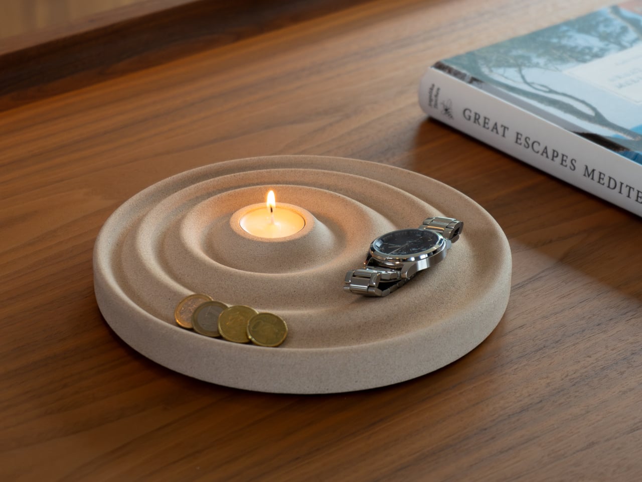
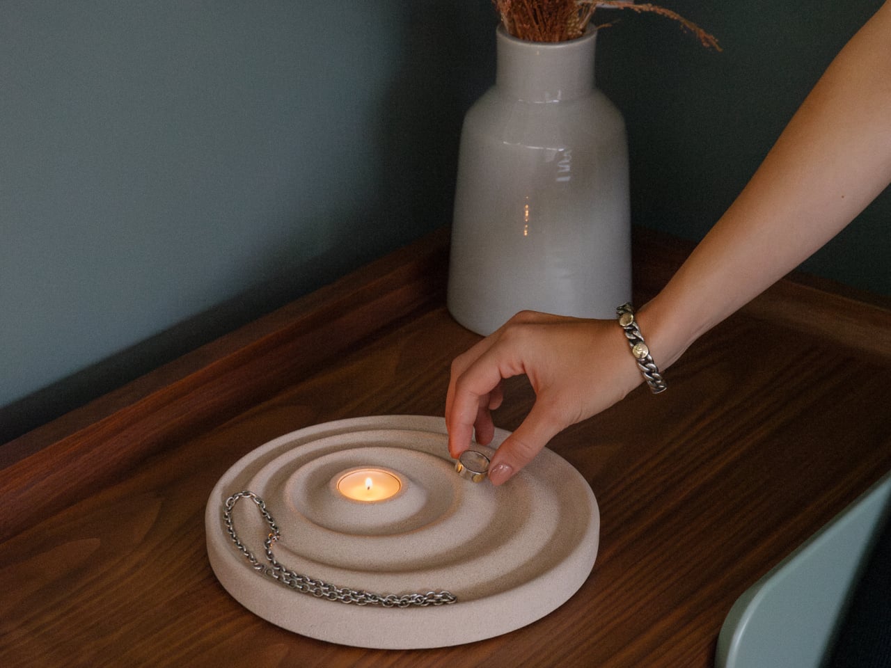
The entryway surface tells a familiar story, and it is rarely flattering. Keys land wherever there is space, coins scatter to the edges, a watch ends up beside a receipt from last week. Joao Teixeira’s Delicato Tray for Oftwise is cast from Jesmonite AC730, a water-based, fire-rated stone composite, in the form of a rippled disc. The concentric waves are asymmetric by design: wider at the outer ring for keys and glasses, tighter toward the center for rings and coins.
At the center of those ripples sits a recessed pocket sized for a tealight candle, turning the daily ritual of dropping your things at the door into something closer to a ceremony. Because the tray is hand-cast, no two are identical. Small air bubbles, subtle texture variations, and minor color shifts are natural byproducts of the process. The result is two kilograms of warm sandy stone that makes a surface look deliberately arranged before anything has been placed on it at all.
What we like
- The hierarchy is built into the form itself, so organization becomes almost unconscious
- Hand-cast production means no two pieces are identical, in the way that actually matters
What we dislike
- At €235 it sits at the very top of the dinner framing, and that math depends on which dinner you have in mind
- Currently available in one color, which limits how it integrates into darker or cooler interiors
5. Luna
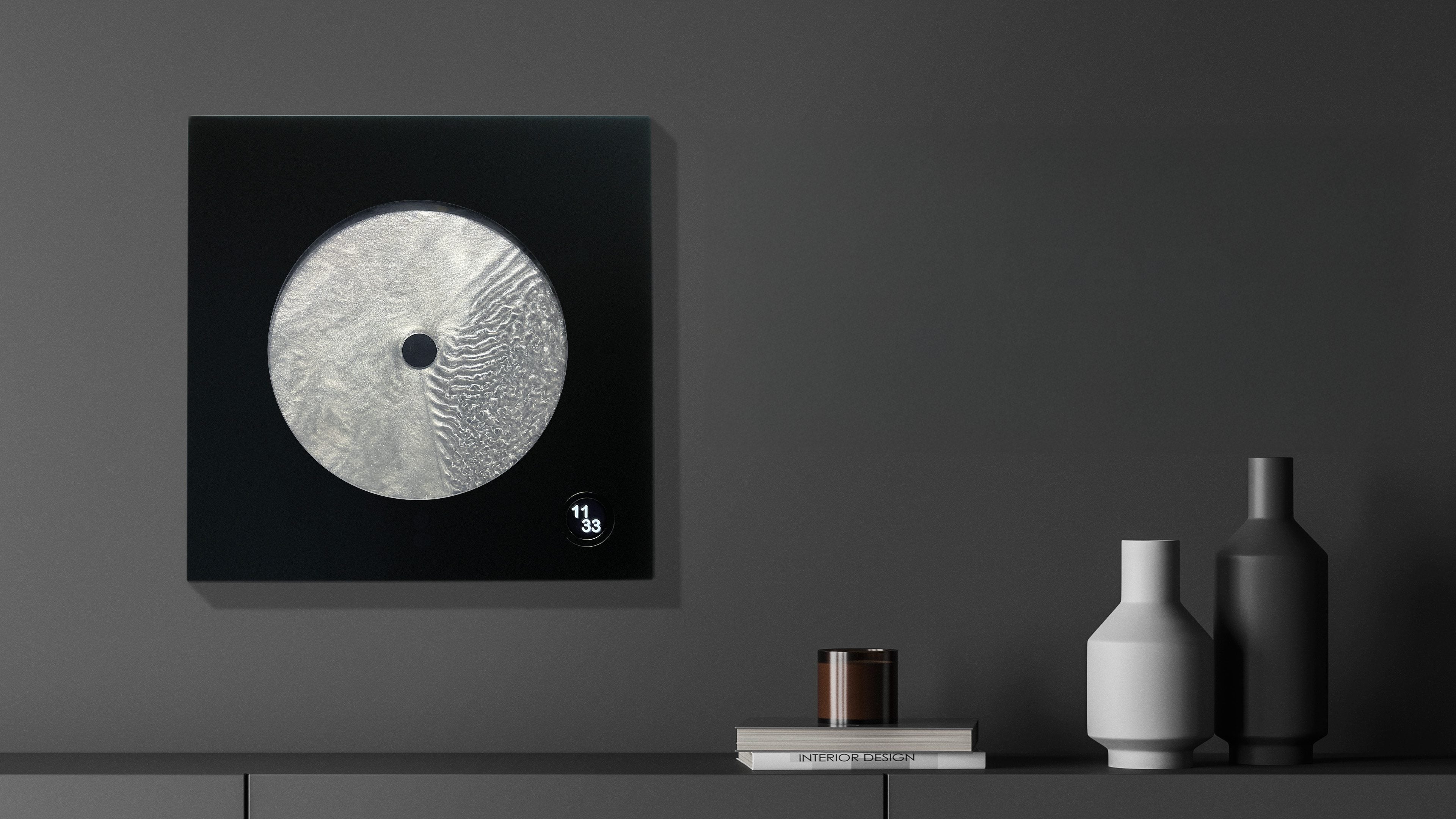

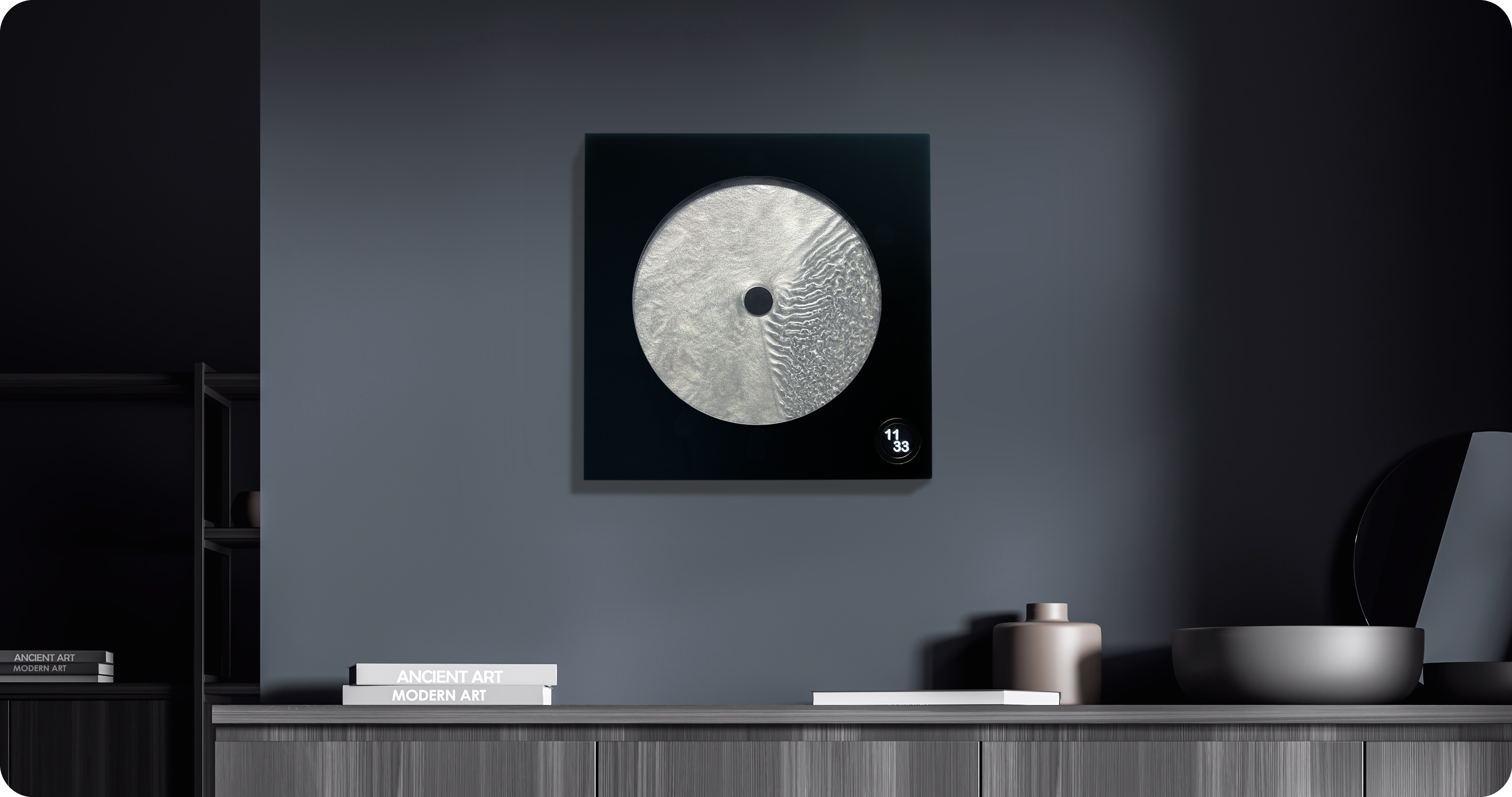

Robert Spillner spent years building components for Formula 1 teams before reversing the entire premise of his career. Instead of measuring speed, he built an object that stages time. Luna is a 400 x 400mm wall piece framed in matte black solid wood with a cast acrylic pane at its center. Inside, a single pointer moves through Zero Flow Technology, Spillner’s proprietary fluid made from distilled water, additives, micro-particles, and a small quantity of genuine lunar dust. Behind the pointer, turbulent patterns mark what has passed. Ahead of it, the liquid sits completely undisturbed.
The exact composition of the fluid is deliberately undisclosed, and that is the right call. The lunar dust is certified and billions of years old, documented with a certificate of authenticity that ships with each piece. Every Luna is signed, numbered, and limited to 99 per year, all made on demand in Germany. A small LCD touchscreen adjusts time and brightness without competing visually with the fluid. Spillner describes it as an art object with a time function, and the order of those words is correct.
What we like
- The past-and-future visual logic is legible in the object itself, not only in the written description of it
- Lunar dust certification and a limit of 99 per year make each piece traceable and unrepeatable
What we dislike
- No public price is listed; the limited edition, handmade production profile suggests it sits above the other objects in this list
- The 400mm square format demands a wall that can hold it as a singular focal point rather than one object among several
Editor’s Choice: Japanese Lantern Candle

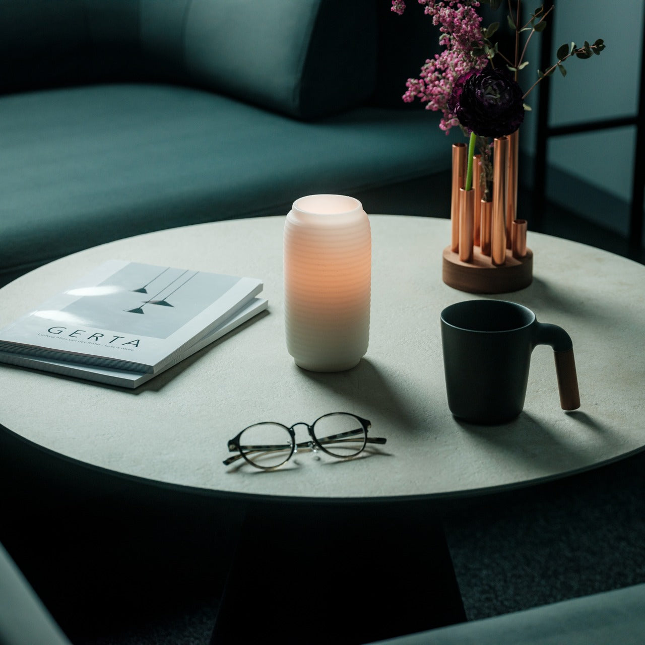

The paper lantern is one of the oldest resolved problems in lighting design. How do you carry warmth from a candle flame into a room without losing it to the hardness of the fixture? Japanese designers worked through that question for centuries and arrived at a form that required almost no further development: a collapsible structure of thin ribs and translucent paper that diffuses candlelight into a soft, directionless glow.
What separates a well-made Japanese lantern from a decorative replica is the quality of light it produces and how it behaves in a room. Warm and sourceless, candlelight filtered through translucent paper fills a corner the way natural light from a small window does, without the hard edge of a focused lamp or the flatness of overhead lighting. On the floor beside a chair or a side table, it becomes the kind of object people notice and comment on before they have thought to ask what it is.
What we like
- The quality of diffused candlelight it produces is genuinely different from any other fixture in a room
- Stores flat, which matters in a small apartment where every permanent object has to earn its place
What we dislike
- Works best as ambient lighting rather than a primary source for reading or close work
- The candle paired with it needs to suit the scale and material to get the full effect
The Best Things in a Room Are the Ones Nobody Can Quite Explain
None of these objects ask for much. A shelf, a corner, a spare stretch of counter. They do not need a gallery to earn the attention they receive. What they share is the quality of being genuinely chosen, the sense that someone worked through a problem not just until it was functional but until it was right. That difference is immediately visible and, unlike most things in a home, it does not fade with time.
The museum argument is that certain objects deserve to be seen. These six make the same case from a kitchen counter, an entryway shelf, a bedroom wall. The price point is almost beside the point, though it helps. What matters is that buying thoughtfully and buying well tend to produce the same result: a home that feels assembled by someone who paid attention, rather than one that simply accumulated things over time.

