For roughly six months of the year, Sweden is cold enough to keep its people reliably indoors. That is long enough to matter, and long enough to shape how a Swedish design team thinks about what a kitchen surface, a kitchen color, or a kitchen appliance should feel like when it is the primary thing a person looks at during the months when the outdoors is largely inaccessible. Electrolux, drawing on research conducted across European markets, found that nature is the single most common answer when people are asked where they go for emotional restoration. The brand’s response to that finding, expressed through a design philosophy called Lagom, the Swedish concept of balance and just enough, arrived in Milan this week at Via Melzo 12 in the Porta Venezia district.
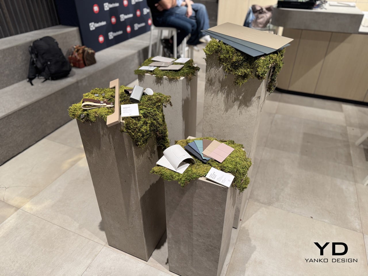
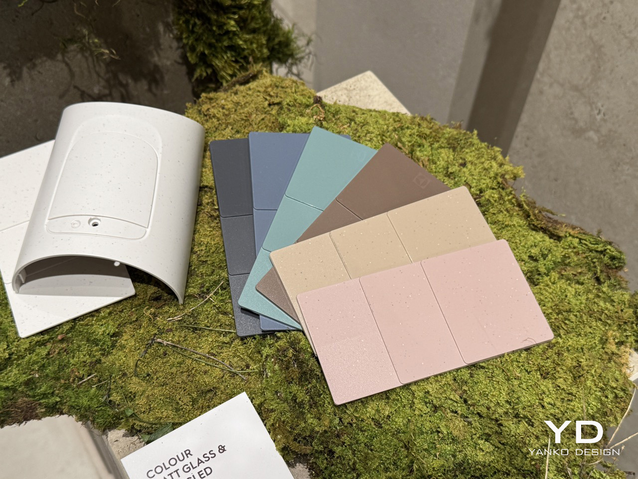
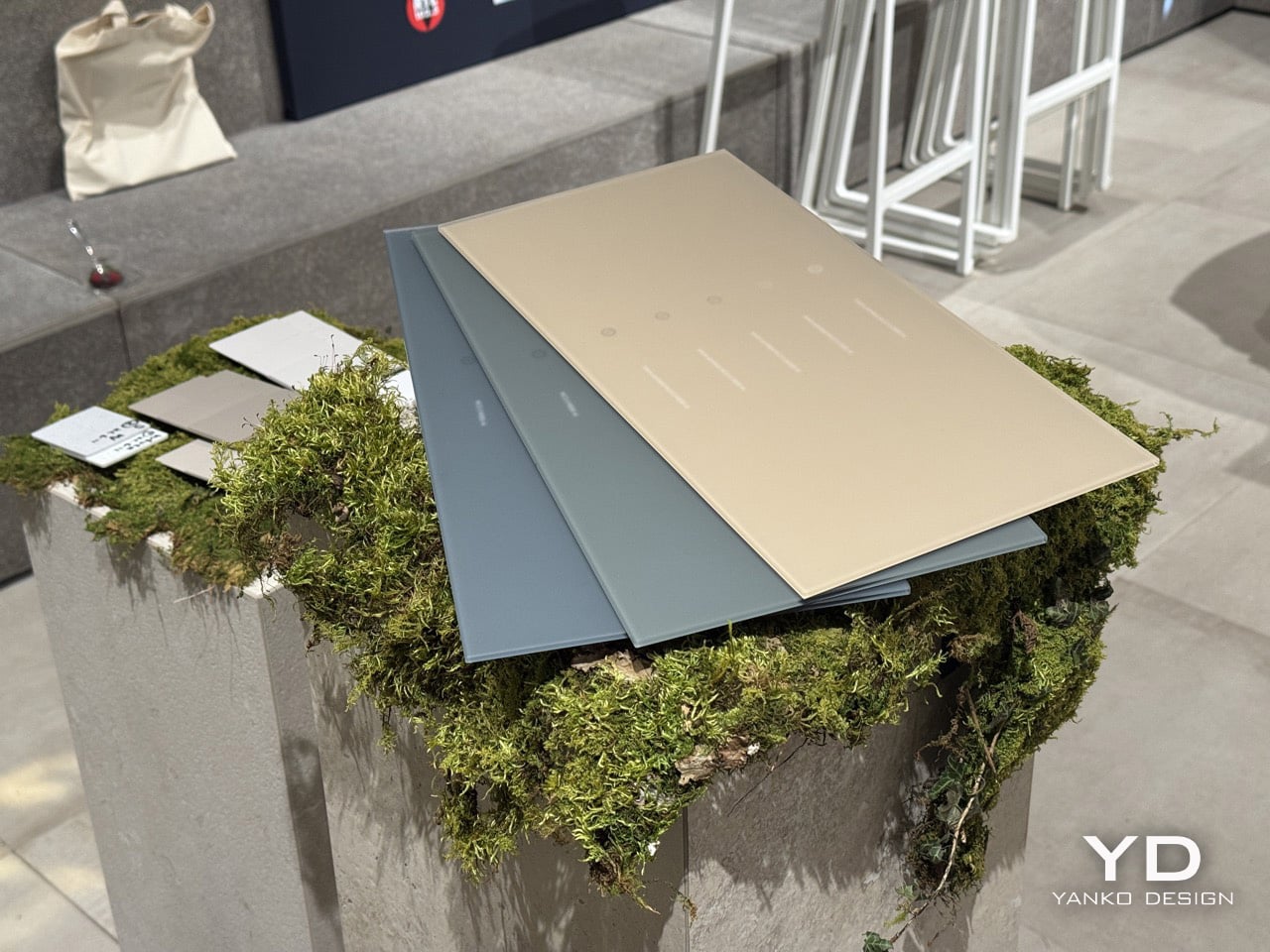
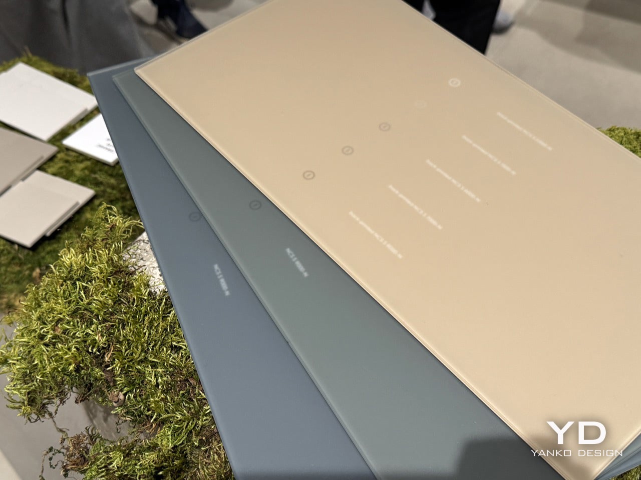
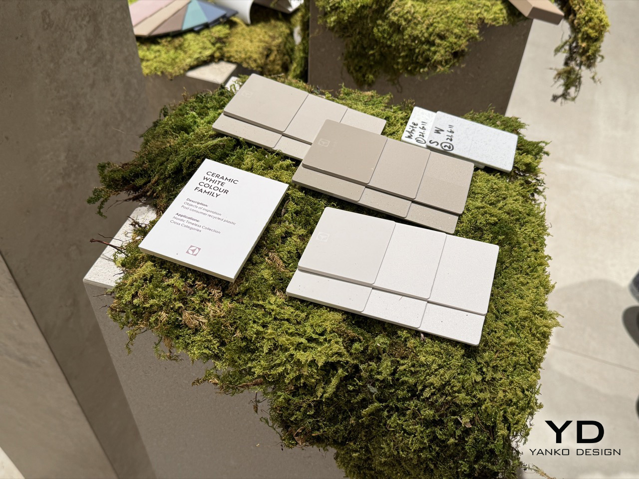
The space was staged as an argument made physical. Concrete plinths topped with living moss carried CMF swatches in muted blush, warm sand, dusty teal, and speckled stone-effect recycled plastic. A pine and wood scent developed by studio Koyia moved through the air. A breathing exercise was built into the programme, alongside a cross-country pizza competition that Turkey ultimately won. The sequence of it, material samples resting on moss, scent designed to recall a forest, appliances displayed in front of a photographic print of Scandinavian woodland, was too consistent to be coincidence. Electrolux arrived at Milan Design Week 2026 with a single, well-developed idea: that the kitchen is an emotional environment, and that the most sophisticated thing its design language can do is bring the outside in.
Designer: Electrolux
Rafael Alonso, who leads Electrolux’s Taste Design team, describes the modern kitchen plainly: a crowded space where people live, cook, manage family life, and absorb the friction of daily routine. Designing for that room means designing for that reality. Lagom, in his framing, is the response: meaningful solutions built around purpose and balance rather than specification and performance alone. The philosophy travels well beyond Sweden. Everybody needs a bit more balance in their lives, and the kitchen, as the room that absorbs the most daily activity, is where that balance is most frequently lost and most worth recovering.
Amelia Chong, based in Electrolux’s Stockholm office and leading Color, Material, Finish Design for the taste category, traces the palette back to something more concrete than trend cycles or stylistic preference. When Electrolux surveyed users across Europe about where they find emotional restoration, nature came back as the most consistent answer. For Chong’s team, that finding becomes a set of material conditions. Scandinavian light is lower in contrast and more diffused than much of Europe, and the colour preferences that emerge from living within that light tend toward the muted and the gentle. The goal is to establish colour and material in a long-lasting, timeless relationship rather than a short-term one.
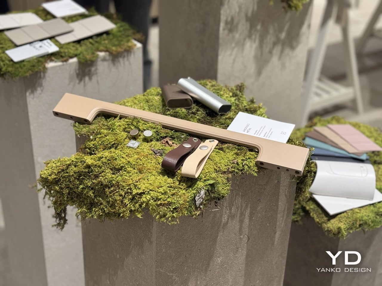
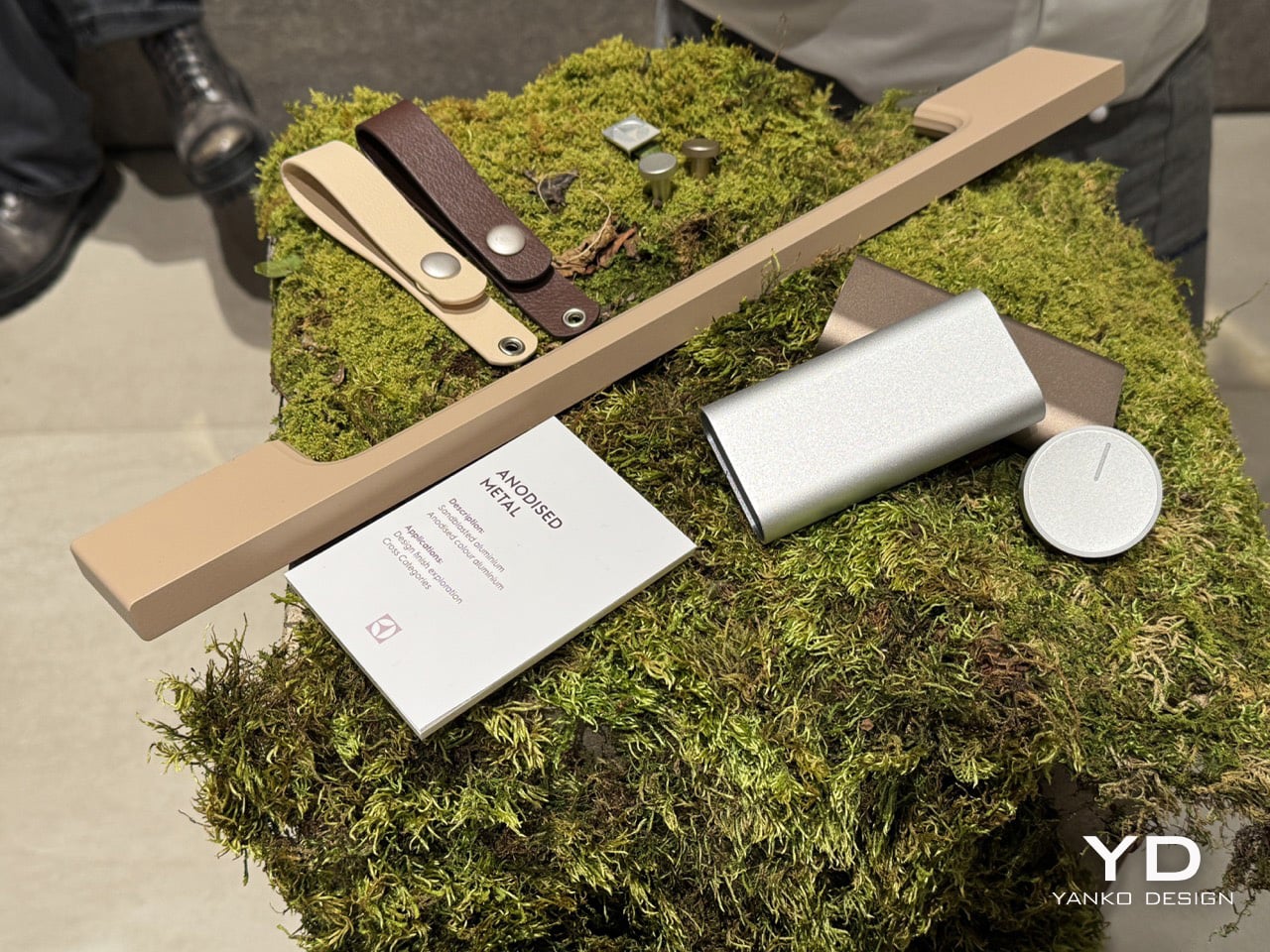
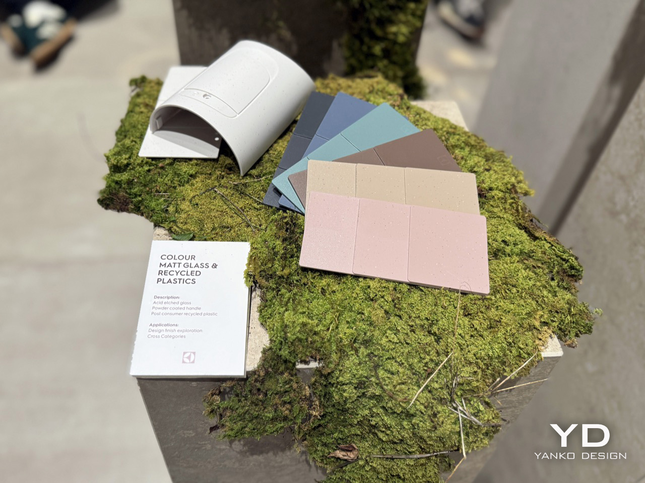
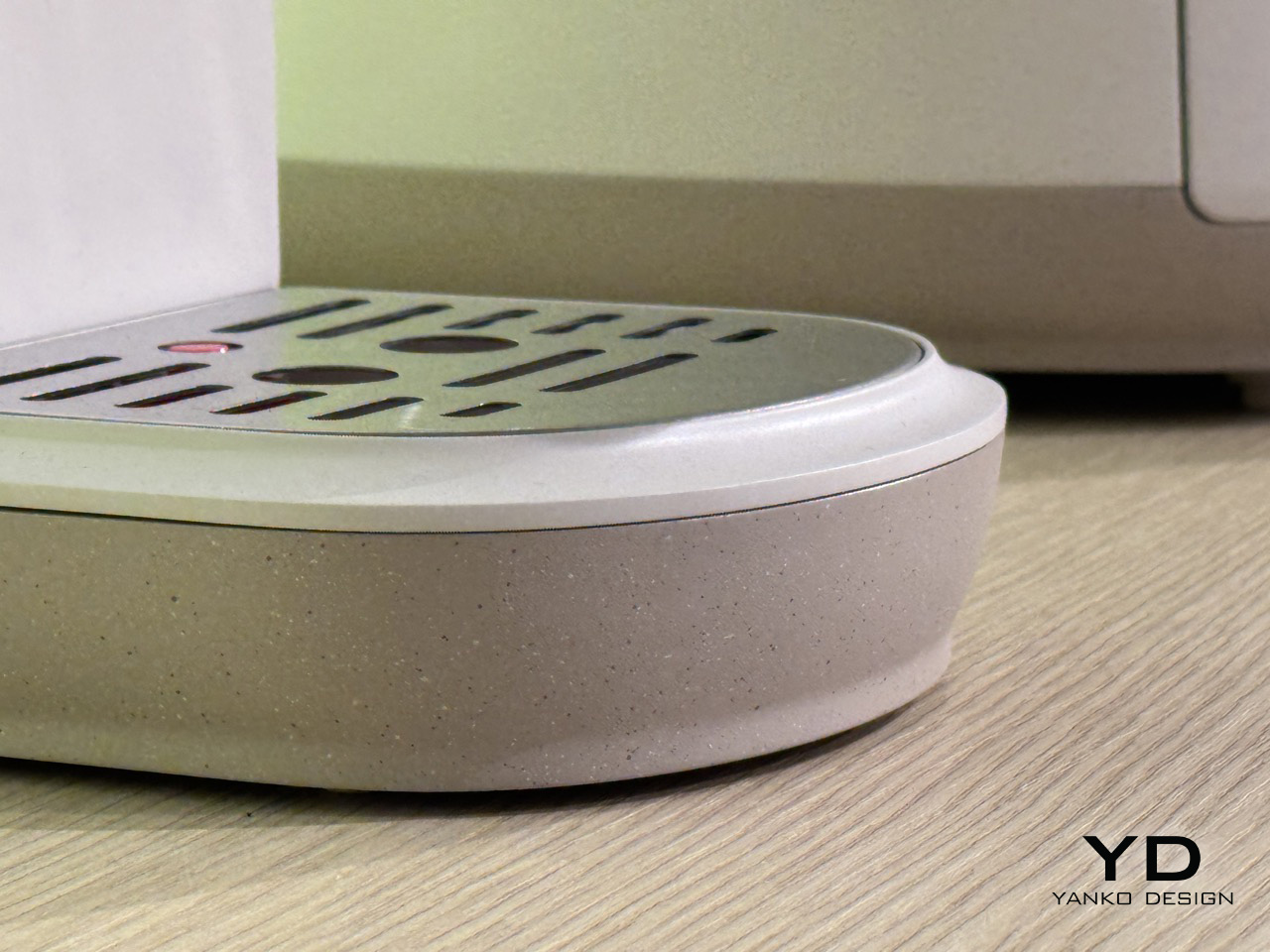
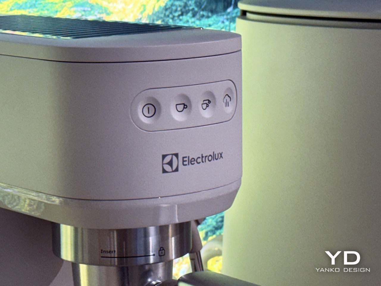
The swatches at Electrolux’s showcase make that intention legible. Across the Ceramic White Colour Family, the Colour Matt Glass and Recycled Plastics range, and the anodised metal samples, the palette holds a consistent register: warm sand and dusty teal, soft blush and speckled stone-effect off-white, warm bronze and low-sheen aluminium. Several finishes are built from post-consumer recycled plastic, and the acid-etched glass surfaces carry none of the glossy visual aggression that has dominated premium kitchen aesthetics for the better part of a decade. Chrome is absent. Matte black, another recent default for high-end appliances, does not appear either. What replaces both is a surface language that reads as organic, with textures referencing stone, compressed earth, and raw ceramic.
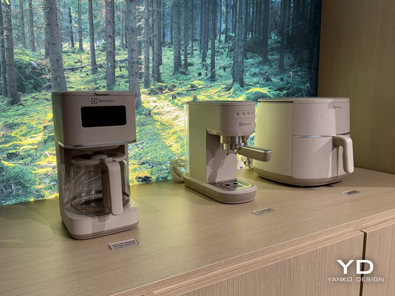
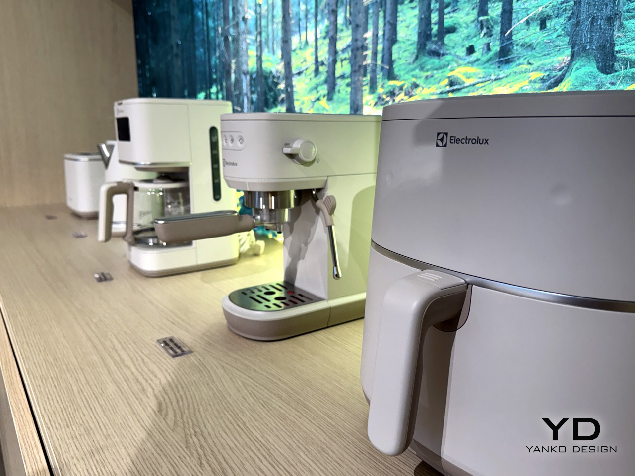
That material thinking finds its form in a new family of conceptual small appliances. A toaster, electric kettle, coffee machine, espresso machine, and air fryer were all presented with a unified design language that feels both calm and confident. Each product shares a primary body finished in a soft, linen-like white, but the most distinctive feature is the base. A warm, speckled finish, reminiscent of granite or raw ceramic, grounds each appliance, giving it a visual and textural weight that connects it to the natural materials referenced in the CMF library. The effect is cohesive and deeply considered; the appliances feel less like industrial objects placed on a countertop and more like a collection of stoneware that has grown out of it.
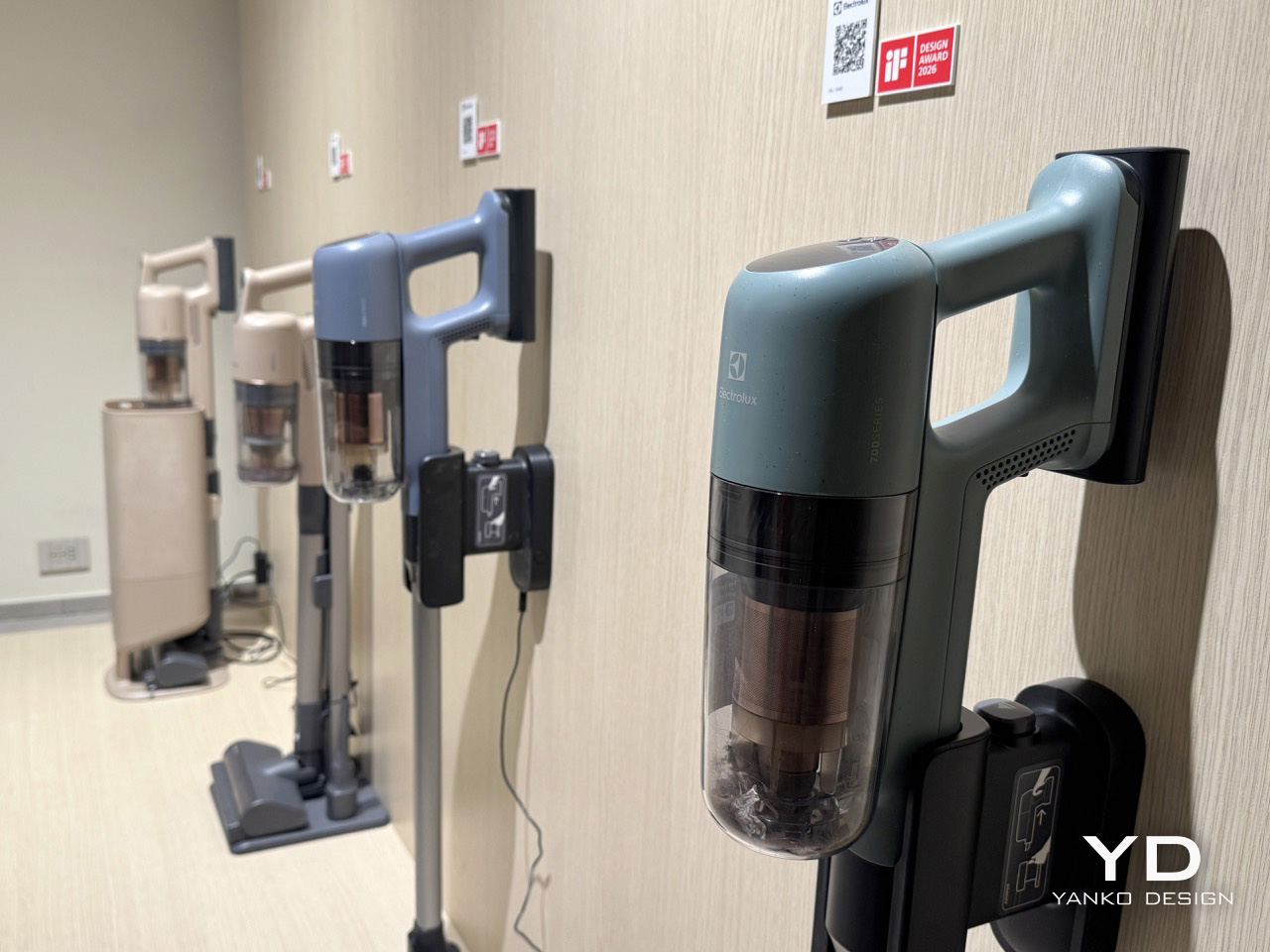
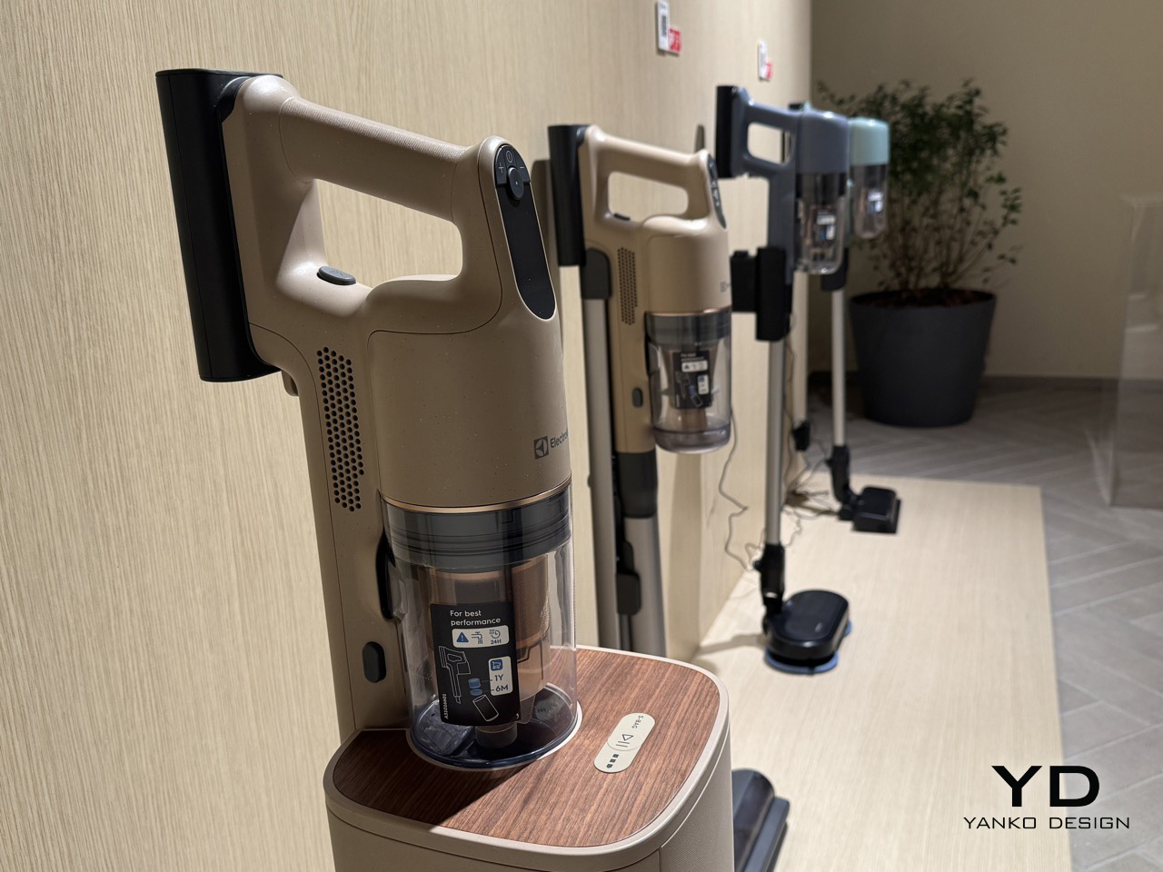
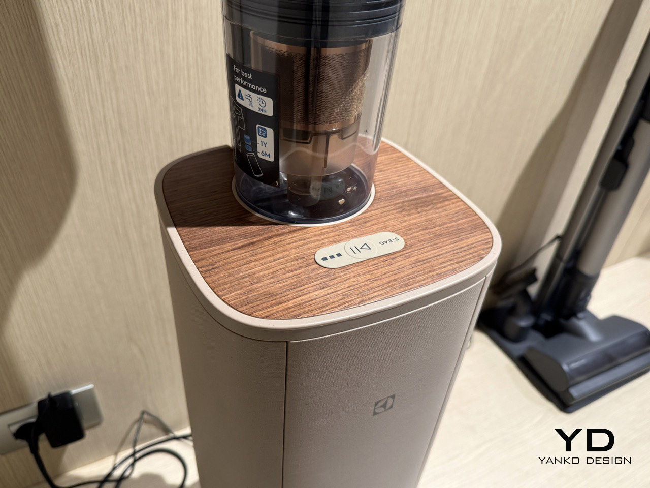
This approach is not confined to the kitchen. A vacuum cleaner, displayed with the same attention to sensory detail, extends the Lagom philosophy into the broader home. Its body carries the same muted, gentle tone as the kitchen concepts, but its top surface is finished with a warm, walnut-panel wood trim. It is a simple but effective move that transforms a utility object into something closer to furniture. The design choice suggests that balance, and the deliberate presence of natural textures in everyday objects, belongs to the whole home, softening the technological footprint of our tools and integrating them more harmoniously into our living spaces.
The neuroaesthetic research informing Chong’s approach is concrete: considered colour selection can reduce perceived stress by as much as 35%, a figure that reframes what a hob surface or a coffee machine body is quietly doing in a room. They contribute actively to the sensory quality of the spaces we inhabit. In a field where brands largely compete on technology, connectivity, and performance metrics, that may be the most quietly confident thing Electrolux brought to Milan: the conviction that calm, deliberately designed, is a specification worth meeting, and that the palette which carries it was drawn from the landscape just outside the window.