The best thing that can happen to a design team is that they stop trying to go viral. Early Nothing had an almost anxious energy to it, products that felt engineered for the screenshot, for the unboxing video, for the moment of surprise. That produced some genuinely striking work, and some choices that aged less gracefully. The Phone (4a) suggests the team has moved past that entirely.
The Phone (4a) is the clearest expression of that shift yet. The pink colorway, the refined glyph interface, the periscope camera quietly migrating down to the base model, none of it screams for attention. It rewards it. This is a phone designed for people who will notice things gradually, over weeks of use, rather than in the first thirty seconds of an unboxing video.
Designer: Nothing
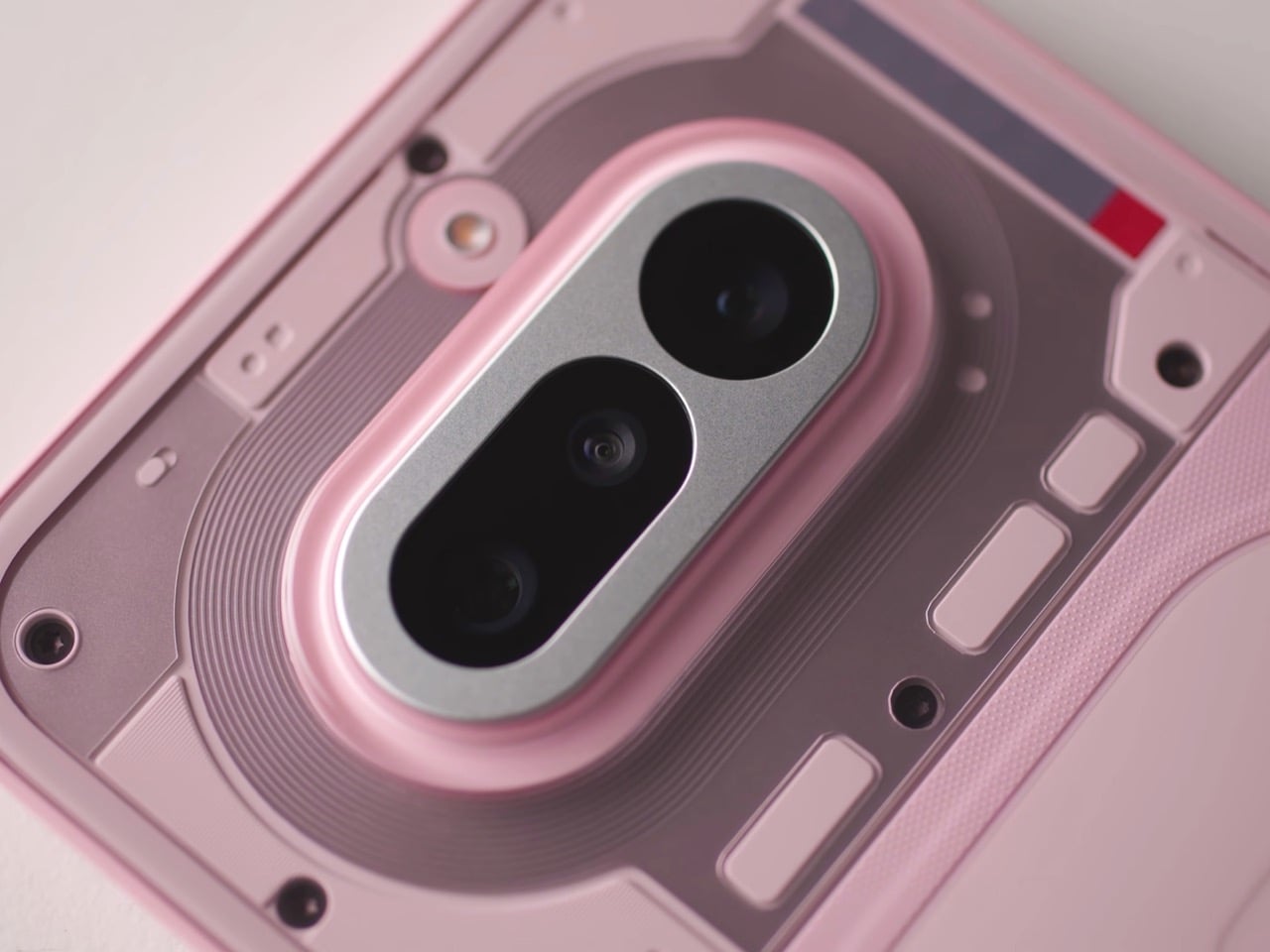
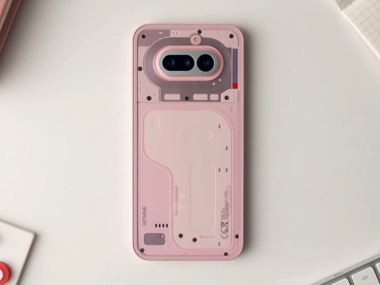
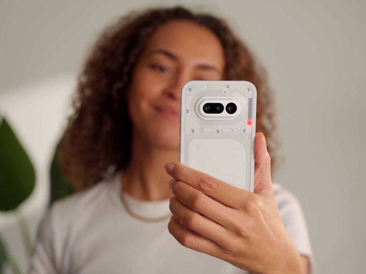
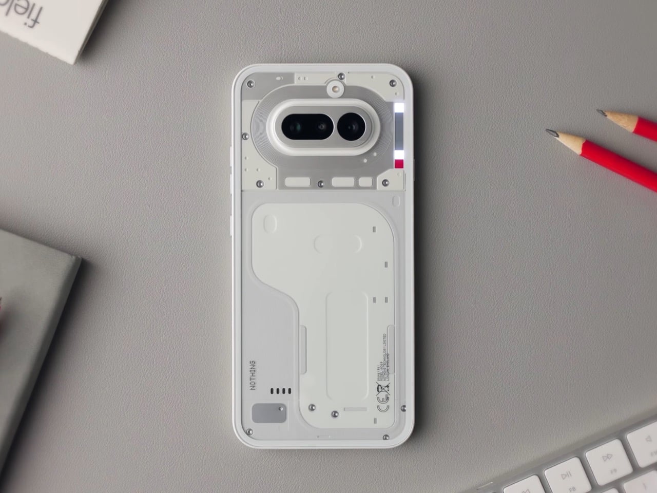
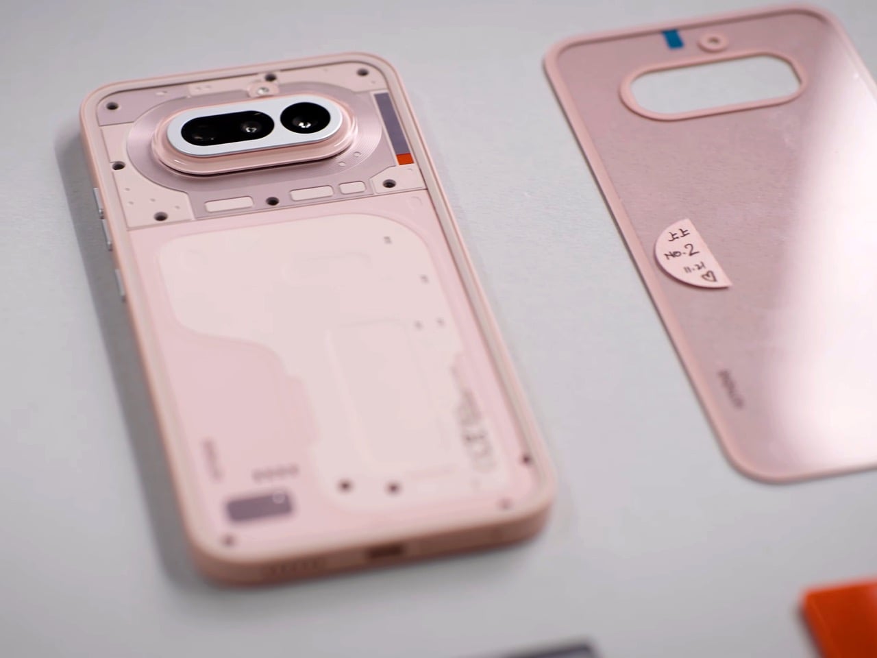
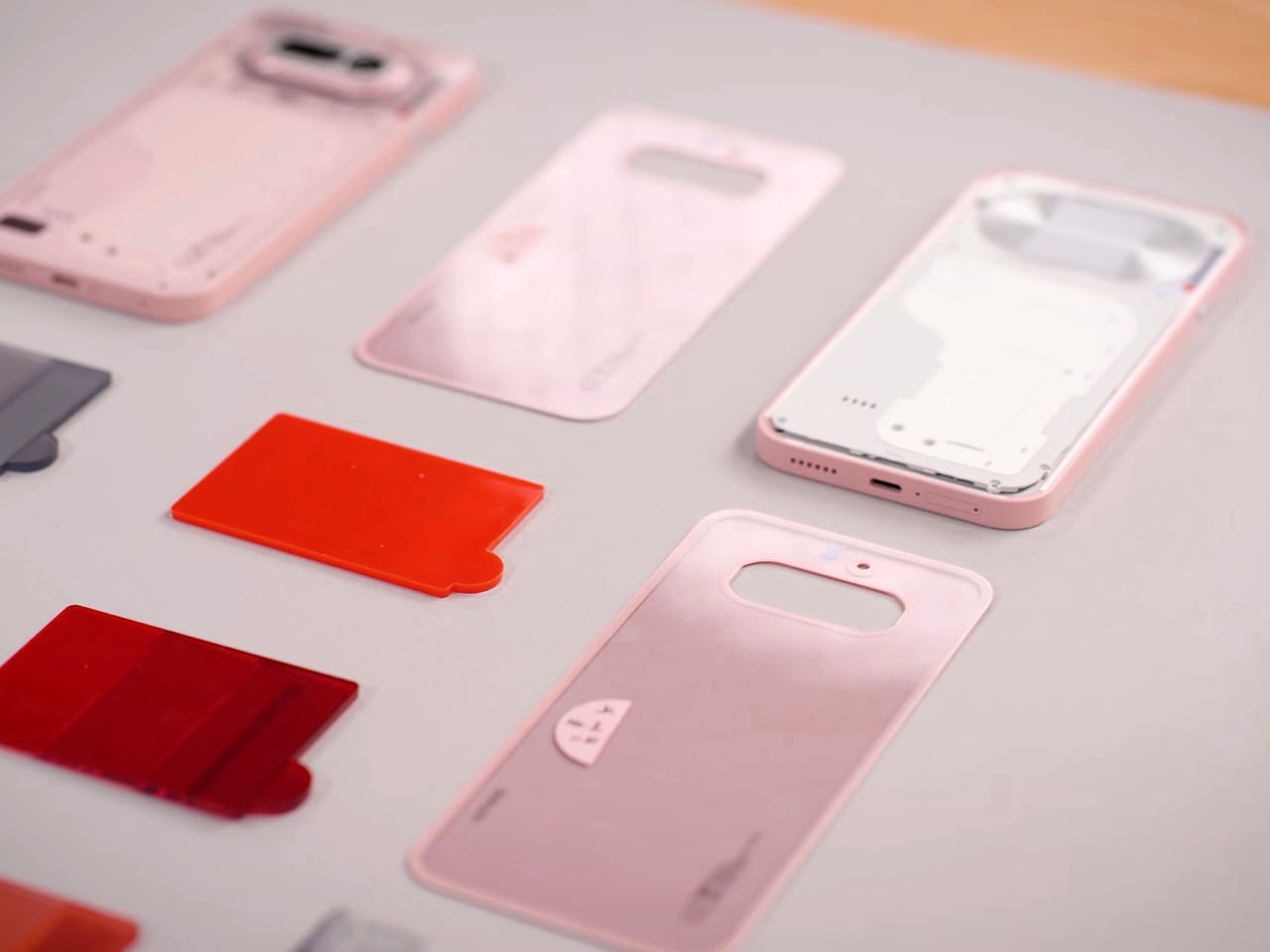
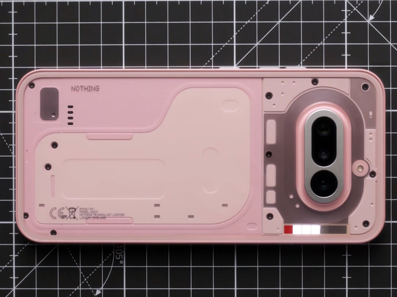
The pink is the first thing people will talk about, and most of them will get it slightly wrong. The phone reads pink, but the back panel is technically white. The color comes from tint layered inside the transparency, sitting between the glass and the resin underneath, which means the light has to travel through it before it bounces back to your eye. That gives it a depth and a luminosity that solid paint physically cannot produce. Nothing’s designers described it as starting with the resin being nearly identical to white, then adding a small amount of tint, then letting the tinted glass layer do the heavy lifting. The result shifts depending on the light you’re standing in, giving you a phone that changes ever so slightly in different lighting scenarios. It’s clever, considering Nothing’s done this in the past by playing with depth, relying on textures and components casting unique shadows based on the light source. Now, the company’s adding color to that formula.
Apple has been doing a version of this for years. The iMac G3 in the late nineties used translucent colored plastic to create that same sense of depth, and modern iPhones apply color to the inside surface of the rear glass rather than painting the outside. It’s a technique with a real legacy, and Nothing’s designers actually had a pink iMac on their mood board. That’s worth knowing, because it reframes the colorway from trend-chasing to something with genuine design lineage. The difference is that Nothing puts the engineering on display underneath it, so the tinted glass is also a window into the hardware, which layers the effect further.
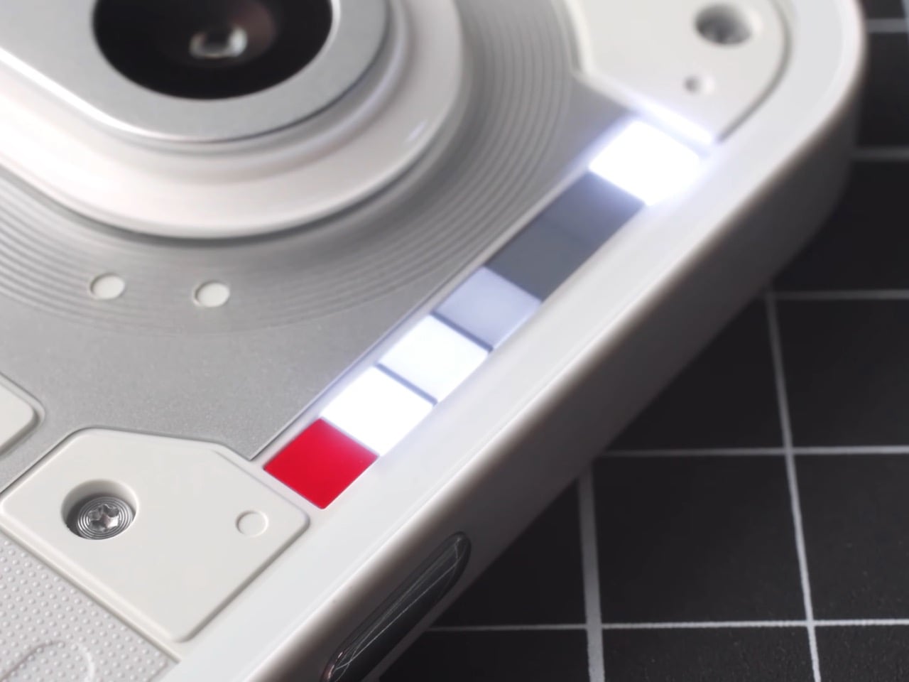
The glyph interface on the (4a) is a 1×6 LED strip, and for the first time on an A series device, it includes the red recording indicator that has been on the numbered phones since the beginning. The team is almost protective about that red square, describing it as deserving its place on every device because being recorded carries real consequence. The animations have been rebuilt from scratch rather than ported from Phone (3), which matters because the linear format demands different thinking. The timer, for instance, uses a single falling column of light instead of the hourglass matrix on Phone (3). Same idea, different grammar. Glyph Progress now runs on Android 16’s live updates API, which means broader app compatibility across the board.
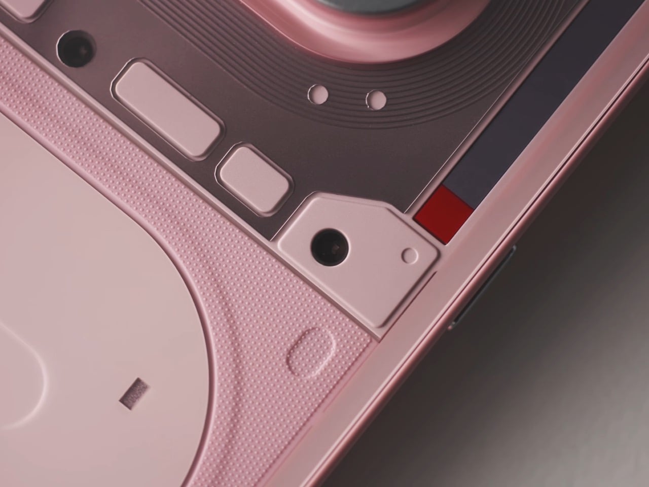
The camera doesn’t get talked about much, but it’s clearly an important part of any phone’s design and spec sheet. For starters, its design relies on a format set by its predecessor, the (3a). No fancy changes, no weird alignment like the (3a) Pro, just homogeneity… with a few upgrades. The periscope module in the (4a) uses a tetraprism design, bouncing light through multiple internal reflections to achieve optical zoom in a package compact enough to fit the base model’s profile. The (3a) Pro had a periscope too, but this one is significantly smaller. Nothing has been careful to represent the internal hardware authentically through the cover panel design, so what you see through the back is a stylized but honest reference to what’s actually underneath, including the PCB boundary, the FPC connectors, and the wireless charging coil.
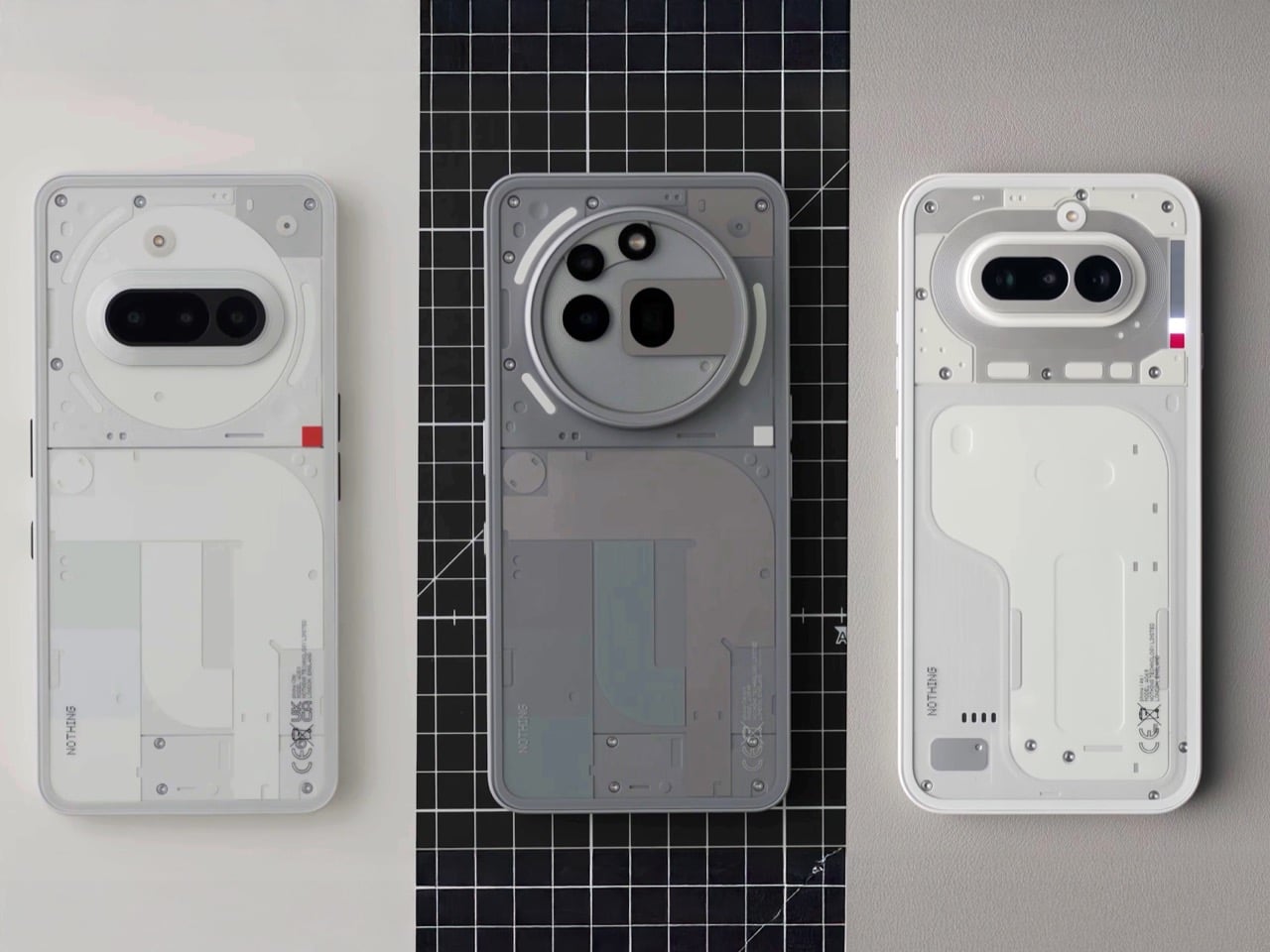
Nothing announced there will be no flagship this year, and that decision reframes everything about the (4a). The A series carries the full weight of the brand’s hardware story in 2025, which means this phone needed to be genuinely good rather than good for the price. The same core design team has been on the A series since the 2A, and that continuity is visible in the way the (4a) sits between its predecessors, borrowing proportions from both without feeling like a compromise. They’ve stopped performing and started building, and the (4a) is the clearest evidence yet that those are very different things.