There’s something oddly satisfying about counting things. Maybe it’s the same reason people find numbered lists so appealing, or why we instinctively organize our world into sequences. By-Enjoy Design seems to understand this perfectly with their OneToTea packaging for CHASHAN’s white tea pearls, turning what could have been just another tea box into something that feels almost like a playful puzzle.
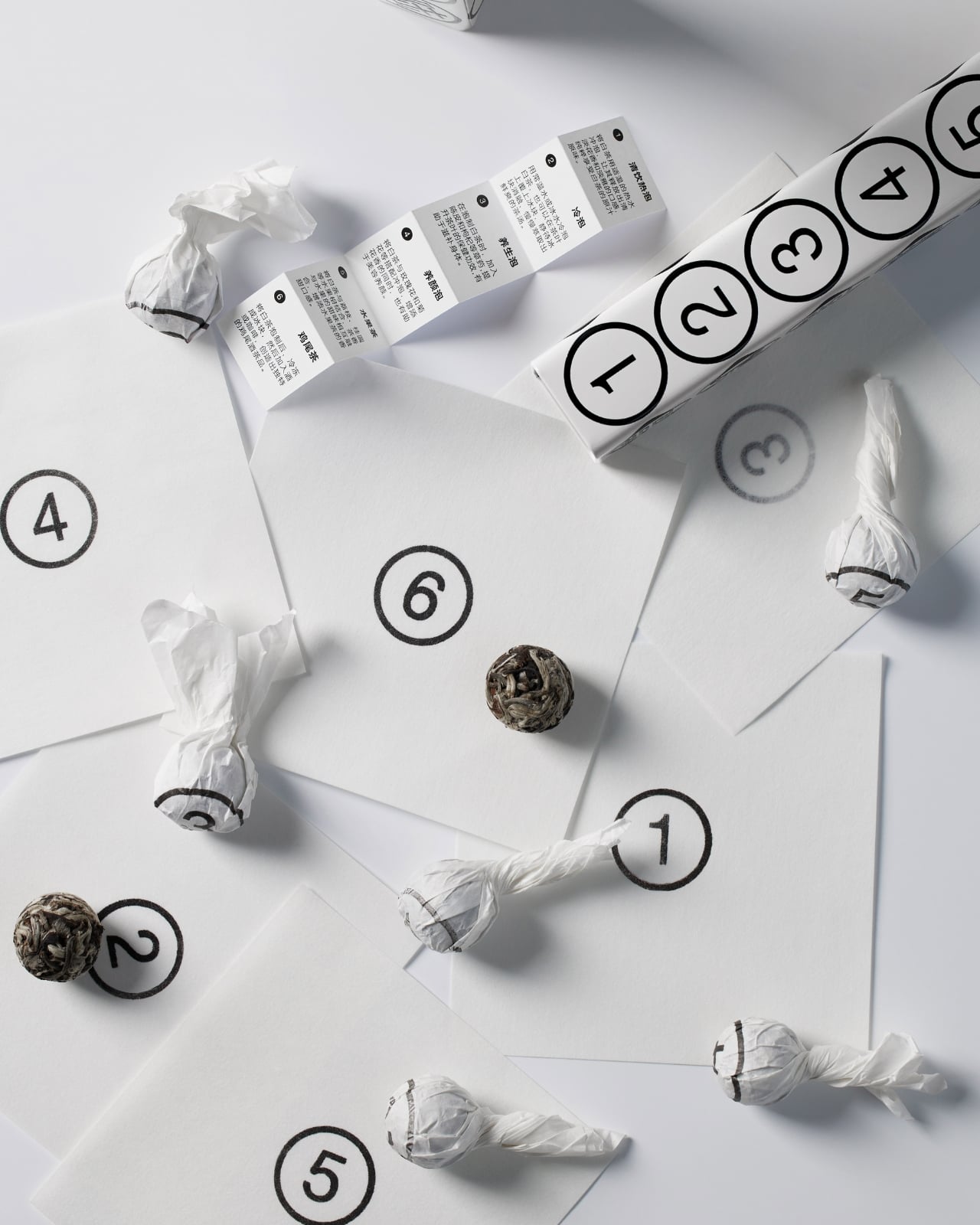
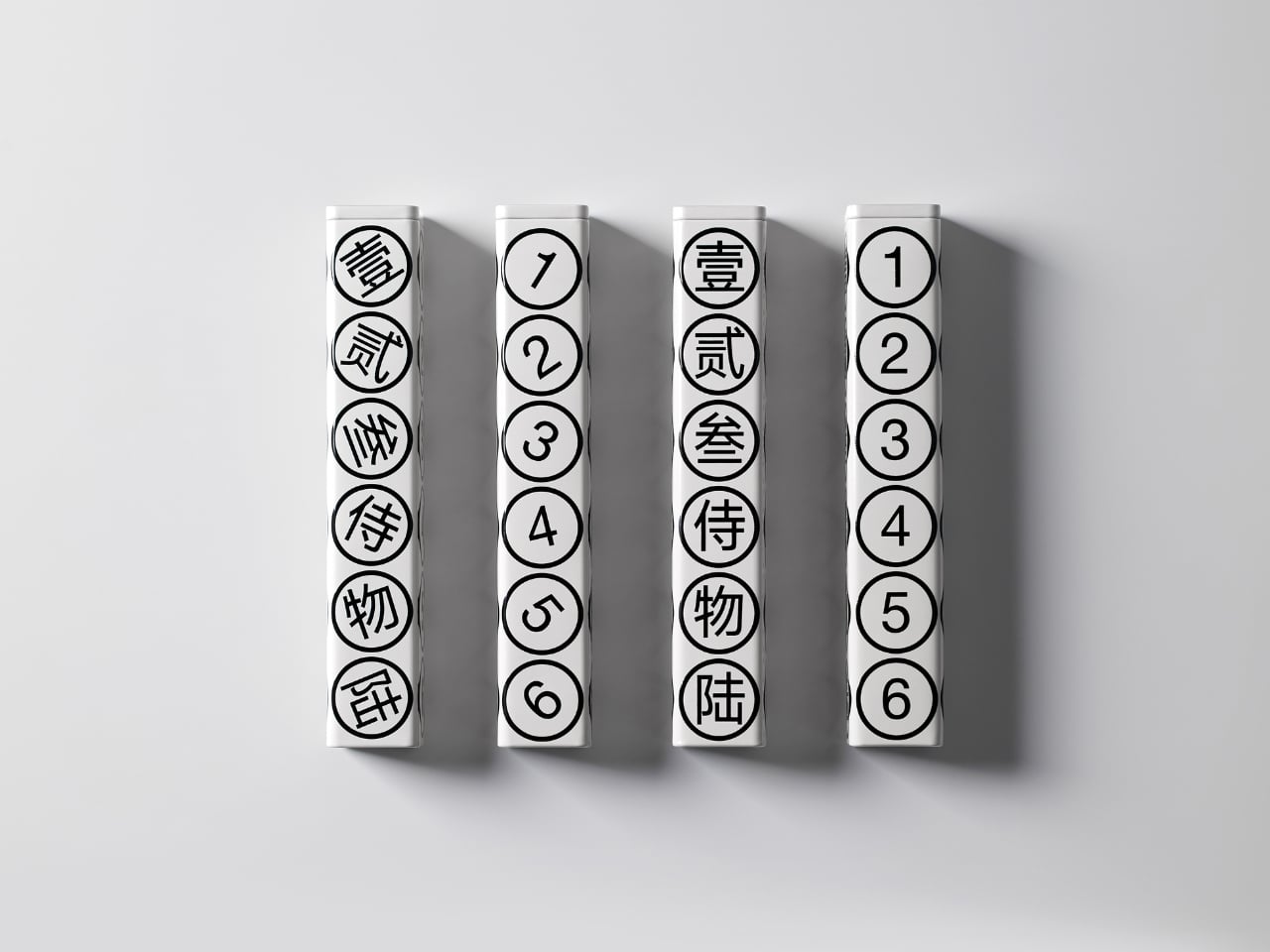
The concept is beautifully simple. Six white tea pearls, six numbers, one hexagonal tube. Each face of the package displays both a Chinese character and its corresponding Arabic numeral, from one through six. It’s the kind of design that makes you wonder why nobody thought of it sooner, which is usually the hallmark of really smart packaging.
Designer: By-Enjoy Design
What strikes me first is the restraint. The color palette is strictly monochrome, with black graphics on a pristine white background. No gradients, no metallic finishes, no desperate attempts to scream luxury through gold foiling or embossing. Instead, the design whispers sophistication through its geometric precision and typographic clarity. The circles containing each number create a rhythmic pattern down the length of the tube, making something as straightforward as counting feel deliberately composed.
But here’s where it gets interesting. The packaging doesn’t just look good sitting on a shelf. According to the designers, a gentle shake brings the whole thing to life, making it playful and dynamic. Imagine holding this tube and feeling those tea pearls shift inside, each one rolling to match its designated number. It transforms a static object into something tactile and interactive, which is pretty rare in the tea world where most packaging is designed to sit pretty and do nothing else.
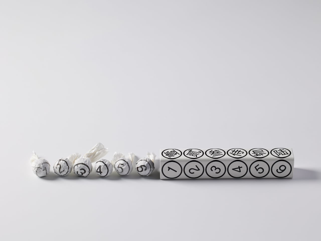
The bilingual approach serves multiple purposes beyond just translation. The Chinese characters carry cultural weight and authenticity, grounding the product in tea’s traditional origins. The Arabic numerals provide universal accessibility, ensuring anyone can engage with the numbering system regardless of language. This dual identity feels especially relevant for contemporary Asian brands trying to speak to both local and global audiences without losing their cultural identity in the process.
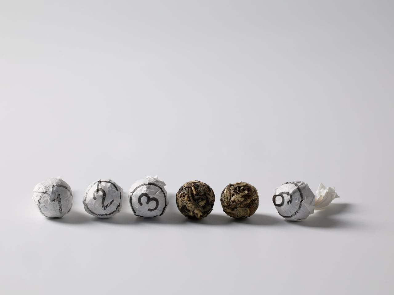
Each tea pearl comes individually wrapped, and naturally, it bears the same number as its spot on the tube. This kind of consistency creates a complete experience rather than just packaging. You’re not randomly grabbing a tea pearl. You’re selecting number three, or saving number six for later. It gamifies the consumption process in a subtle way, adding a layer of intentionality to your tea ritual.
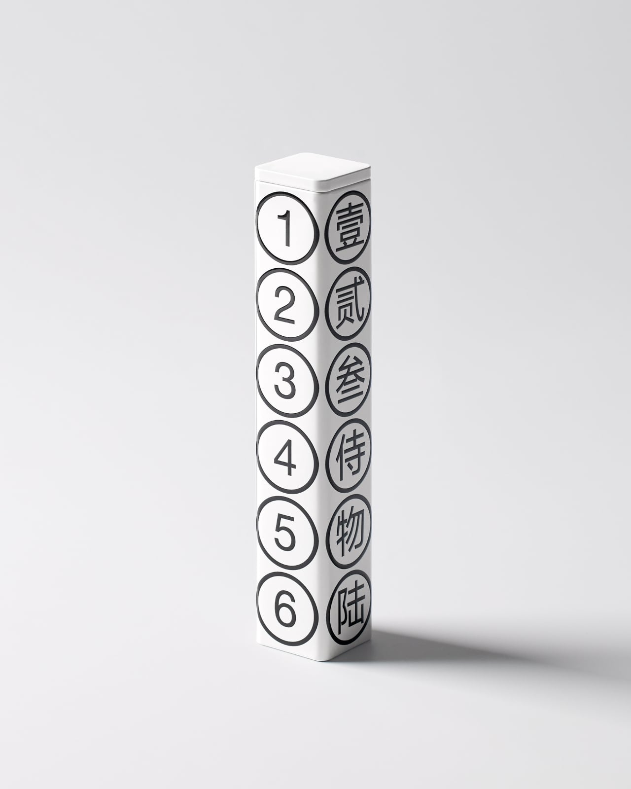
The hexagonal form itself deserves attention. It’s not the easiest shape to manufacture or ship, but it offers six equal faces for that perfect one-to-six display. It also stacks and arranges beautifully, as shown in the images where multiple tubes create their own geometric compositions. From a retail perspective, these tubes photograph incredibly well, which matters immensely in our Instagram-driven market where packaging needs to perform on screens as much as on shelves.
What really works here is how the design manages to be both minimal and maximal at once. Minimal in its aesthetic choices, with that stark black and white palette and clean typography. But maximal in its thoughtfulness, with every element serving both function and form. The numbers aren’t just decorative. They’re an organizational system, a design motif, a playful interaction, and a cultural bridge all at once.
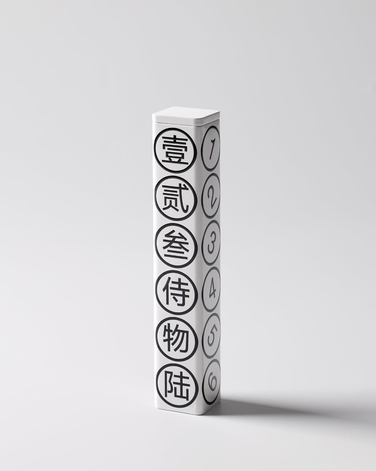
This kind of packaging also taps into something collectors understand well. When design is this cohesive and clever, you don’t want to throw the box away. That tube becomes an object worth keeping, maybe for storing other small treasures or just displaying because it looks that good. It’s the opposite of disposable packaging, and that sustainability angle (even if unintentional) resonates with contemporary values around consumption and waste.
By-Enjoy Design has created something that works on multiple levels. It’s functional enough for everyday use, beautiful enough for gift-giving, clever enough to spark conversation, and simple enough that its brilliance doesn’t require explanation. Sometimes the best design solutions are the ones that make you smile because they just make sense.
