The world is rapidly changing in more ways than one. While technologies are advancing at a fast pace, so is our planet’s state fluctuating at a somewhat worrying rate. It’s hard to ignore how the climate seems to be less reliable in the past years, throwing predictions and statistics into chaos. At the same time, however, it may have given us more insight into how nature really works, where balance is less static and more like an ever-changing dance. Keeping track of the many environmental factors that affect our health and comfort can be overwhelming and a bit distant for most people, so this curious device tries to represent those environmental markers in a more visual way that drives home the need for equilibrium in our living spaces.
Designers: Johnny Jiasheng Chen, Safiya El Ghmari, Betania Locatti, Rafael Bojorquez (Forenext Design Studio)
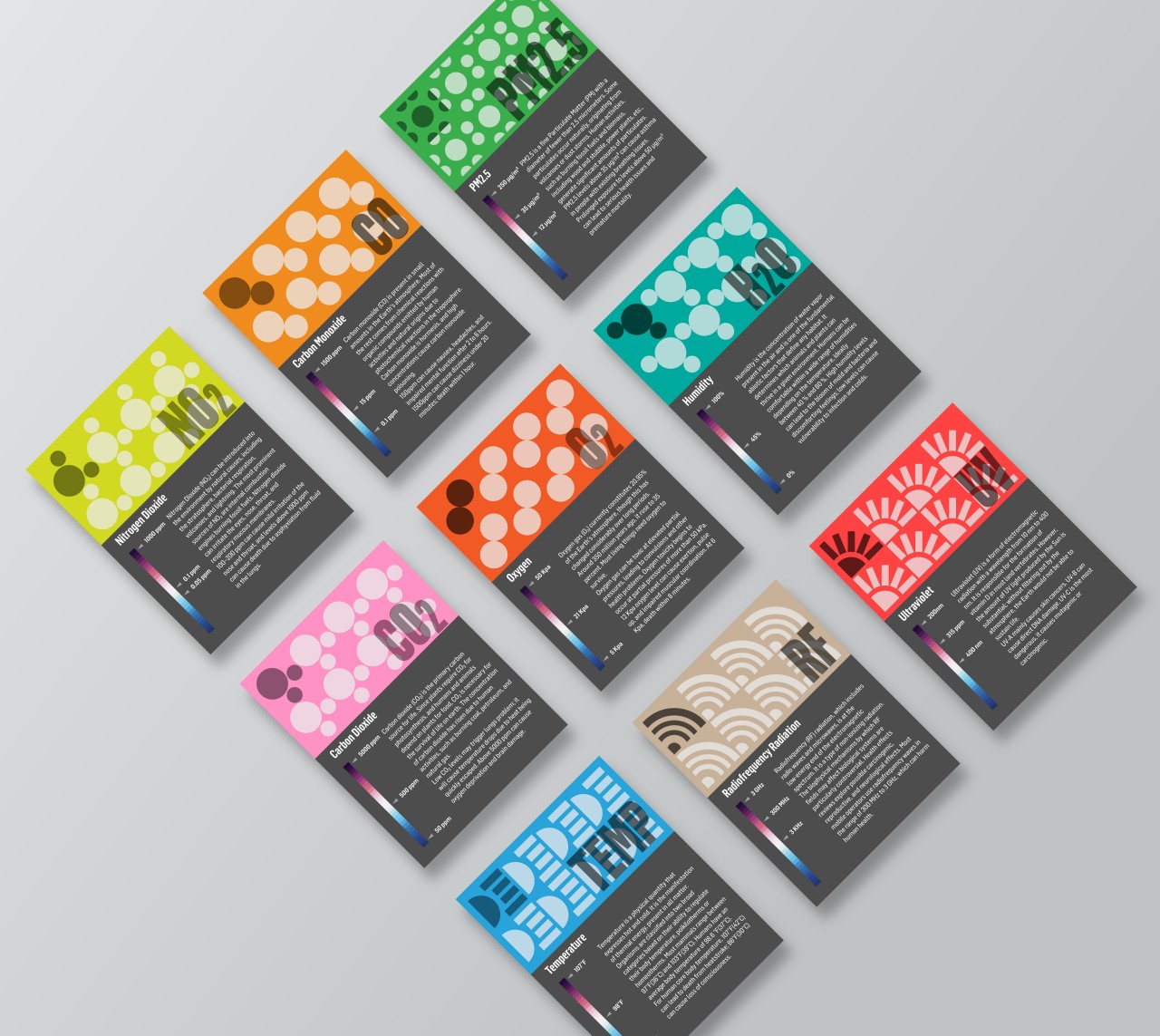
Given the health scare we had in 2020 through 2022, many people have become more interested in knowing the quality of the air around them. It isn’t just about viruses and bacteria floating in the air but also environmental factors such as humidity, carbon dioxide, pollution, and even ultraviolet radiation. There are some public services or indoor devices that can give a report on these pieces of data, but most people won’t be able to make heads or tails of the figures they present. More importantly, they don’t always present what should be the ideal amount given your specific location or setting.
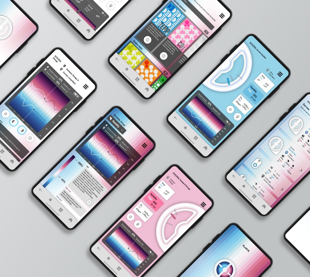
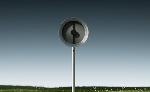
Plan B, which is short for “Plan Balance,” offers a different way of interpreting those very same figures. It revolves around the concept of balance, where too much or too little of something could be bad for our health. At the same time, however, it also acknowledges that our situation rapidly changes, so what might be in balance today won’t be the same tomorrow.
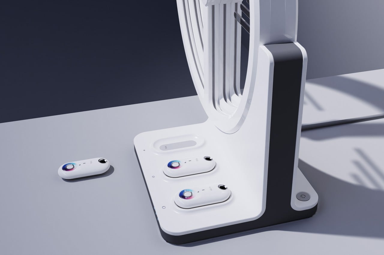
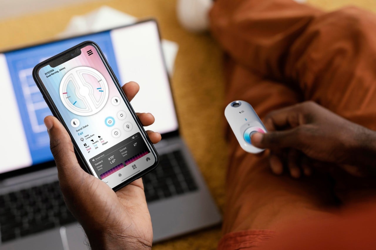
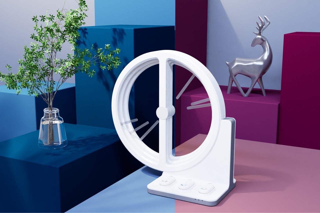
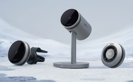
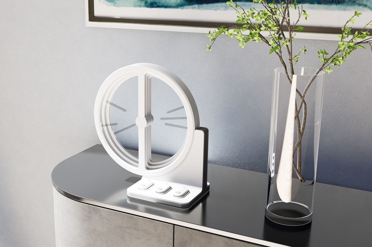
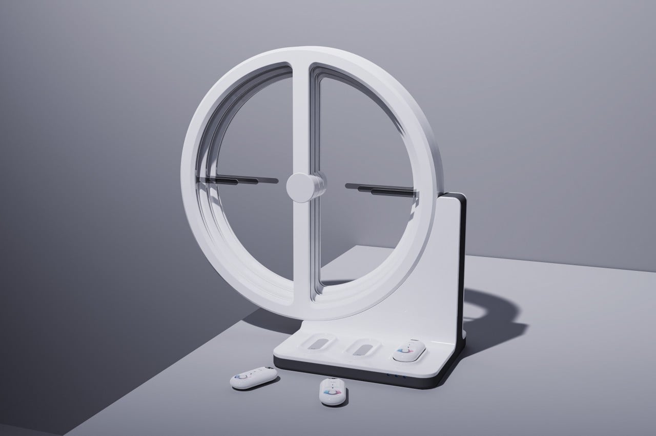
At the heart of the Plan B device is a dial composed of three layers that can keep track of at most three elements, including carbon dioxide, oxygen, humidity, temperature, and the like, depending on which ones the user wants to monitor. Each dial has a left and right half, each taking data from a different source. The left side sources information from public services, while the right side gets its data from the three portable sensors below it. The pointers on each side move depending on how much or how little there is of each element. When the two pointers point to each other in the middle, they form a horizontal line that symbolizes balance has been reached.
Plan B is a unique way of looking at how the rapidly changing climate affects our environment, but it also shows the traditional figures in the companion app. Admittedly, not all environmental markers need to be balanced (you want as low PM2.5 as possible, for example), so the visual might not work perfectly for all cases. At the very least, it can compare your indoor environment with what is outside or what should be ideal, allowing you to quickly make changes to increase your comfort and your safety.