I usually never recommend rendering any sort of product on a white background unless it’s truly necessary. When rendering, the background plays an important role along with the foreground, helping complement/balance it, or create a heavy contrast (that’s usually the photographer or designer’s call), but a white background can generally feel slightly template-ish. The real problem, however, is rendering white on white. A white product on a white background can usually be a nightmare because they tend to merge into one and another, creating ambiguity, and often end up concealing details of the product rather than revealing them… so how exactly does one render white on white? There are a few tricks you could master.
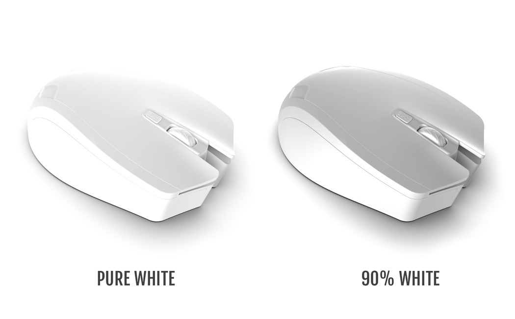
The first trick is realizing that your product, background, and lighting are NEVER the same color. When you load a model into a rendering software, chances are, you’ll use pure white on your product, while the background and lights by default are set at white too. This similarity begins causing your product and background to be practically indistinguishable. The fix? No product is perfectly white, and conversely, no backgrounds are perfectly white either. Choose a shade that’s 98% white (on the black to white spectrum) and your product immediately stands out against the background, while looking more realistically white, rather than perfectly white. You may also want to add a hint of blue to enhance its perceived whiteness, or maybe go in the other direction and drop in a tiny bit of yellow to make it look on the warmer side. Consider using a warmer or cooler shade of white as your background too to create a contrast that your eye will easily pick up on because of the difference in color. You could exploit Keyshot’s color options, even using their extensive Pantone color set.
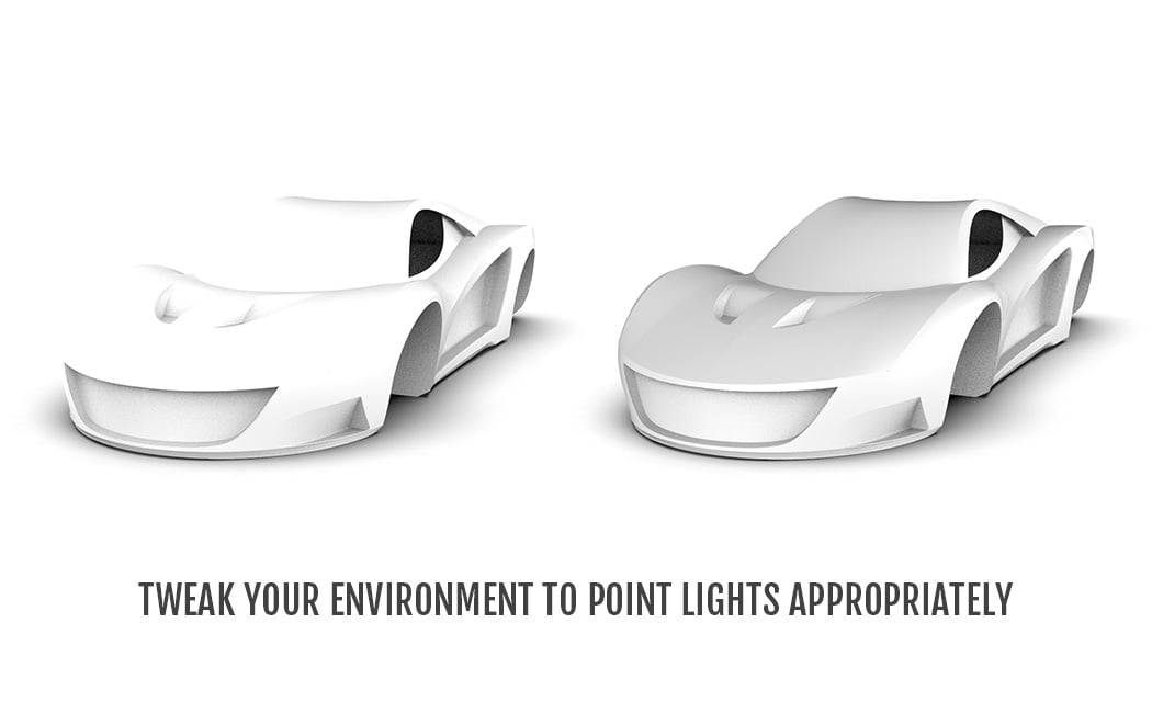
Trick one relied on choosing your product and background colors. Trick two requires a fair amount of expertise, but if done right, can make renders look stunning, regardless of how plain your product is. In fact, it’s something Apple has mastered over the years. With products that usually constitute straight lines and geometric curves, Apple relies heavily on perfect lighting to make their products pop. Take for instance the Apple Airpods that are placed against a white background. The idea is to have lights that illuminate the correct places, and cast shadows on the correct places. Never have a light shining on the side of a product, because a highlight on the side makes your product’s edge disappear into a white background. Always aim for a shadow around the edge, giving your product a gray outline, which helps a viewer easily pick up on the product’s shape. If all fails, add a light in a way that casts a shadow on the floor around the edge of a product, making it more visible. Keyshot has tonnes of environment options that help accentuate product details (consider experimenting with an environment that has a dark-ish background rather than settling for the default environment setting). With time, you can build your own environments to add a signature touch to your renders, placing lights exactly where you need them, creating accurate highlights on your products. This, in turn, will also help you brush up on your studio lighting skills, when you’re dabbling in photography. Another pro-tip? A glossy finish on your product makes highlights and shadows more pronounced. If your product is matte, the crisp lighting details often turn fuzzy. Want to render a matte-finish white product? Make sure your environment has a good balance between light and dark elements, so that they show up well on your matte product.
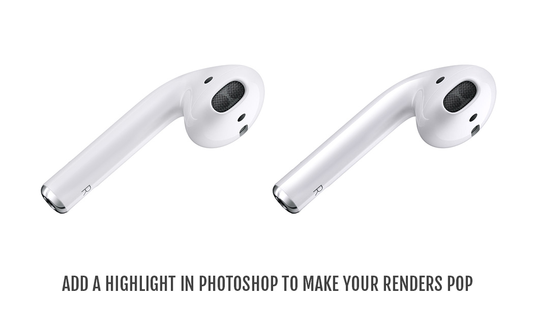
Not really getting the exact highlight you want on your rendering software? No problem! Trick number 2.5… just build the highlights in photoshop. Take your render to a photo editing software, and add your highlights using a brush. This gives you MUCH more control over your render, and if it’s any consolation, touching up renders and adding artificial highlights is something ALL companies do to make their renders look more flashy.
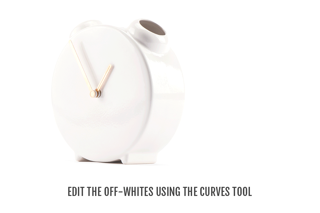
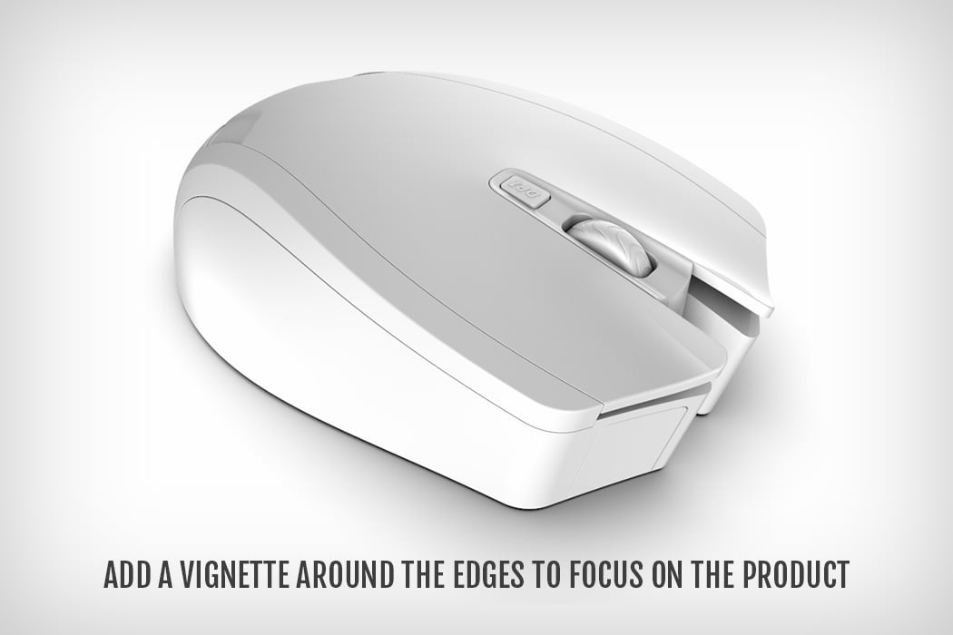
The last trick… just manually increase or decrease the contrast on your pictures. If your product has black details that are getting lost when you tinker with the contrast, try meddling with the Curves tool (ctrl + M or command + M) in photoshop to increase the intensity of just the grays. That way, you’re not touching the whites or the blacks. You’re just taking the ‘almost white’ parts of the image and making them more gray. To finish off, try adding a vignette to the image, giving it a bit of a distinct border, and helping it create a spotlight on your product.
Rendering white on white is quite a challenge, but the trick is being able to have either a mental or visual reference. If you know exactly what you want, where you want highlights, where you want shadows, it makes execution easier. As far as personal advice goes, stay away from templates and try to build materials and environments from scratch. It makes rendering a much more hands-on activity, and more so, helps YOU stay true to YOUR vision, rather than getting lucky by dragging and dropping colors, textures, materials, and environments. And most importantly, when rendering white on white or rendering anything in general… stop thinking like a product designer, and start thinking like a photographer. Your renders will look absolutely stunning!
Video Credits: Luxion Keyshot
Mouse 3D Model: Luxion Keyshot
Car 3D Model: Taufiqul Islam
Airpods Image: Apple
Clock Vase Image: Jaro Kose