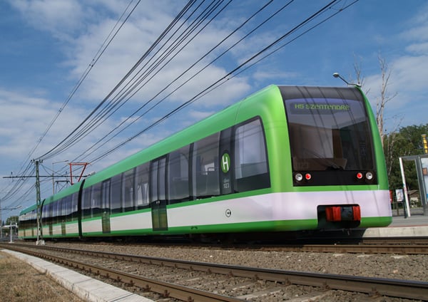
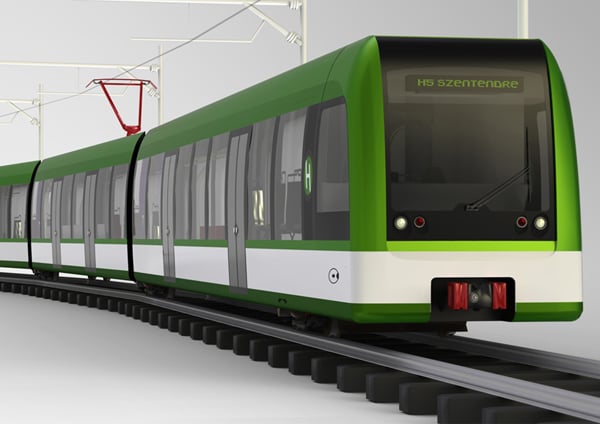
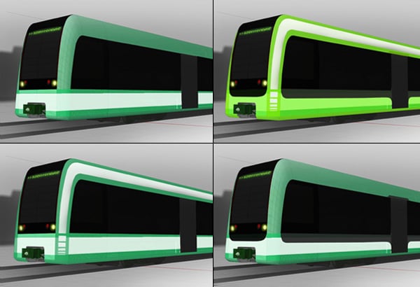
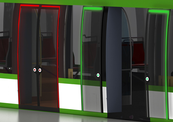
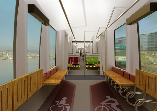
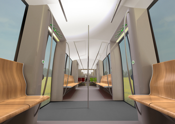
From the outside, the New Generation Light Rail might seem like a straightforward tram design, but what sets it apart are a few thoughtful features that are surprisingly not already in use by existing models. The design uses bold, universally recognizable visual cues like red/green lighting around the doors to indicate times to enter and exit and large wheelchair/bicycle graphics to indicate dedicated areas. It makes getting around easier and safer even if riders aren’t familiar with the language or procedures.
Designer: Adam Molnar
