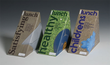
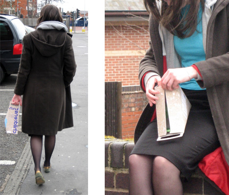
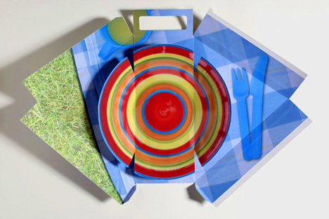
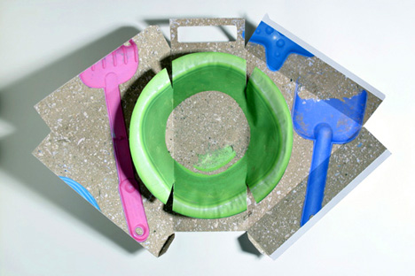
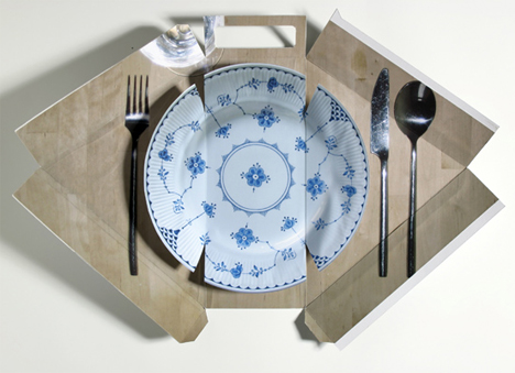
While few lunchtime experiences can best a classic superhero inspired box, these foldout gourmet lunch boxes by Emma smart definitely go the distance. Winning her a D&AD Yellow Pencil in packaging design, the challenge was to categorically separate the boxes while maintaining an overall sense of visual unity. Now if only there were one with a licensed fictional character I could pretend to be during lunch, my life would be complete.
Designer: Emma Smart
id rather the extra cash go into the quality of the sarni.. who cares what the inside of the box that will be thrown just after it is eaten will look like. slightly unnecessary.. and a gimmick at best 🙁
Its a really beautiful piece o utilitarian art. But although it pleases the eye, it bothers me that it’s disposable and seems a bit far from such urgent theme as sustainability.
at last, we will throw it away, so why bother to design such a thing?
exelente packaging
a pesar de que esto tu lo tiras a la basura luego de comer, habla de la preocupación y calidad del lugar que posee estos pack.
finalmente es publicidad, y la publicidad mueve al mundo.
me gusta.
quite interesting!
Seen a simpler design and also practical M&S in UK more than 3 years ago. I think they are great!
But this is really going overboard…it’s gonna be dumped anyways, why put so much effort?
boring, and pointless. Maybe an idea McDonalnds would adopt.